
General information about the plugin #
The Sale Countdown Timer Builder plugin by Develux provides additional functionality for your online store, enhancing the standard product card and product page capabilities.
In all online stores built on WooCommerce, product cards are displayed on the following pages:
- Catalog
- On the product page (Upsells)
- On the cart page (Cross-sells)
- May also be displayed on other pages if implemented in the site theme
If your WooCommerce theme has not modified the standard generation of product cards and pages, the full functionality of the plugin will be available. Otherwise, only part of its features will be accessible.
With this plugin, you can perform the following actions:
- Create a countdown timer for discounted prices or other promotions
- Work with the bulk manager, which allows you to assign timers using WooCommerce categories and tags, as well as include or exclude specific products
- Create your own library of timers
Plugin compatibility #
The plugin is designed to provide additional functionality for your online store built on WooCommerce. It is not compatible with other e-commerce platforms. Our plugin works correctly with WordPress themes developed for WooCommerce, following all requirements and recommendations of the WooCommerce/WordPress developer guidelines.
Important! Our plugin uses standard WooCommerce/WordPress hooks and filters. If your theme or other plugins modify the default behavior of these hooks/filters, the plugin may not function correctly!
Important! Our plugin uses the standard jQuery/jQuery UI library. If your theme or other plugins modify or disable these libraries, the plugin may not function correctly!
Installation and configuration #
The plugin is installed using the standard method provided in WordPress.
In the admin panel, you need to go to the Add New Plugin page.
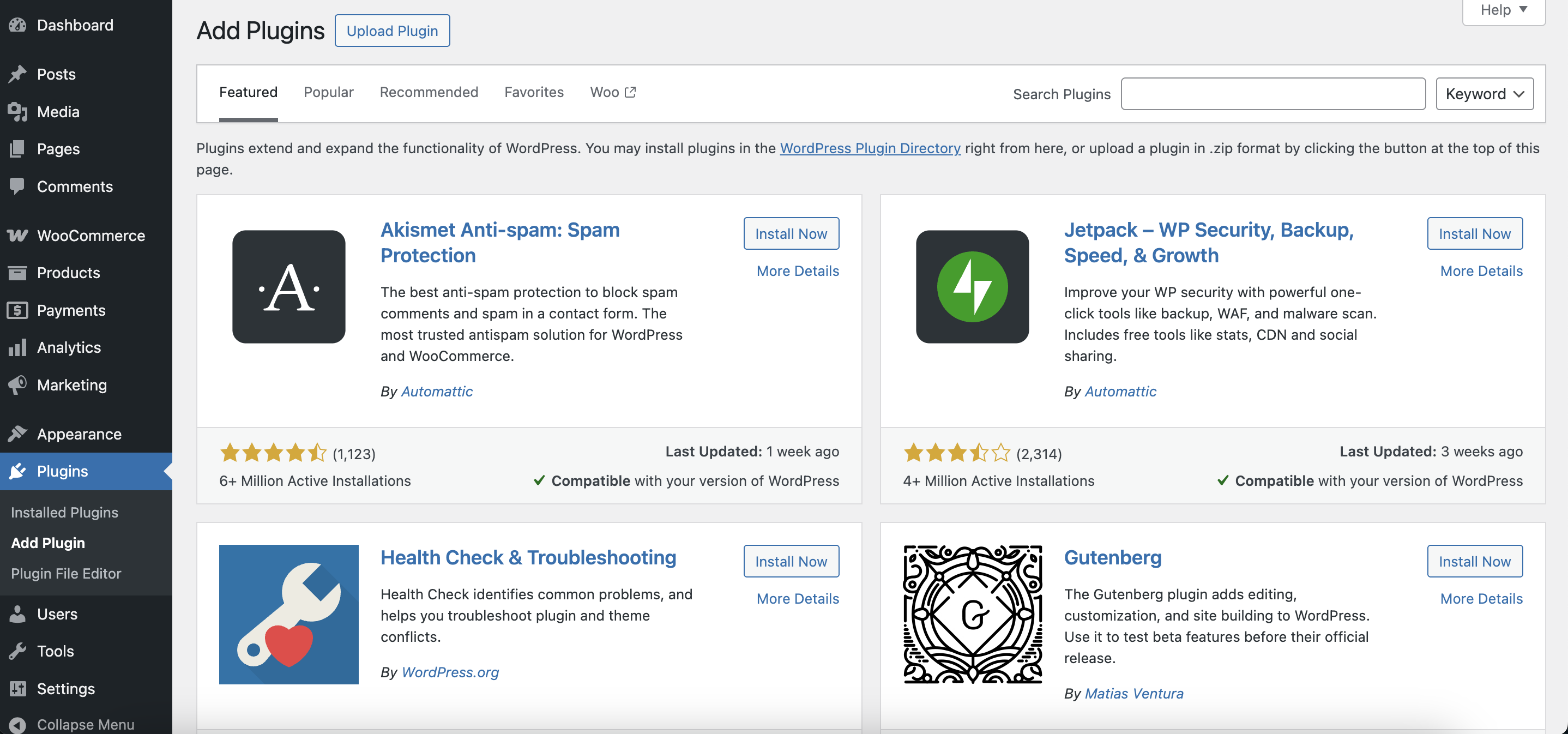
‘Add New Plugin’ page
Using the Upload Plugin button, upload the plugin’s zip archive.

‘Uploud plugin’ button
After the plugin installation, it will be ready for use immediately. Additionally, after installation, you will receive ready-to-use elements in the label and timer library.
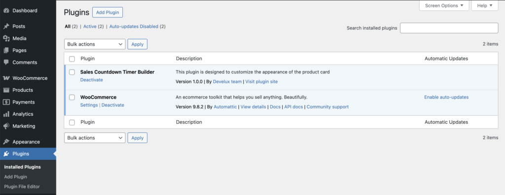
‘Plugins’ page with installed Sales Countdown Timer Builder
Creating a unique timer for a sale promotions #
In the Sale Timer Builder, you can create unique timers with different styles for various events and dates.
You can assign the created timers to specific categories, tags, or individual product cards, or exclude certain products where the timer shouldn’t appear.
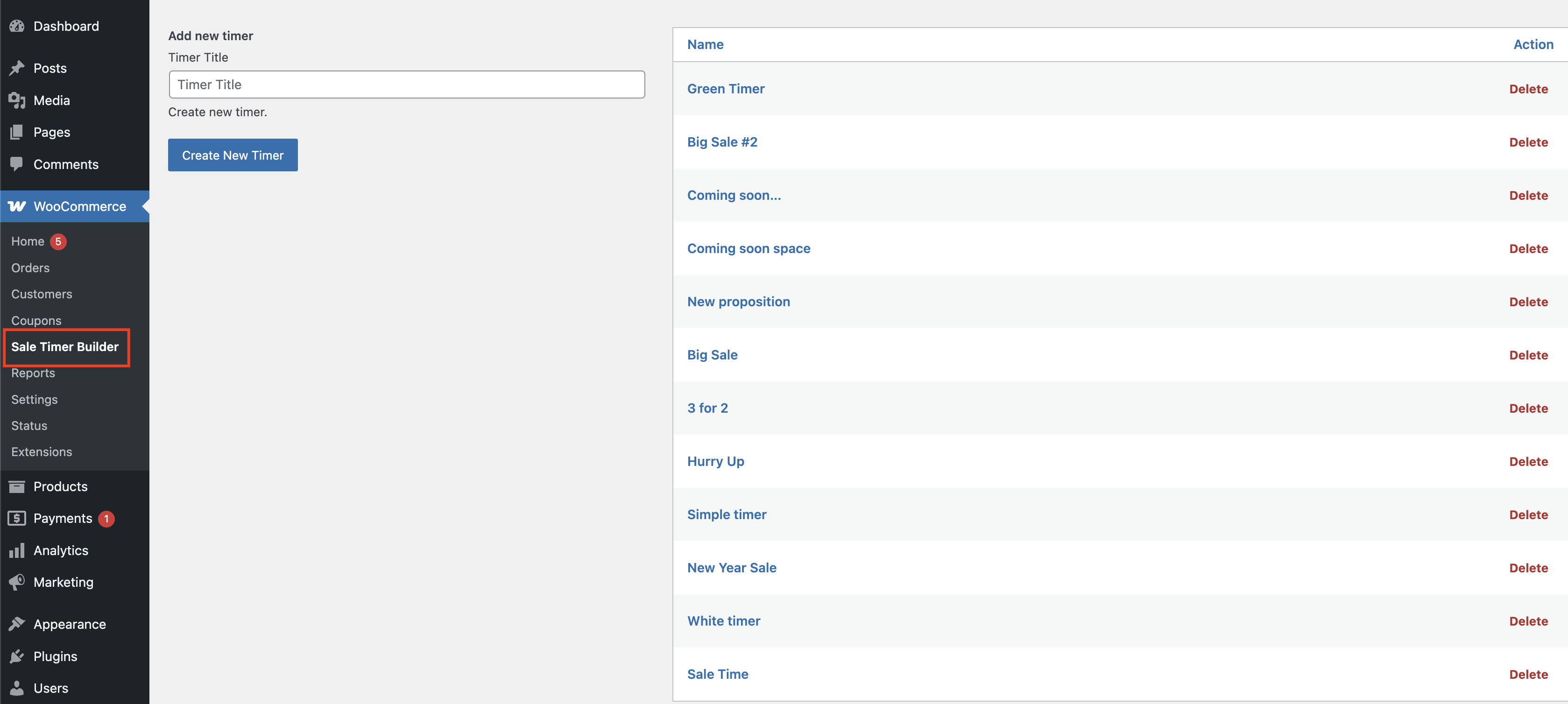
‘Sale Timer Builder’ page
At the beginning, you need to:
- Enter the name of your new timer in the input field.
- Click the “Create New Timer” button.
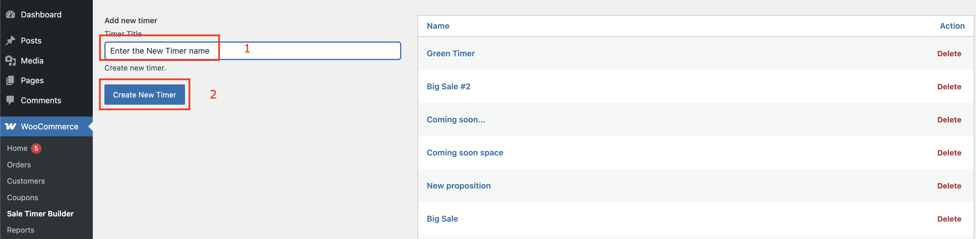
Steps for creating a new timer
If you need to delete the timer, click the ‘Delete’ button and confirm the removal in the pop-up.
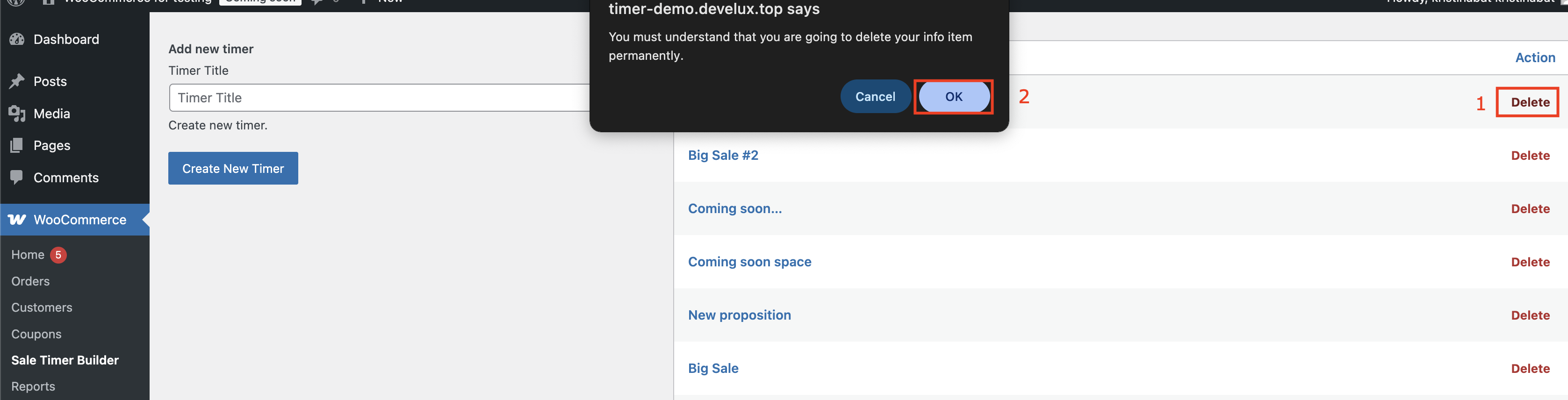
Steps for removing a new timer
Timer Settings #
Here you can set the titles for the timer and the locations on the product card/ page.
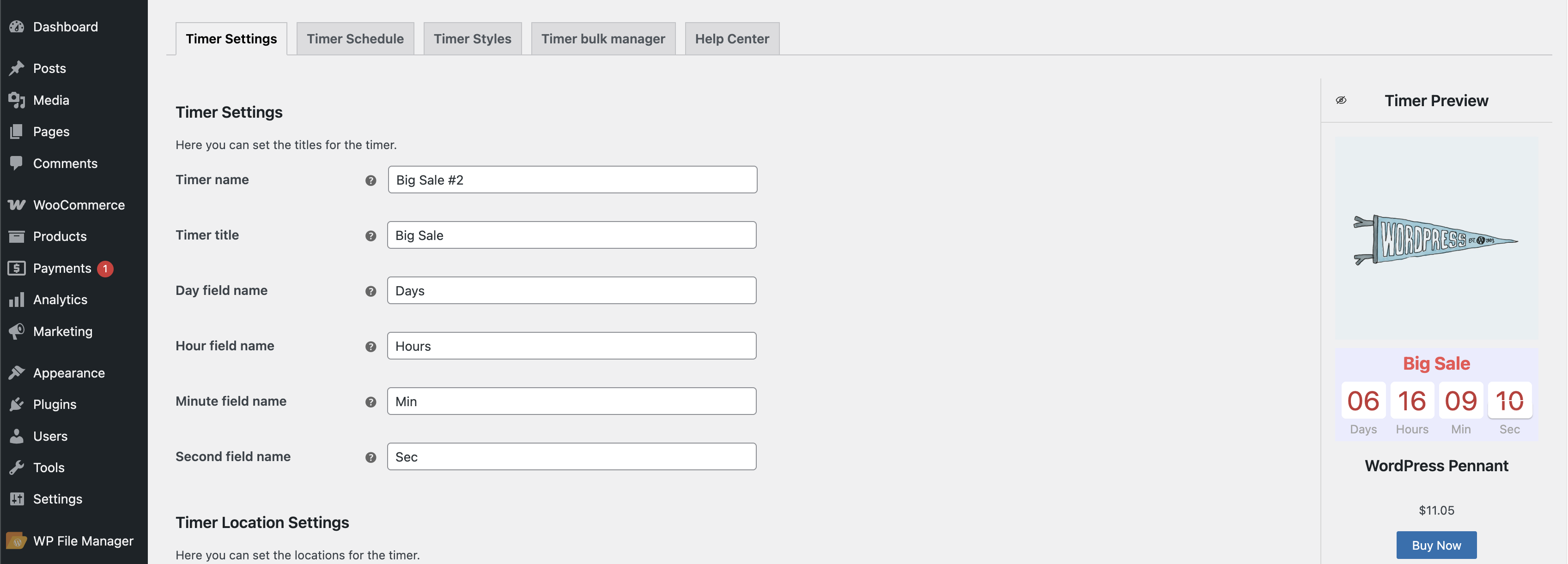
‘Timer’ Settings page
Timer name – allows you to name the timer so you can easily identify it later in the list.
Timer title – sets the timer topic and helps you organize timers by event or purpose.
Day field name – allows you to choose how the word ‘day’ will appear on the timer.
Hour field name – allows you to choose how the word ‘hour’ will appear on the timer.
Minute field name – allows you to choose how the word ‘minute’ will appear on the timer.
Second field name – allows you to choose how the word ‘second’ will appear on the timer.
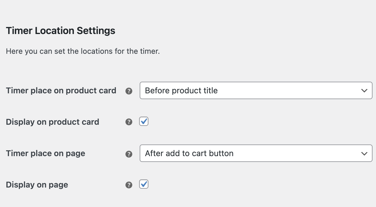
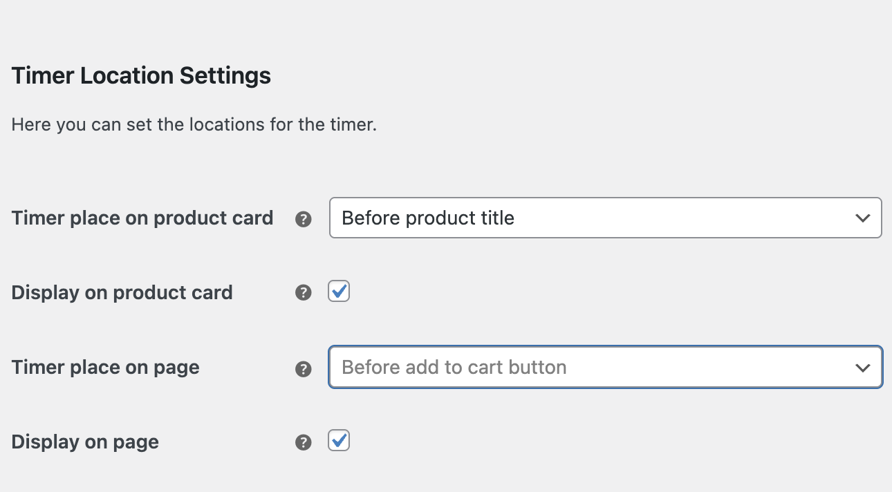
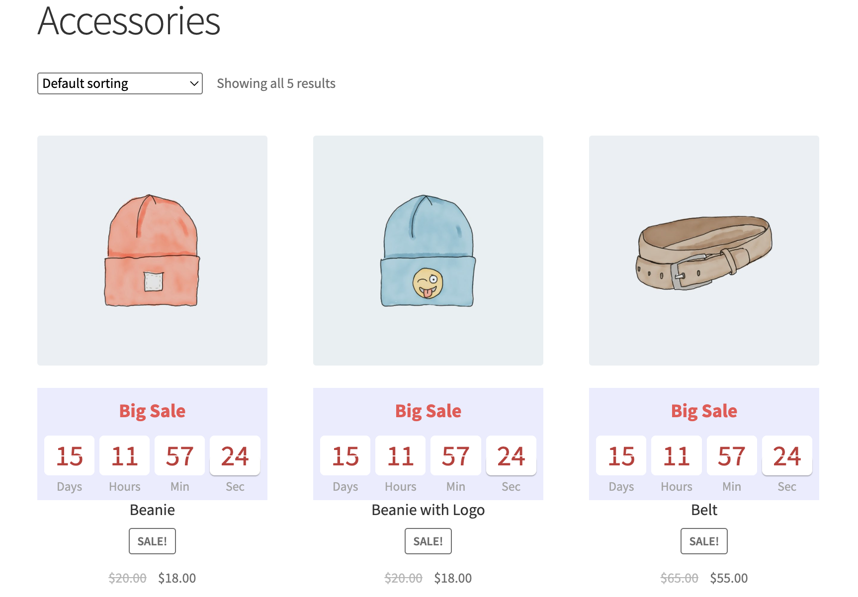
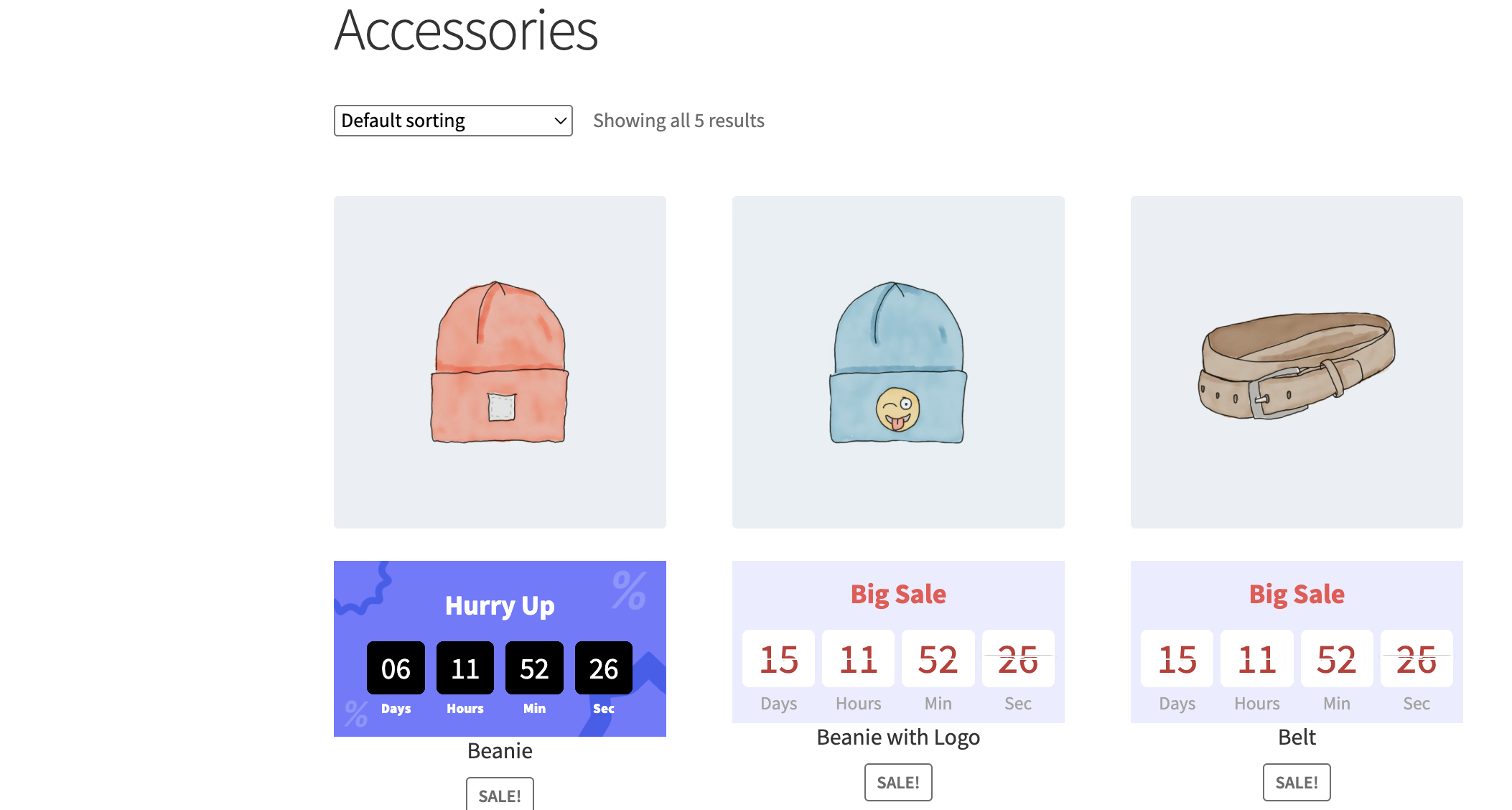
Timer place on product card – allows to locate the timer in different places on the product card
- Before product card – in this location timer will be displayed at the top of the product card
- Before product title – in this location timer will be displayed before the product card
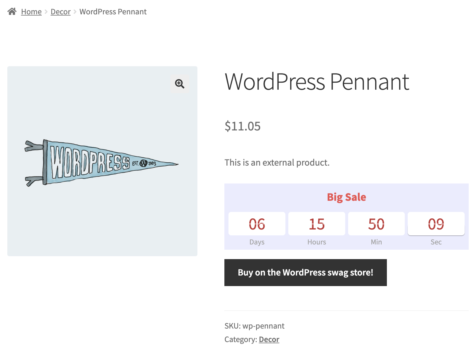
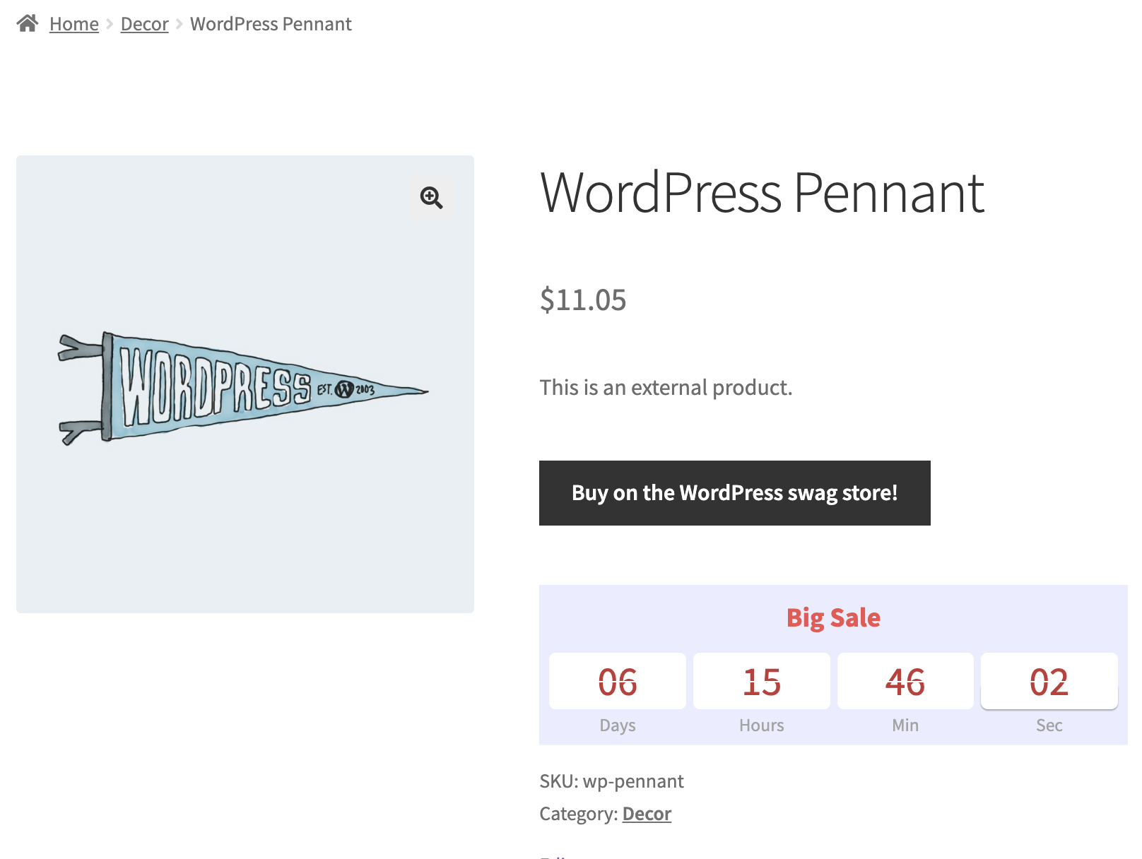
- After product title – in this location timer will be displayed after the product card
Before product card location
Before product title location

After product title location
Display on product card – allows turning off/ turning on the timer on the product card
Timer place on product page – allows to locate the timer in different places on the product page
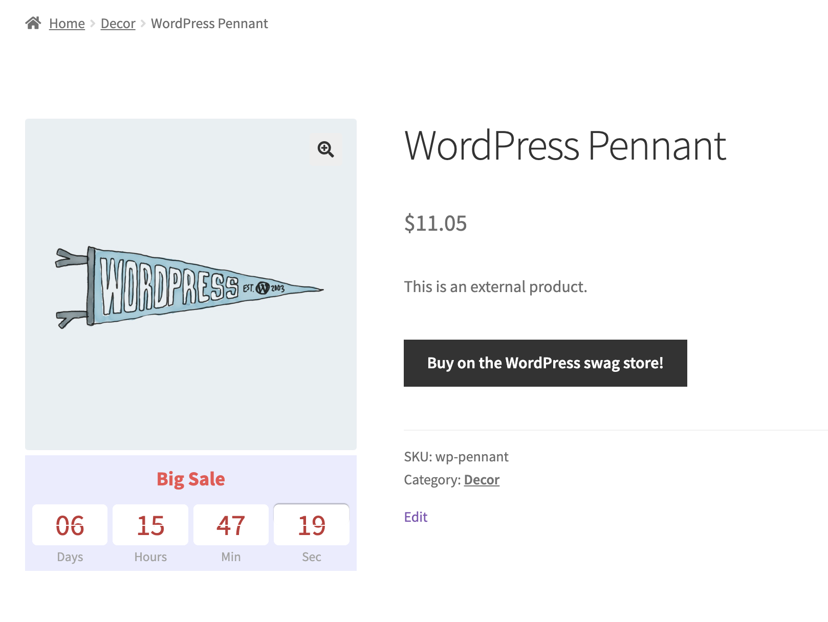
- Before add to cart button – in this location timer will be displayed before the ‘Add to cart’ button
- After product thumbnail – in this location timer will be displayed after the thumbnail
- After add to cart button – in this location timer will be displayed after the ‘Add to cart’ button
Display on product page – allows to turn off/ turn on the timer on the product page
Before add to cart button location
After product thumbnail location
After product thumbnail location
Important!
If the product has no price, the Before Add to Cart button and After Add to Cart button locations will not be shown.
‘After Add to Cart button’ location
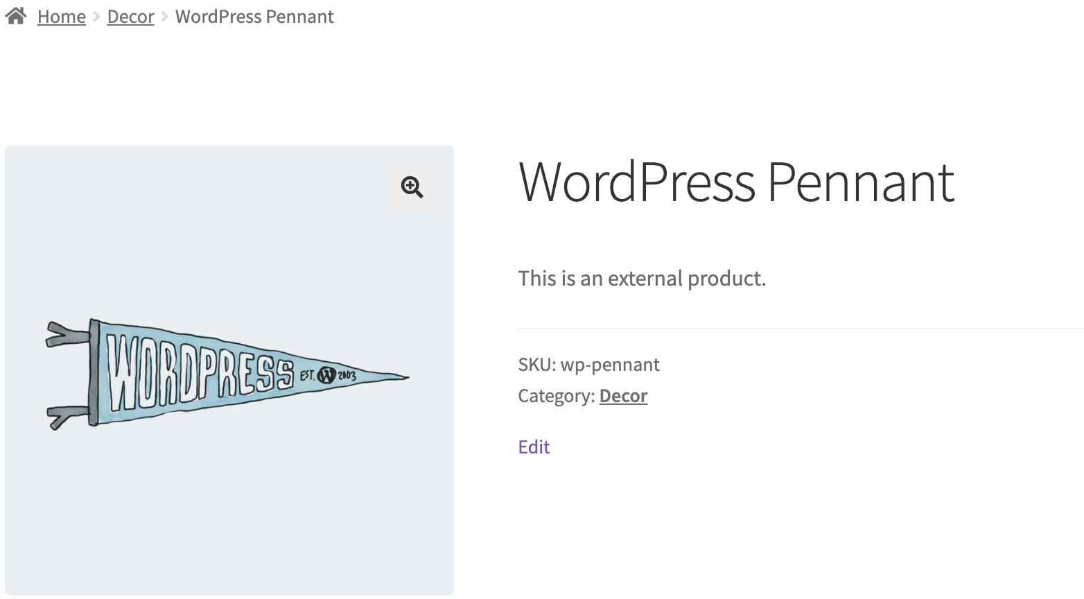
Product page
‘Before Add to Cart button’ location
Important!
If the product has a gallery or a slider, After product thumbnail location will not be shown.
Product card in meta boxe
Product page
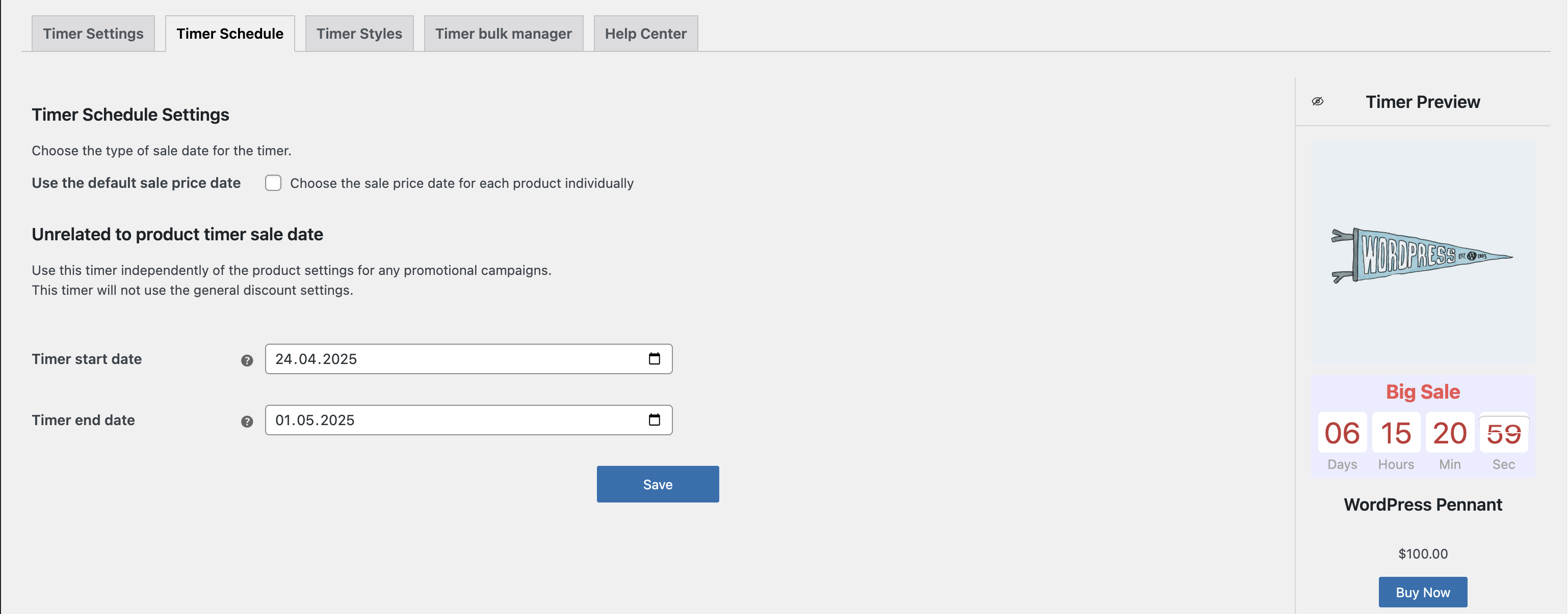
Timer Schedule #
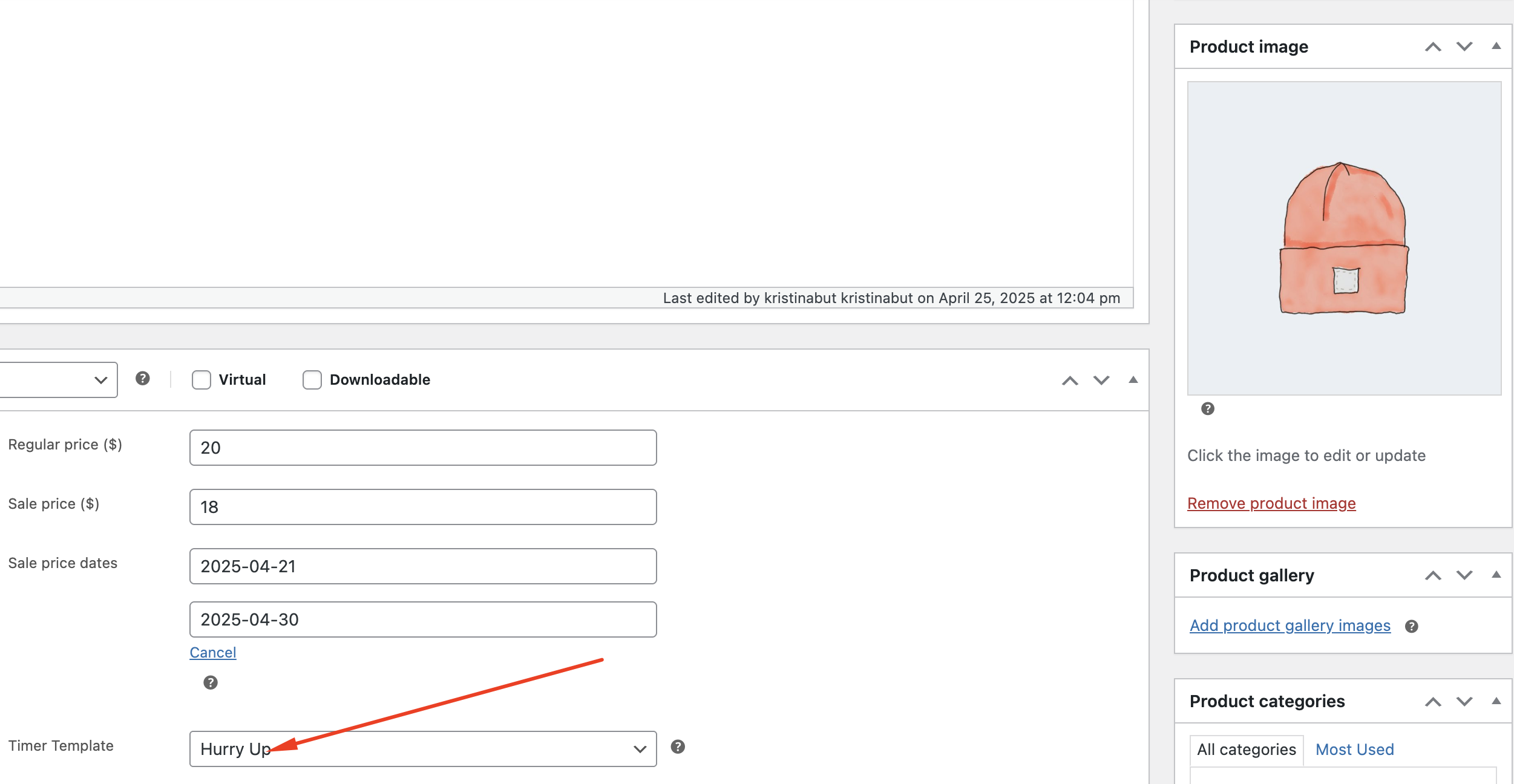
In the Timer Scheduler tab, you can set the date in the timer for a scheduled event.
‘Timer Scheduler’ page
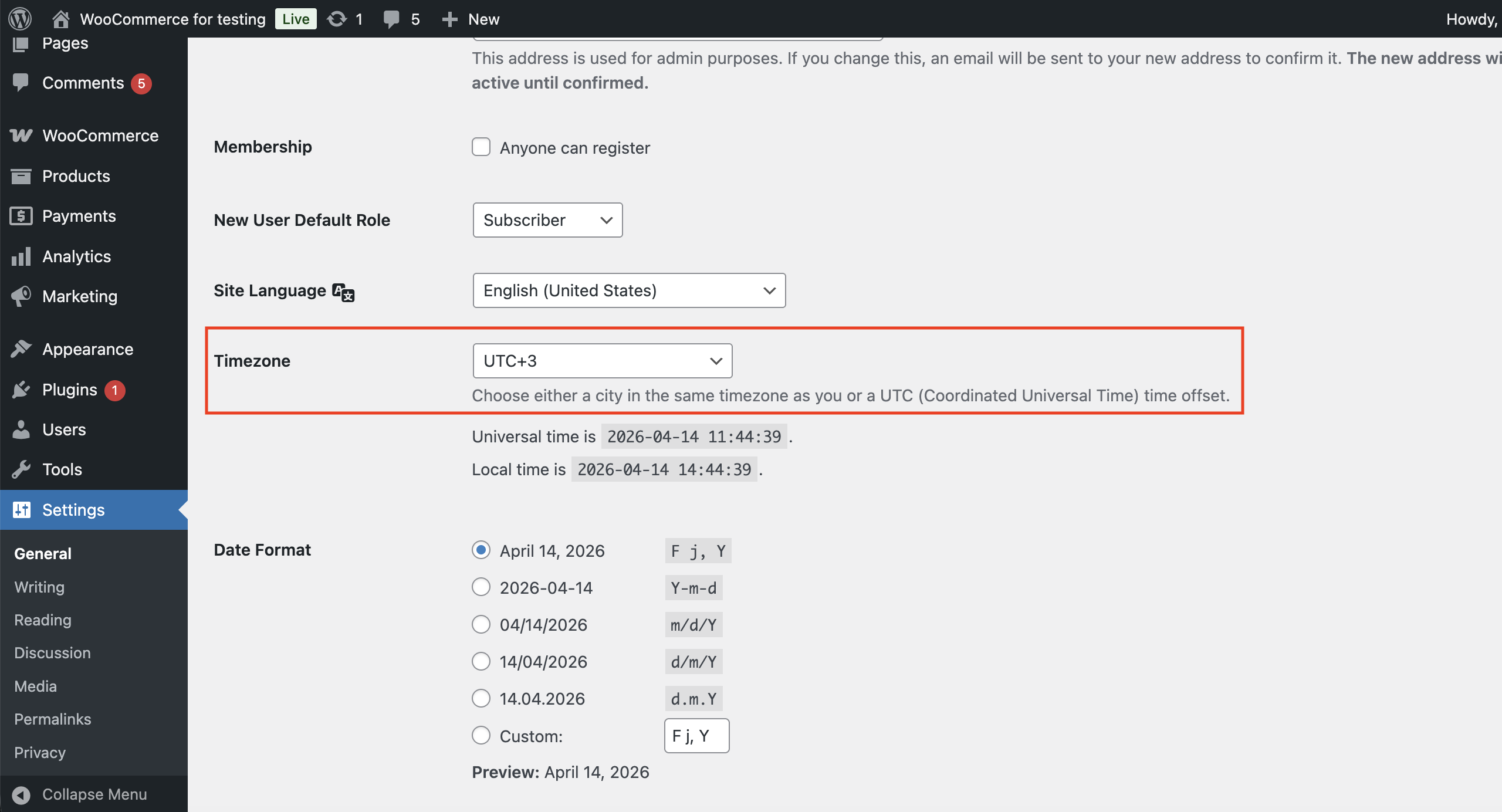
Important!
You can change the global time settings for your timers in the general plugin settings. To do this, navigate to Settings -> Timezone.
Timezone — defines the specific geographical region or offset used to calculate the start and end times of your timers. Ensure this matches your store’s local time to avoid scheduling discrepancies.
If you plan to use the Timer Bulk Manager, make sure to use the default sale price date and leave the Choose the sale price date for each product individually option unchecked.
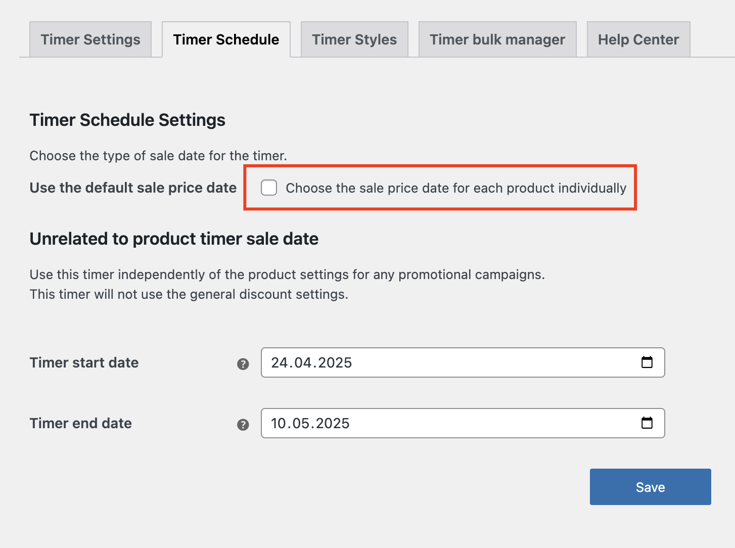
‘Timer Scheduler’ page with default sale price date settings
Timer start date – defines the date when the event begins.
Timer end date – defines the date when the event ends.
If you want to use a sale date for a specific product, check the Choose the sale price date for each product individually option and set the schedule in the meta box.
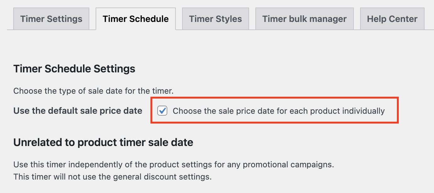
‘Timer Scheduler’ page with individually price date settings
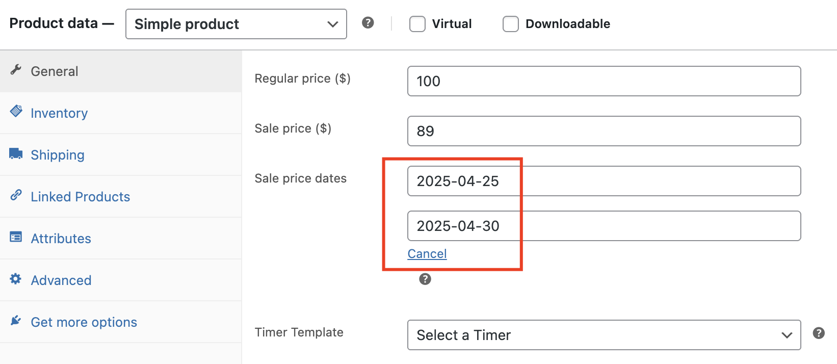
Meta box schedule settings
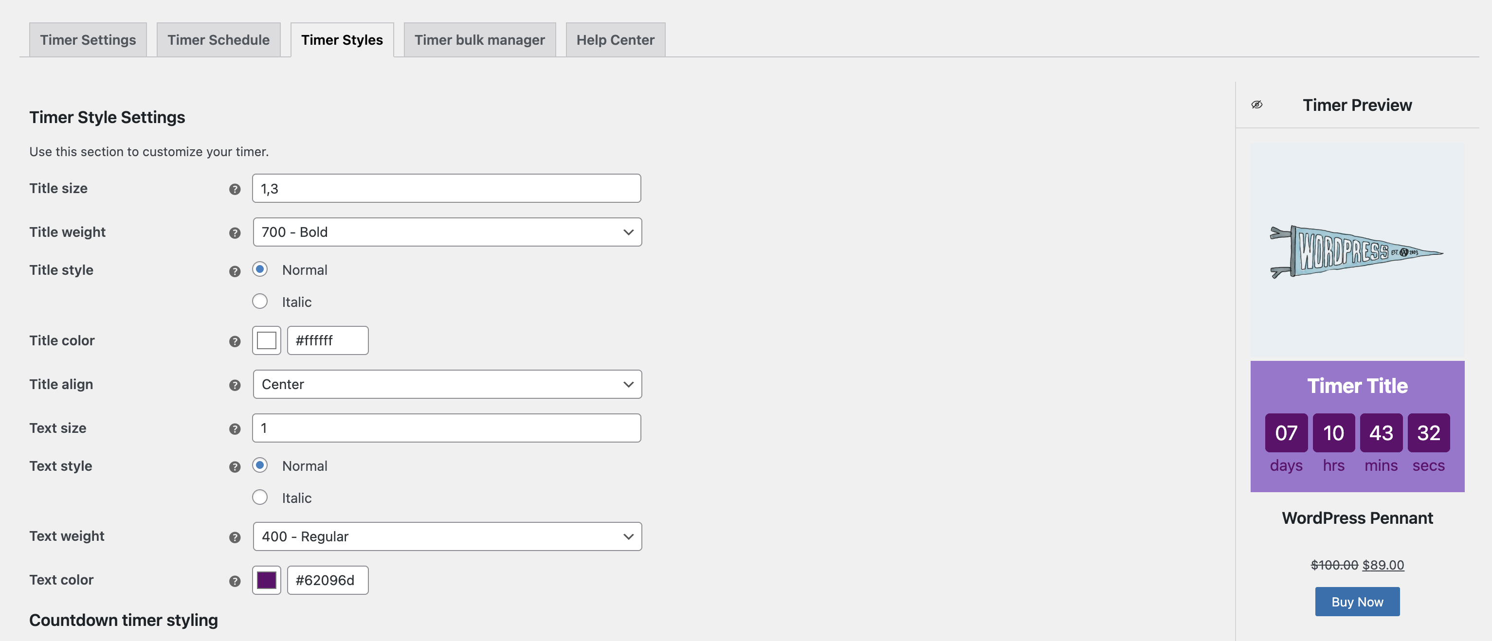
Timer Style #
In this tab, you can set different colors, fonts, and sizes for the timer.
‘Timer Style’ page
Title size – sets the title size
Title weight – sets the weight of the title (light, medium, bold)
Title style – sets the style for the title (normal, italic)
Title color – sets the color of the title
Title align – sets the alignment for the title (start, center, end)
Text size – sets the size for the text (days, hours, minutes, seconds)
Text style – sets the style for the text (normal, italic)
Text weight – sets the weight for the text (light, medium, bold)
Text color – sets the color for the text
Use animation for timer – enables smooth transitions when the timer updates its countdown values
Numbers size – sets the number size in the boxes
Numbers style – sets the number style in the boxes (normal, italic)
Numbers weight – sets the number weight in the boxes (light, medium, bold)
Numbers color – sets the number color in the boxes
Rounding – sets the roundness of the number box corners
Number box width – sets the width for the number boxes
Number box height – sets the height for the number boxes
Space between boxes – sets space between the number boxes
Top outer space – sets the space between the title and number boxes
Background color – sets the background color of the number boxes
Bottom inner space – sets the space between the text and the wrapper
Horizontal inner space – sets the space inside the left and right sides of the numbers container
Main width – sets the width of the container that holds the timer boxes
Main top offset – sets the vertical location of the number boxes
Background color – sets the wrapper background color
Background opacity – sets the transparency level of the background color
Timer background image – allows uploading an image for the timer
Repeat background – allows to choose if the background image should repeat to fill the space or appear just once
Background position – allows to choose how the background image fits inside the space
- Cover – fills the area and may crop the image
- Contain – shows the whole image, but might leave the empty space
- Revert – uses the default setting
Image placement – allows to choose where the image appears inside the background (at the top, bottom, left, right, center)
Inner space – sets the inner space in the general wrapper
Width (for product page only – sets the timer width on the product page
Top offset – sets the space between the timer wrapper and the element above
Bottom outer space – sets the space between the timer wrapper and the element below
Rounding – sets the roundness of the general wrapper
Frame size – sets the outline width of the general wrapper
Frame color – sets the outline color
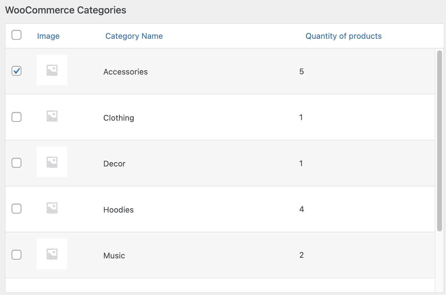
Timer bulk manager #
The Timer bulk manager allows you efficiently manage timer assignments across many products in one place. Using this tool, you can:
- Apply a selected timer to a group of products by category or tag
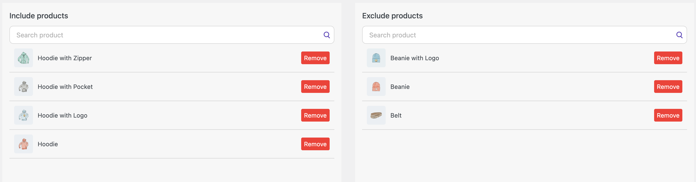
- Assign timers to specific products using the Include Product option
- Exclude certain products from a timer using the Exclude Product option
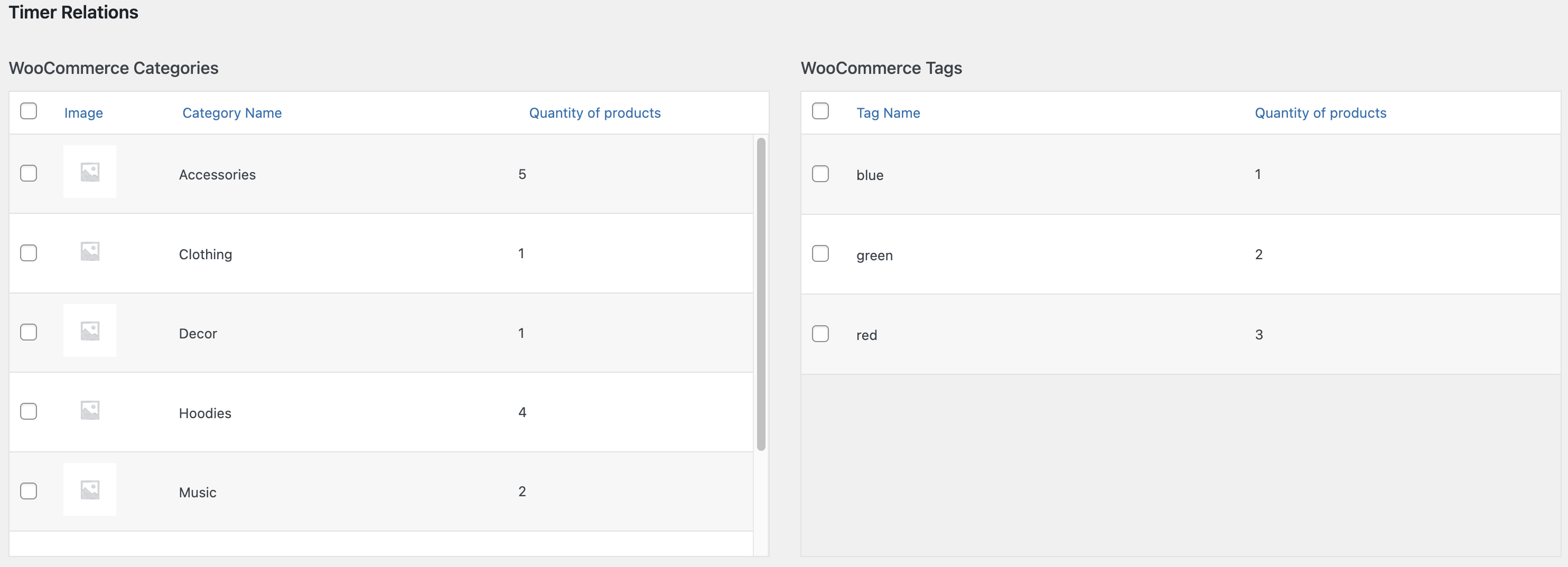
‘Timer bulk manager’ page
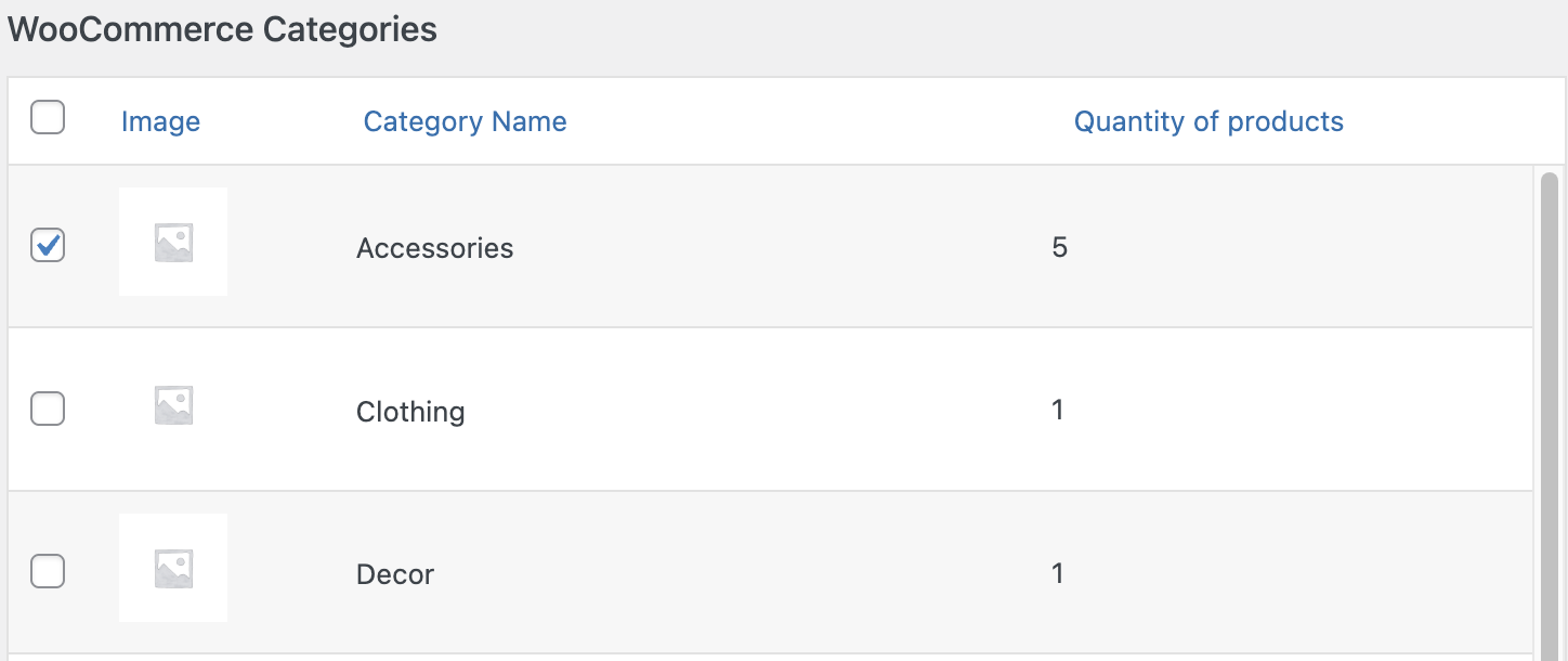
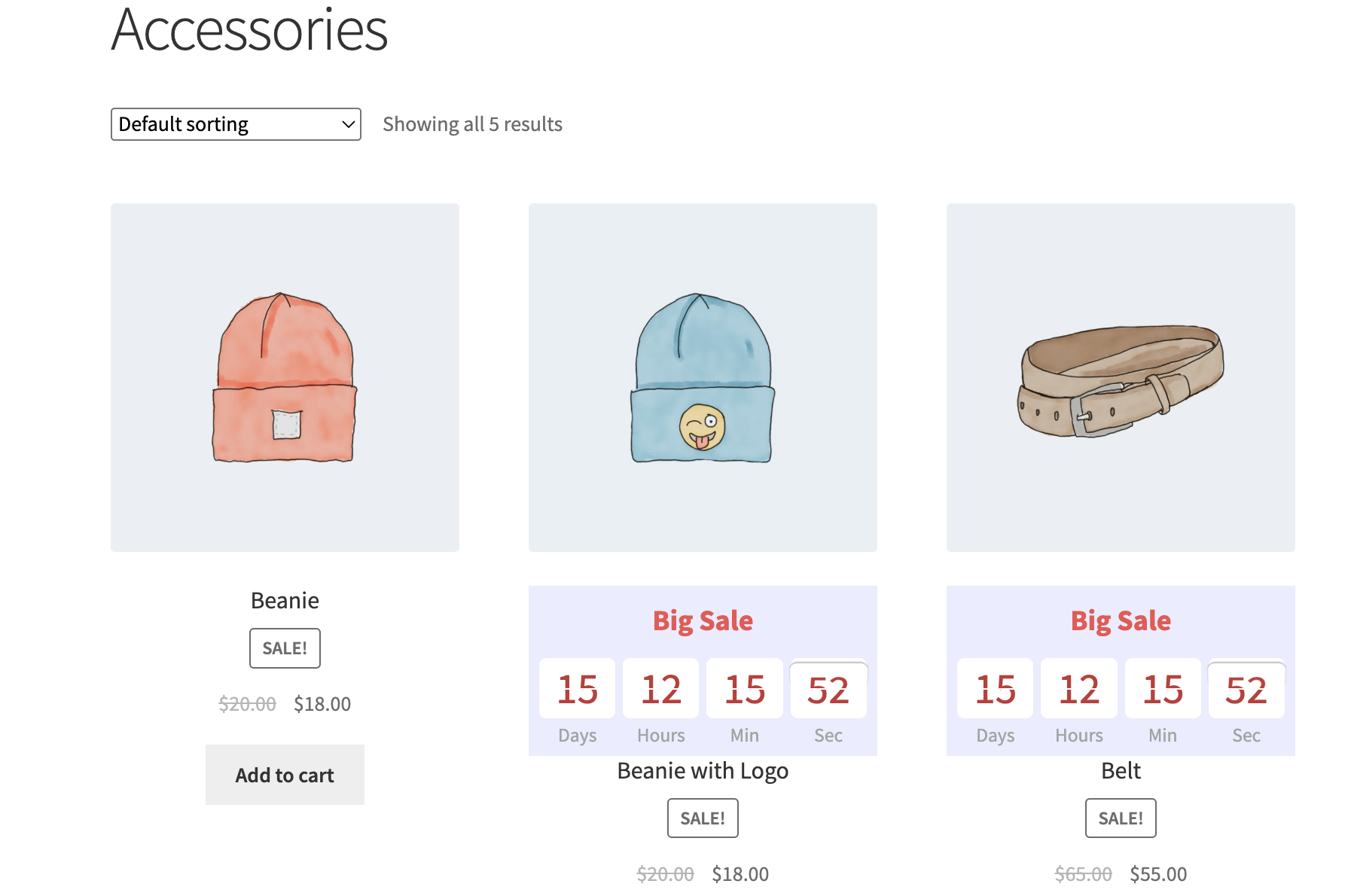
WooCommerce Categories – the timer will be displayed on all categories’ products.
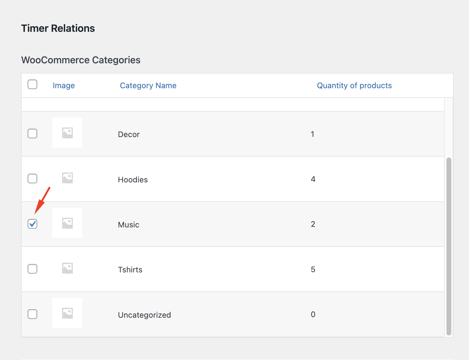
Timer bulk manager settings by category
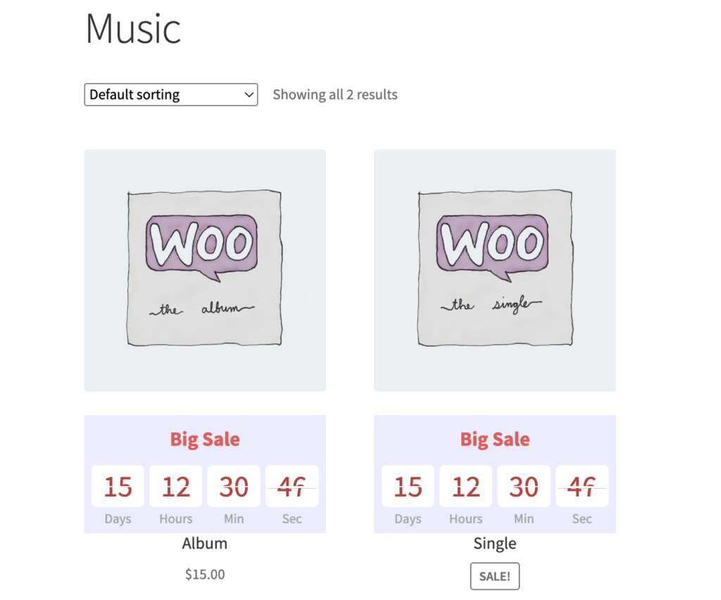
Shop page with products grouped by category
WooCommerce Tags – the timer will be displayed on all products with this tag.
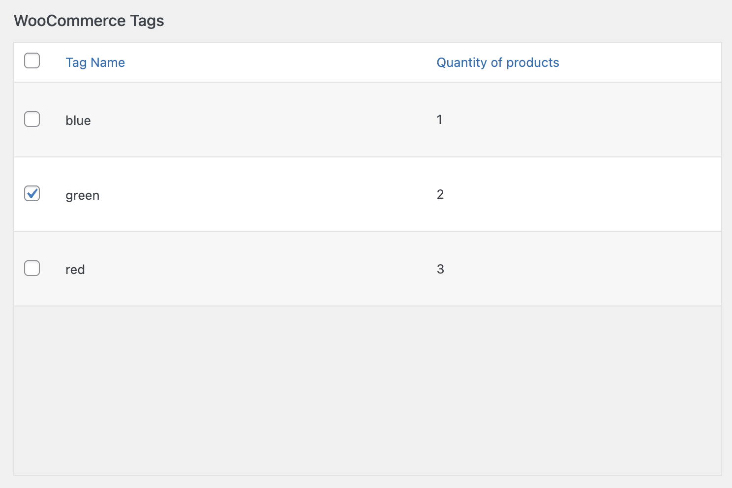
Timer bulk manager settings by tag
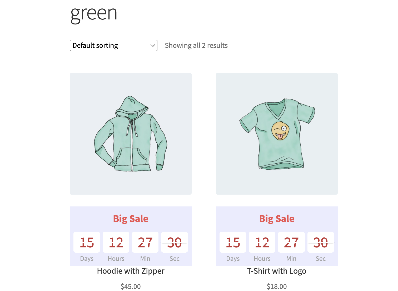
Shop page with products grouped by tag
Include products – assign the timer to a specific product.
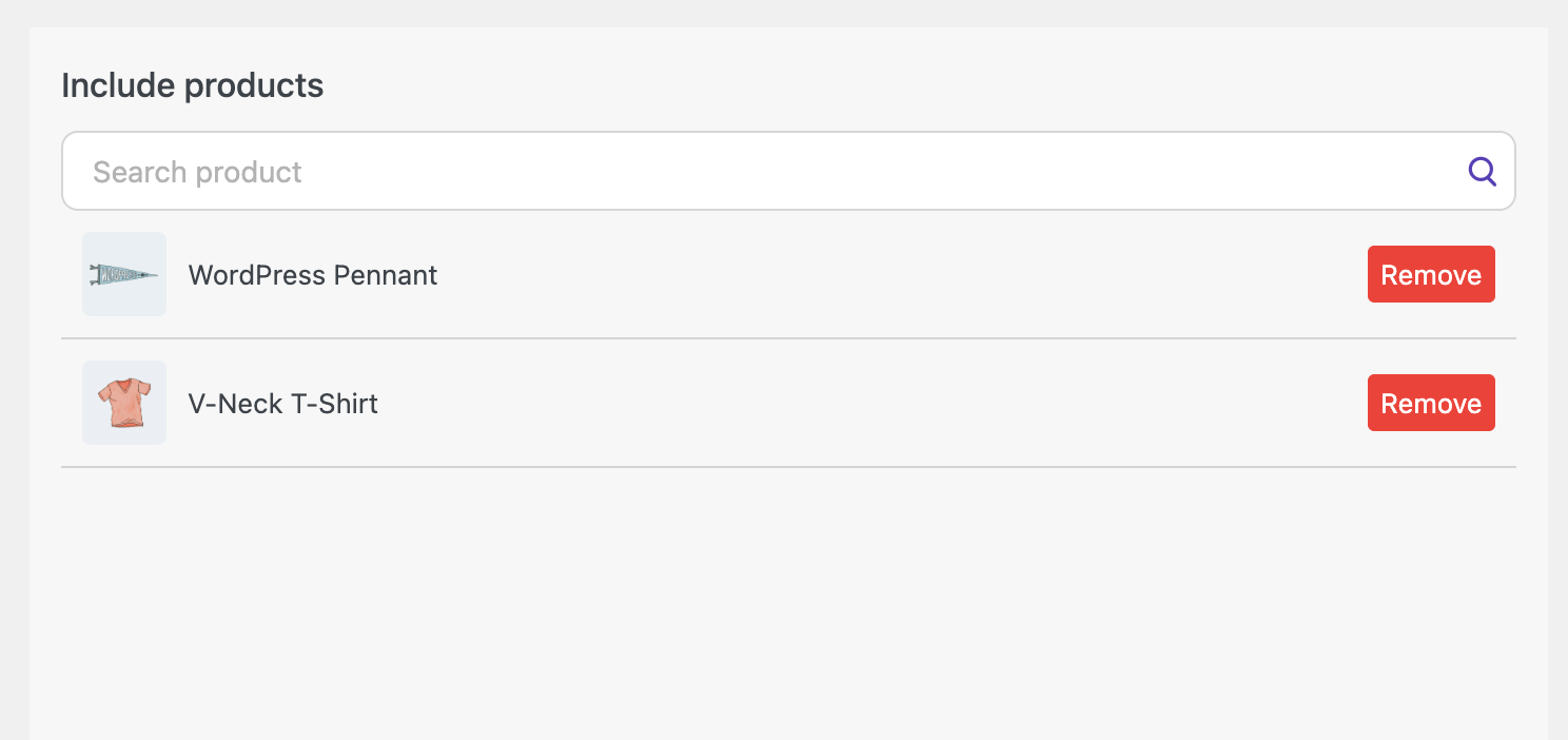
Timer bulk manager settings by including products
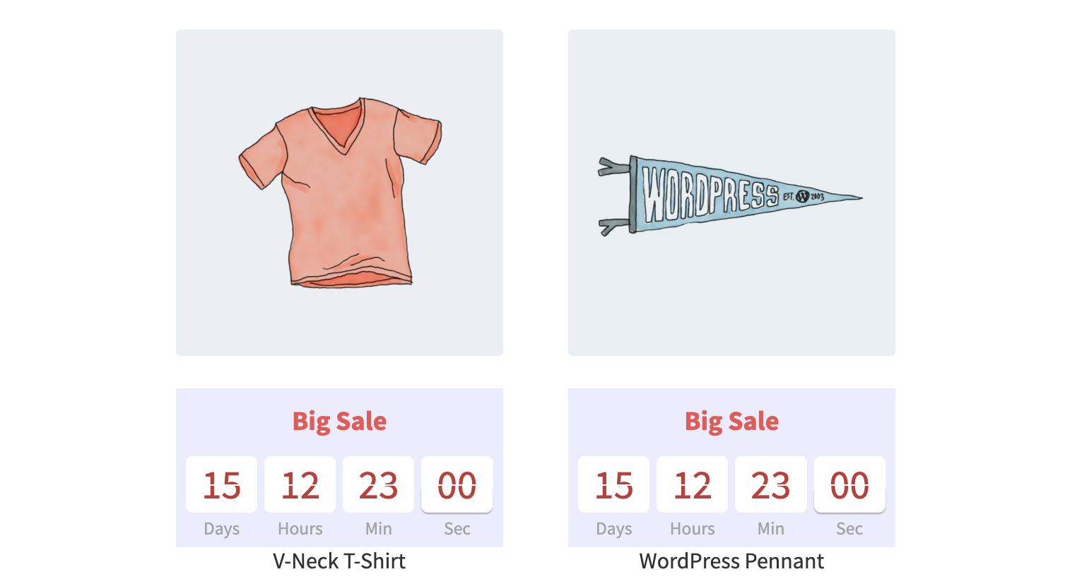
Shop page
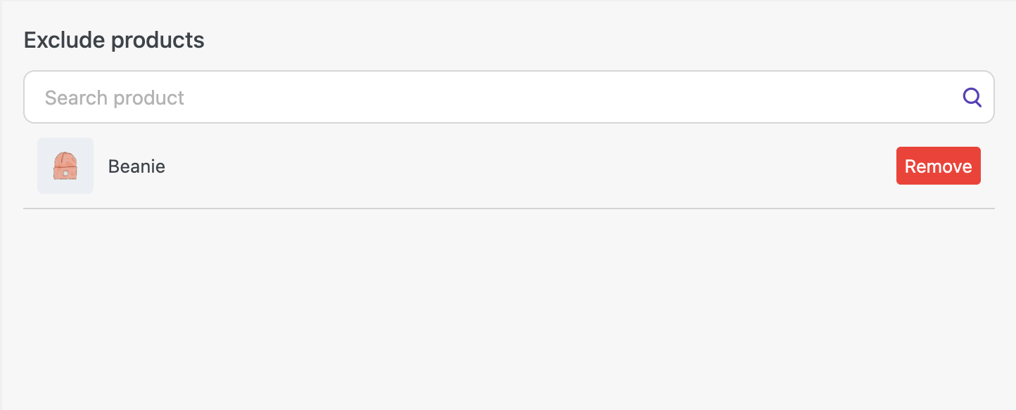
Exclude products – remove the timer from required products (the element will not be displayed on these products).
Timer bulk manager settings by excluding products
Shop page
Help Center #
If you have any questions about the plugin, you can visit the documentation and receive support in the Help Center tab.
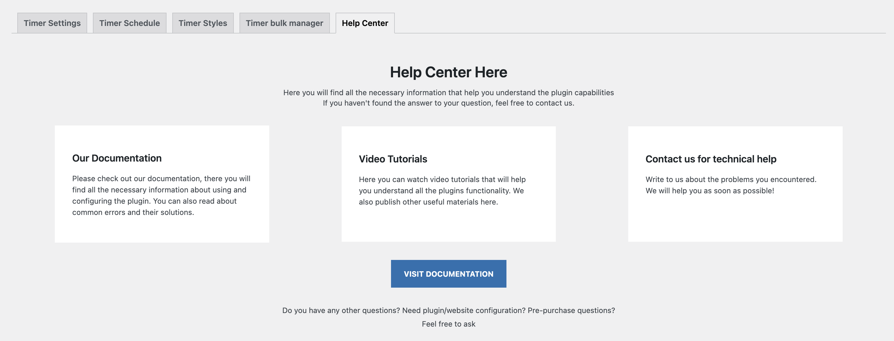
‘Help Center’ page
Product meta box #
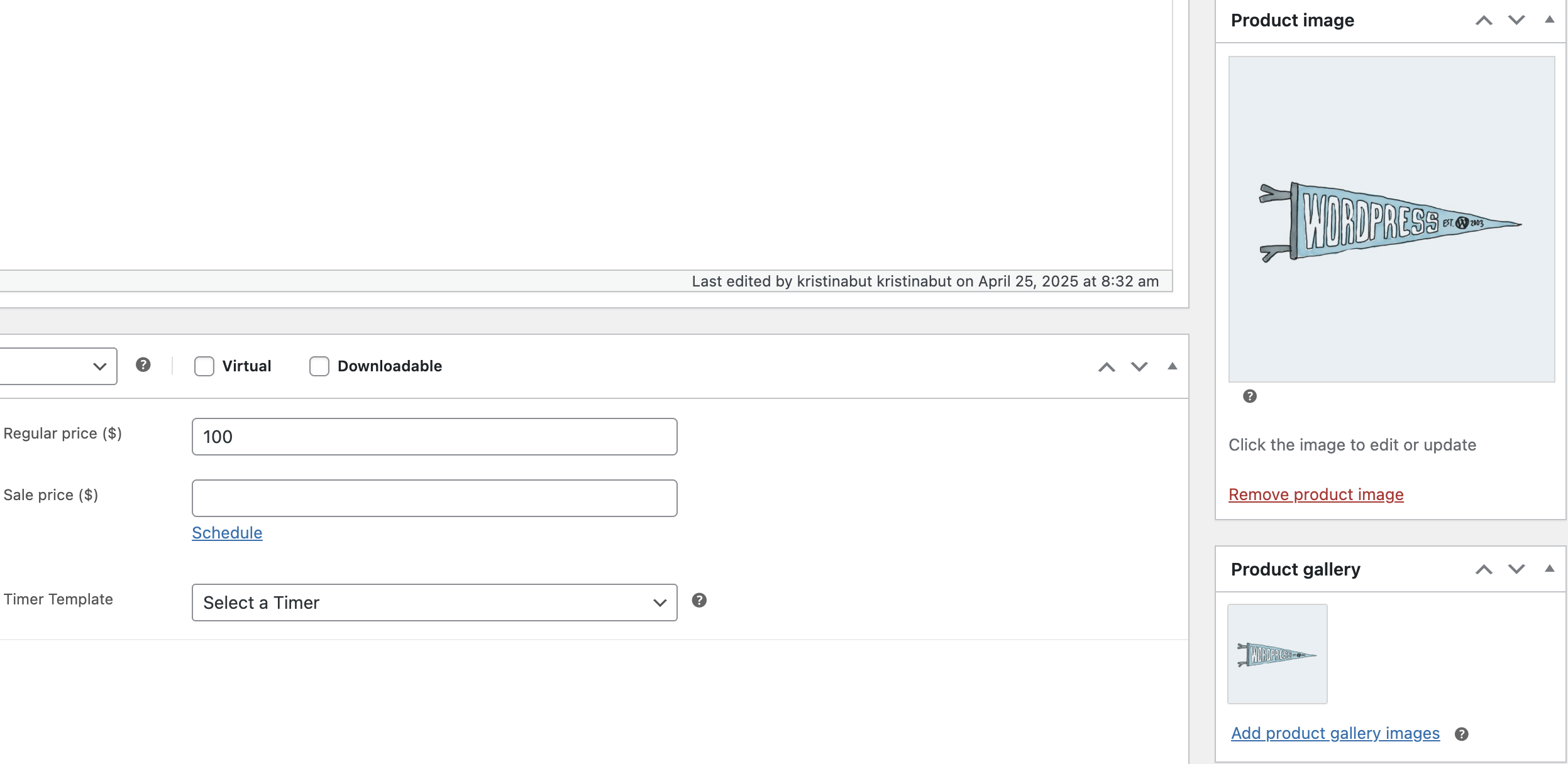
In the meta box, you can assign the timer for the product and the schedule for it as well.
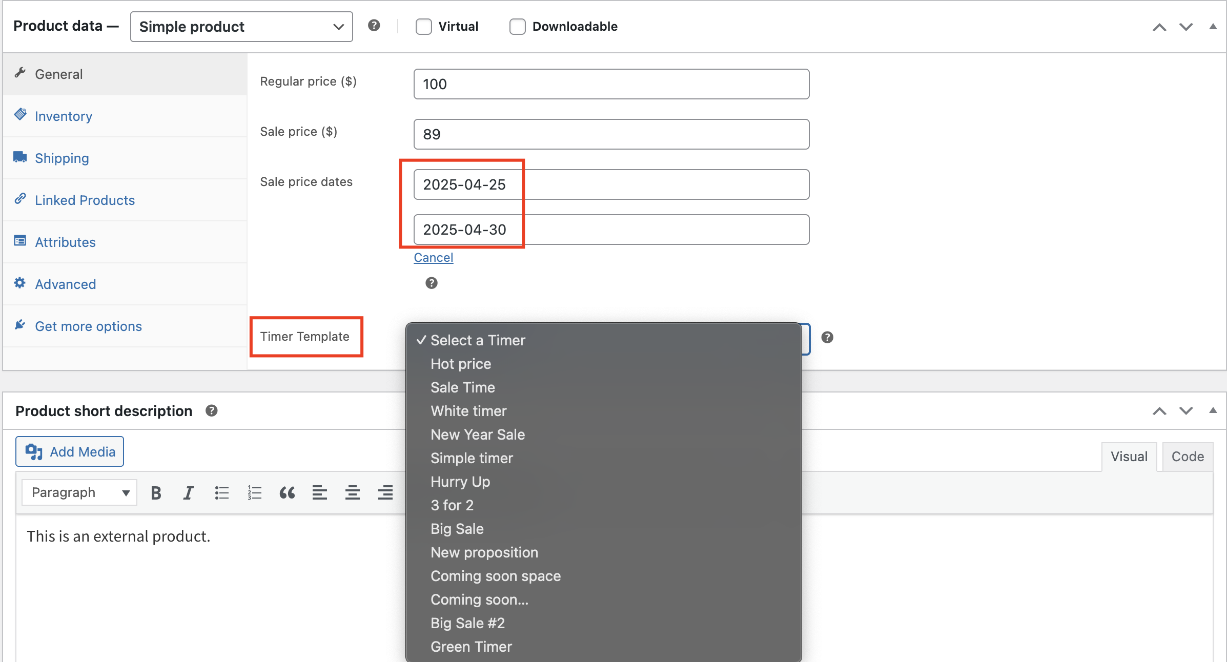
‘Product meta box’ page
If you have assigned a specific timer to a group of products, but one of the products needs a different timer, go to the meta box of that product, select the desired template, set the date, and update the changes.
The selected timer template will then be applied to the product.
Important!
If you assign timers from both the library and the meta box to the same product, the timer from the meta box will take precedence.
Assign timers from the library
Shop page with timers from library
Assign timers from the meta box
Shop page with timers from both the library and the meta box
You can also assign the desired timer template to a single product card.


