
General information about the plugin #
The Product Card Properties plugin by Develux provides additional functionality for your online store, enhancing the standard product card and product page capabilities.
In all online stores built on WooCommerce, product cards are displayed on the following pages:
- Catalog
- On the product page (Upsells)
- On the cart page (Cross-sells)
If your WooCommerce theme has not modified the standard generation of product cards and pages, the full functionality of the plugin will be available. Otherwise, only part of its features will be accessible.
With this plugin, you can perform the following actions:
- Style additional product descriptions that will be displayed in the product card
- Display additional informational elements in various places on the product card via the Info Items
- Create your own library of additional information elements
Video instruction: Product Card Properties. General video
Plugin compatibility #
The plugin is designed to provide additional functionality for your online store built on WooCommerce. It is not compatible with other e-commerce platforms. Our plugin works correctly with WordPress themes developed for WooCommerce, following all requirements and recommendations of the WooCommerce/WordPress developer guidelines.
Important! Our plugin uses standard WooCommerce/WordPress hooks and filters. If your theme or other plugins modify the default behavior of these hooks/filters, the plugin may not function correctly!
Important! Our plugin uses the standard jQuery/jQuery UI library. If your theme or other plugins modify or disable these libraries, the plugin may not function correctly.
Installation and configuration #
The plugin is installed using the standard method provided in WordPress.
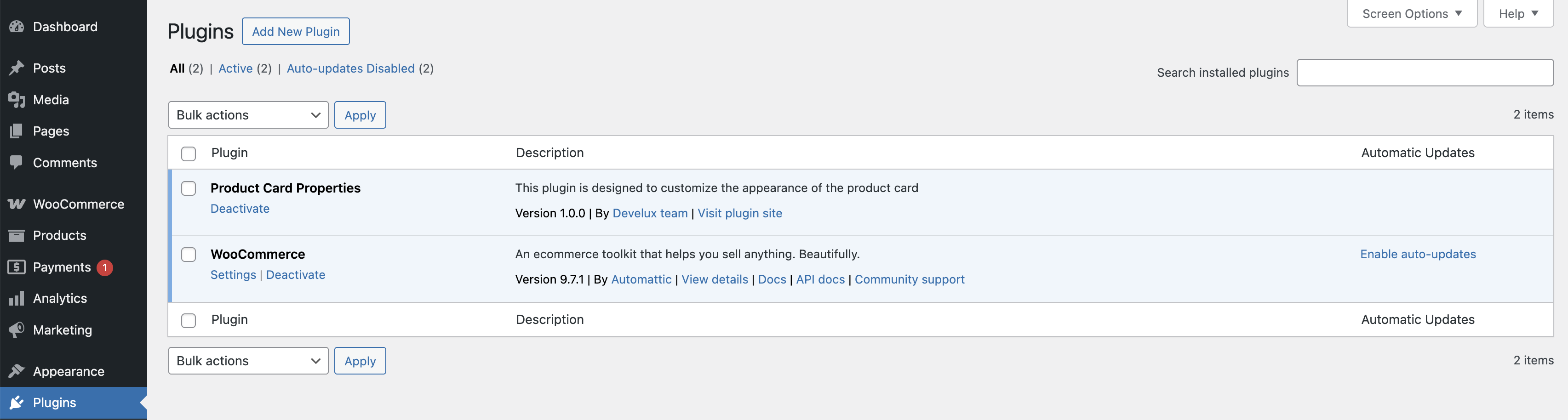
Go to the Plugin > Installed Plugins page in the admin panel.
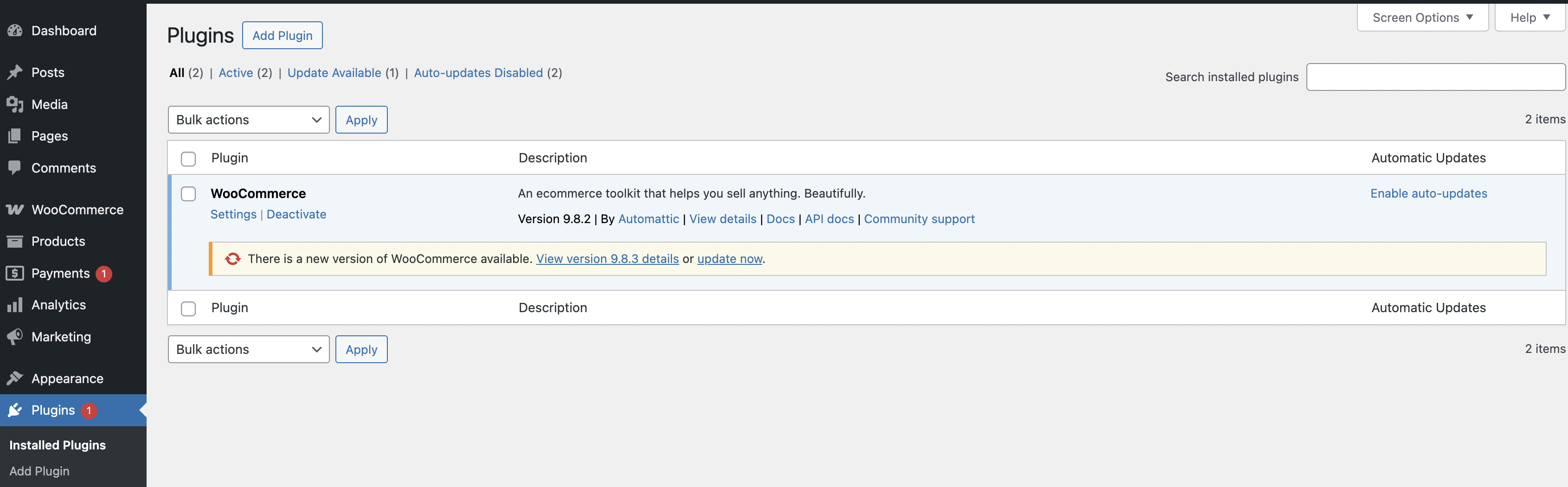
‘Plagin’ page
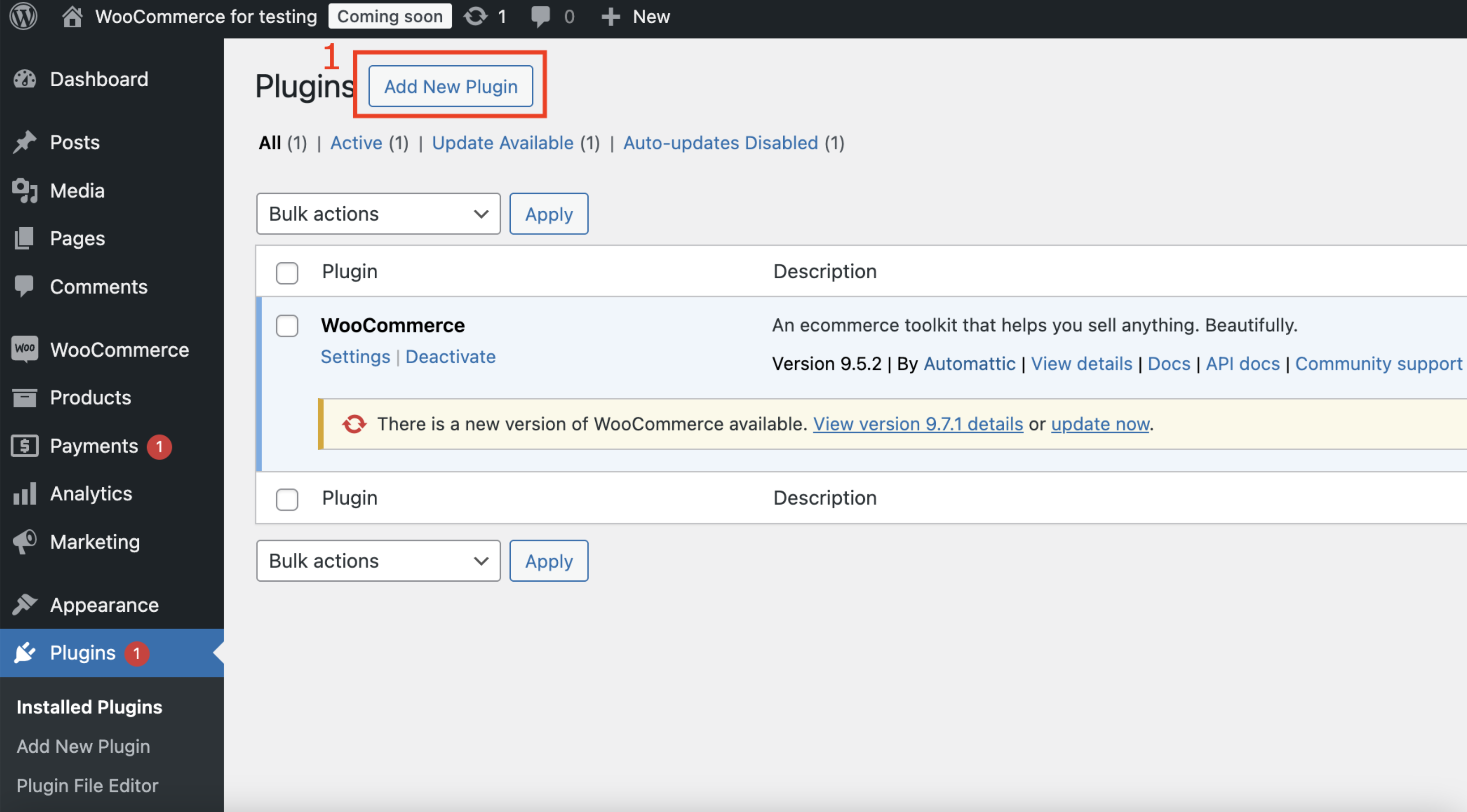
Click ‘Add New Plugin‘ > ‘Upload Plugin’ button and upload ZIP. archive
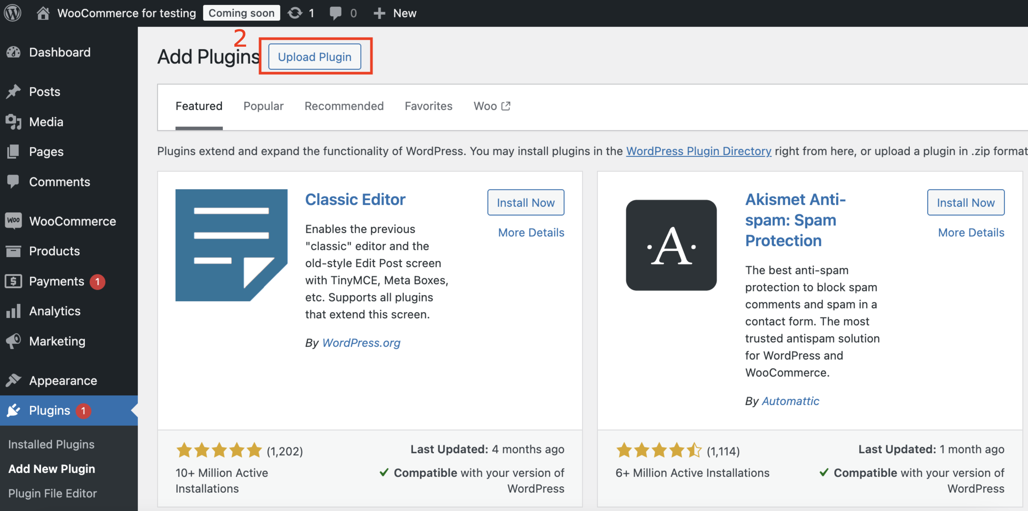
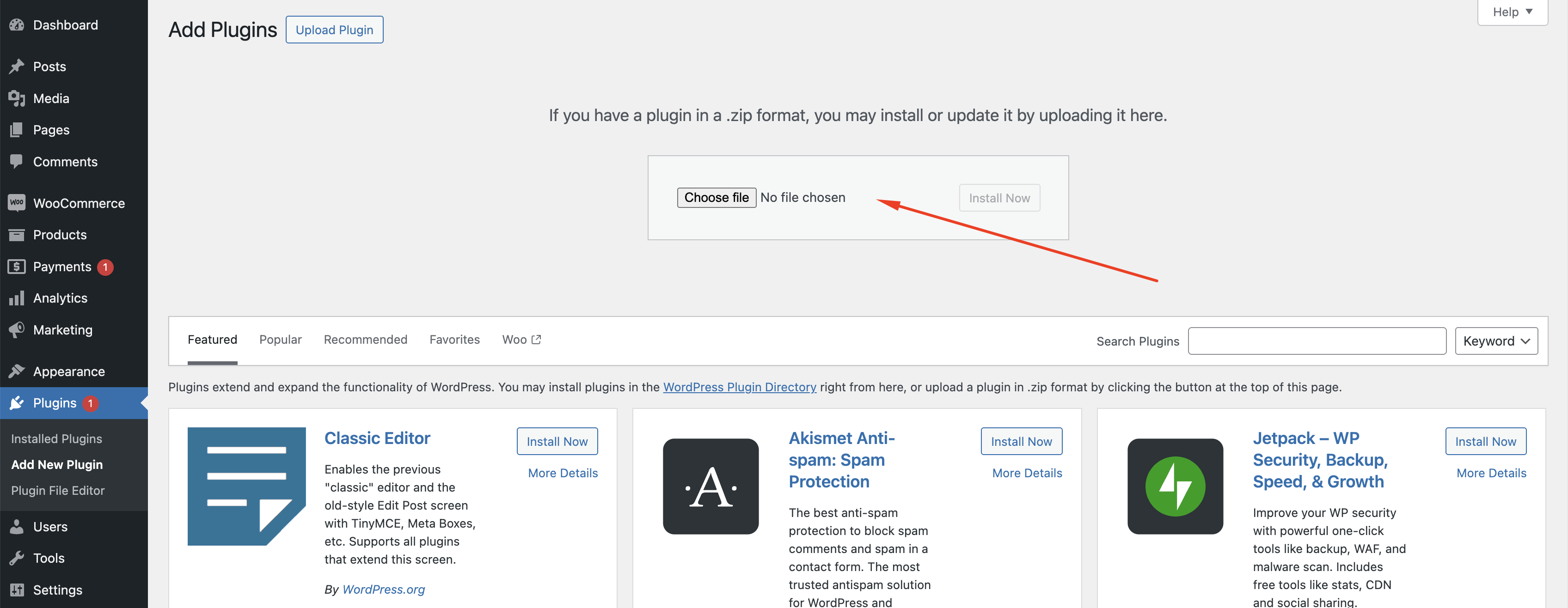
The place for uploading ZIP. archive
After the plugin installation, it will be ready for use immediately.
Plugin page with installed ‘Product Card Properties’ plugin
Product Properties Settings #
In the Product Properties Settings, you set the general styling for the product property list. These styles will be applied to all properties/lists displayed on the product cards.
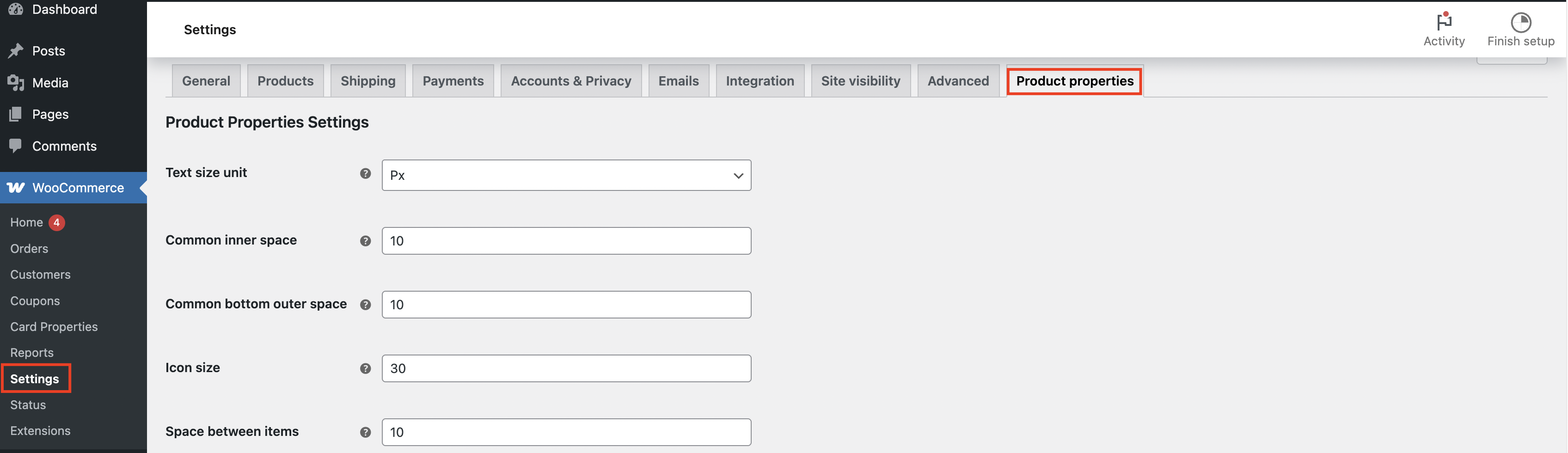
General settings for product properties
Text Size Unit – defines the measurement units used for text size
- px is a fixed unit of measurement that does not scale based on the user’s settings or parent elements. The font size is always equal to the specified pixel value, regardless of other factors.
- em is a relative unit based on the font size of the parent element. 1em equals the font size of the parent.
- rem is relative to the root font size instead of the parent element. It is more consistent than em since it doesn’t depend on nesting.
Common inner space – defines the space inside an element, between the content and its border
Common bottom outer space – defines the amount of space between the element and the next element underneath it
Icon size – sets the icon size for the property
Space between items – sets the distance between the elements
Property decoration – specifies which decorative elements will be used for the lists (images, circles, disc, or decimal)
Property text size – sets the text size for the property
Property text weight – sets the text weight for the property
Property text style – sets the text style (normal or italic) for the property
Property text color – sets the property font color
Value text size – sets the text size for the value
Value text weight – sets the text weight for the value
Value text style – sets the text style (normal or italic) for the value
Value text color – sets the value text color
Show more (collapse) button
Collapse after items – specifies whether a collapse is needed, and after which element it should occur
Collapse icon size – sets the icon size for the collapse
Collapse icon color – sets the ‘plus’ color in the collapse
Collapse background color – sets the background color for the collapse
Collapse size – sets the collapse’s size
Collapse top offset – sets the outer space between the container top and the collapse
Collapse bottom offset – sets the outer space between the collapse and the container bottom
Collapse rounding – sets the roundness of the collapse’s corners
Collapse border width – sets the width of the collapse’s border
Collapse border color – sets the color of the collapse’s border
Collapse border style – sets the style of the collapse border
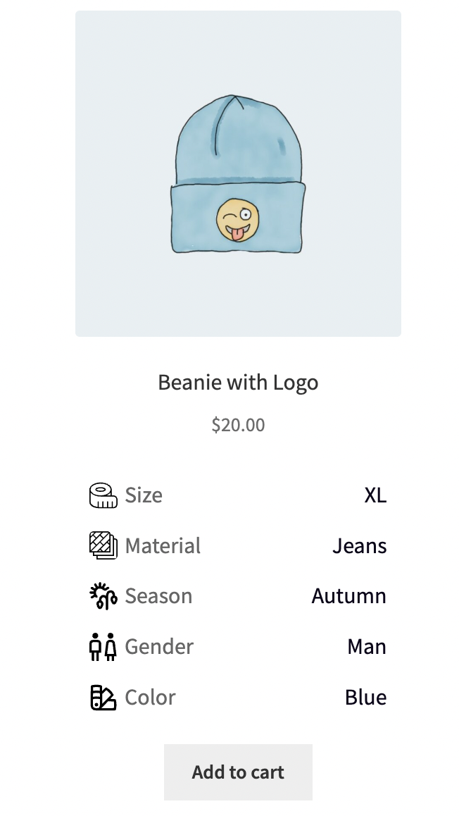
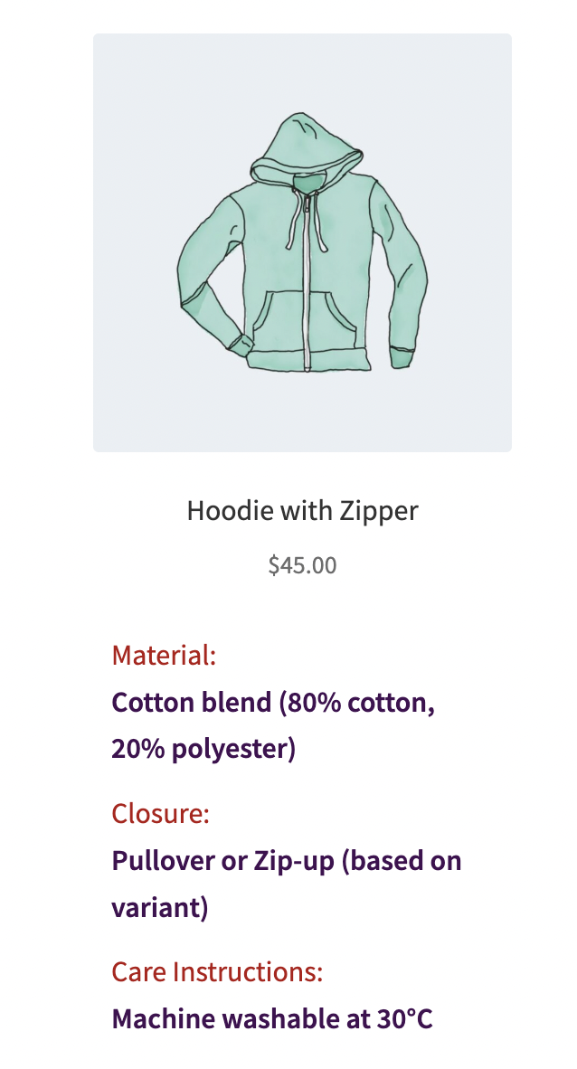
Where to display properties – allows to display properties after the card or after the product title
How to display properties – allows to display properties in a row or a column
Video instruction: General settings for Product Properties
The Meta Box functionality, which is placed on the product creation page #
On the WooCommerce product creation page, our plugin provides an additional meta box where you can configure the following elements that will be applied to the product you are currently working on:
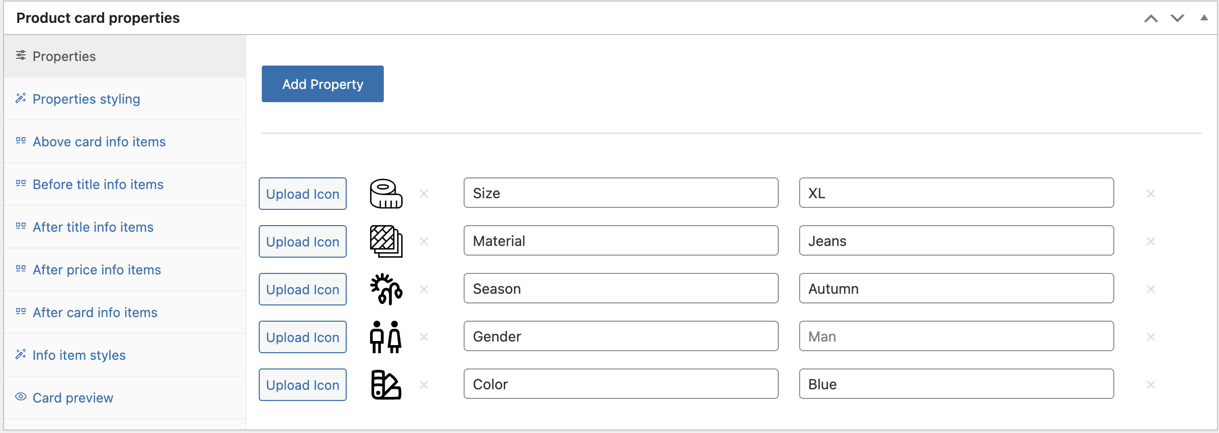
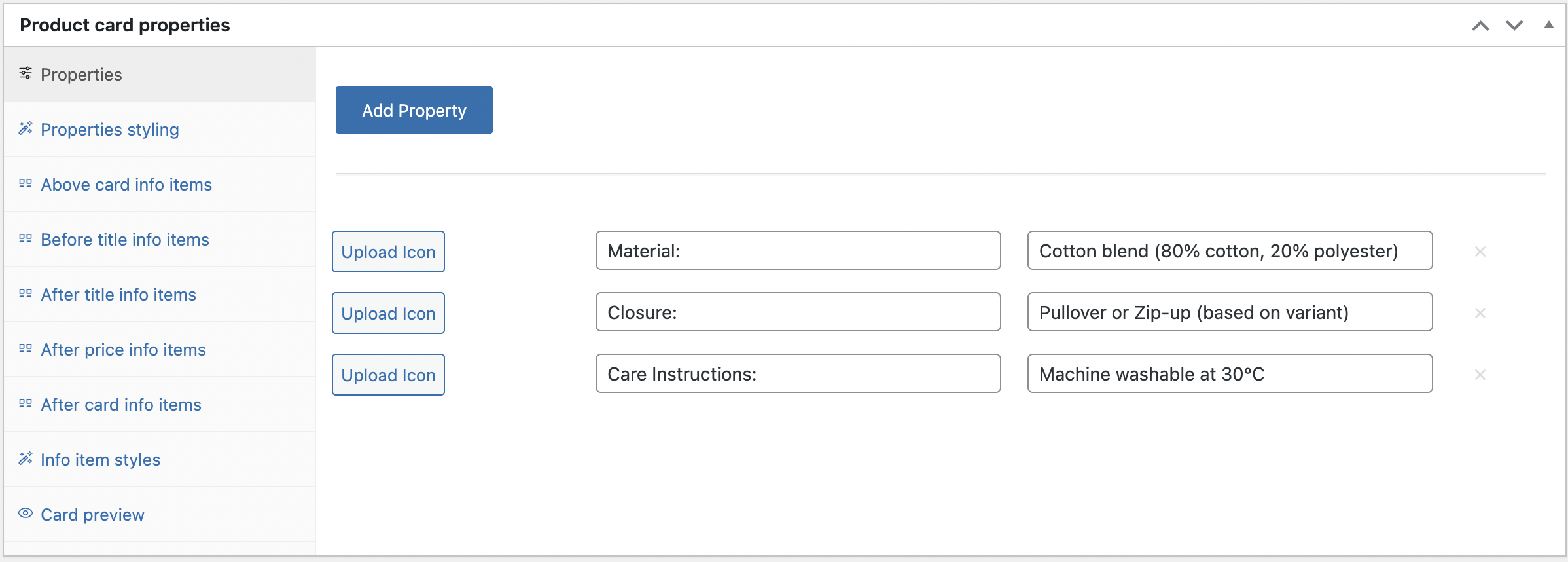
Creating properties for a product #
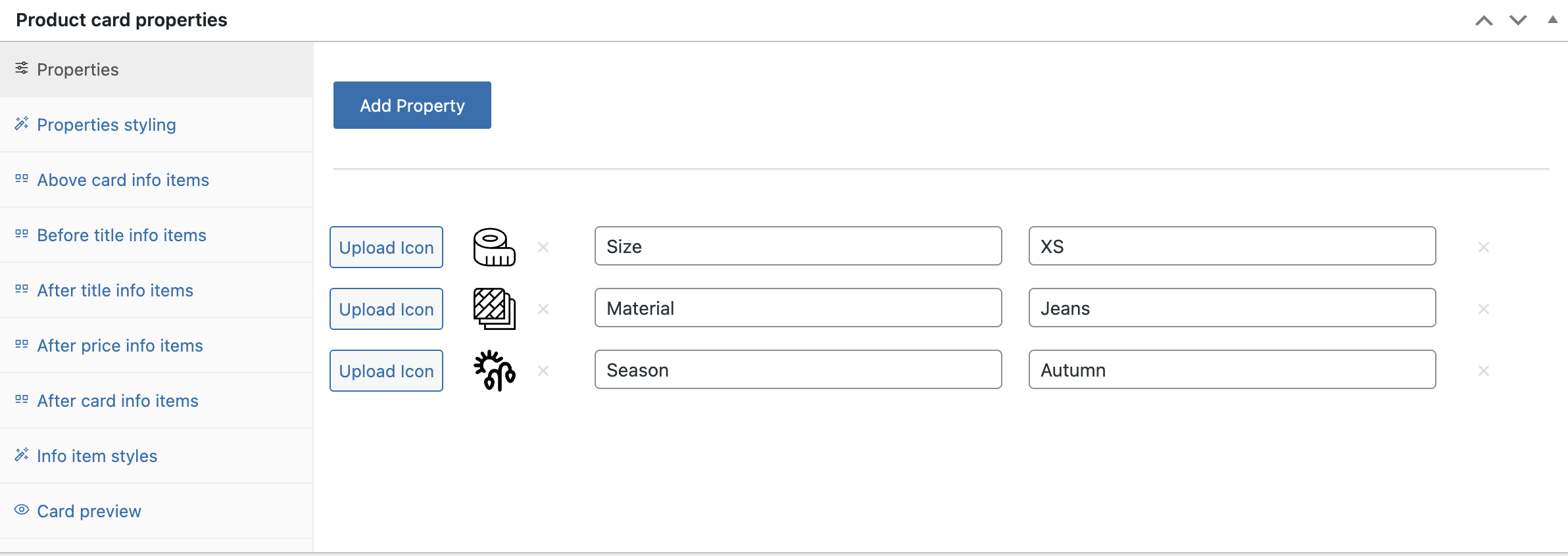
‘Product card properties’ page
Using the ‘Add Property‘ button, you can create the required number of fields for product properties.
Upload icon – used to add an icon for a property item
Property – a field for the property text
Value – a field for the value text
Stylization of product properties #
To style product properties for a specific product, you need to go to ‘Properties styling’ mode and click the ‘Use this styles’ check box.
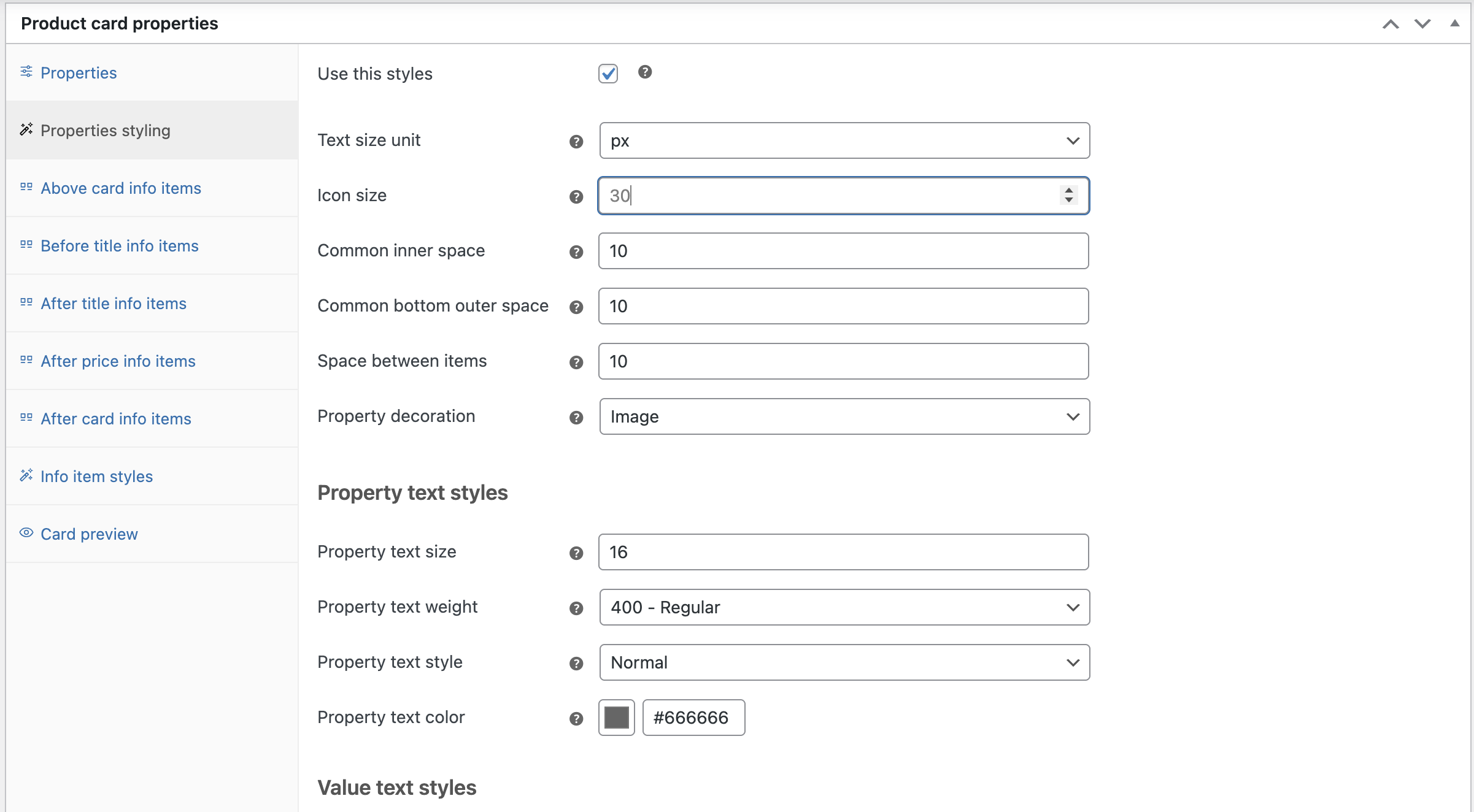
‘Properties styling’ page
The styling tools are the same as the Product Properties settings (See the ‘Product Properties‘ section in the WooCommerce Settings)
Video instruction: Creating and configuring product properties in the product metabox
Creating the unique info items for a product #
Info Items allow you to place additional informational elements.
There are five tabs, each responsible for a different location of the informational elements.
Above card info items allows to place information block above card
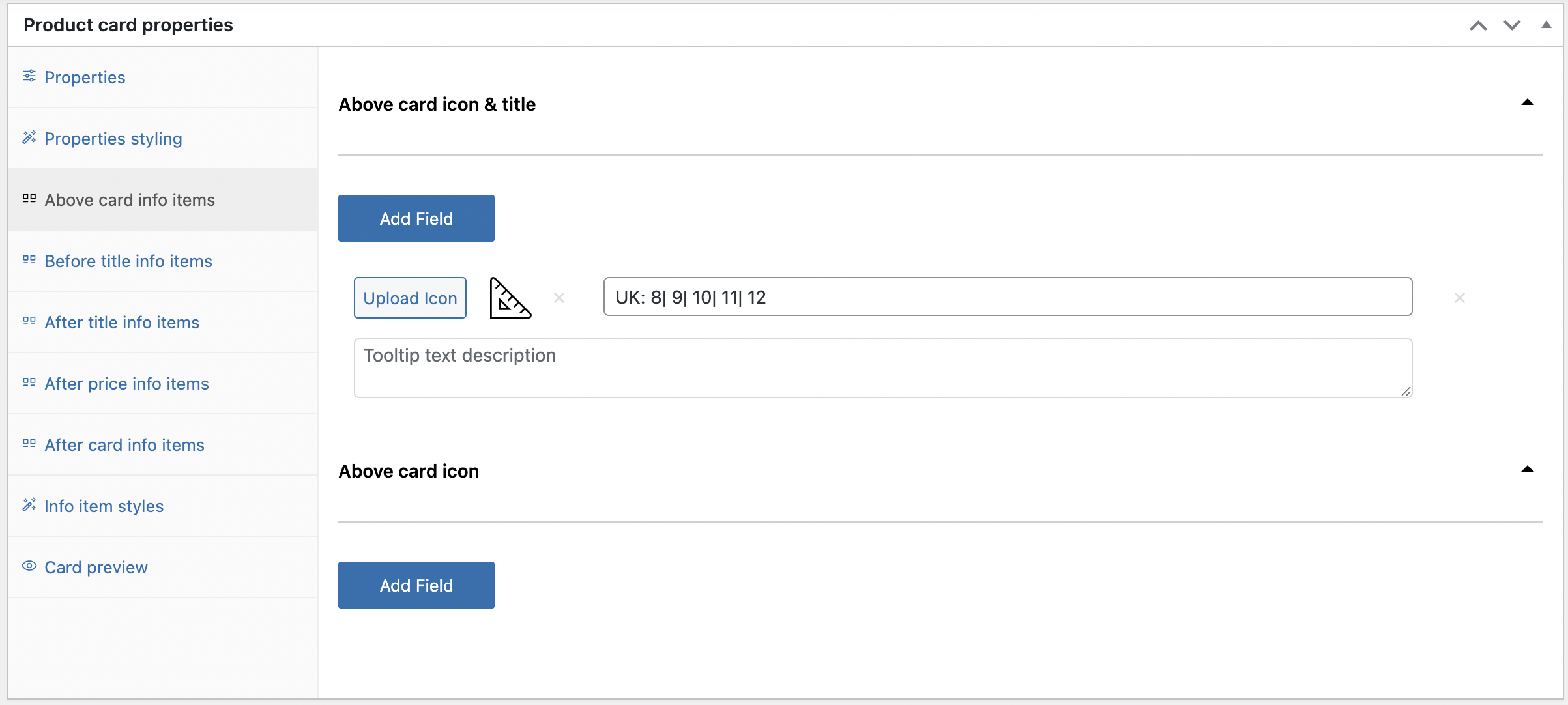
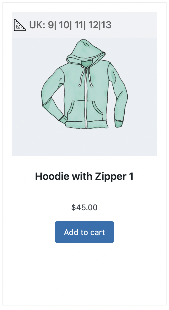
‘Above card info items’ location picture
Before title info items allows to place information block before title
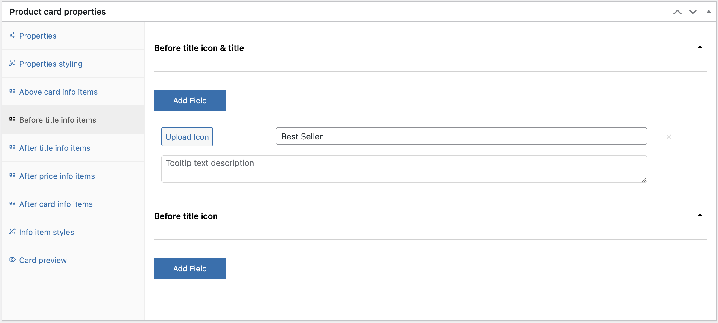
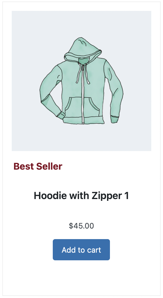
‘Before title info items’ location picture
After title info items allows to place information block after title
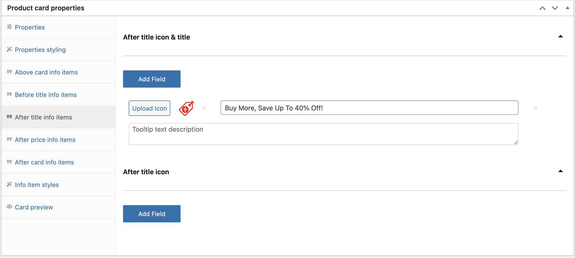
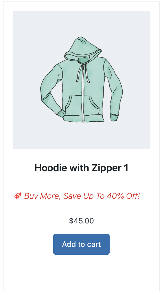
‘After title info items’ location picture
After price info items allows to place information block after price
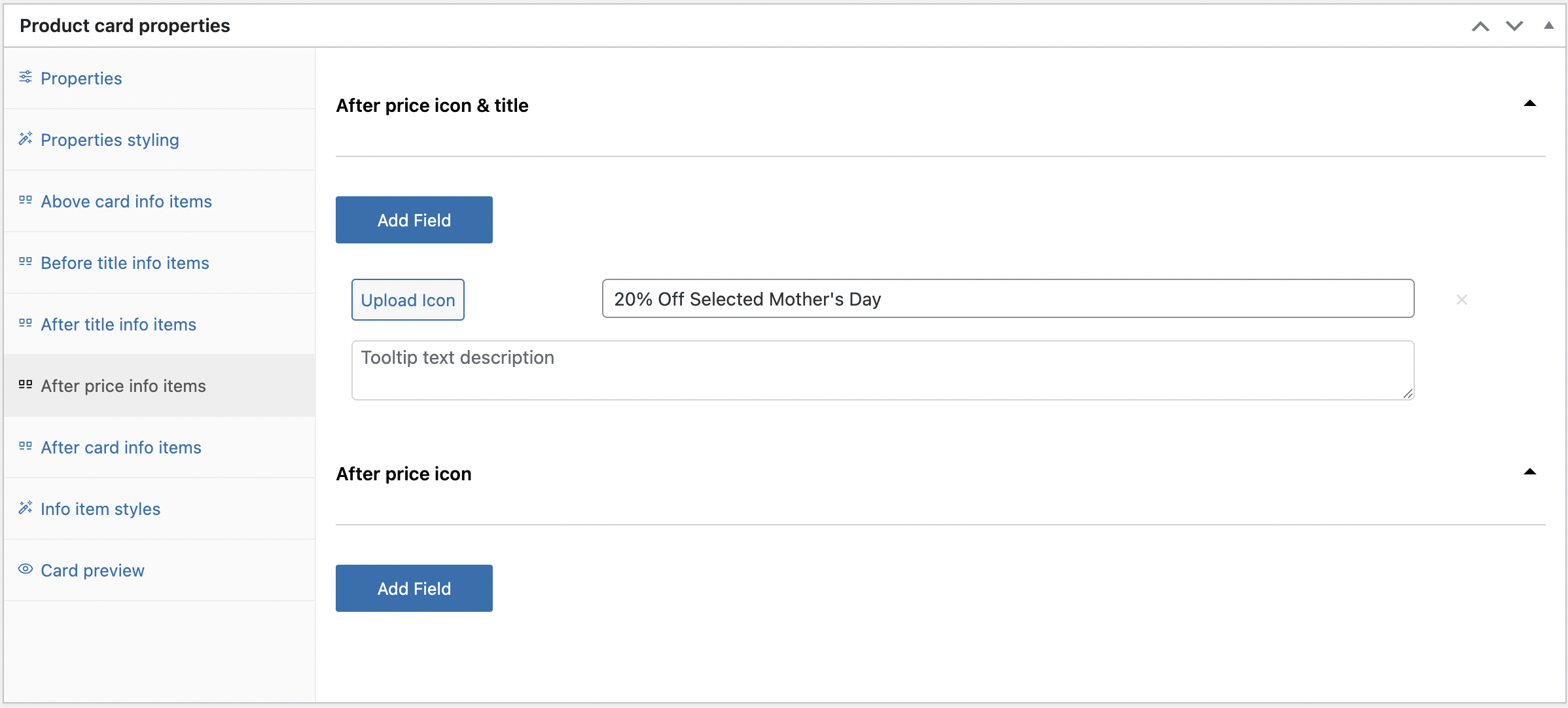
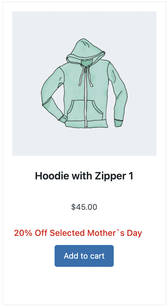
‘After price info items’ location picture
After card info items allows to place information block after card
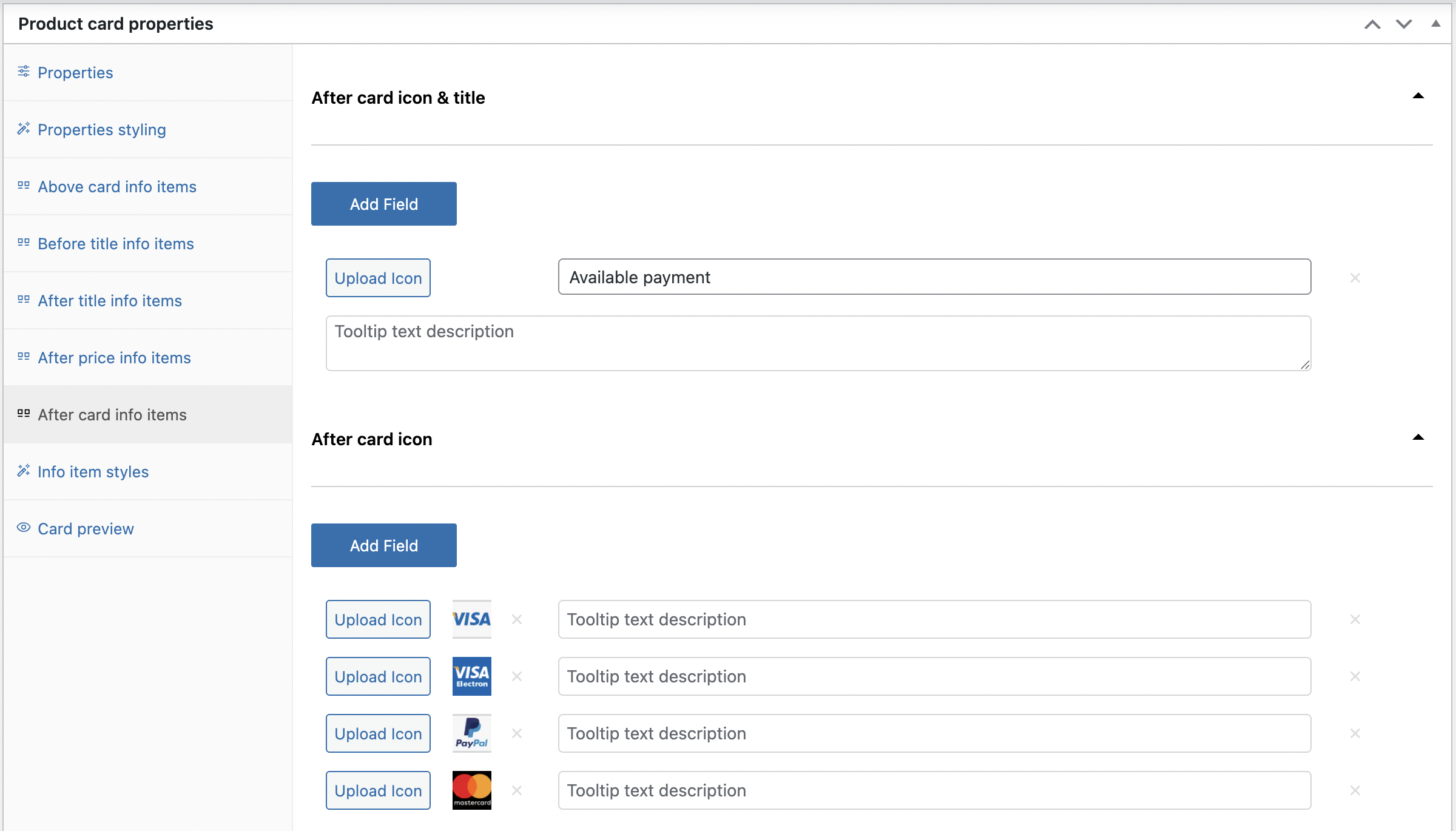
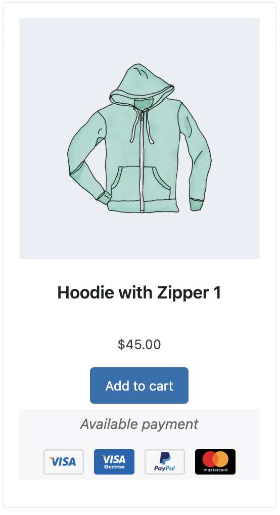
‘After card info items’ location picture
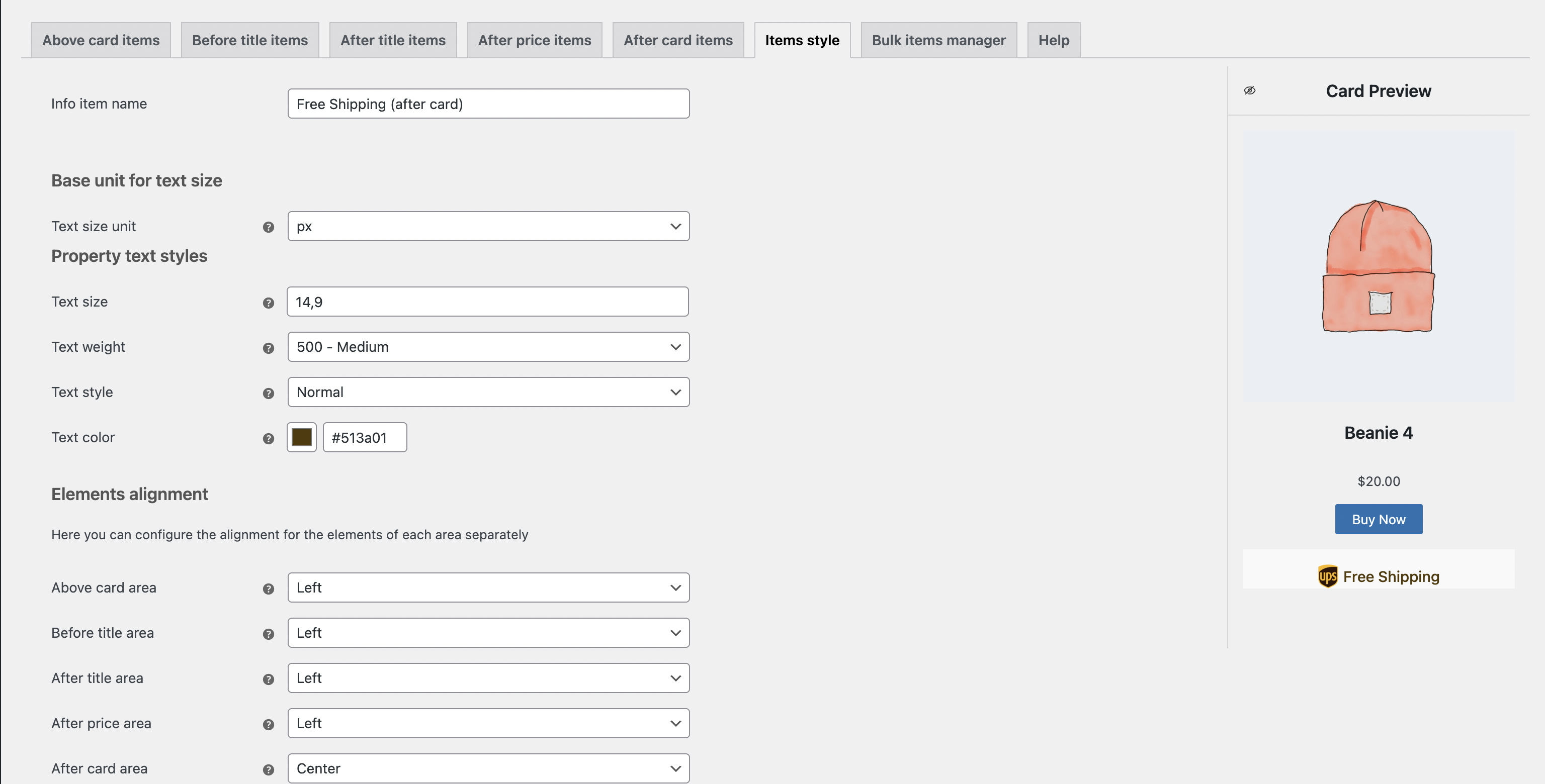
Styling the unique info items for a product #
For stylization info items, click ‘Info item styles’ tab and turn on ‘Use this Info Items’ checkbox
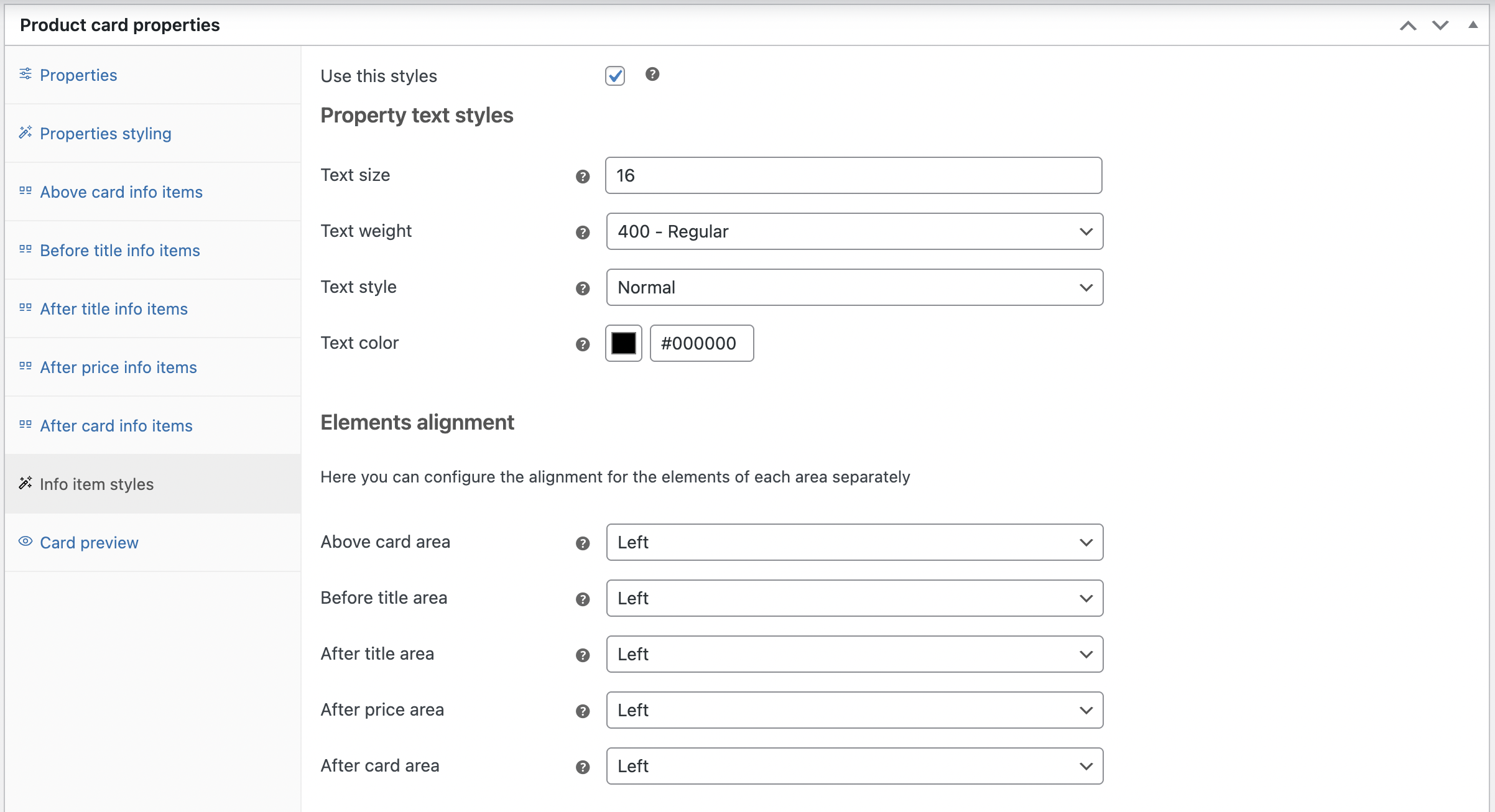
‘Info item styles’ page
Use these information items checkbox allows you to apply custom styling
Property text styles
Text size – sets the property and value text size
Text weight – sets the property and value of text weight
Text style – sets the property and value text style (normal or italic)
Text color– sets the property and value text color
Elements alignment
Above card area – aligns text to the left /center /right in the ‘Above card item’ zone
Before title area – aligns text to the left /center /right in the ‘Before title item’ zone
After title area – aligns text to the left /center /right in the ‘After title item’ zone
After price area – aligns text to the left /center /right in the ‘After price item’ zone
After card area – aligns text to the left /center /right in the ‘After card item’ zone
General settings for elements
Title icon size – sets the icon size for the icon & title info element
Single icon size – sets the icon size for the icon info element
Left outer space – sets the outer space on the left side of element, pushing it away from adjacent elements
Bottom outer space – sets the outer space below an element, pushing it away from elements under it
Top outer space – sets the outer space above element, pushing it away from elements above it
Common inner space – sets the inner space between the list container’s edges and its content, affecting the spacing inside the list
Space between items – sets the space between list items
Above card area/ After card area
How to display – controls how the element is visible:
- On hover – the element appears only when the user hovers over a specific area or item
- Always visible – the element is constantly shown, no matter what the user does
Where to display – defines the element’s placement in relation to the product card:
- Inside product card – the element appears within the boundaries of the product card, alongside product details
- Outside product card – the element is placed just below the product card
Backgrounds
Above / After card background– sets the color of the background for the Above / After card info elements
Above / After card opacity – sets the transparency level of the background color
General tooltip settings
Text size – sets the text size for the tooltip
Text weight – sets the text weight for the tooltip
Text style – sets the text style (normal or italic) for the tooltip
Text color – sets the text color for the tooltip
Background – sets the color of the tooltip background
Width – sets the width of the tooltip
Inner space – sets the inner space around the text in the tooltip
Border color– sets the border color for the tooltip
Border width – sets the border width for the tooltip
Border style – sets the border style for the tooltip (Solid, Solid double, Dotted, Dashed, Dashed double, Inset)
Rounding – sets the roundness of the tooltip’s corners
Horizontal/ Vertical shadow – sets the vertical and horizontal position of the shadow
Shadow dispersion – sets the density of the shadow
Shadow opacity – sets the level of transparency for the shadow
Shadow color – sets the color for the tooltip shadow
Card Preview tab shows all changes made to the product card and lets you review them before saving
Video instruction: Creating and configuring information elements in the product metabox
Card Properties #
The Card Properties feature allows you to create additional info items in different locations within the product card (Above card items, Before title items, After title items, After price items, After card items), styling, and assigning them to multiple products at once in your shop.
This gives you a unique opportunity to fill product cards with the necessary information quickly.
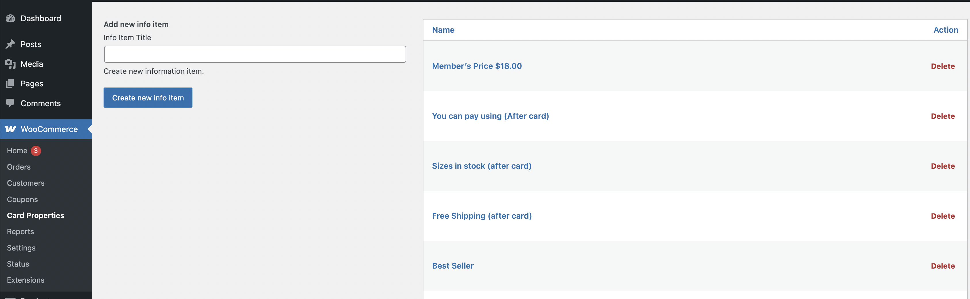
General ‘Card properties’ page
Create a card for the new info item
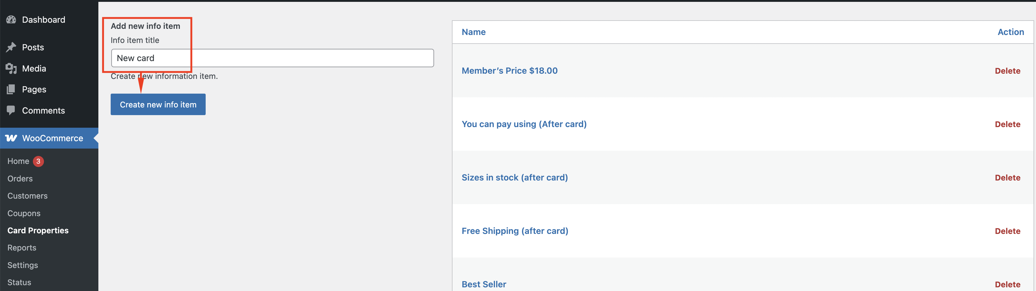
Steps for the creation of the new card
Step 1. In the head of the card, select the desired location for the information.
Step 2. Enter the required icons/ text into the fields.
Step 3. Click ‘Save’.
Only after this action will it be possible to see the entered info in the Card preview.
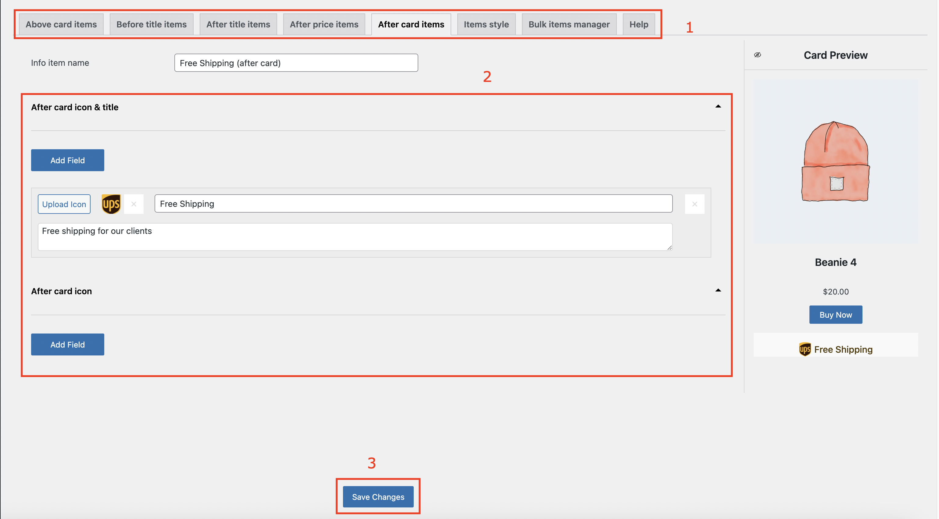
Steps for filling out the card
The locations for the info items in the Card properties are the same as in the Product card properties settings (See the ‘Creating the unique info items for a product‘ ).
In the Item Styles tab, you can style the created info item.
Opened Card property
The item styling in the Card properties is the same as in the Product card properties settings (See the ‘Styling the unique info items for a product‘)
Video instruction: Working with a library of information elements
In the Bulk items manager you can use:
- Categories
- Tags
- Include or exclude specific products
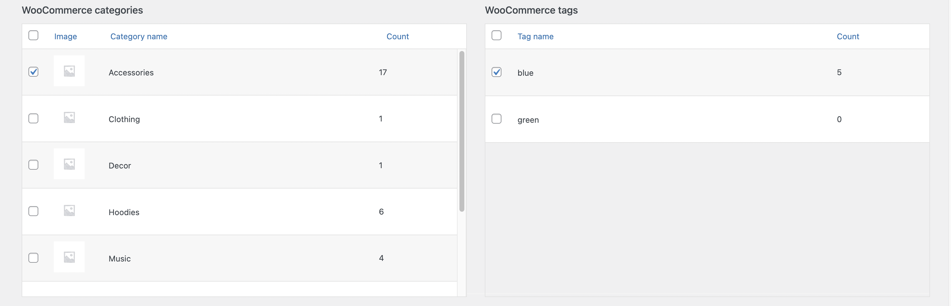
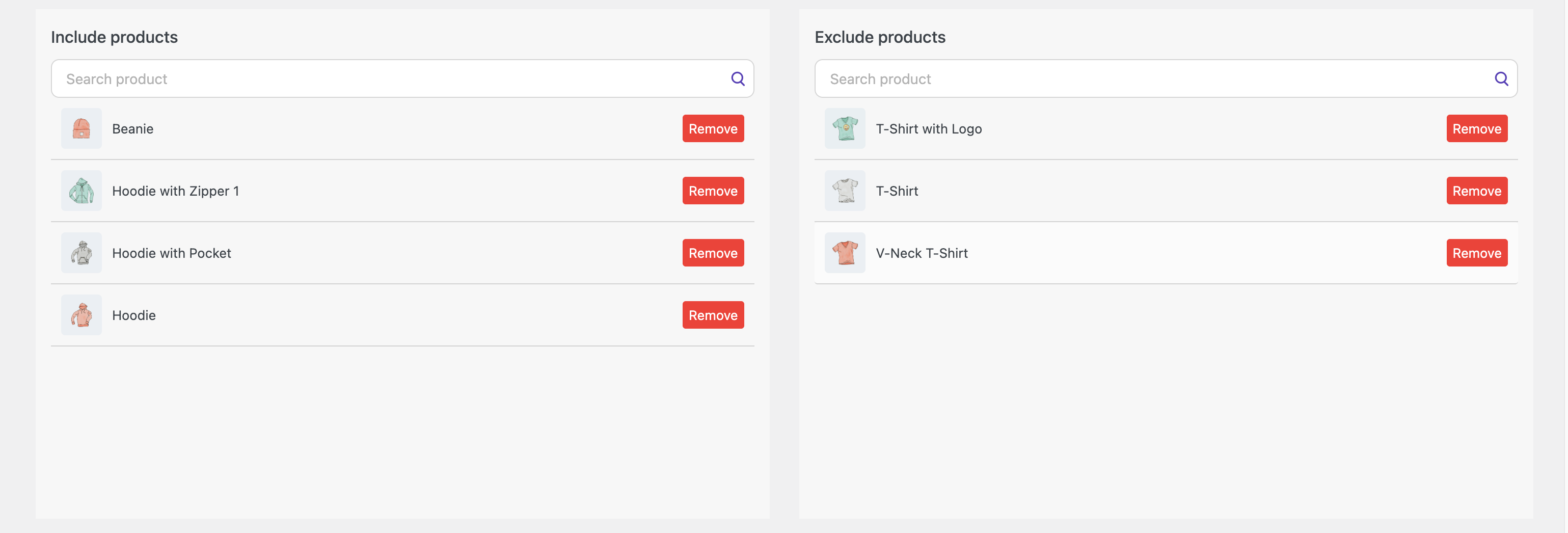
‘Bulk items manager’ page
WooCommerce Categories – the info item will be displayed on all categories’ products.
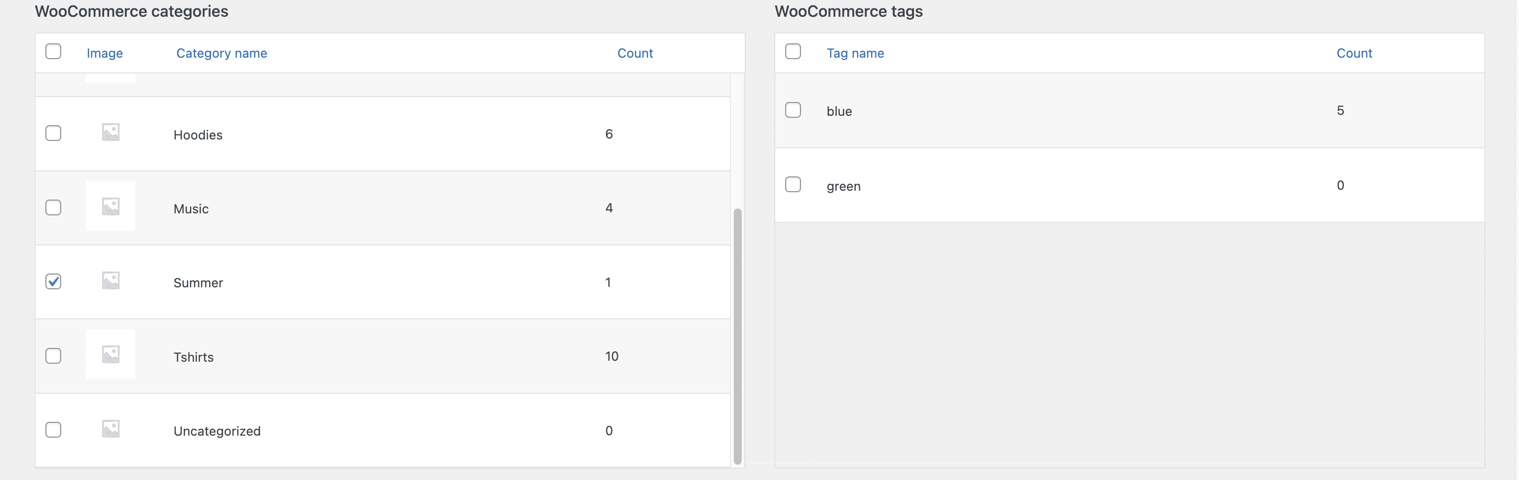
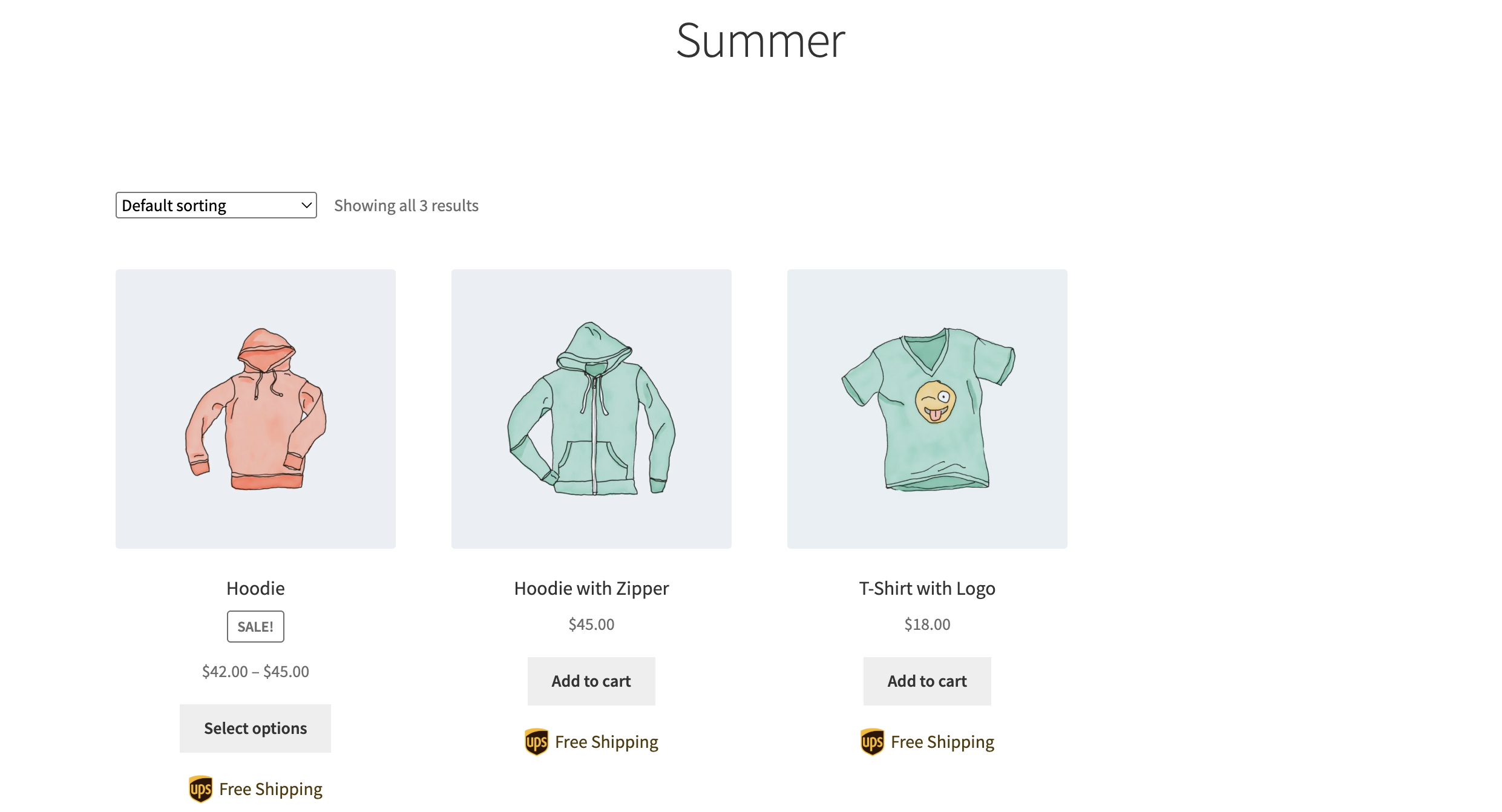
Info item displayed on all categories’ products
WooCommerce Tags – the info item will be displayed on all products with this tag.
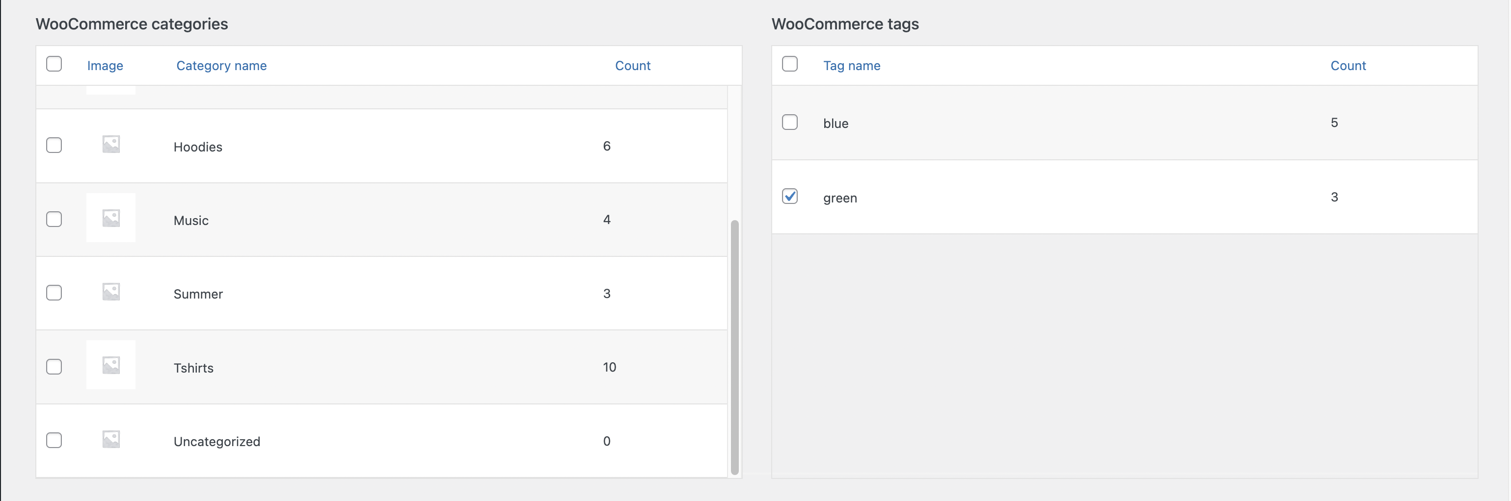
Info item displayed on all tag’s products
Include products – adding the info item to a specific product.
Exclude products – remove the info item from these products (the element will not be displayed on these products).
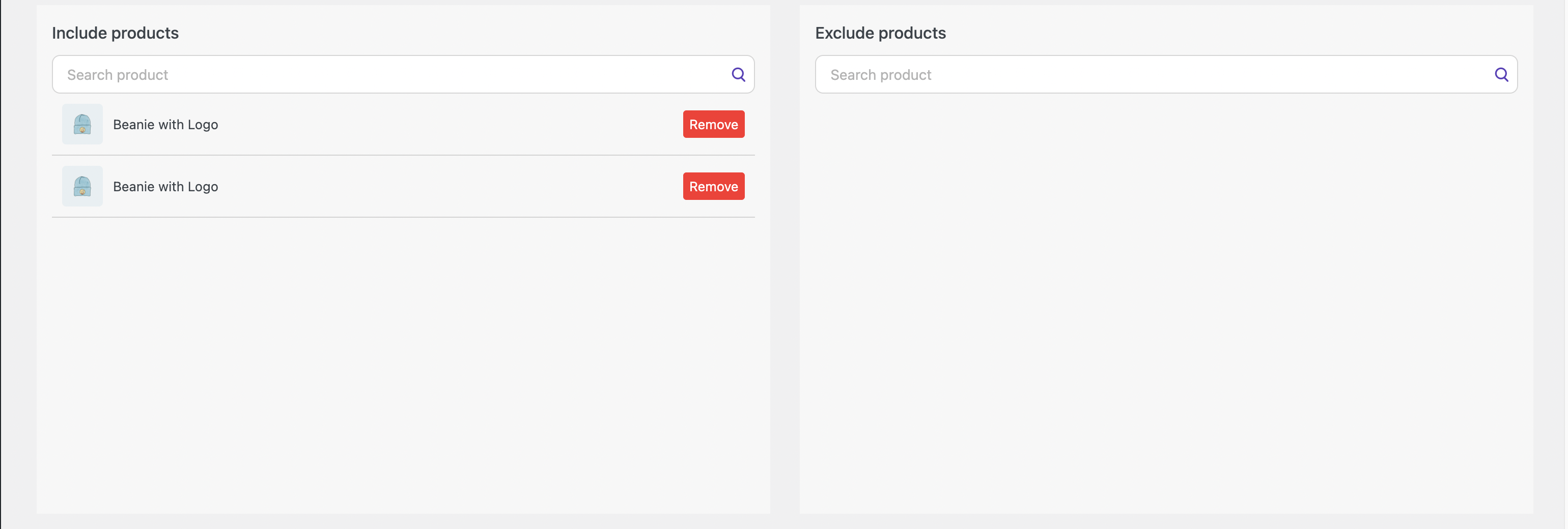
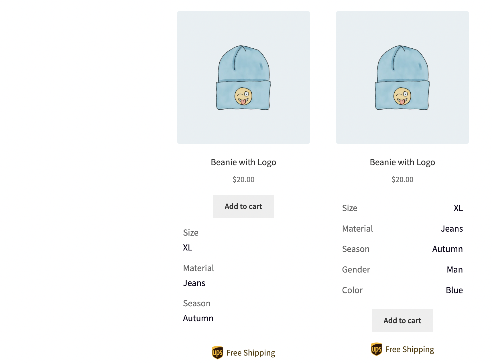
Info item displayed on all included / excluded products
Video instruction: Bulk manager for items
If you have any questions connected with plugin, in the Help tab you can connect with the support.
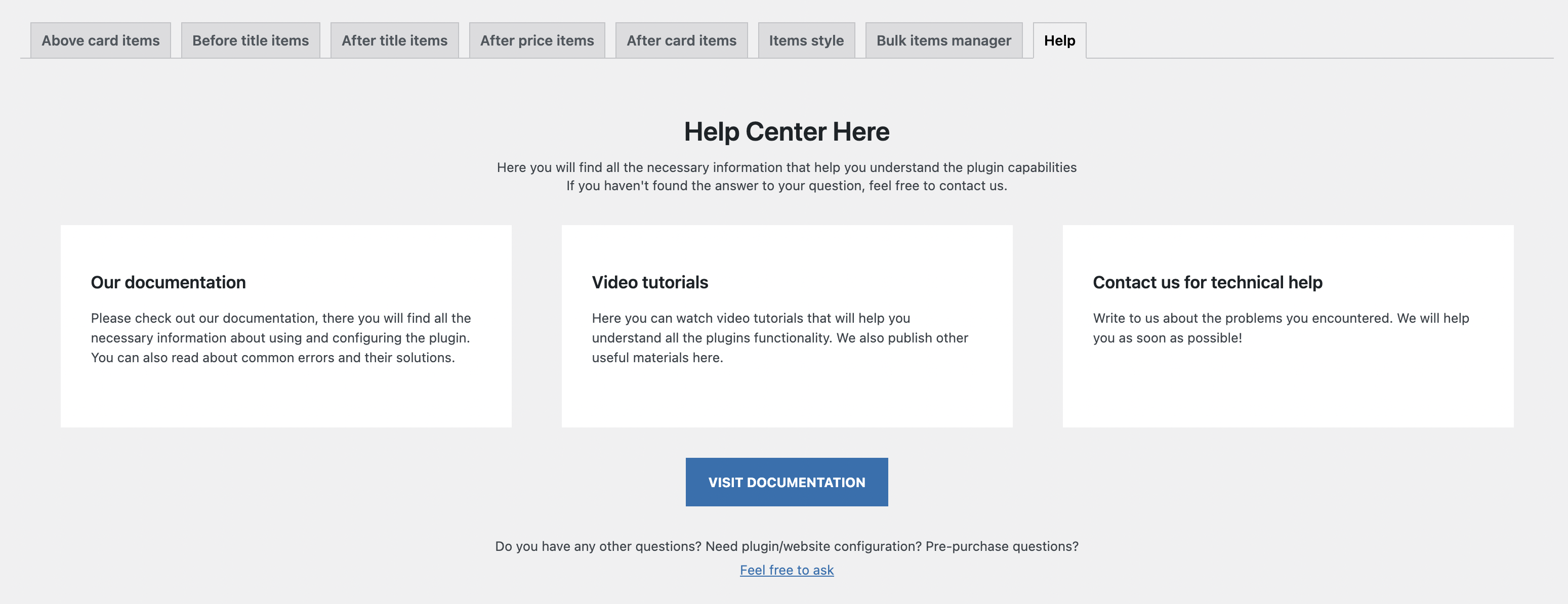
‘Help’ page
Recommendations and solutions to potential problems #
Each theme is partially unique and may have different settings, along with various ways to implement the same elements.
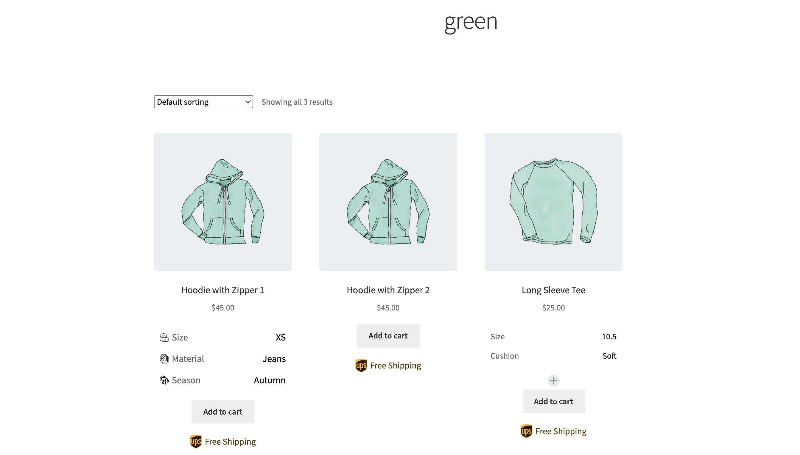
Properties Display Modes: Row vs. Column
By default, properties are shown in a row, making them align horizontally with other product details. However, if your theme displays six or more products per row, the available space for custom properties, values, and icons may become too narrow, causing layout issues.
In such cases, switching to Column mode will help by stacking properties vertically, ensuring better readability.
Another reason to use Column mode is when property names or values contain long text. If the text is too large to fit comfortably in a single row, displaying them in a column will improve clarity and presentation. Users can choose the mode that best fits their design and content needs.
Card properties in a row mode
Card properties in a column mode
Rem and Em unites
Em unit changes depending on the font size of its parent element.
Rem unit is fixed relative to the root element’s font size and doesn’t change based on the parent’s font size.
Important! Measurement units depend on the theme.
Theme influence on the display of Info Items in the product card
As we mentioned above, each theme has different settings and various ways to implement the same elements.
For instance, when the ‘After Price Info Items’ block is set in the product card, it may display in the ‘After Title Info Items’ location in some themes.
To resolve such issues, you need to switch to a different theme.


