
Creating a unique product card #
The plugin allows you to create unique product cards with custom design and functionality. These cards are independent of the theme installed on your site. You can place them anywhere on your site using a shortcode, wherever text can be written. The only requirement is that shortcode processing must be enabled for your theme (this feature works in most themes).
Color switcher
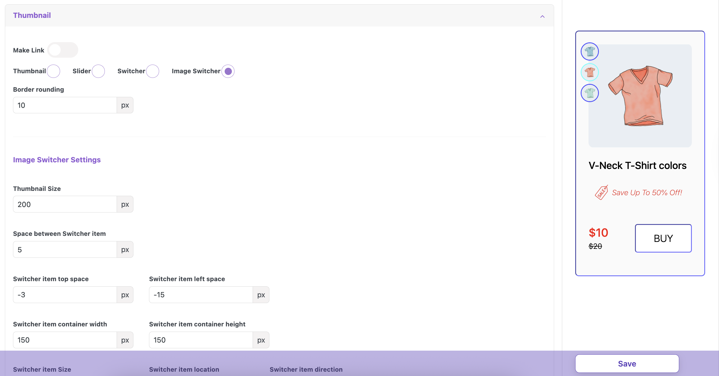
Image switcher
Slider
Thumbnail
You can use popular website/page builders with the design and structure you need. Our unique/custom product cards will be compatible with these builders. Additionally, you can set the required unique design and settings for each card.
Picture 1
Plugin compatibility #
The plugin is designed to provide additional functionality for your online store built on WooCommerce. It is not compatible with other e-commerce platforms. Our plugin works correctly with WordPress themes developed for WooCommerce, following all requirements and recommendations of the WooCommerce/WordPress developer guidelines.
Important! Our plugin uses standard WooCommerce/WordPress hooks and filters. If your theme or other plugins modify the default behavior of these hooks/filters, the plugin may not function correctly!
Important! Our plugin uses the standard jQuery/jQuery UI library. If your theme or other plugins modify or disable these libraries, the plugin may not function correctly.
Installation and configuration #
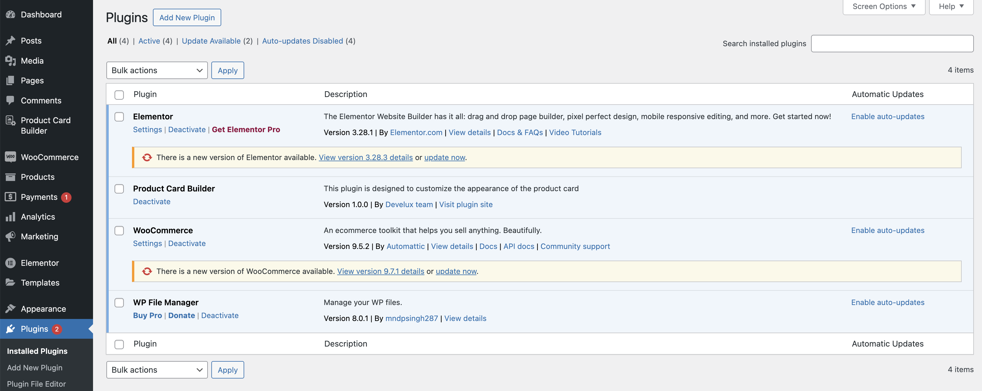
The plugin is installed using the standard method provided in WordPress.
Go to the Plugin > Installed Plugins page in the admin panel.
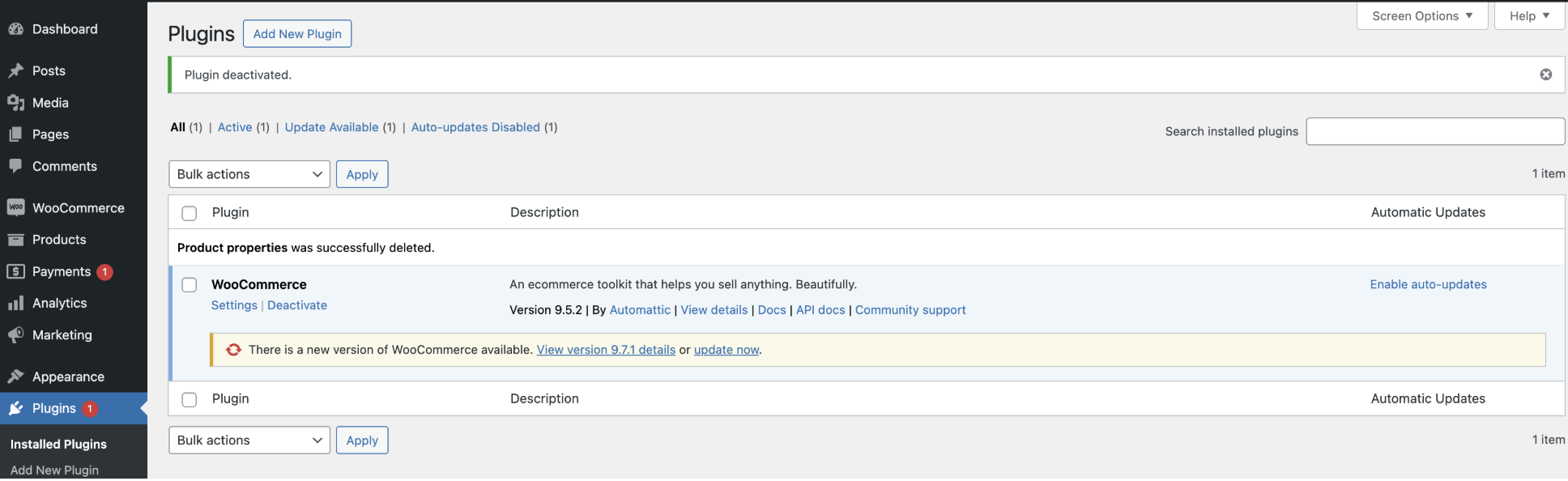
Plugin page
Click ‘Add New Plugin‘ > ‘Upload Plugin’ button and upload ZIP. archive
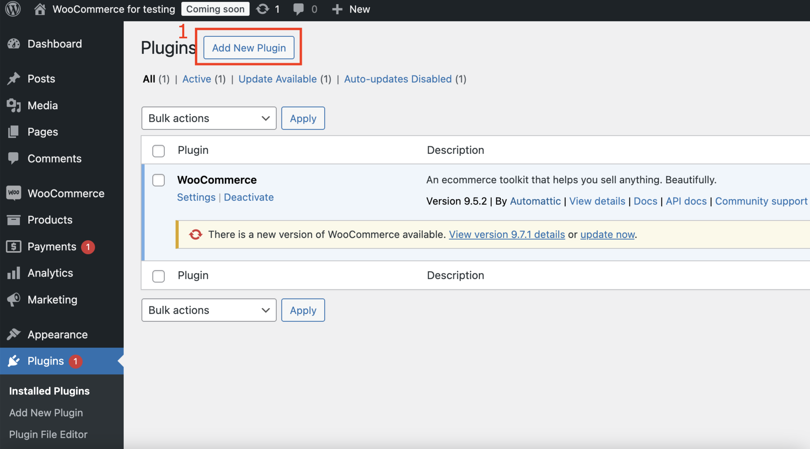
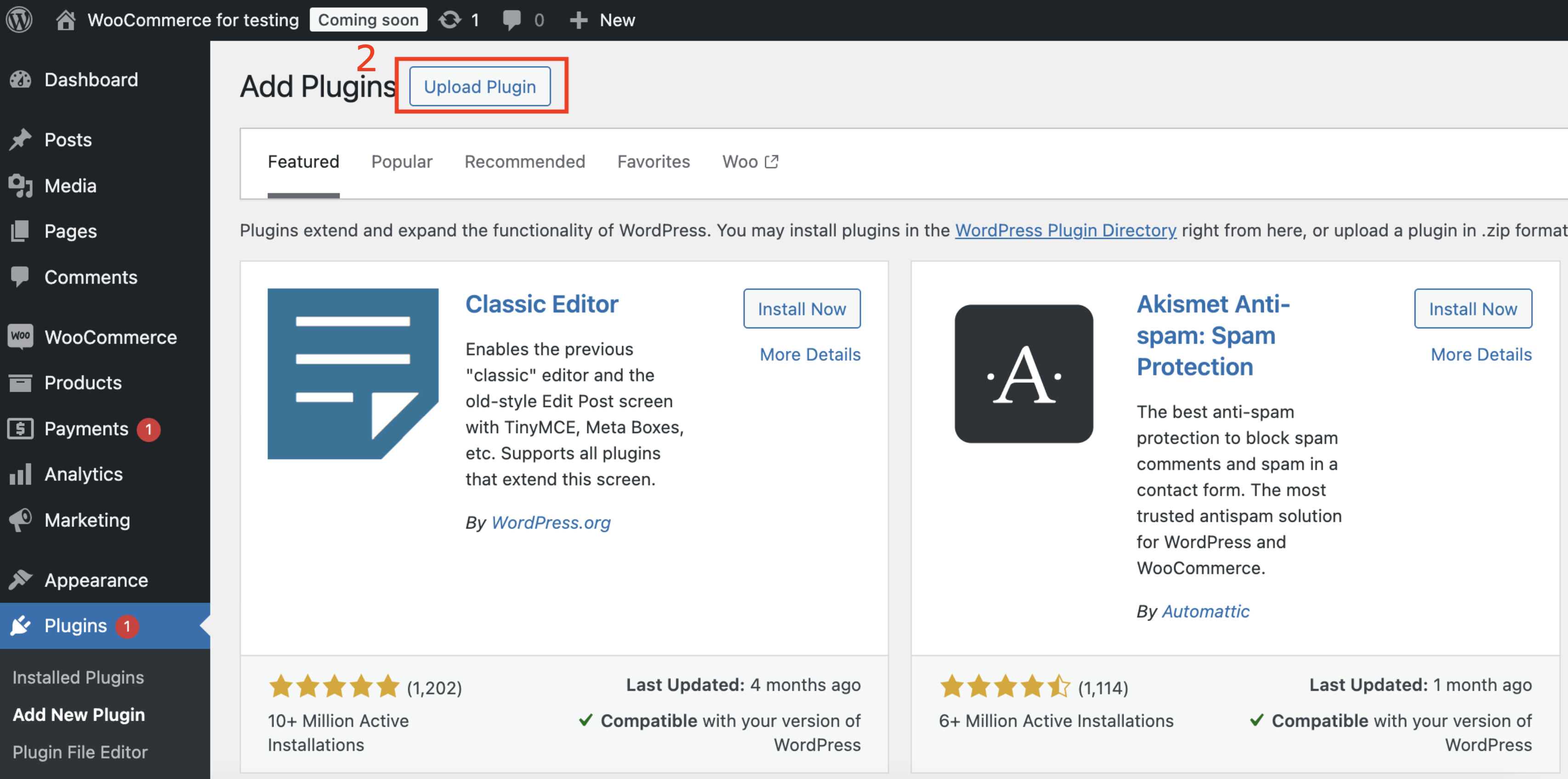
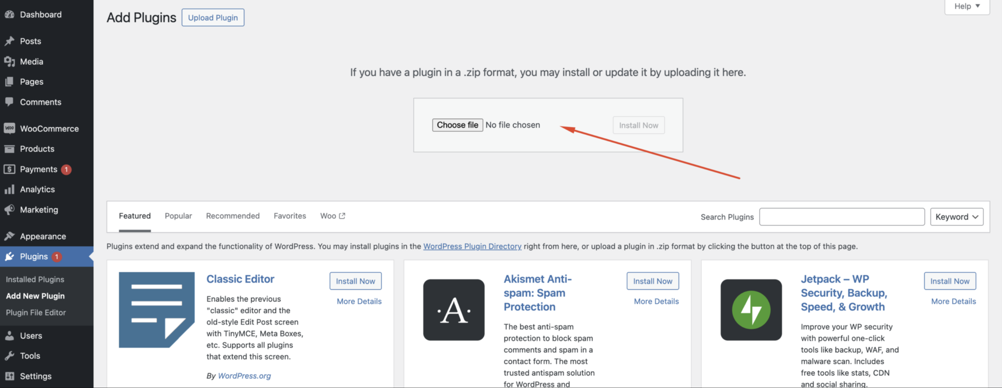
The place for uploading ZIP. archive
After the plugin installation, it will be ready for use immediately. Additionally, you will receive ready-to-use elements in the label and timer library after installation.
Plugin page with installed ‘Product Card Builder’ plugin
Functionality of the Meta Box, which is placed on the product creation page #
On the WooCommerce product creation page, our plugin adds an additional meta box where you need to add an additional product description, slider, switcher color/ image for future creation of a custom card.
Step 1. Open ‘Products‘ page
Step 2. Open the required product
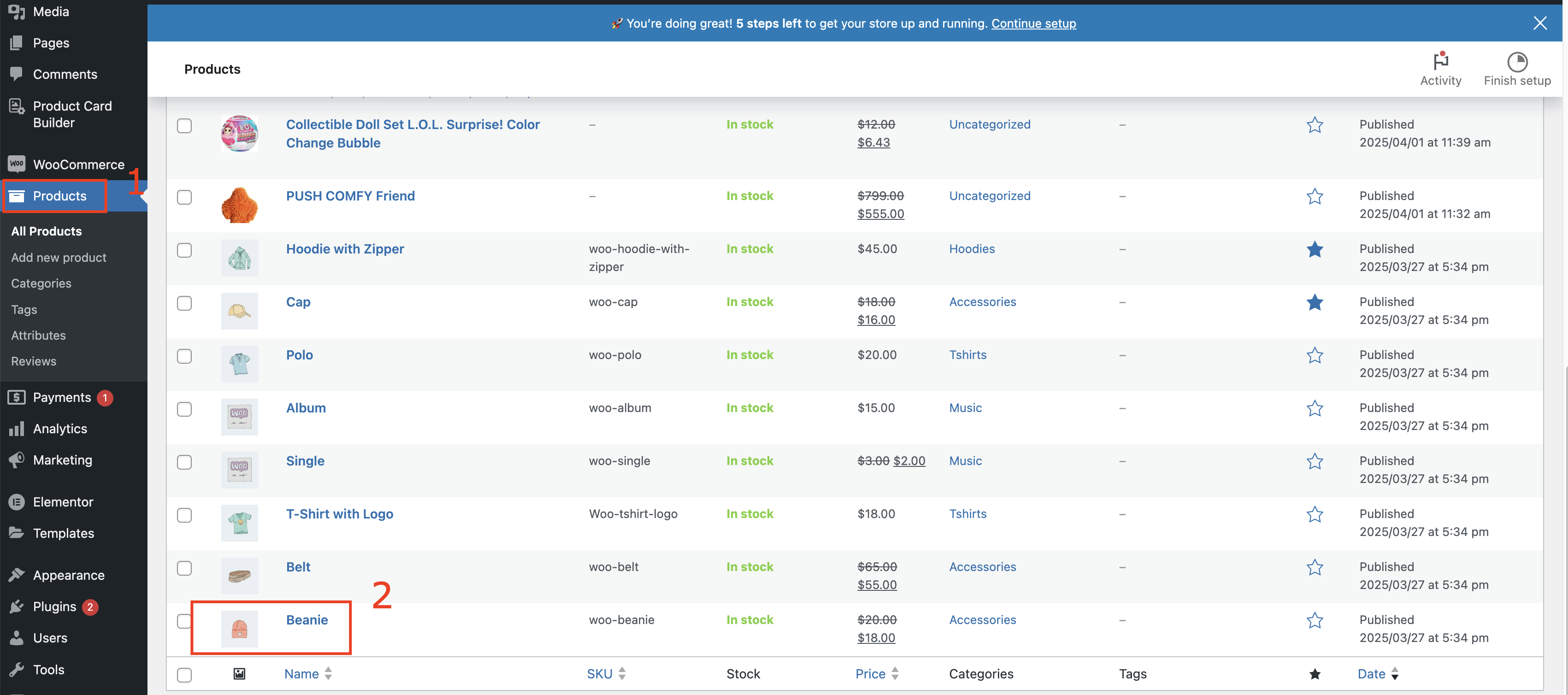
Product creation page
In the ‘Properties‘ tab you can upload the icon/ image, property, and value for your product.
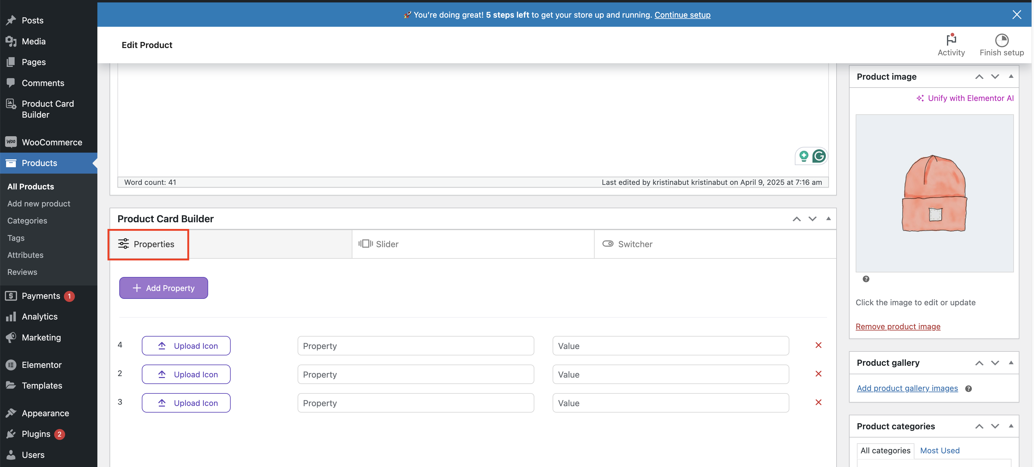
‘Properties’ on the ‘Product card’ page
Add property button allows to create the required number of fields for product properties
Upload icon button allows uploading icon or image
In the Property / Value fields, you can enter the required card description
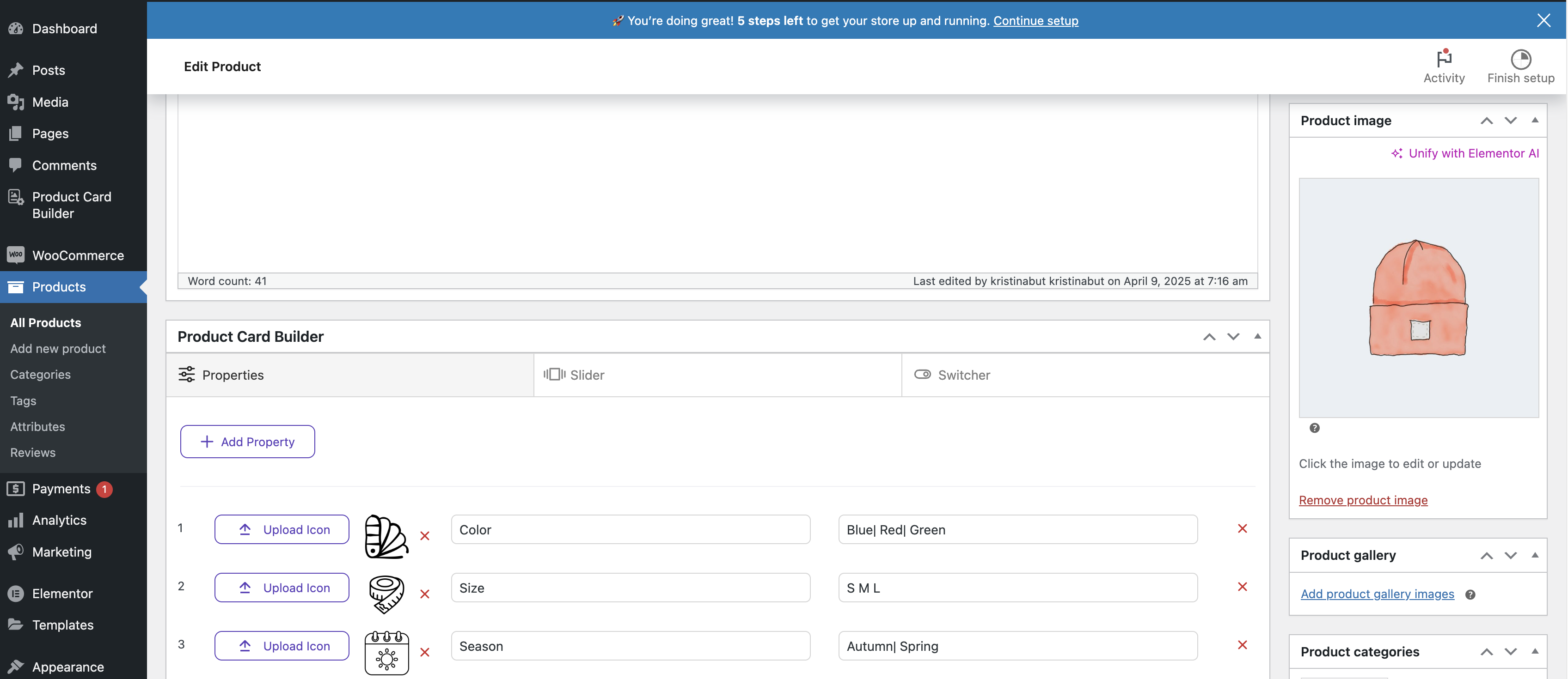
Product card with added properties
In the ‘Slider‘ tab you can click ‘Add Images’ button and upload the required number of images
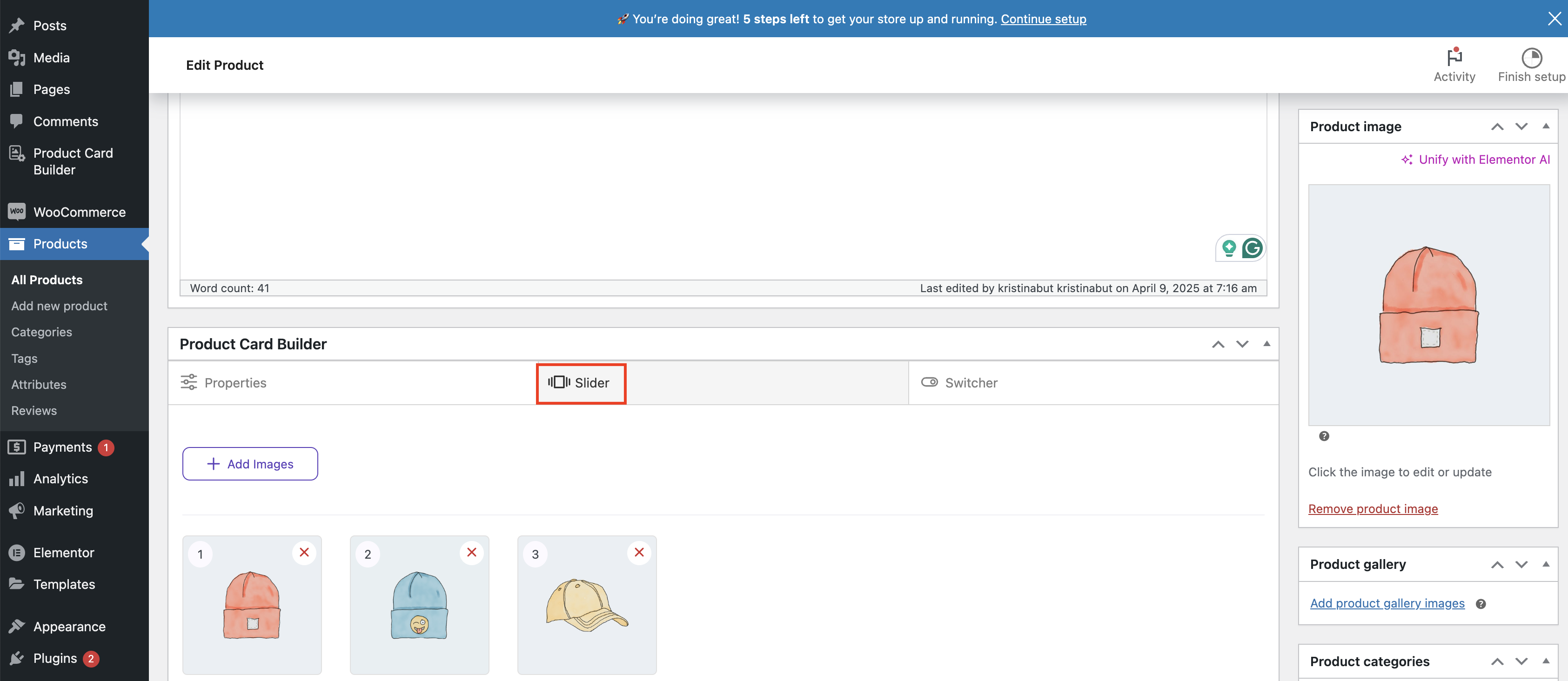
‘Slider’ on the ‘Product card’ page
In the ‘Switcher‘ tab you can click ‘Add Images’ button and upload the required number of images to the Color switcher and Image switcher
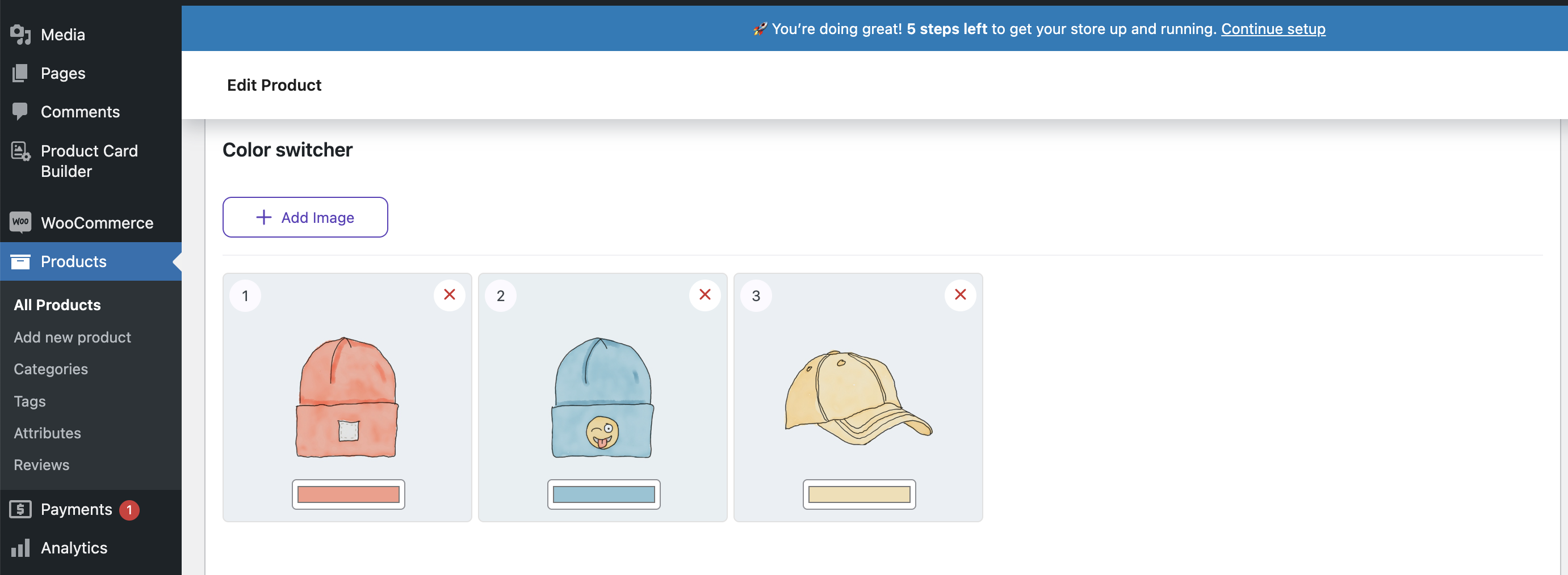
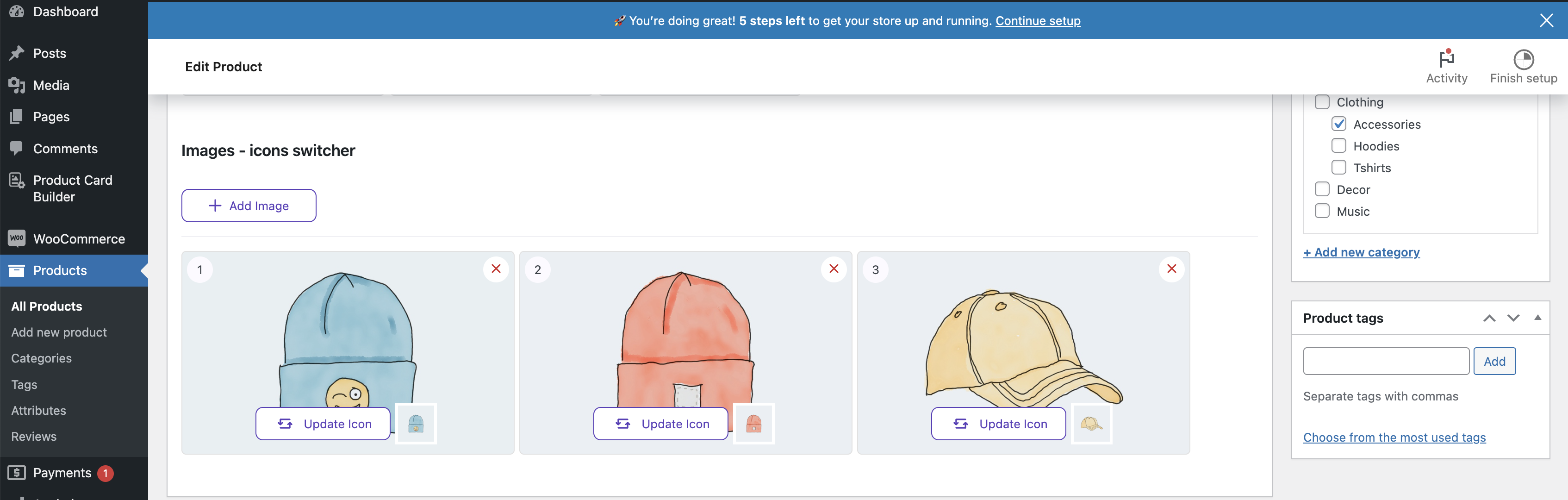
‘Switcher color’ and ‘Switcher image’ on the ‘Product card’ page
Important! Additional properties, sliders, and switchers will only be displayed in the custom card created using the Product Card Builder.
Product Card Builder #
Go on the ‘Product Card builder’ page
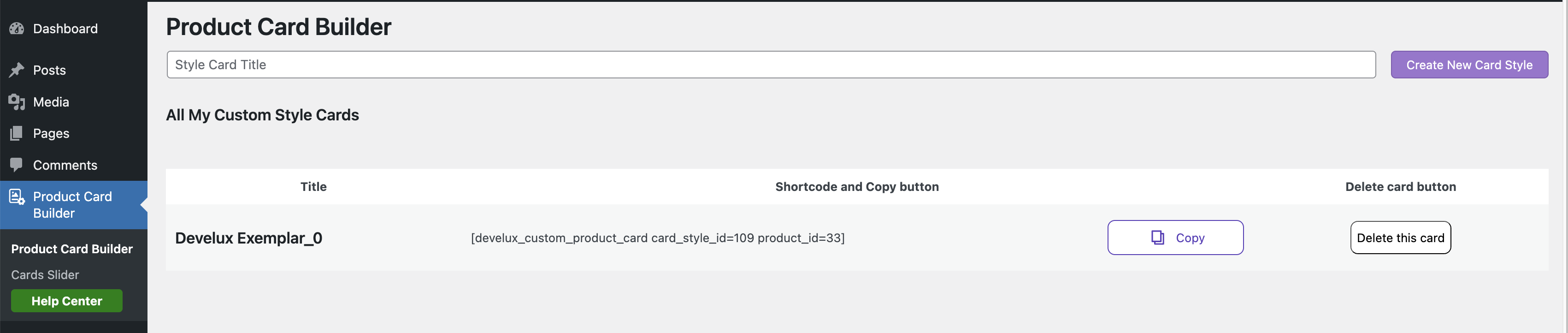
Common ‘Product Card Builder’ page
In the ‘Style Card Title’ field, create a new card
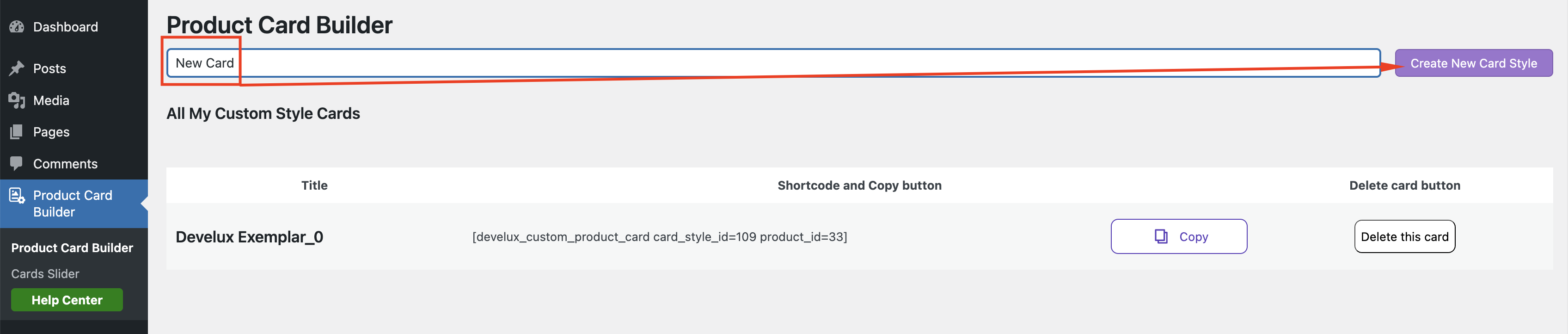
New card creation
Before creating a custom product card, you need to attach a product to it.
This is necessary for the custom card to preview how it will appear on the site and display the required product card elements, such as:
- Thumbnail (main product image)
- Image Slider
- Color switcher
- Rating
- Product name
- Product price
- etc
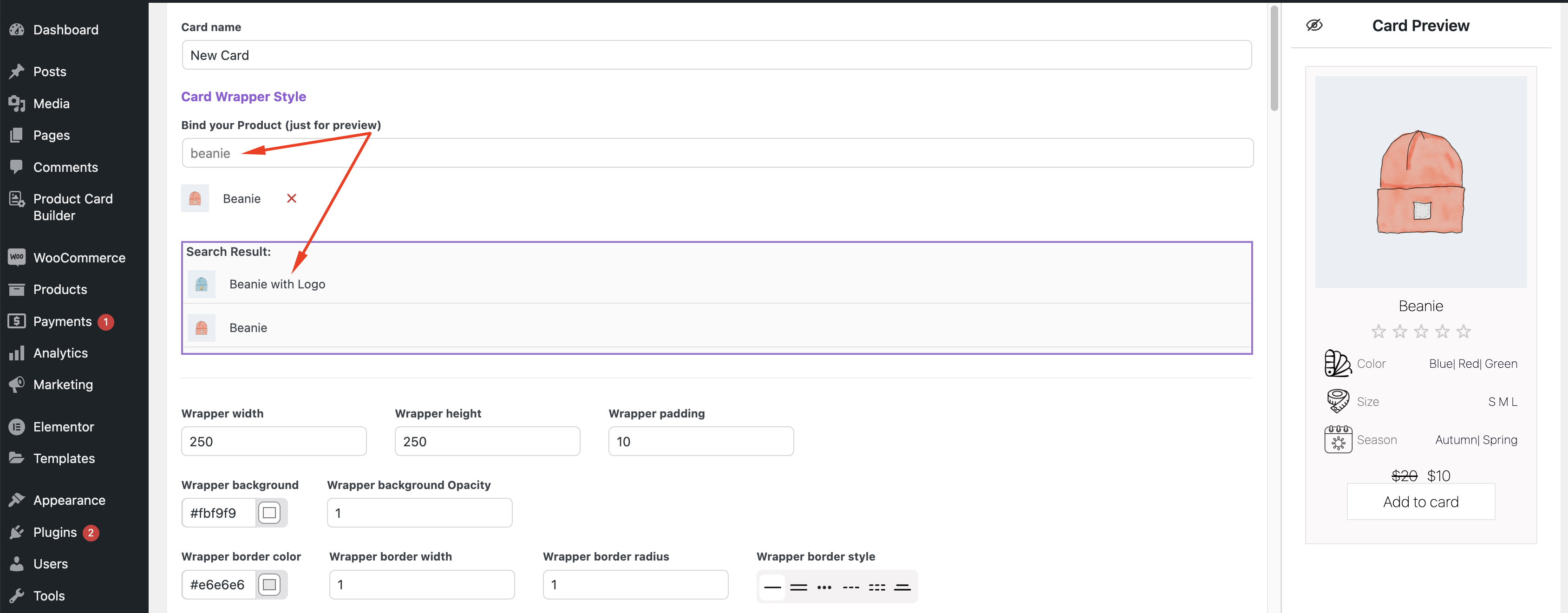
Bind the product card
Custom cards have all the necessary elements for the product:
- Product image
- Slider, Switchers for the product that will be displayed on the product card
- Product color variations
- Collapse and rating
- Product price and buy button
- All of these elements can be styled and customized
- You can use an additional product description and style it for each specific card
Styling the Custom Product Card #
Wrapper width – sets the width of the product card
Wrapper height– sets the height of the product card
Wrapper padding – sets the inner spacing of the product card
Wrapper background – sets the background color of the product card
Wrapper background Opacity – sets the transparency level of the background color in the product card
Wrapper border color – sets the border color for the product card
Wrapper border width – sets the width of the border color in the product card
Wrapper border radius – sets the roundness of the product card’s corners
Wrapper border style – sets the wrapper border style of the product card
Rem / Em / Px– sets the text size
Thumbnail
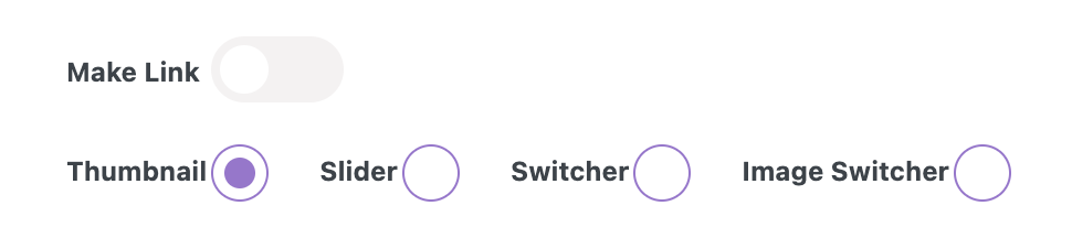
Turned off ‘Make link‘ toggle – prevents using the card page link in Thumbnail, Slider, Switcher, and Image Switcher
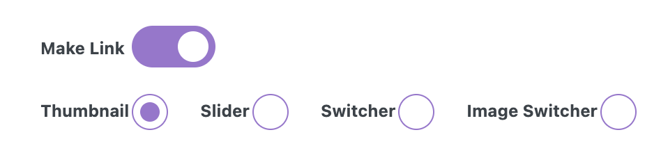
Turned on ‘Make link‘ toggle – allows using the card page link in Thumbnail, Slider, Switcher, and Image Switcher

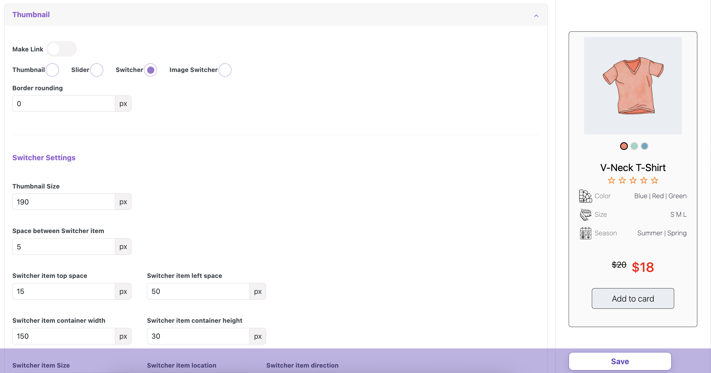
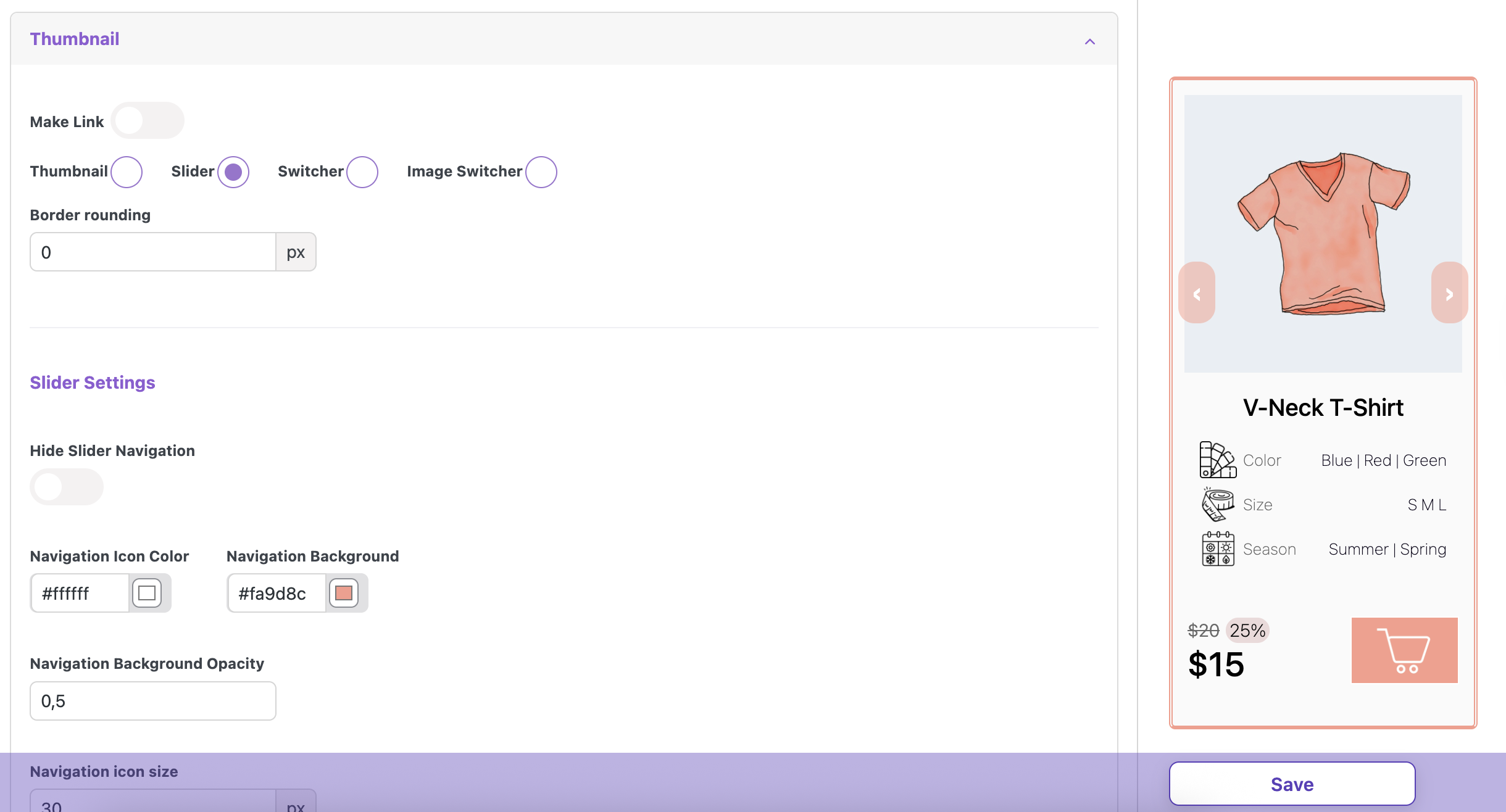
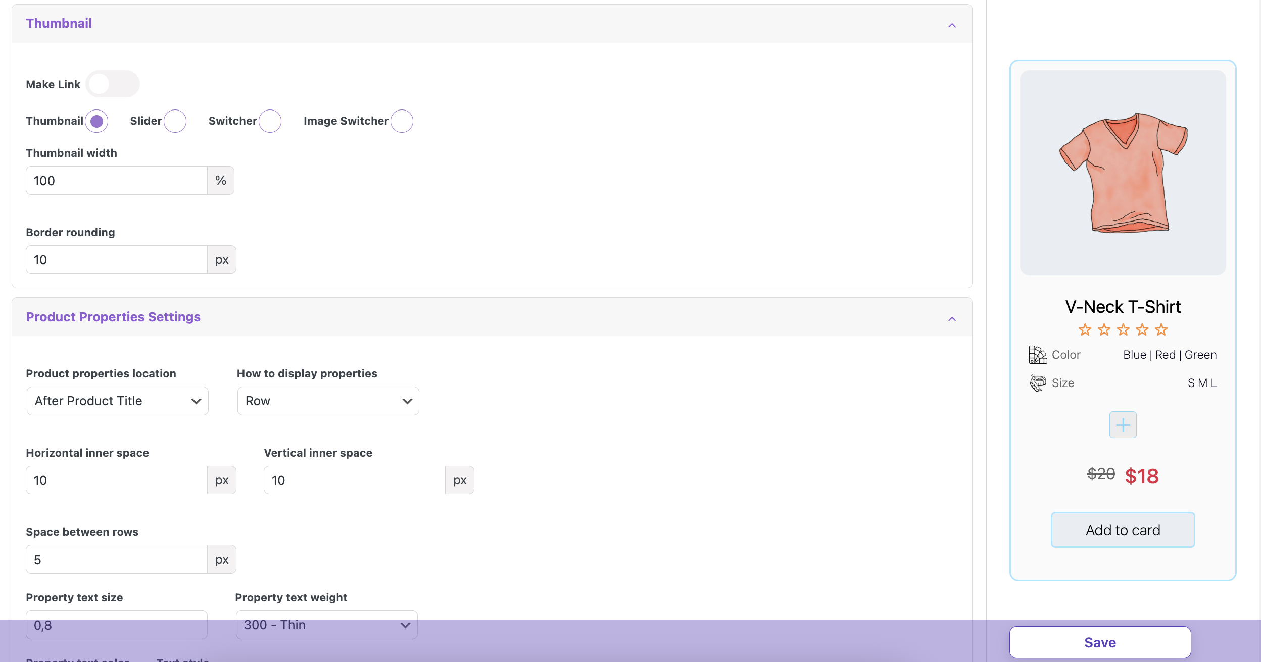
Thumbnail / Slider / Switcher / Image Switcher – allows you to select the desired type of image display
If you select Slider, Switcher, or Image Switcher but haven’t set image settings in the meta boxes for this one, a ‘No data for %switcher%’ alert will appear, and no image will be displayed in the Cart preview.
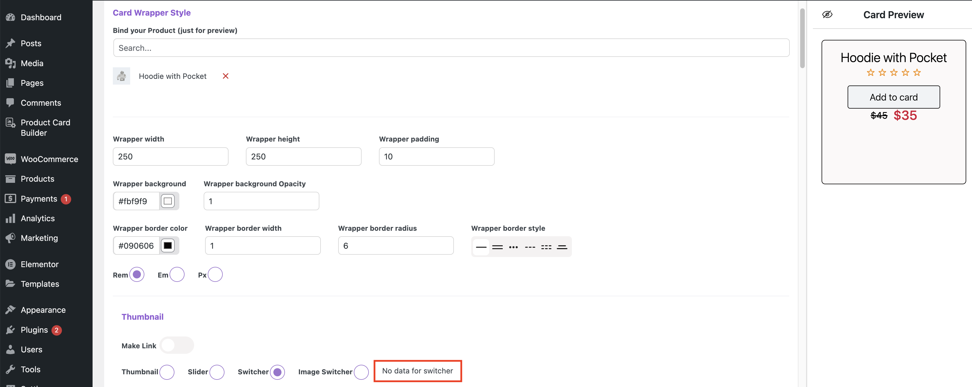
Slider custom card settings without slides in the meta box
Thumbnail settings #
Thumbnail width – sets the size of the thumbnail
Border rounding – sets the roundness of the thumbnail’s corners
Slider Settings #
Hide Slider Navigation – Allows you to hide the slide navigation
Navigation Icon Color – sets the color of icons in the slider navigation
Navigation Background – sets the background color in the slider navigation
Navigation Background Opacity – sets the transparency level of the navigation background
Navigation icon size – sets the navigation size
Navigation vertical position – sets the vertical position of the navigation, moving it to the top or bottom
Slider screen size – sets the width of the slider viewport
Navigation width – sets the width of the navigation
Navigation height – sets the height of the navigation
Navigation rounding – sets the roundness of the border corners for the navigation
Navigation horizontal padding / Navigation vertical padding – sets the horizontal and vertical inner space for the navigation
Navigation arrow type – sets the type of the navigation arrow
Hide Slider Switcher item – allows hiding the slider switcher item
Switcher item Background – sets the background for the switcher item
Switcher item Active Background – sets the background for the active switcher item
Switcher item Top Space – sets the space between the thumbnail and the switcher items
Switcher item size – sets the image switcher item size
Space between Switcher item – sets the gap between the image switcher item size
Switcher Settings #
Border rounding – sets the roundness of the thumbnail’s corners
Thumbnail Size – sets the switcher thumbnail size
Space between Switcher item – sets the gap between the dots
Switcher item top space – sets the top position for the dots
Switcher item left space – sets the left position for the dots
Switcher item container width – sets the wrapper width for dots in ‘Before title’ and ‘After title’ dots locations
Switcher item container height – sets the wrapper height for dots in ‘Before title’ and ‘After title’ dots locations
Switcher item Size – sets the dot size
Switcher item location – sets the dots location
Switcher item direction – sets the dot’s direction
Switcher item border color – sets the border color for dots
Active Switcher item border color – sets the border color for the active dot
Switcher item rounding – sets the corner roundness for the dots
Switcher item Border Width – sets the border width for the dots
Switcher item border style – sets the border style for the dots
Switcher item Shadow Color – sets the shadow color for the dots
Switcher item horizontal shadow / Switcher item vertical shadow – sets the position of the shadow for the dots
Switcher item Shadow Dispersion – sets the density of the shadow
Image Switcher Settings #
Border rounding – sets the roundness of the thumbnail’s corners
Thumbnail Size – sets the thumbnail size for the switcher
Space between Switcher item – sets the gap between the dots
Switcher item top space – sets the top position for the dots
Switcher item left space – sets the left position for the dots
Switcher item container width – sets the wrapper width for dots in ‘Before title’ and ‘After title’ dots locations
Switcher item container height – sets the wrapper height for dots in ‘Before title’ and ‘After title’ dots locations
Switcher item Size – sets the dot size
Switcher item location – sets the dots dislocation
Switcher item direction – sets the dots direction
Switcher item border color – sets the border color for dots
Active Switcher item border color – sets the border color for the active dot
Switcher item rounding – sets the corner roundness for the dots
Switcher item Border Width – sets the border width for the dots
Switcher item border style – sets the border style for the dots
Switcher item Shadow Color – sets the shadow color for the dots
Switcher item Shadow Dispersion – sets the density of the shadow
Switcher item horizontal shadow / Switcher item vertical shadow – sets the position of the shadow for the dots
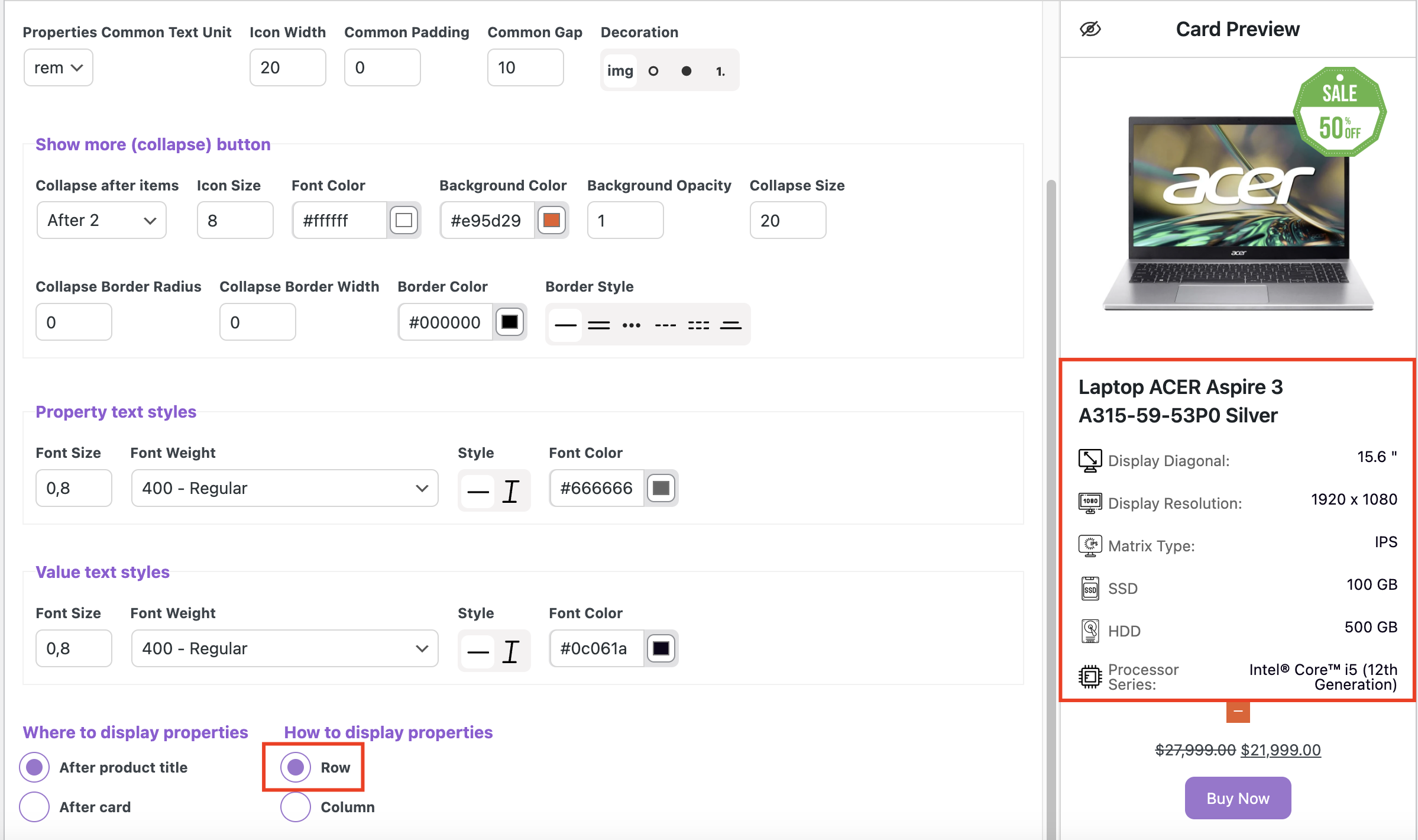
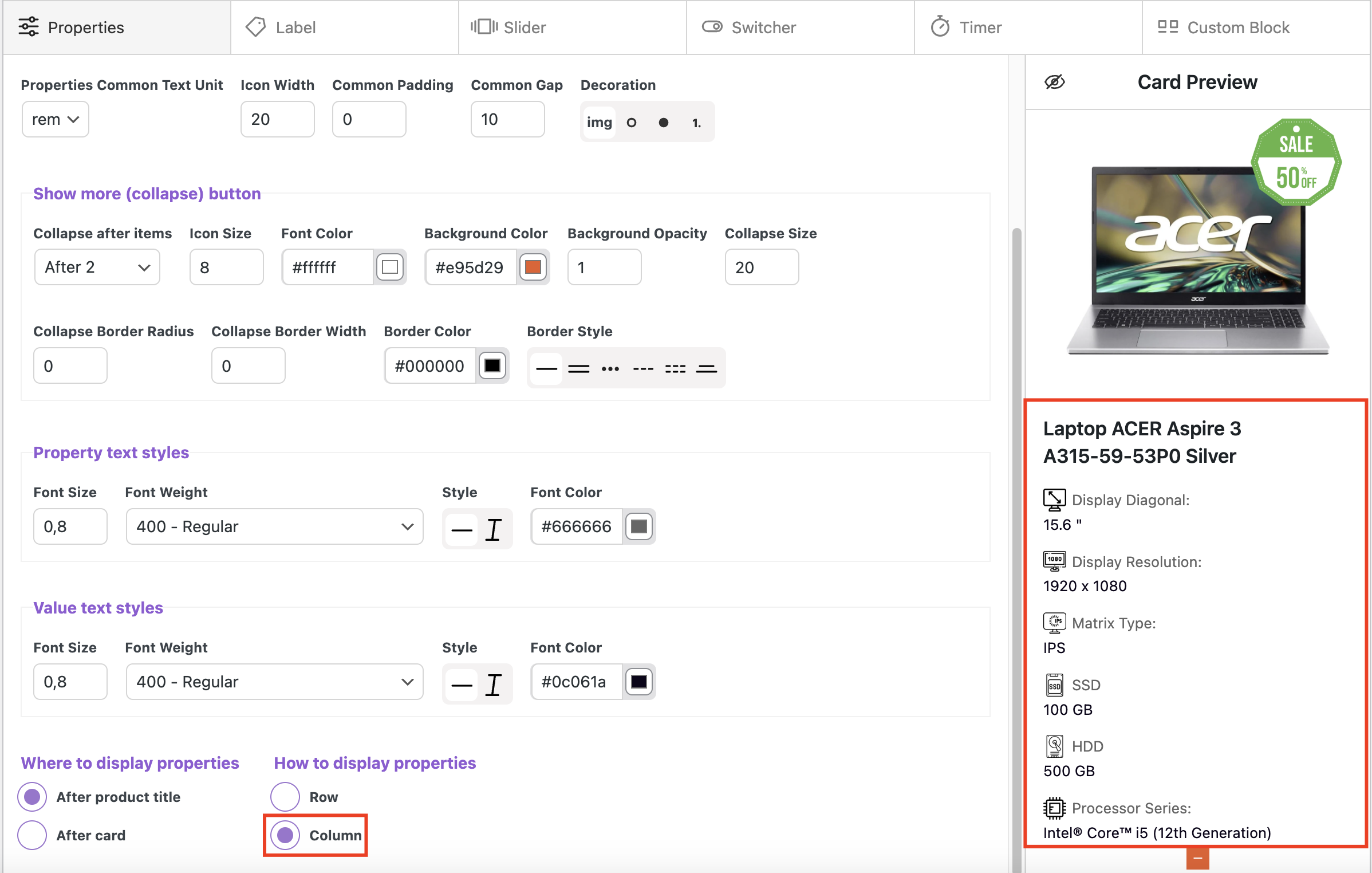
Product Properties Settings #
Product properties location:
Dislocation ‘After Product Title’ – places properties after title
Dislocation ‘After Cart’ – places properties after cart
How to display properties:
Row – displays items horizontally in a row
Column – displays items vertically in a column
Horizontal inner space / Vertical inner space – sets the inner space around the properties
Space between rows – sets the gap between the rows with properties
Property text size – sets the property text size
Property text weight – sets the property text weight
Property text color – sets the property font color
Text style – sets the text style (normal or italic)
Value text size – sets the value text size
Value text weight – sets the value text weight
Value text color – sets the value font color
Icon size – the size of the icon set for product properties lists
Decoration – specifies which decorative elements will be used for the lists (images, circles, or numbering)
Collapse Settings
Collapse after items – specifies whether a collapse is needed and after which element it should occur
Collapse icon size – sets the icon size
Collapse icon color – sets the collapse icon color
Collapse color – sets the collapse background color
Collapse background opacity – sets the transparency level of the background color
Collapse Size – sets the size for the button
Collapse Border Radius – sets the roundness of the collapse button corners
Collapse top space – sets the top position for the collapse
Collapse bottom space – sets the bottom position for the collapse
Collapse rounding – sets the corner roundness for the collapse
Collapse Border Width – sets the collapse border width
Border Color – sets the collapse border color
Border Style – sets the collapse border style
Product title settings
Switching on / Switching off ‘Make link‘ toggle allows or disallows using the card page link in the title
Choosing ‘Underline’ or ‘None’ controls whether the title is underlined
Text size – sets the text size
Text weight – sets the text weight
Text style – sets the text style (normal or italic)
Text align – sets text on the left, right and center
Text Color – sets the value of the text color
Top space – sets the amount of space between the top edge of an element and its content
Bottom space – sets the amount of space between the bottom edge of an element and its content
Rating settings
Display / Hide – displays or hides the rating stars
Switching on / Switching off ‘Make link‘ toggle allows or disallows using the card page link in the rating
Rating star Size – sets the rating star’s size
Rating star color – sets the color of the rating star’s
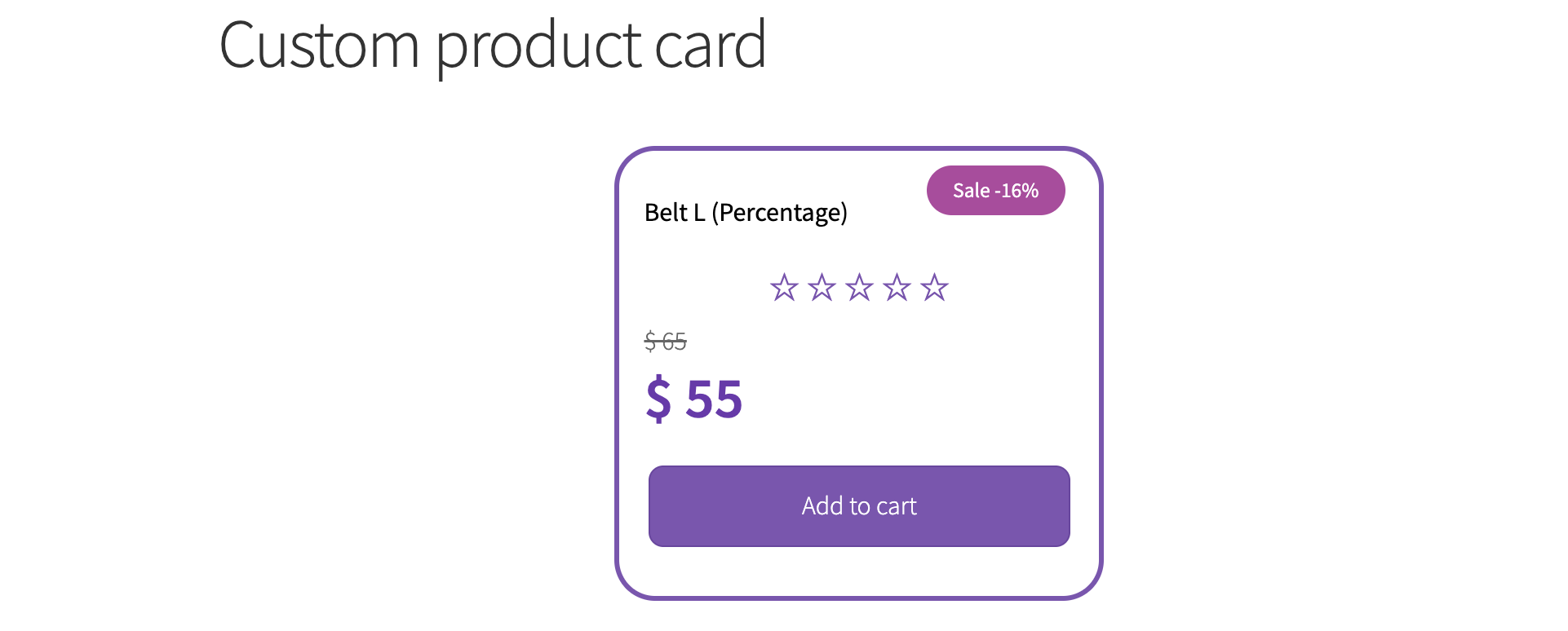
Regular price settings
Price size – sets the price size
Price weight – sets the text weight
Price style – sets the price style (normal or italic)
Price color – sets the price font color
Price & sale space – sets the space between Regular price and Sale
Price vertical inner space – sets the top and bottom inner space around for the price
Text Align – sets the price on the left, right, and center
Price direction – sets the price direction
Sale Size – sets the sale size
Sale Weight – sets the text weight
Sale Style – sets the sale style (normal or italic)
Sale Color – sets the sale color
Price Difference settings
Switching on / Switching off ‘Display price difference‘ toggle allows or disallows displaying the price difference
Display price difference before product price / Display price difference after product price – sets the price difference position relative to the product price (before or after)
Number / Percent – displays the price difference as a numeric value or a percentage
Price difference size – sets the price difference size
Price difference weight – sets the price difference weight
Price difference style – sets the price difference style (normal or italic)
Price difference color – sets the price difference color
Price difference inner space – sets the top and bottom inner space around for the price difference
Price difference top space – sets the top position for the price difference
Price difference bottom space – sets the bottom position for the price difference
Price difference left space – sets the left position for the price difference
Price difference right space – sets the right position for the price difference
Price difference border width – sets the border width for the price difference
Price difference rounding – sets the roundness of the border corners for the price difference
Border color – sets the price difference border color
Border style – sets the price difference border style
Background mono Color / Background Gradient – sets the price difference type of color
Background mono Color:
Color – sets the background color
Background Opacity – sets the transparency level of the background color in the price difference
Background Gradient:
Start color – sets the gradient start color
End color – sets the gradient end color
Gradient Type – sets the gradient type
Gradient Opacity – sets the transparency level of the background color in the price difference
Add to cart button settings
Button Text – field for button text
Button & price dislocation
Font Size – sets the text font size
Font Style – sets the text style (normal or italic) in the button
Font Weight – sets the text weight in the button
Font Color – sets the text font color
Hover Font Color – text color that appears when a user hovers over an element with their cursor
Button image settings
Upload Image – allows uploading a custom icon or image for the button
Use Button Image – enables or disables the display of the uploaded image
Before text / After text – sets the image position relative to the button text
Button image size – sets the width and height of the button image
Image left space – sets the margin to the left of the image
Image right space – sets the margin to the right of the image
Content align – sets text and image on the left, right and center
Button width – sets the button width
Button height – sets the button height
Button top space – sets the top position for the button
Button bottom space – sets the bottom position for the button
Vertical inner space / Horizontal inner space – sets the inner space around the properties
Background color – sets the button background color
Hover Background – background color that appears when a user hovers over the button with their cursor
Background Opacity – sets the transparency level of the background color in the button
Border color – sets the button border color
Hover Border color – sets the hover border color
Border width – sets the button border width
Border rounding – sets the roundness of the button’s corners
Border style – sets the button border style
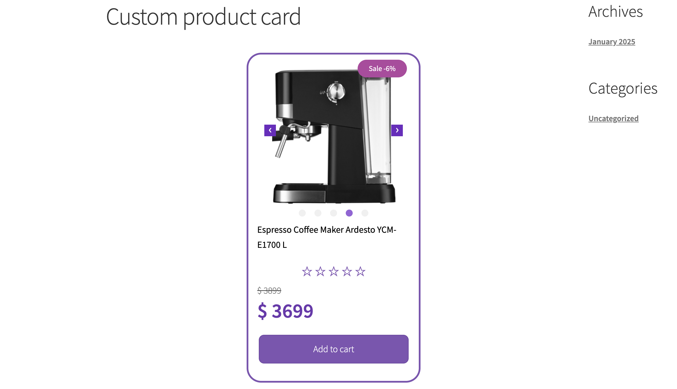
To display a custom card in the shop, save all settings and copy the shortcode
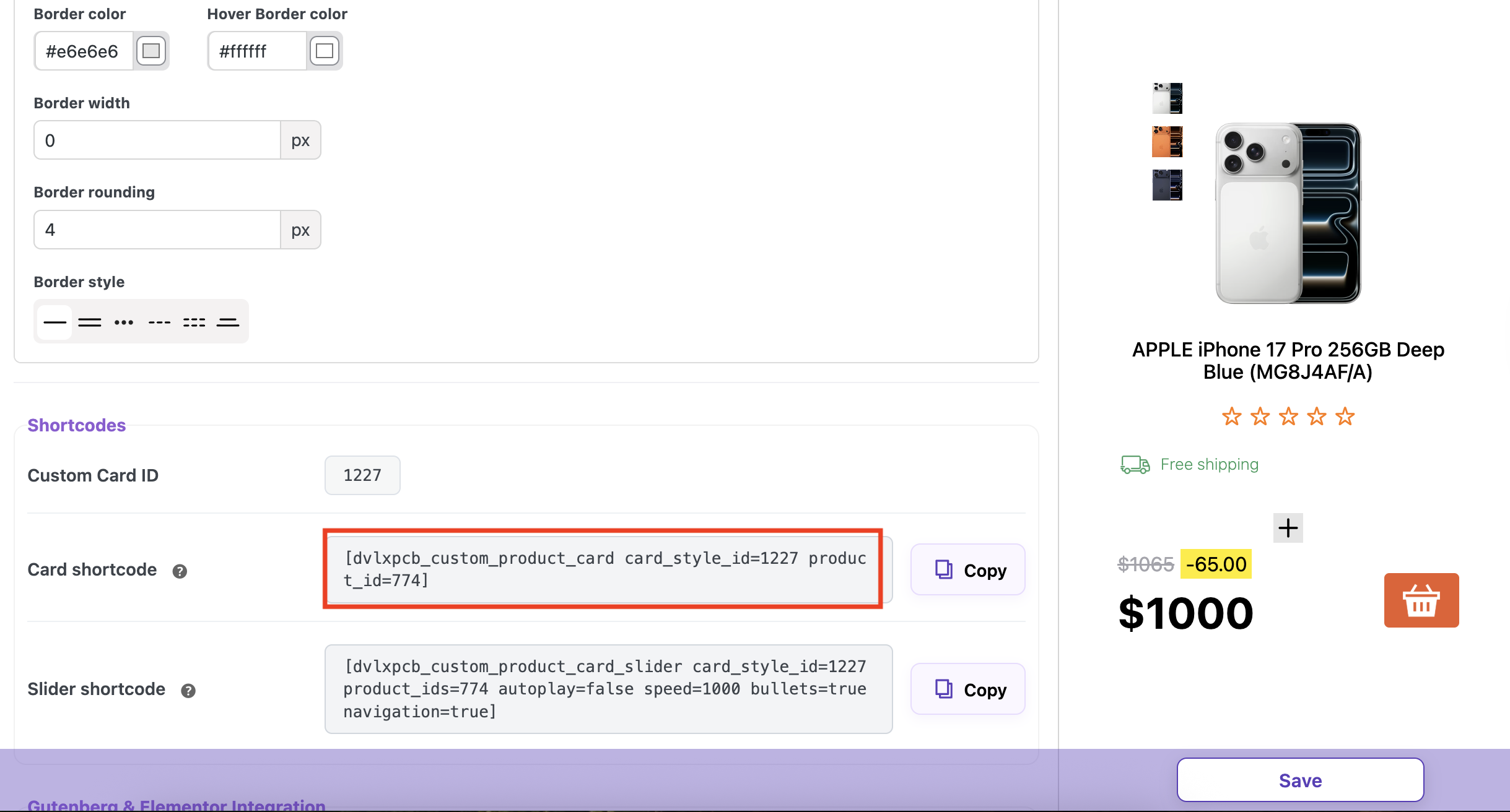
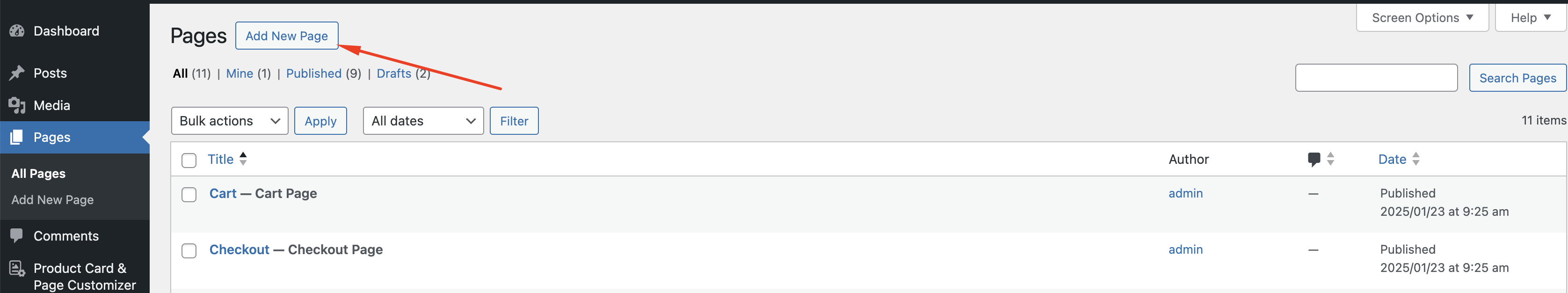
Create a new page
Insert the copied shortcode using the Gutenberg shortcode block or any other plugin like Elementor or Beaver Builder
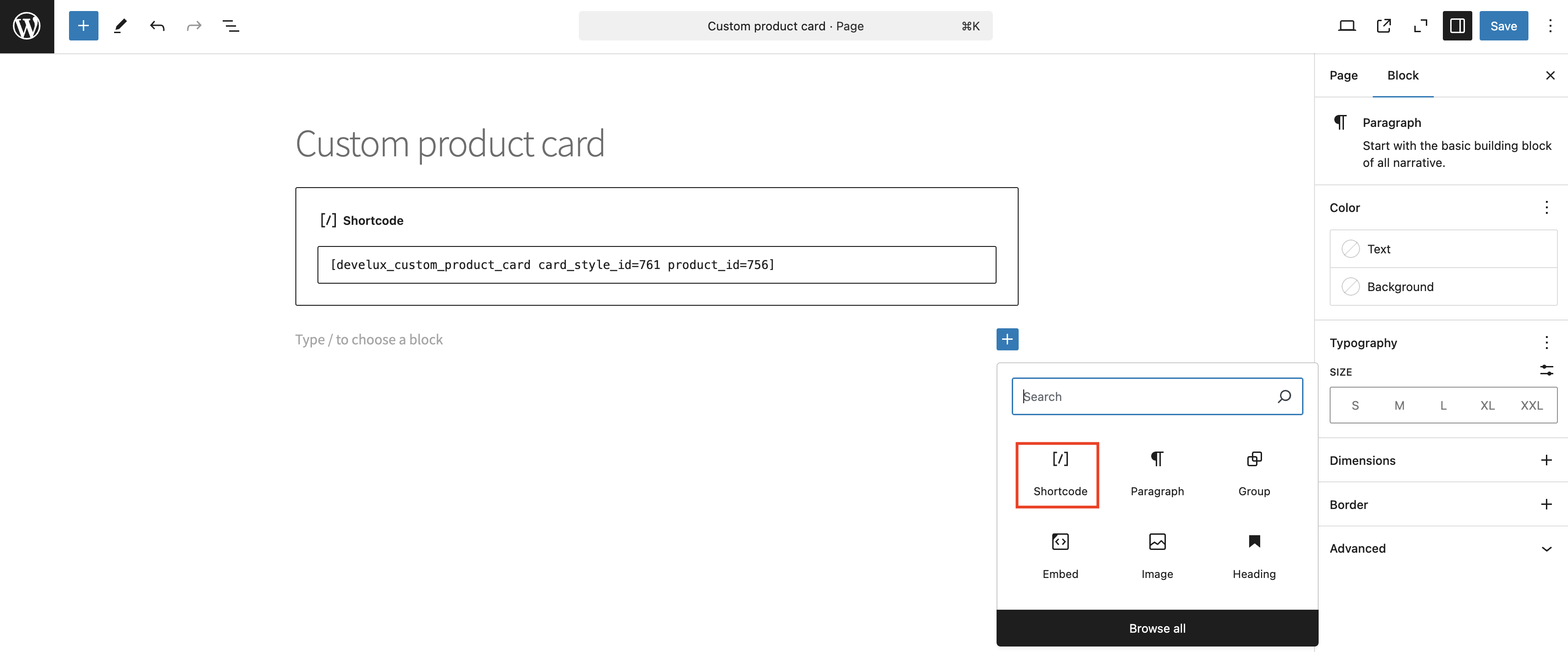
Click the ‘Save’ button, then the ‘View Page’ button
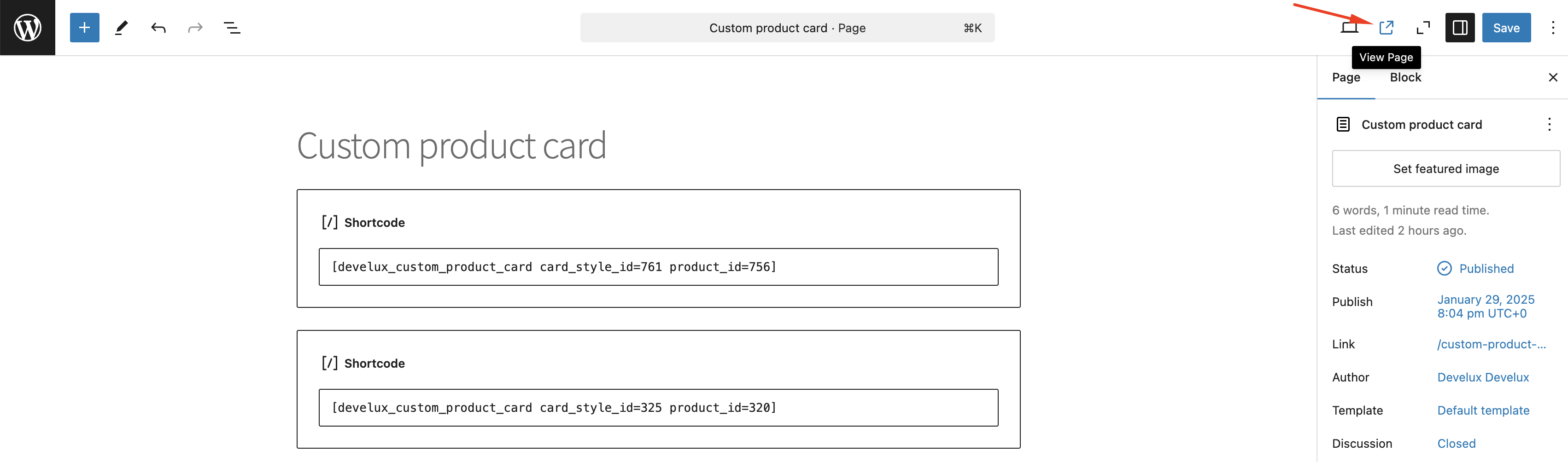
The inserted shortcode will display the custom card on the page

Recommendations and solutions to potential problems #
Each theme is partially unique and may have different settings, as well as different ways to implement the same elements. For such cases, our plugin provides various methods to implement the display of the required elements.
Examples of such cases include:
- Displaying Product Properties
- If your website uses narrow product cards and the text doesn’t fit, you can choose to display the text in Column mode. This option is available on the plugin’s page under the general appearance settings for product property descriptions, Global Properties Styles. If you’re customizing a specific product, you can do this in our Product Card Configurator metabox, under the Properties tab in the “Properties Styling” section, which is located on the product creation page.
Custom Properties Display Modes: Row vs. Column
Our plugin offers two modes for displaying custom properties: Row and Column.
By default, properties are shown in a row, making them align horizontally with other product details. However, if your theme displays six or more products per row, the available space for custom properties, values, and icons may become too narrow, causing layout issues.
In such cases, switching to Column mode will help by stacking properties vertically, ensuring better readability.
Another reason to use Column mode is when property names or values contain long text. If the text is too large to fit comfortably in a single row, displaying them in a column will improve clarity and presentation. Users can choose the mode that best fits their design and content needs.
Row example
Column example
Rem and Em unites
Em unit changes depending on the font size of its parent element.
Rem unit is fixed relative to the root element’s font size and doesn’t change based on the parent’s font size.
Important! Measurement units depend on the theme. For better text display, switch to rem.
Font Rendering
All fonts displayed by the plugin may be inherited from the active website theme. In some cases, theme-specific styles may override the font settings configured within the plugin, which may prevent changes from being applied correctly.
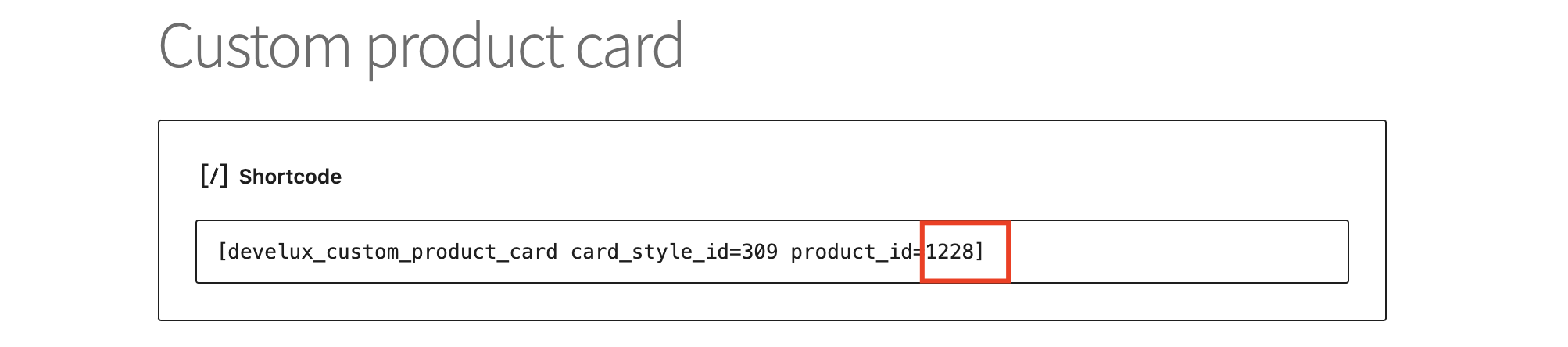
ID replacement in the shortcode
To display a custom card on the page, you need to enter the shortcode of this card into the shortcode field.
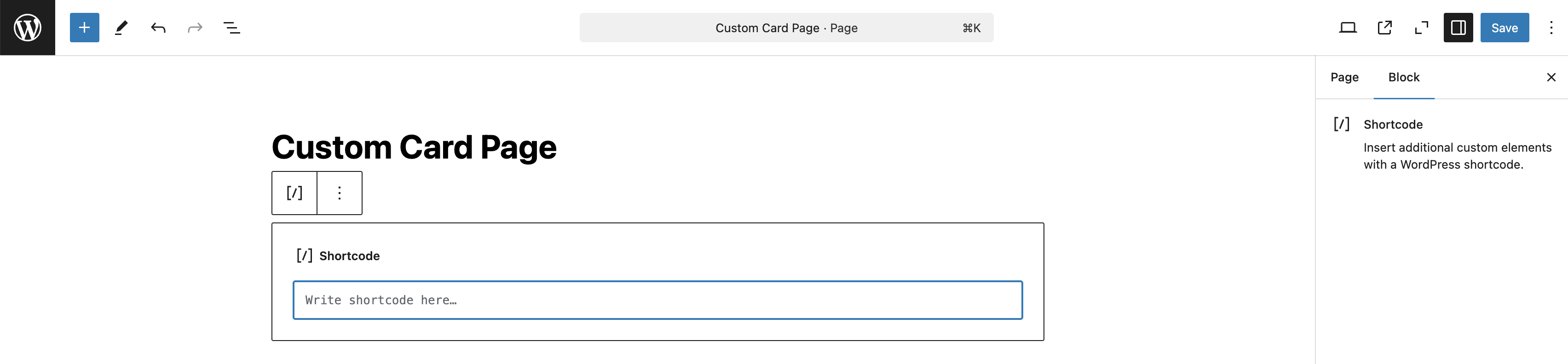
To replace the card on the product page, get the card ID from the Product tab
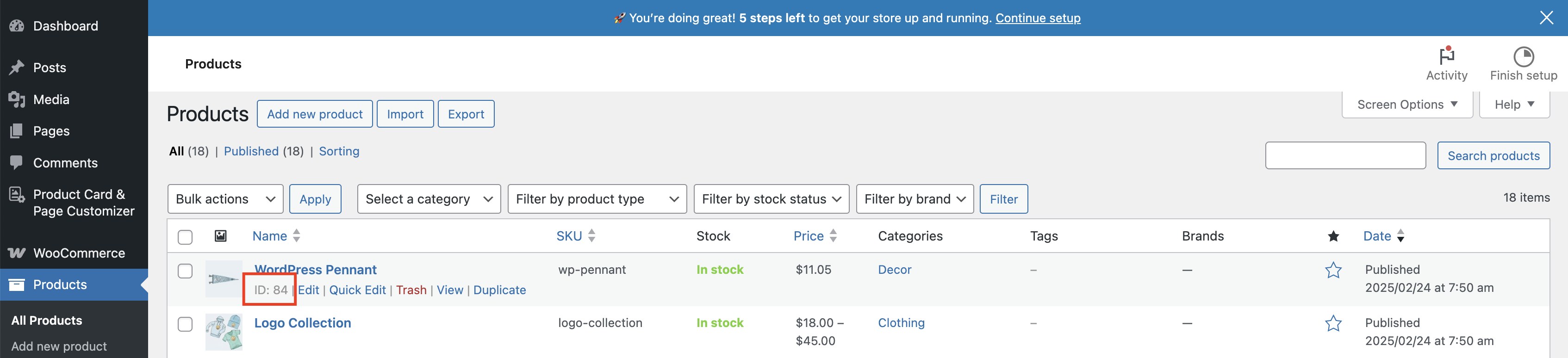
Enter this ID instead of existid ID in the shortcode
Important! If the shortcode belongs to a custom card with a slider, and a custom card shortcode with a switcher is inserted instead, the thumbnail will be absent on the custom product card


