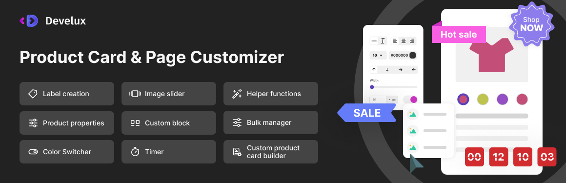
General information about the plugin #
The Product Card & Page Customizer plugin by Develux provides additional functionality for your online store, enhancing the standard product card and product page capabilities.
In all online stores built on WooCommerce, product cards are displayed on the following pages:
- Catalog
- On the product page (Upsells)
- On the cart page (Cross-sells)
- May also be displayed on other pages if implemented in the site theme
If your WooCommerce theme has not modified the standard generation of product cards and pages, the full functionality of the plugin will be available. Otherwise, only part of its features will be accessible.
With this plugin, you can perform the following actions:
- Create unique custom product cards and place them on the site using a shortcode
- Design and style additional product descriptions that will be displayed in the product card
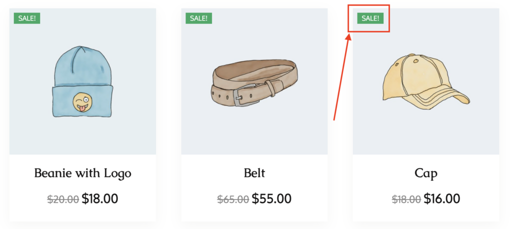
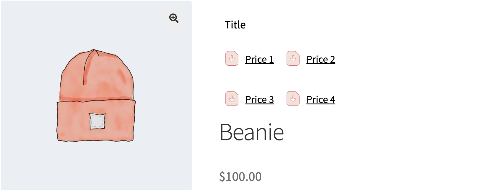
- Create custom labels or use ready-made ones from our library. You can also use labels created in other graphic programs and saved in the following formats: jpg/jpeg, png, svg, placing them on the product card or page.
- Use a slider for custom product cards
- Enable a color switcher for products, which can be configured and used in custom product cards
- Create a countdown timer for discounted prices or other promotions
- Display additional informational elements in various places on the product card via the Custom Blocks tab
- Customize different informational elements on the Single Product Page Builder, placing them in various locations on the product page
- Work with the bulk manager, which allows you to assign labels, timers, and additional elements to multiple products using WooCommerce categories and tags, as well as include or exclude specific products
- Create your own library of elements (labels, timers, and additional elements)
- Use the general auxiliary features of the plugin
Plugin compatibility #
The plugin is designed to provide additional functionality for your online store built on WooCommerce. It is not compatible with other e-commerce platforms. Our plugin works correctly with WordPress themes developed for WooCommerce, following all requirements and recommendations of the WooCommerce/WordPress developer guidelines.
Important! Our plugin uses standard WooCommerce/WordPress hooks and filters. If your theme or other plugins modify the default behavior of these hooks/filters, the plugin may not function correctly!
Important! Our plugin uses the standard jQuery/jQuery UI library. If your theme or other plugins modify or disable these libraries, the plugin may not function correctly!
Installation and configuration #
The plugin is installed using the standard method provided in WordPress.
In the admin panel, you need to go to the Add New Plugin page.
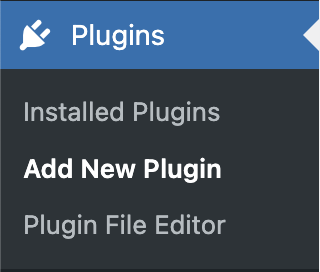
Using the Upload Plugin button, upload the plugin’s zip archive.

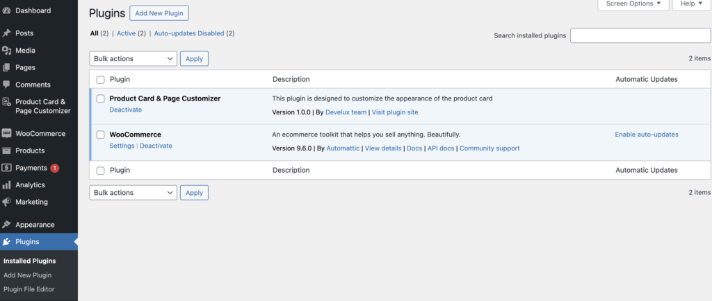
After the plugin installation, it will be ready for use immediately. Additionally, after installation, you will receive ready-to-use elements in the label and timer library.
Video instruction: Installation
Plugin global settings #
On this page you can find general help functions
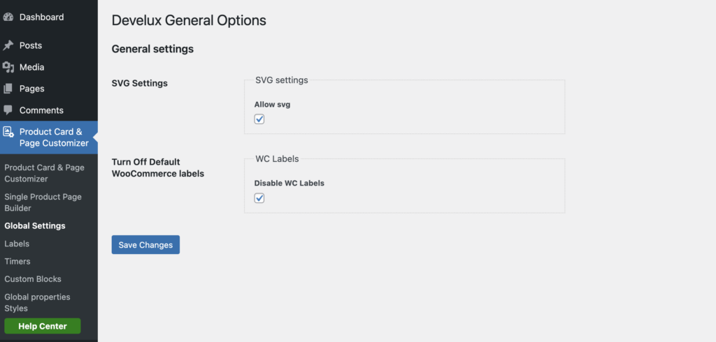
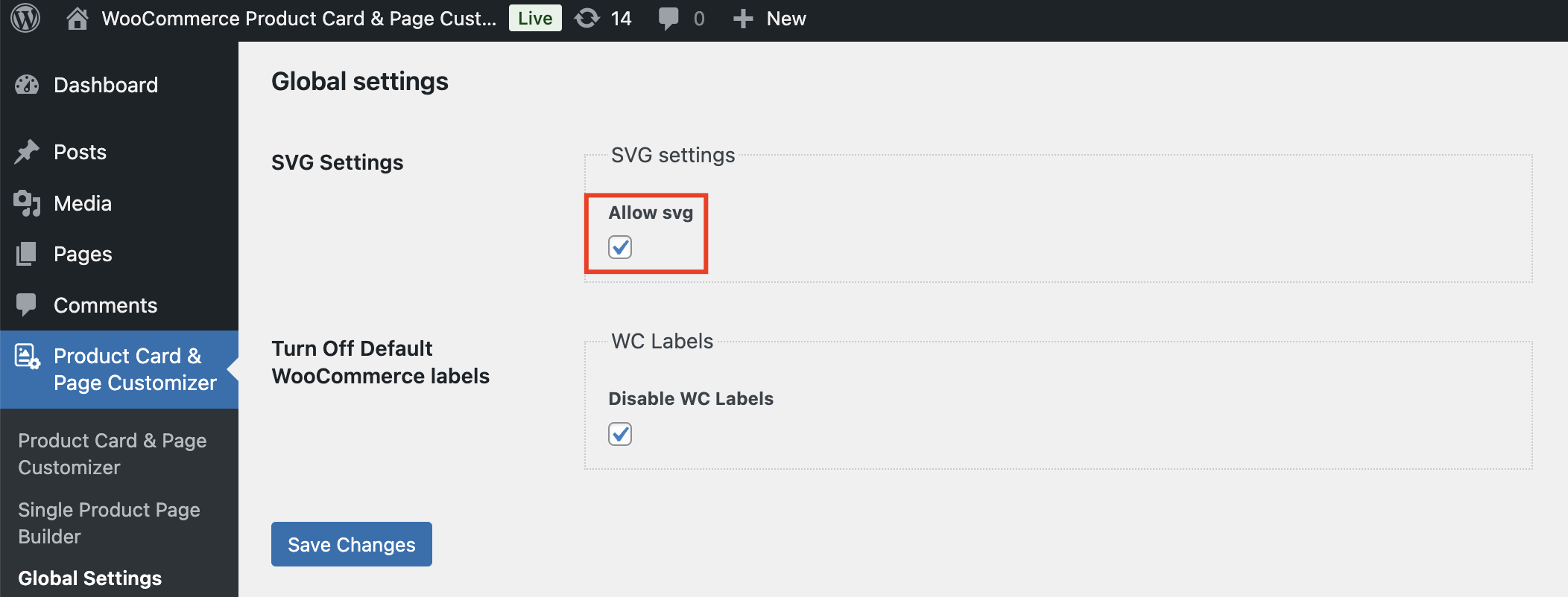
SVG Settings – Here you can enable support for working with svg files.
By default, support for this extension is disabled.
Default WC labels – here you can disable the standard labels that are displayed in most WooCommerce themes
Video instruction: Plugin global settings
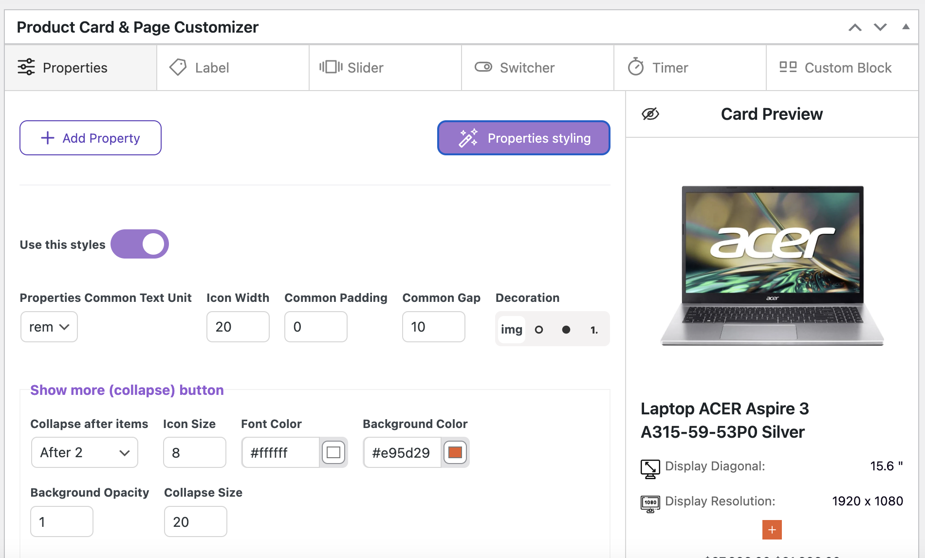
Global product properties settings #
On this page, you set the general styling for the product property list. These styles will be applied to all properties/lists that will be displayed on the product cards.
Common Fields
Text Size Unit refers to the units of measurement that will be used for the text size.
- rem – Relative to font-size of the root element
- em – Relative to the font-size of the element (2em means 2 times the size of the current font)
Icon Width – refers to the size of the icon that you can set for the product property lists. This icon is defined on the product creation page in the Product Card & Page Customizer metabox
Common Padding – the total internal space that is applied around the perimeter
Common Gap – the distance between the elements
Decoration – here you specify which decorative elements will be used for lists (pictures, circles or numbering)
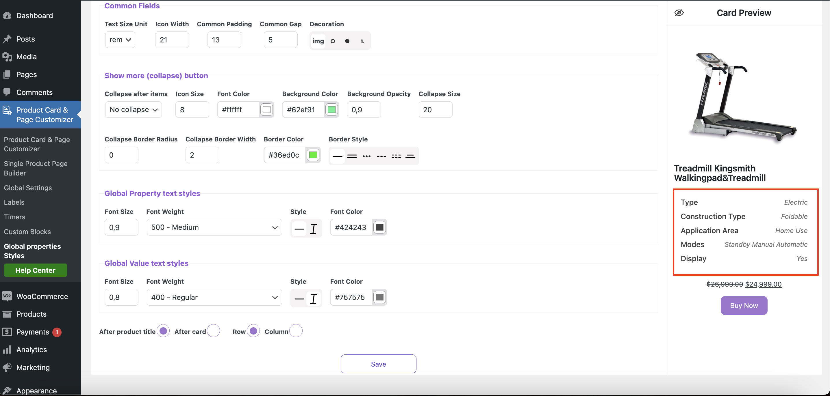
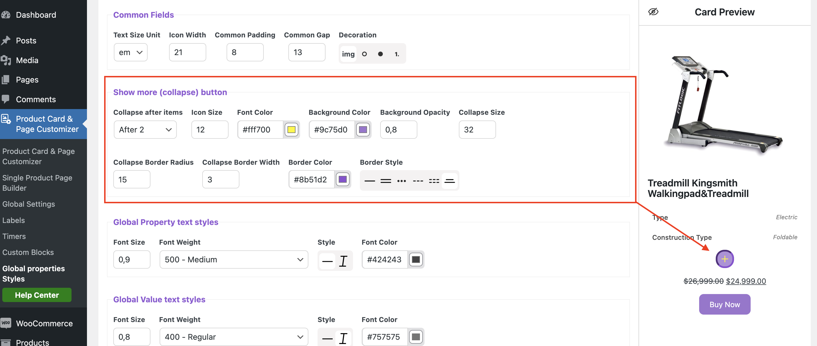
Show more (collapse) button
Collapse after items – here we specify whether we need a collapse and after which element
Icon Size – here we set the icon size
Font Color (icon color) – here we set the icon color
Background Color – here we set the background color for the button
Background Opacity – here we set the opacity for the button
Collapse Size – here we set the size for the button
Collapse Border Radius – here we set the radius for the button
Collapse Border Width – here we specify the thickness of the frame
Border Color – here we set the color for the border
Border Style – here we specify the frame style
Global Property text styles / Global Value text styles
Font Size – here we specify the text size (rem)
Font Weight – here we specify the text weight
Style – here we specify the text style (normal or italic)
Font Color – here we specify the text color
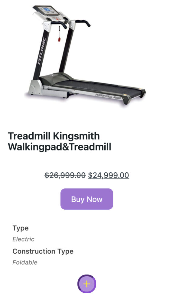
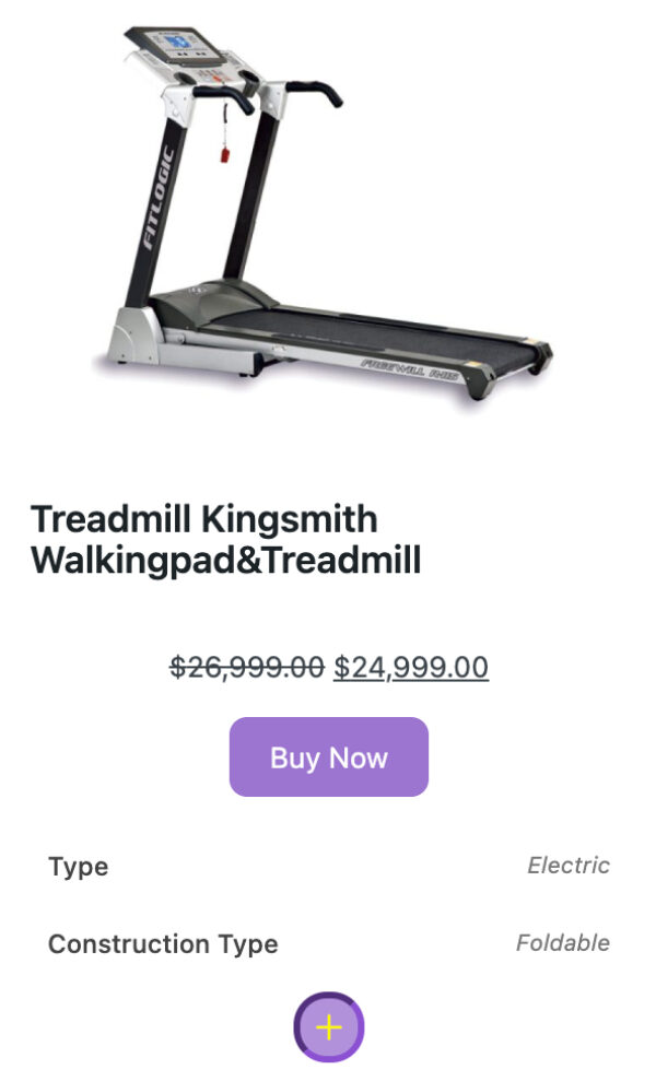
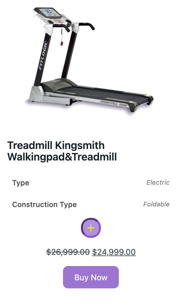
Positioning and orientation of the description of product properties

After product title – The description of the product properties will appear next after the product name
After card – A description of the product properties will appear at the bottom of the product card
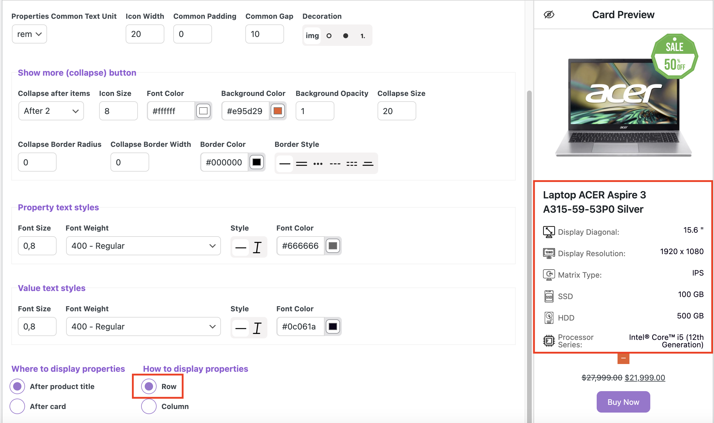
Row – the property name and its description will be aligned in one line
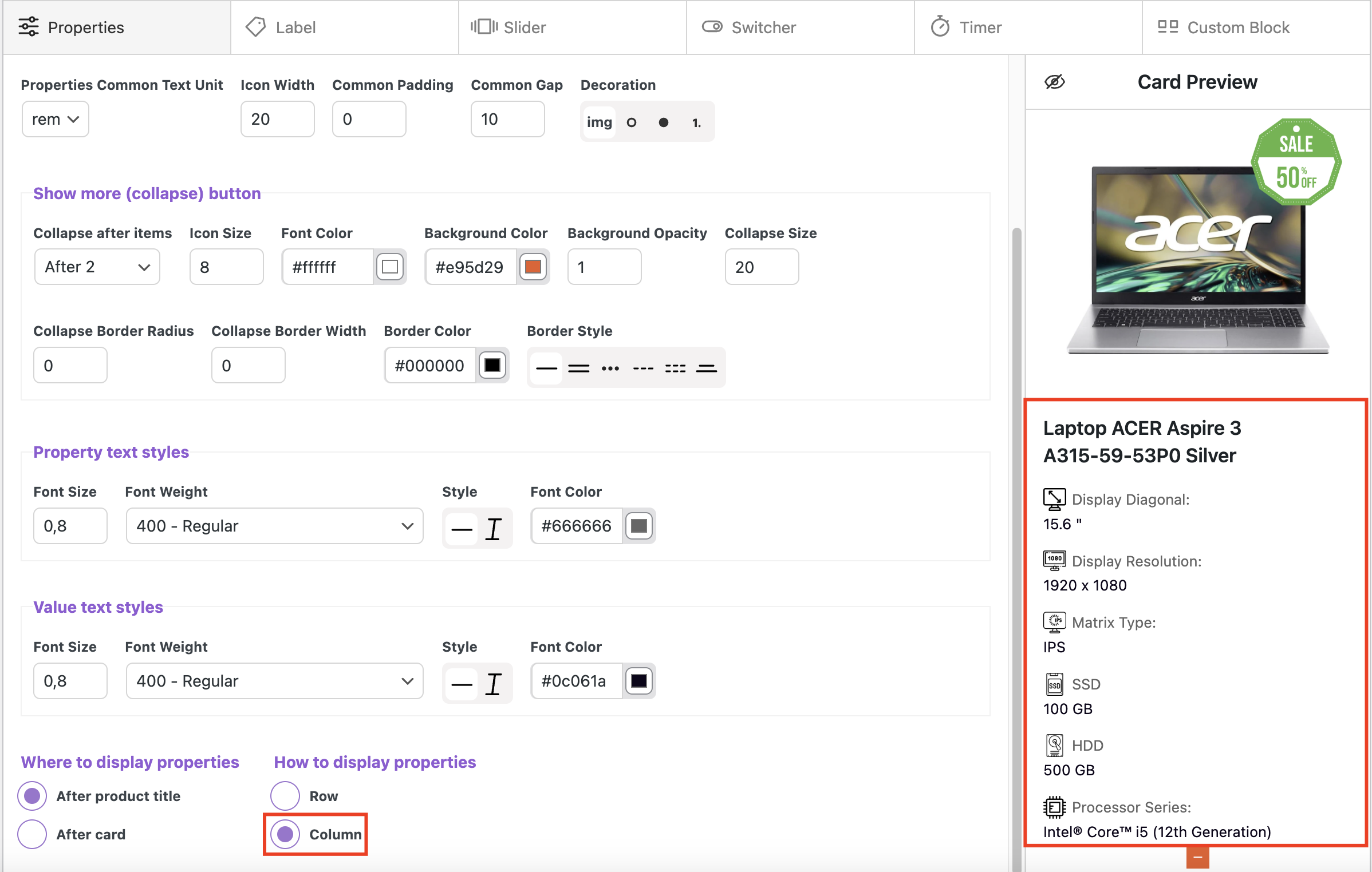
Column – the property name and its description will be aligned in one column (one by one)
Properties with column orientation
Properties after card
Properties after product title
Video instructions Global product properties settings
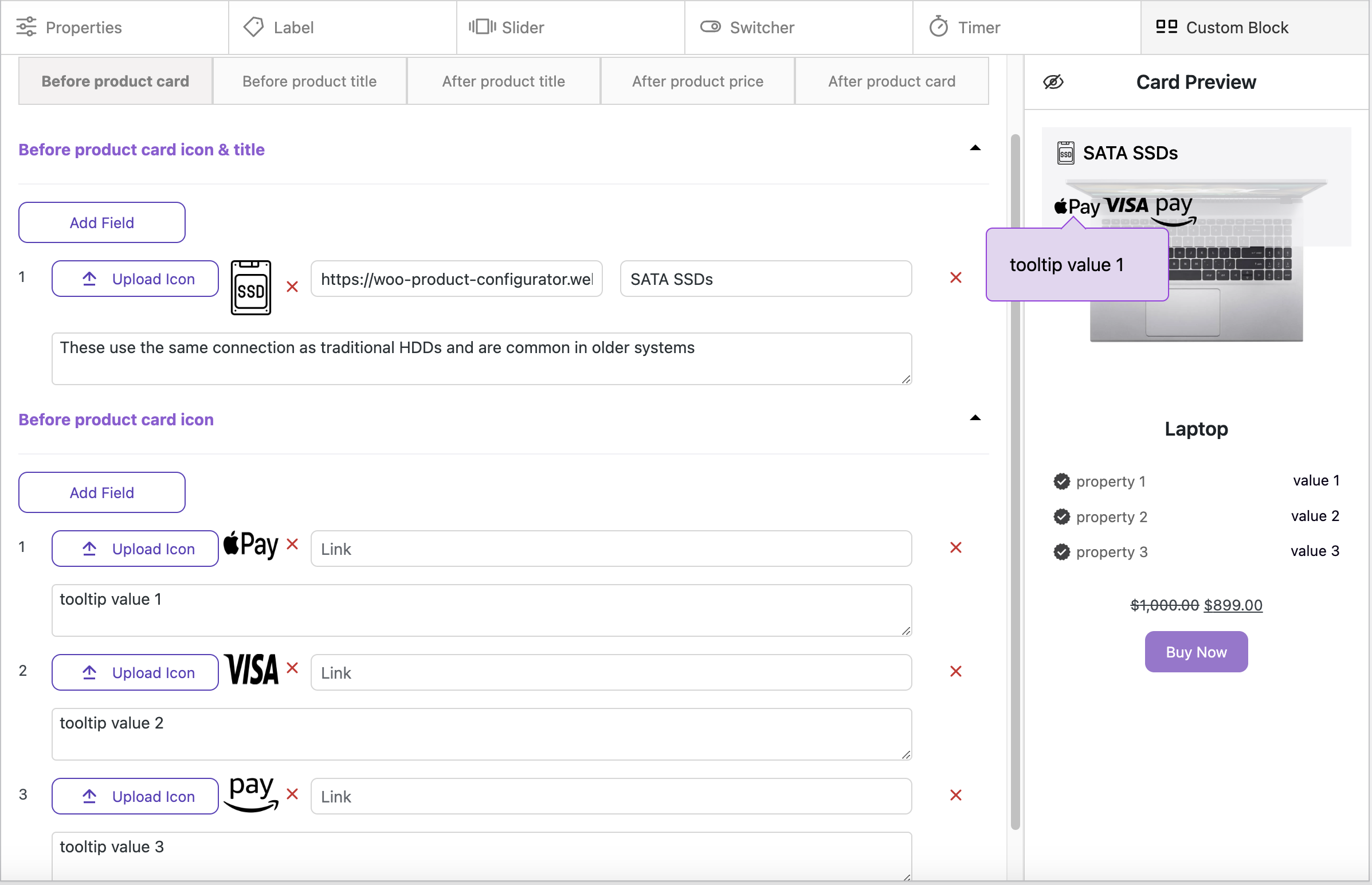
Functionality of the Meta Box, which is placed on the product creation page #
On the WooCommerce product creation page, our plugin provides an additional metabox where you can configure the following elements that will be applied to the product you are currently working on:
Creating and styling an additional description for a product #
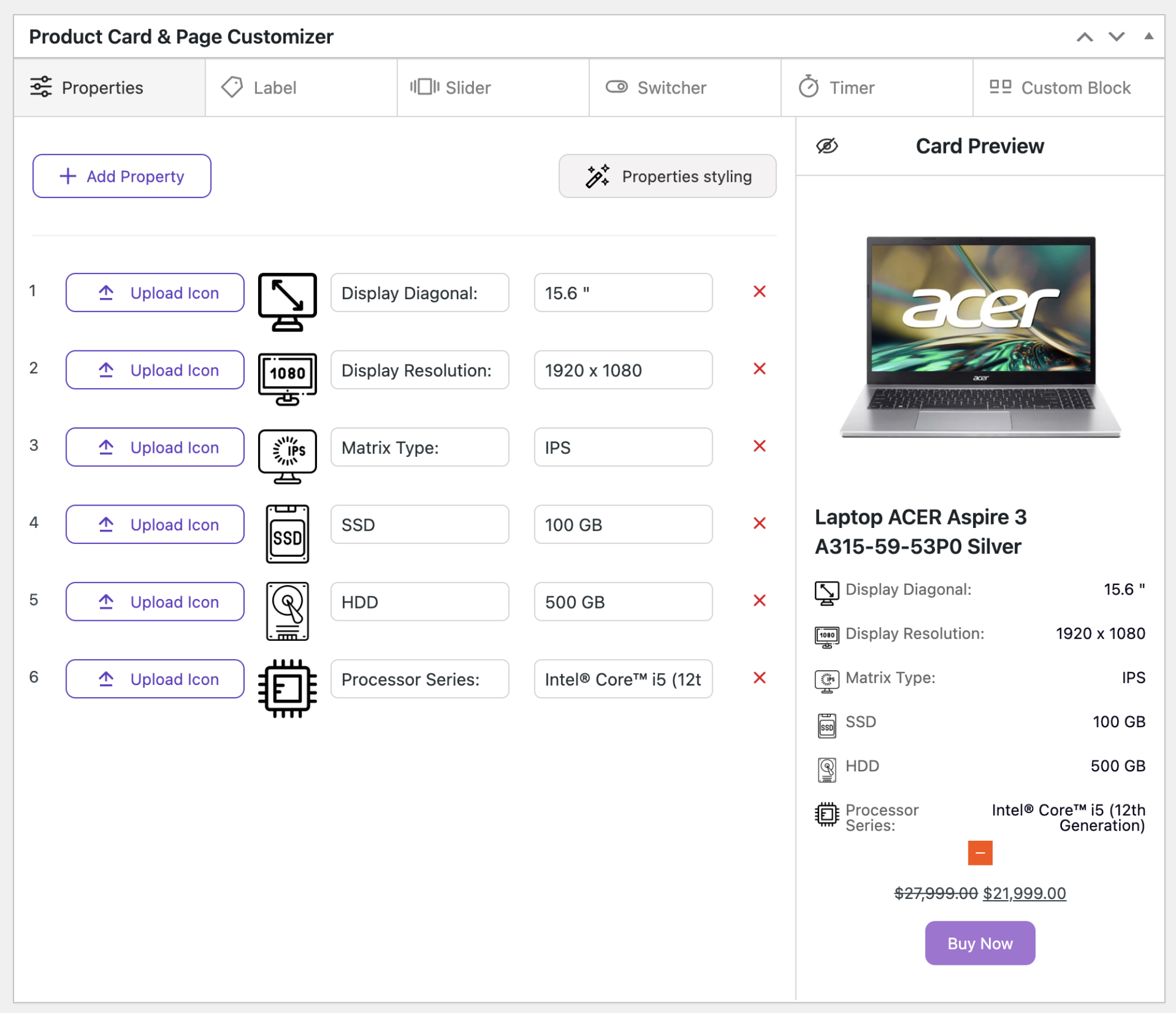
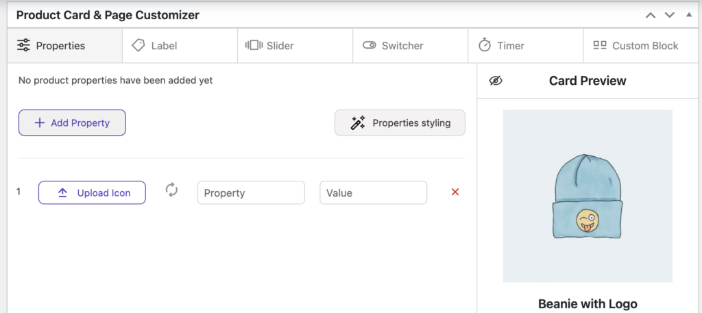
Using the Add Property button, you can create the necessary number of fields for the product properties.

Upload icon – used to add an icon for a property item
Property – a field for the property name
Value – a field for the property value
Stylization of product properties
To style product properties for a specific product, you need to go to “Properties styling” mode and click the “Use this styles” switch.
The styling tools are exactly the same as in the global settings (See the “Global properties Styles” section)
Video instruction Individual product properties settings
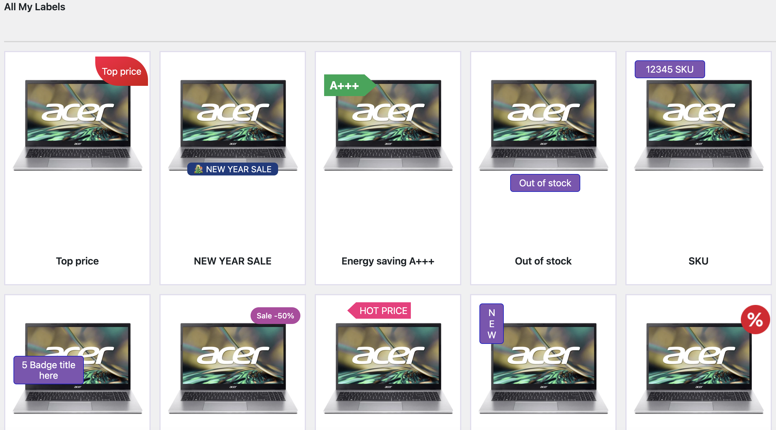
Creating and customizing/styling a unique label for a product #
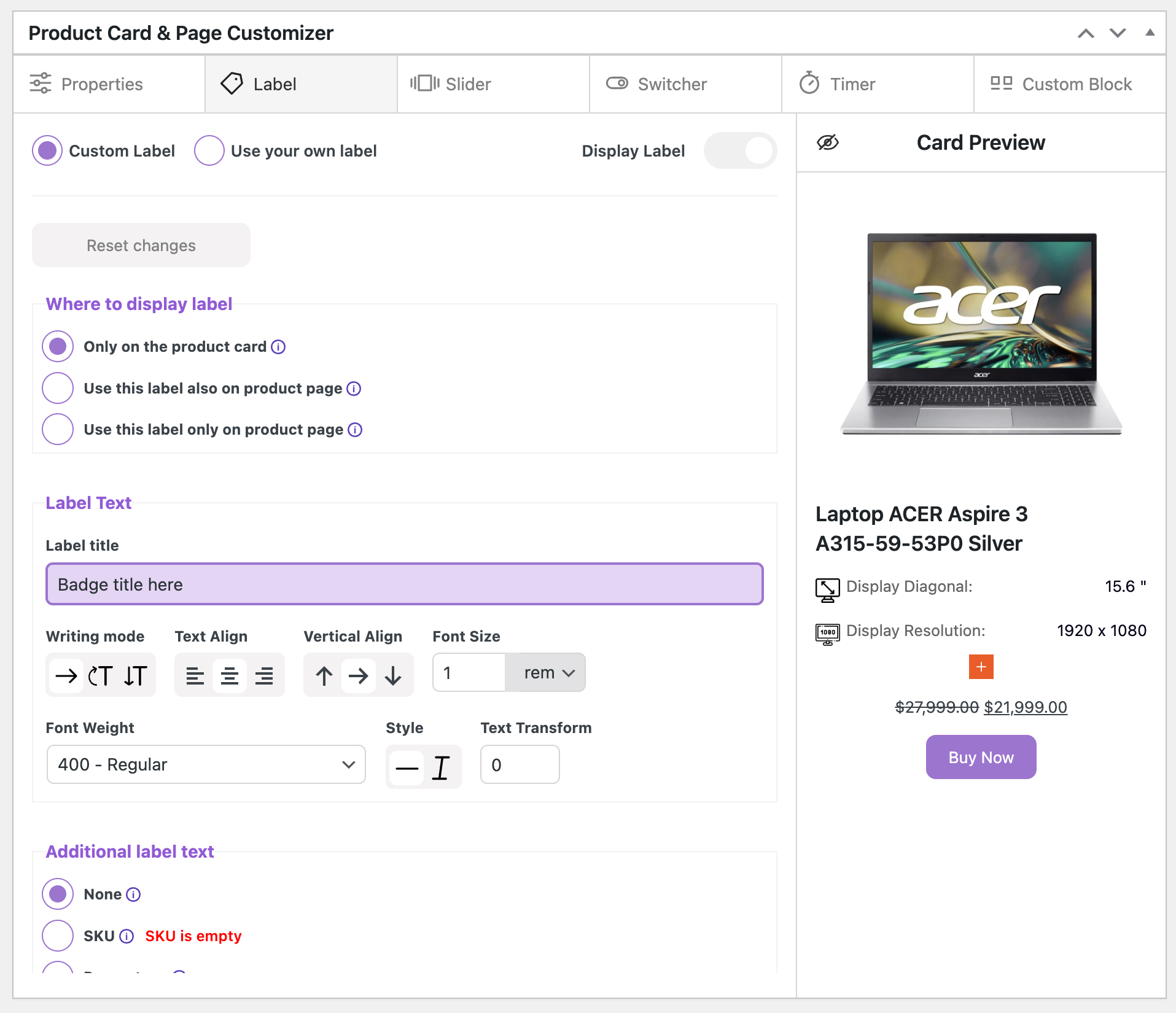
With our tools you can create two types of labels, custom and ready-made in these formats (jpeg/jpg, png, svg).
For the label to appear on the product card, it must be enabled using the “Display label” switch.
Custom label mode #
Where to display label list of options
Only on the product card – the label will be placed exclusively on the product card
Use this label also on product page – label will be placed on the card and product page
Use this label only on product page – the label will be placed exclusively on the product page
Label Text
Label title – field for entering text that will be placed in the label
Writing mode – Here we can change the text orientation
Text Align – you can align the text on the left, right and center
Vertical Align – You can align text along the top and bottom side as well as center.
Font Size – here we specify the text size (rem)
Font Weight – here we specify the text weight
Style – here we specify the text style (normal or italic)
Text Transform – here we can rotate the text inside the label
Additional label text
None – normal static label mode
SKU – a unique product code will appear on the label. Along with this code, you can use additional text that you write in the label title field
Percentage – the label will display the percentage of the discount for the product, if such a discount is set. Along with this code, you can use additional text that you write in the label title field
Out of Stock – in this mode the label will appear automatically when the product is out of stock.
This mode does not add any additional text inside the label, only the text you write will be used
Quantity – The available quantity of the product that you set in the store settings will appear on the label. Along with this code, you can use additional text that you enter in the label title field
Display before label text – the dynamic value will appear before the static text
Display after label text – the dynamic value will appear after the static text
Mono Color – a single color will be used for the text
Gradient – mode in which you can set a gradient (there are no text shadow tools available in this mode)
- Start color – initial color
- End color – final color
- Direction – the direction in which the gradient will be applied
Text Shadow
Shadow X / Shadow Y – the position of the shadow
Color – here you set the color for the shadow
Label Block Styles
Background mono Color – here you set the background color for the label
- Color – background color for the label
- Background Opacity – here you set the opacity for the label color
Background Gradient – here you set the gradient colors for the label
- Start color – initial color
- End color – final color
- Gradient Type – the direction in which the gradient will be applied
- Gradient Opacity – here you set the opacity for the label gradient
Label Width – here you set the width for the label (in pixels or percentage)
Label Height – here you set the height for the label (in pixels or percentage)
Padding X / Padding Y – internal space inside the label
Opacity – transparency of the entire label
Layer order – order of the element (used in cases where several labels or other elements are displayed on the product card)
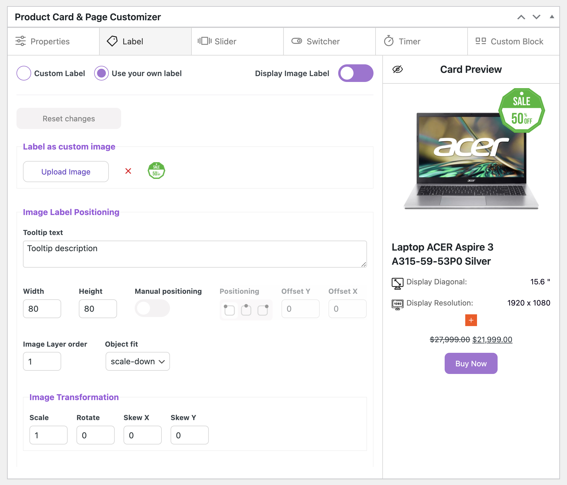
Transformation
Scale – Proportional label increase
Rotate – here we can rotate the label
Skew / Skew Y – Label skew in both directions
Positioning
This block configures the placement of the label on the product image. By default, the manual object dragging mode is activated.
Manual positioning
Position – here you choose the starting position of the label in relation to the product image
Offset Y / Offset X – additional properties for label positioning
General Border Styles
Border Color – here you set the color for the label frame
Radius – here you set the general rounding for the label
Width – thickness of the frame
Style – here you can choose a style for the frame
Custom Borders – in this mode you can separately style each side of the frame
Label Shadow
Shadow Color – here you set the color for the shadow
X / Y – here you set the shadow positioning
Dispersion – the density of the shadow
Opacity – here we set the opacity for the shadow
Label Icon Styles
Label Icon – here you can add an icon that will be placed in the inside of the label, next to the text you write
Icon width – here you set the icon size
Margin Top – here you set the icon position
Before text / After text – here you choose the placement of the label in relation to the text
Label Tooltip Text – This is a text tooltip that appears when you hover over a label. It is not a mandatory element and will appear when the required text is written.
Tooltip text – a field for entering the text of a hint
Text Align – you can align the text on the left, right and center
Font Size – here we specify the text size (rem, em)
Font Weight – here we specify the text weight
Style – here we specify the text style (normal or italic)
Color – here we specify the text color
Background – here you set the background color for the tooltip
Opacity – here you set the opacity color for the tooltip
Width – here you set the width color for the tooltip, height is set automatically
Padding – the total internal space that is applied around the perimeter
Border Color – Border Color – here we set the color for the frame
Border Width – here we specify the thickness of the frame
Border Style – here we specify the frame style
Border Radius – here we set the radius for the tooltip
Shadow X / Shadow Y – the position of the shadow
Shadow Dispersion – the density of the shadow
Shadow Opacity – here you set the transparency for the shadow
Shadow Color – here you set the color for the shadow
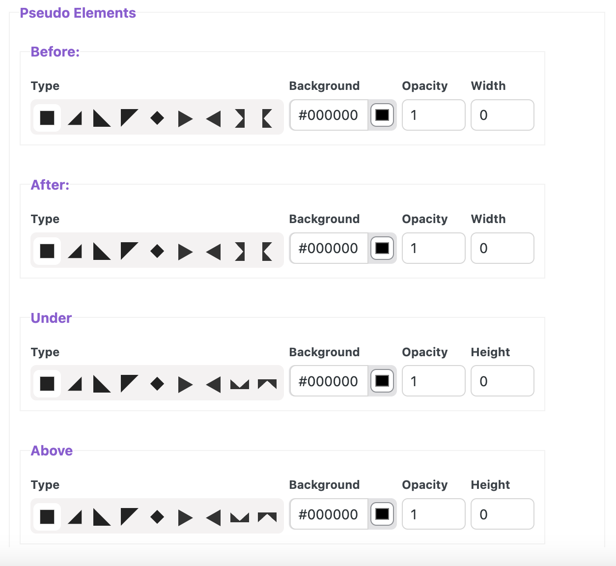
Pseudo Elements – here you can set and customize decorative elements for the label
Use your own label
Video instruction Creating custom label
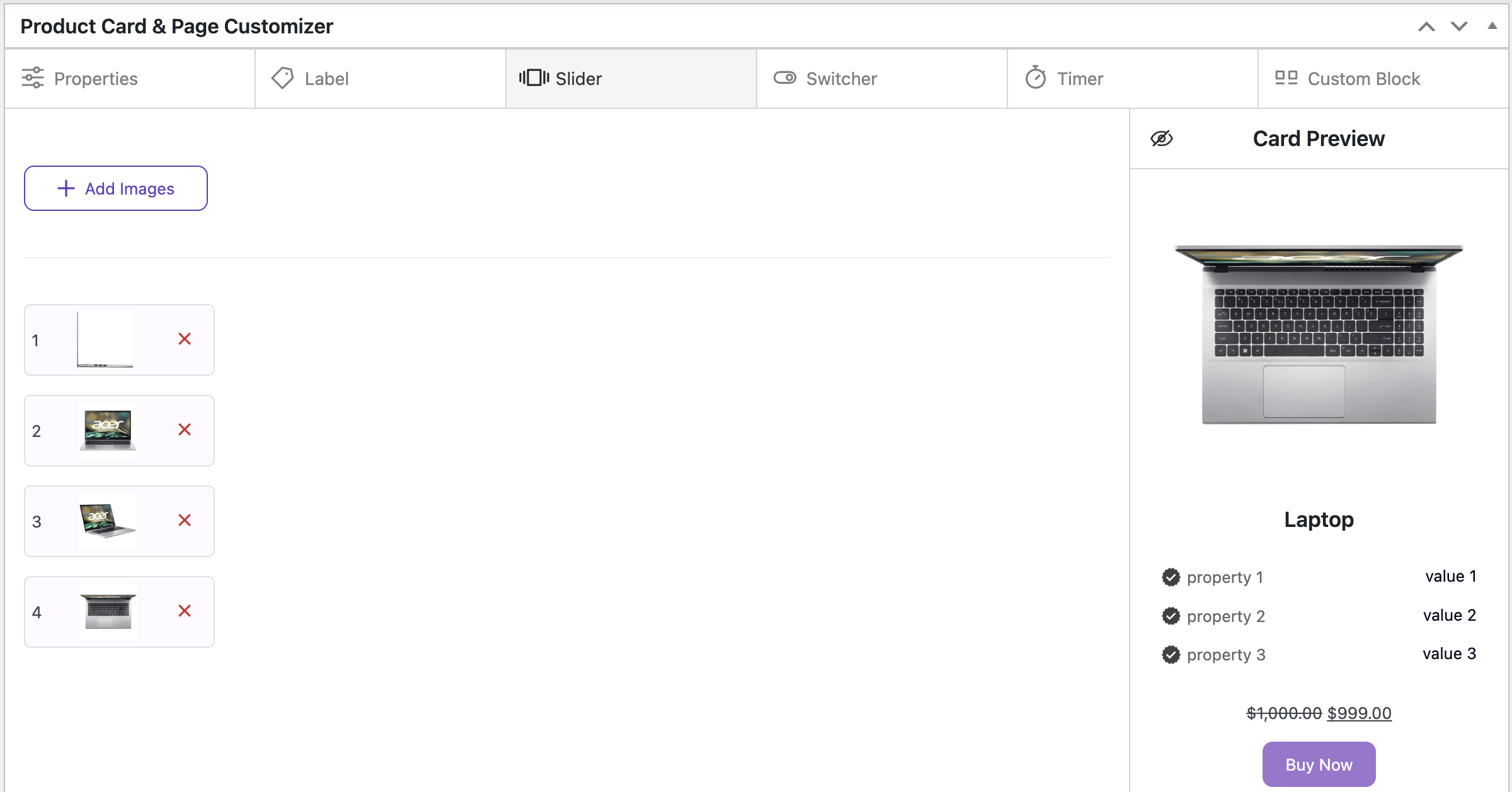
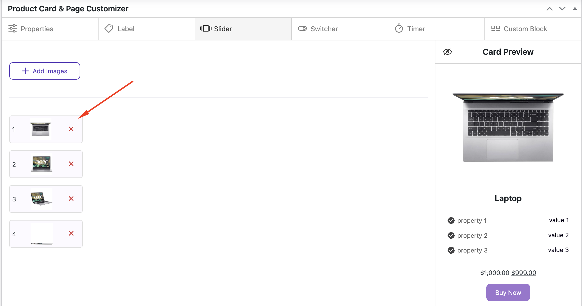
Working with the Slider #
Adding images for the slider that will be displayed in this product. Important! The slider will only be displayed on custom cards, regular product cards will not show this slider. This is the responsibility of the theme you have installed
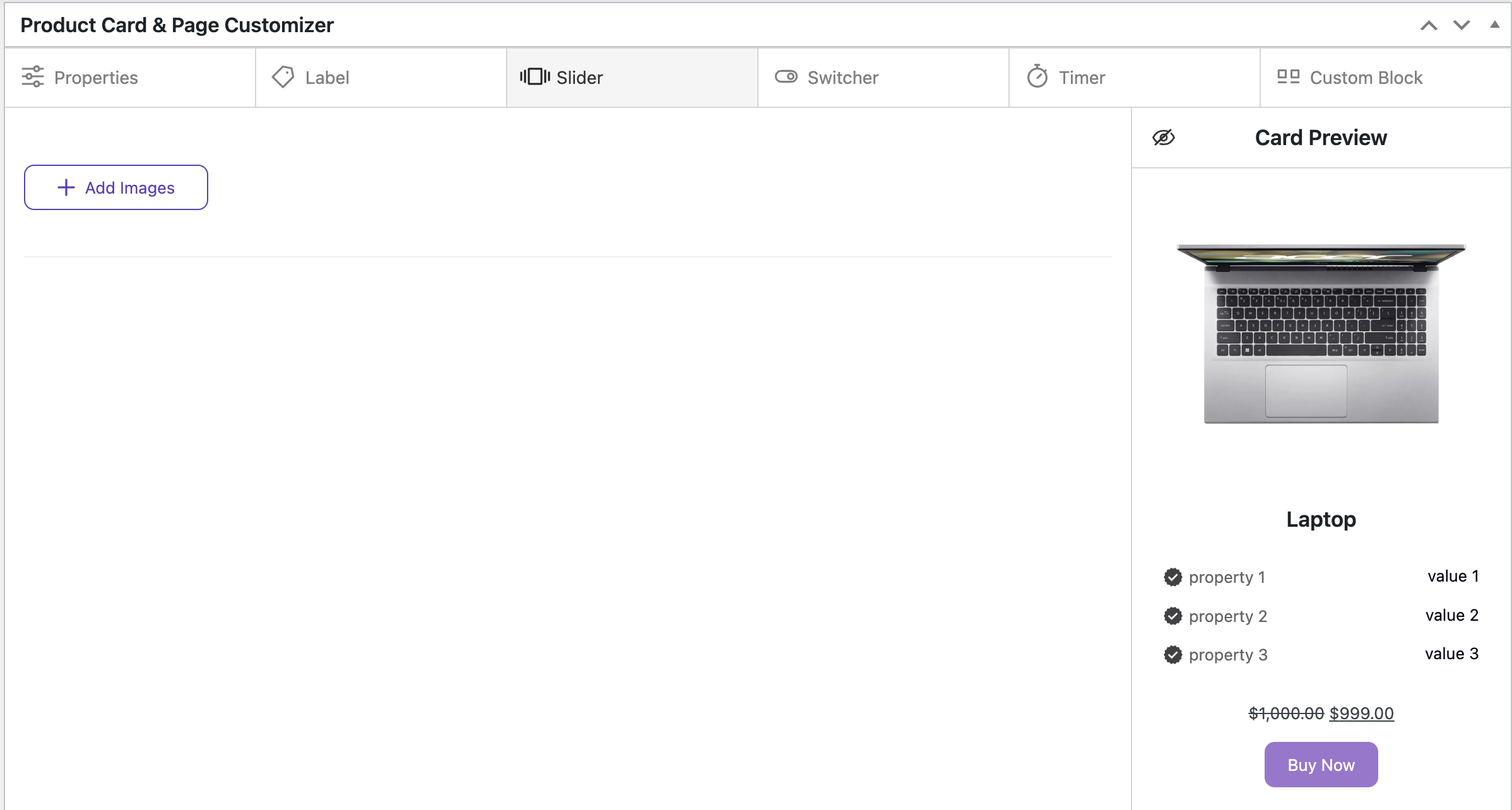
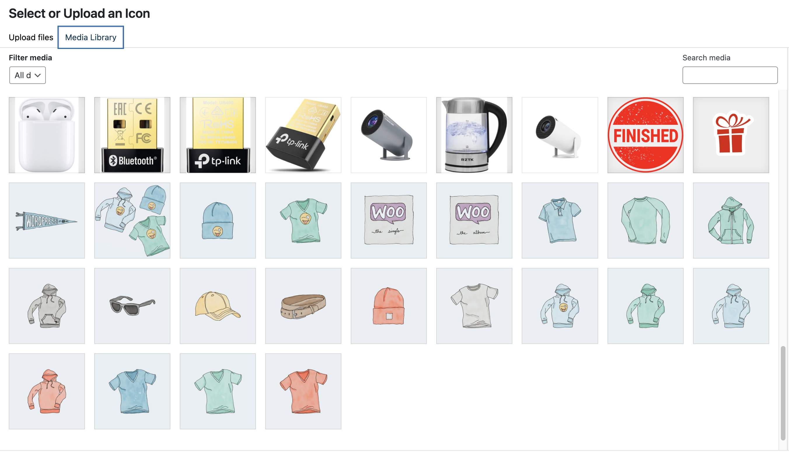
Click the ‘Add Image’ button and select the required images from the Media Library, or upload the images from your computer
If you need to change the order of the added images, simply drag and drop the image to the desired position
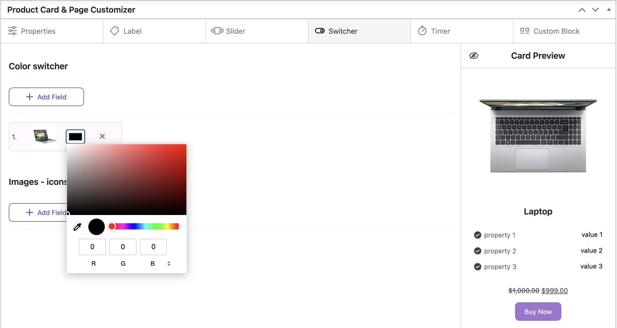
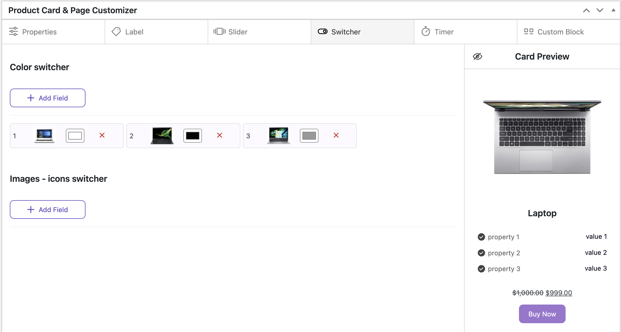
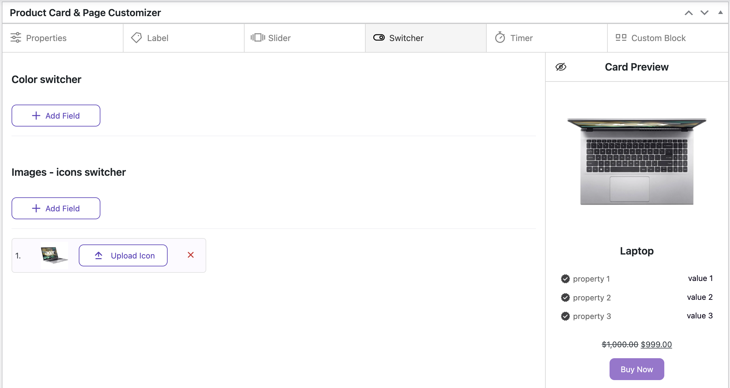
Working with the Color Switcher/ Color Image #
In this tab, you can work with the product colors and product images

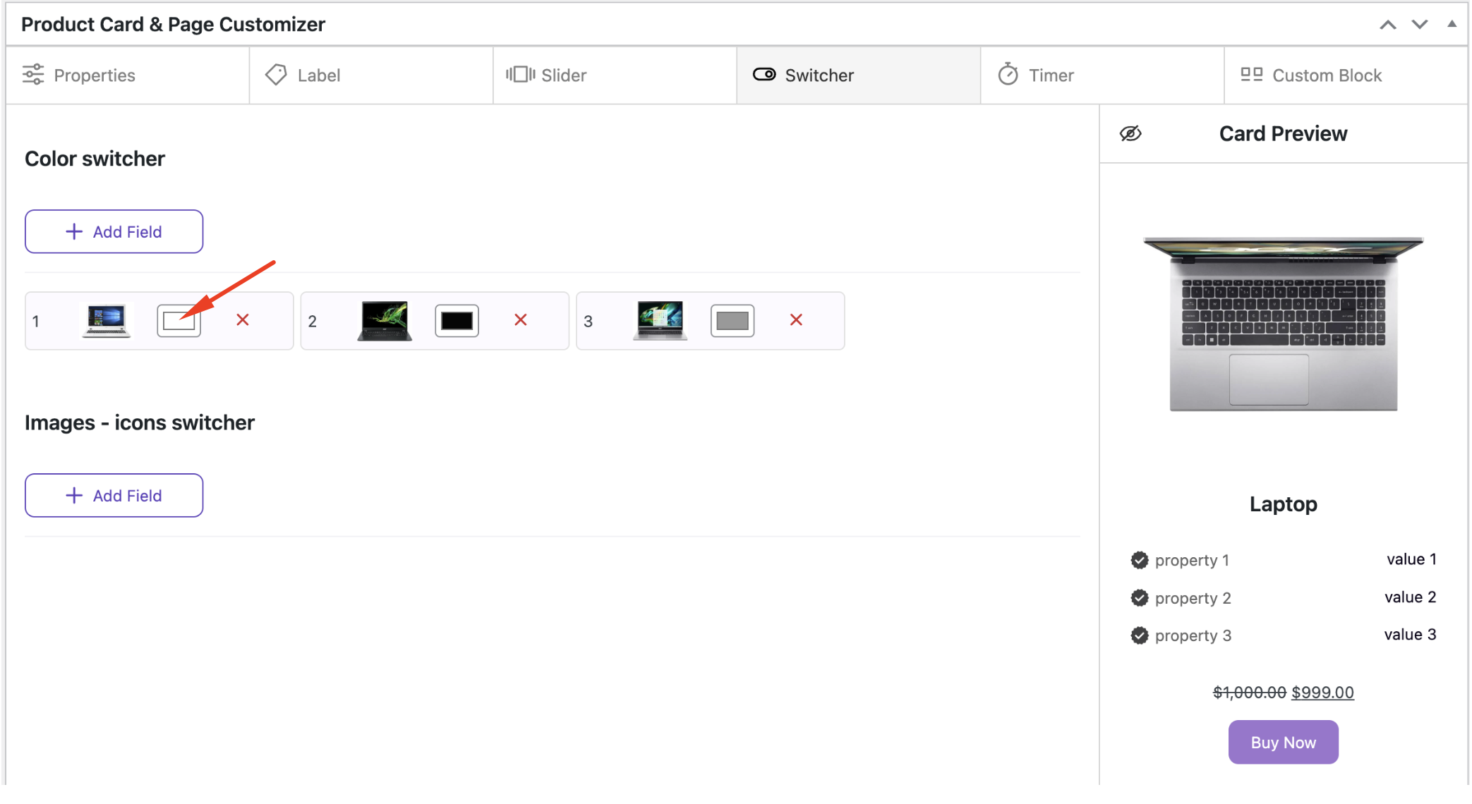
To set the Color Switcher, click the ‘Add Field’ button and select the required images from the Media Library, or upload the images from your computer
Click on the color image and select the desired color
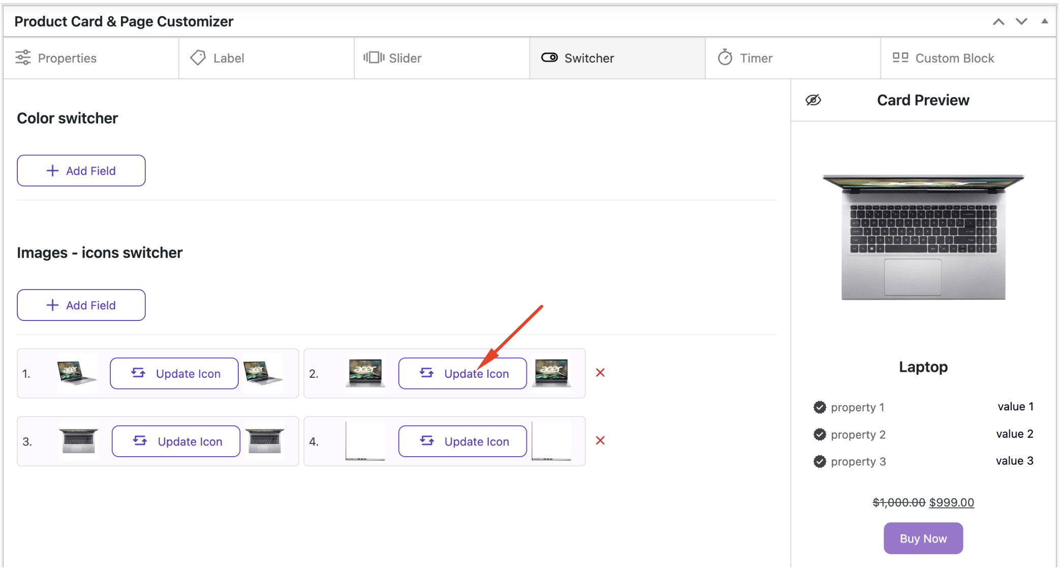
To set the Image Switcher, click the ‘Add Field’ button and select the required images from the Media Library, or upload the images from your computer. Then, click the ‘Upload Icon’ button and choose the desired image
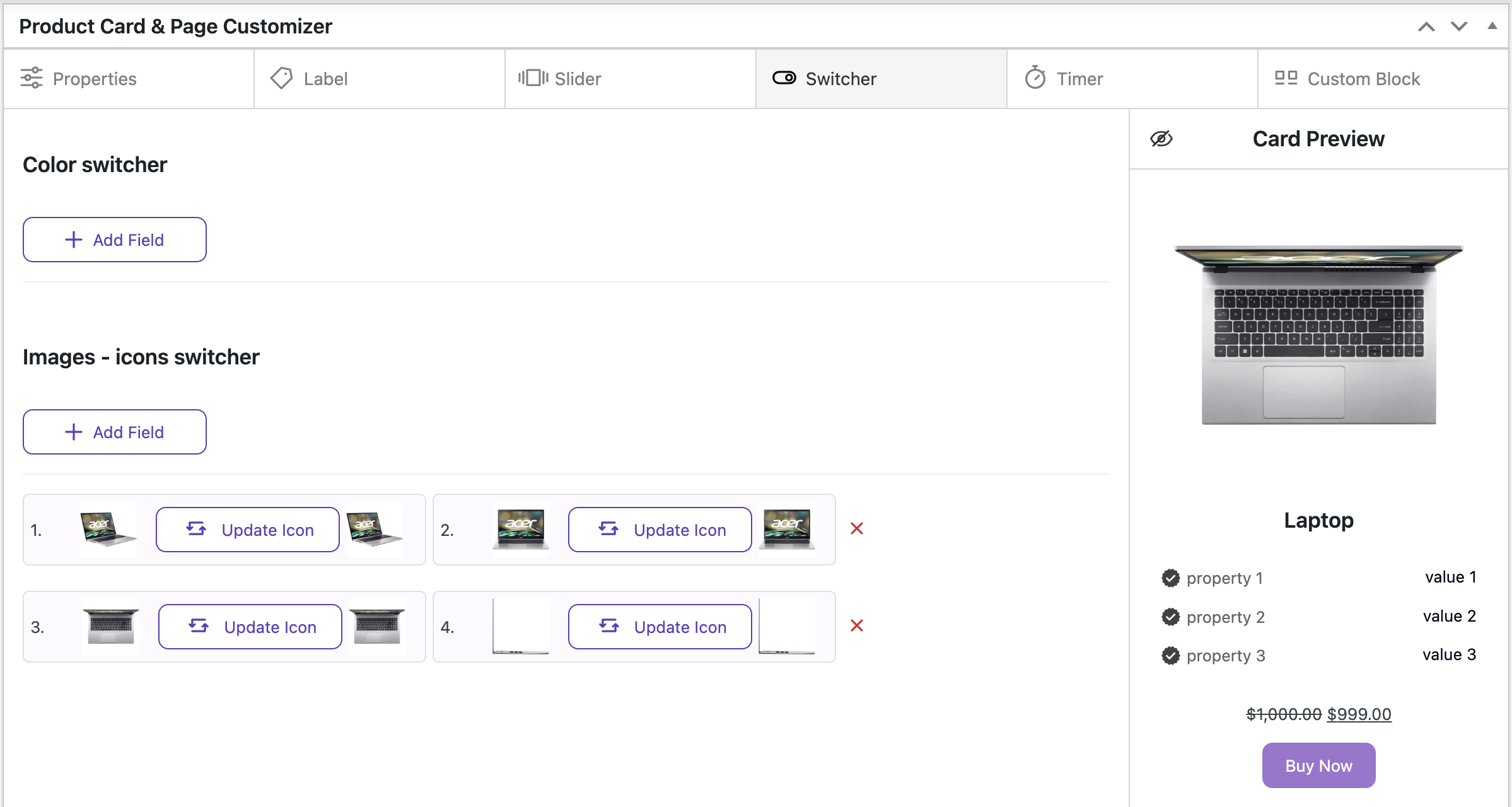
If you need to change the order of the added images, simply drag and drop the image to the desired position
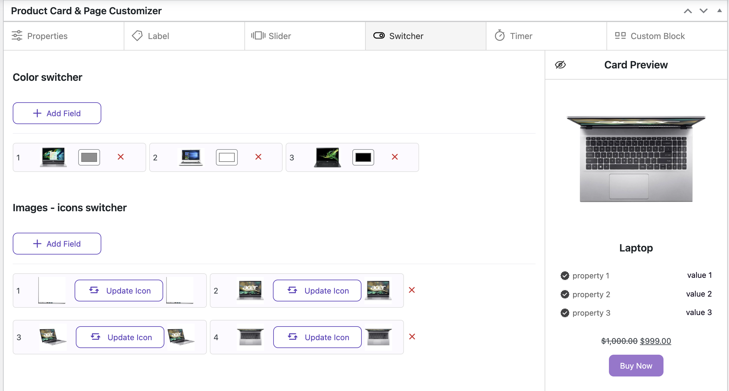
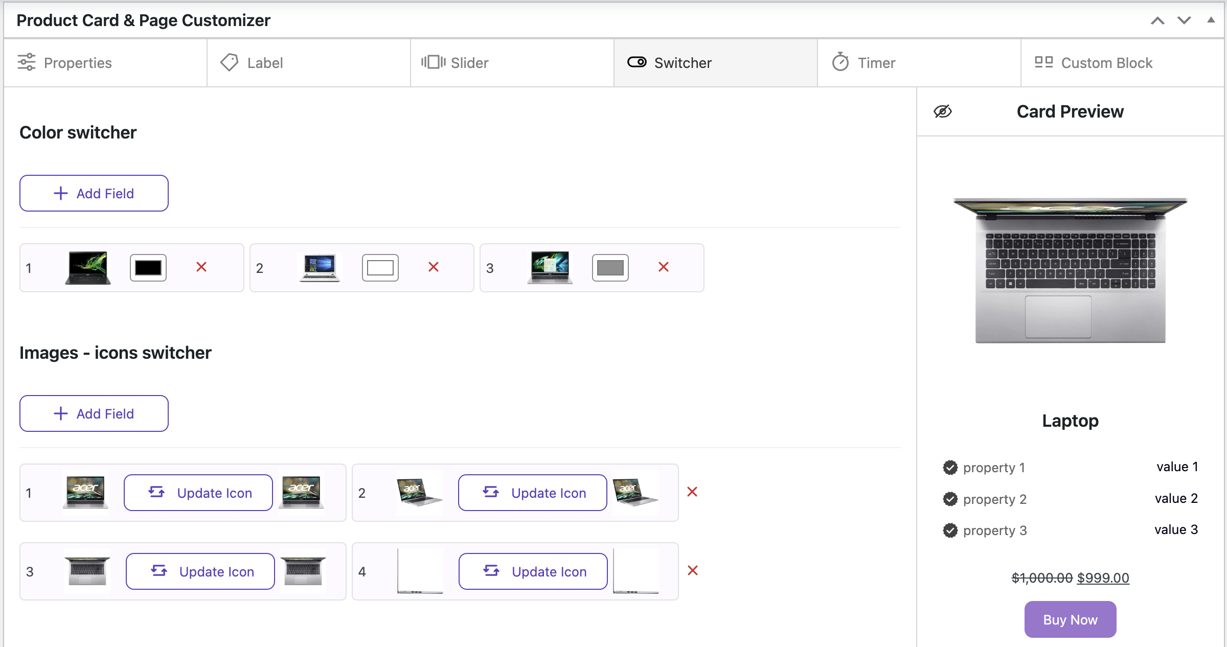
If you need to change the color in the color switcher, click the color image and select a new one
If you need to change the image in the image switcher, click the ‘Update Icon’ button and select a new one
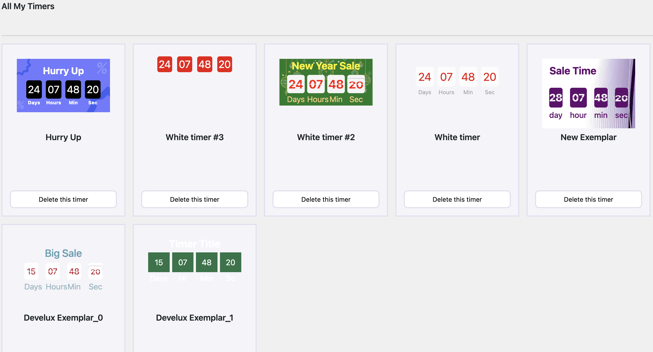
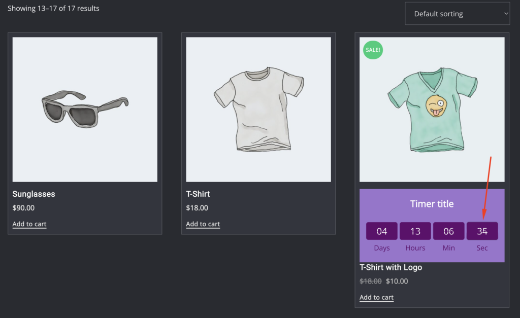
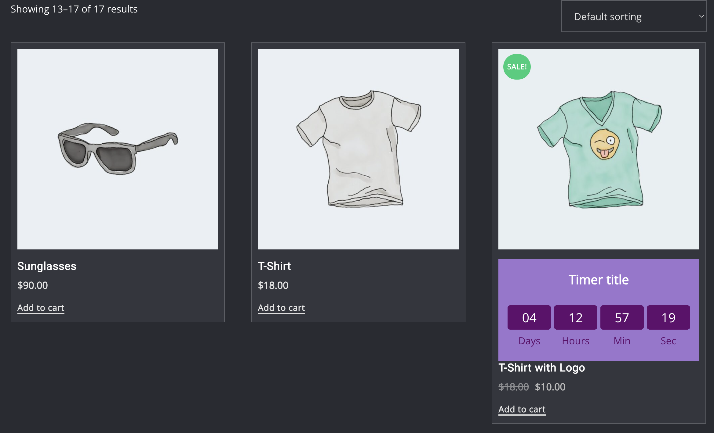
Creating and customizing/styling a unique timer for a product #
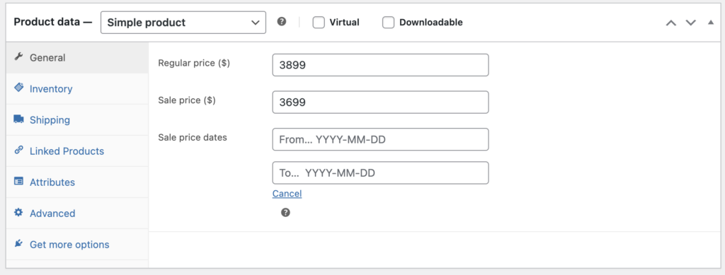
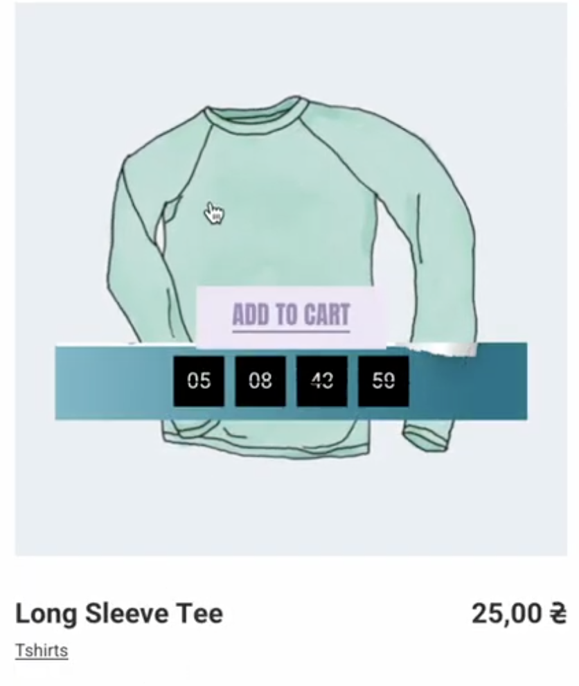
The timer is used for the countdown until the discount ends
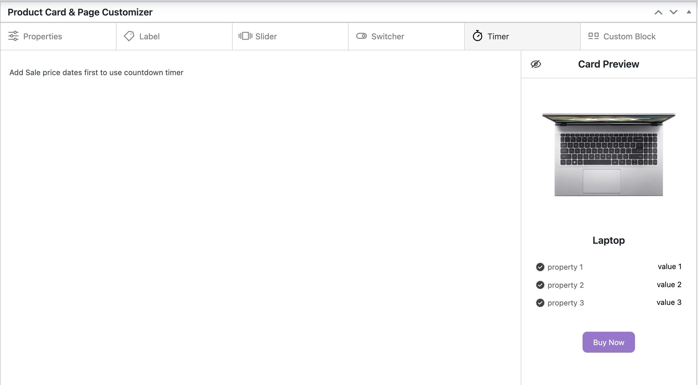
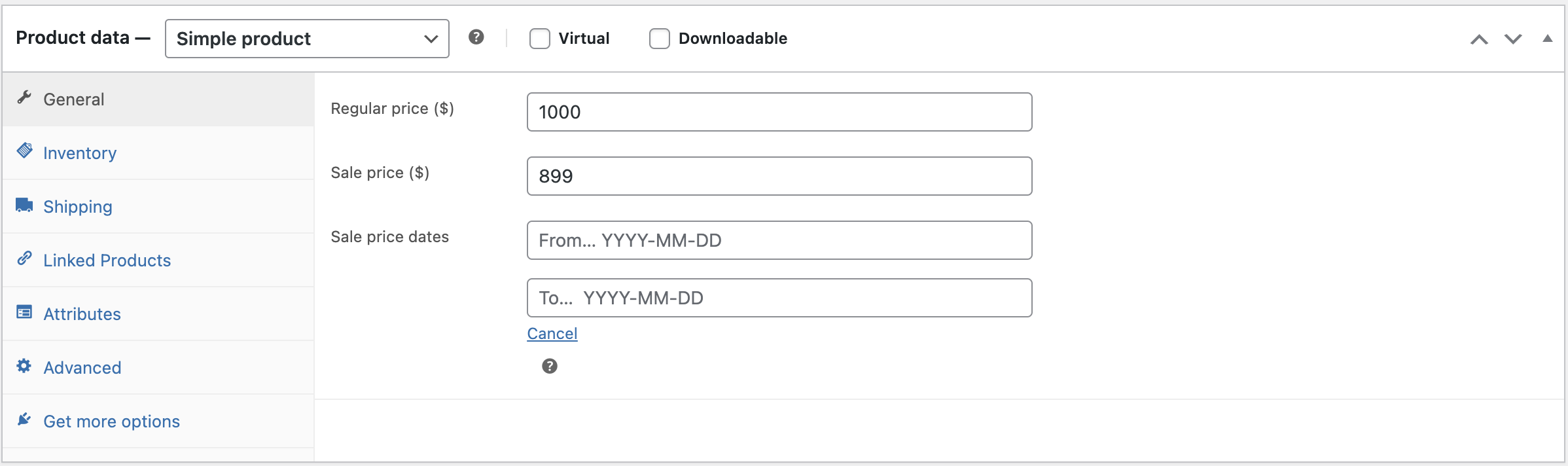
At first, add Regular, Sale prices, and Sale price dates in the schedule
After completing these steps, click the ‘Update’ button and go to the Timer tab. All settings will be activated
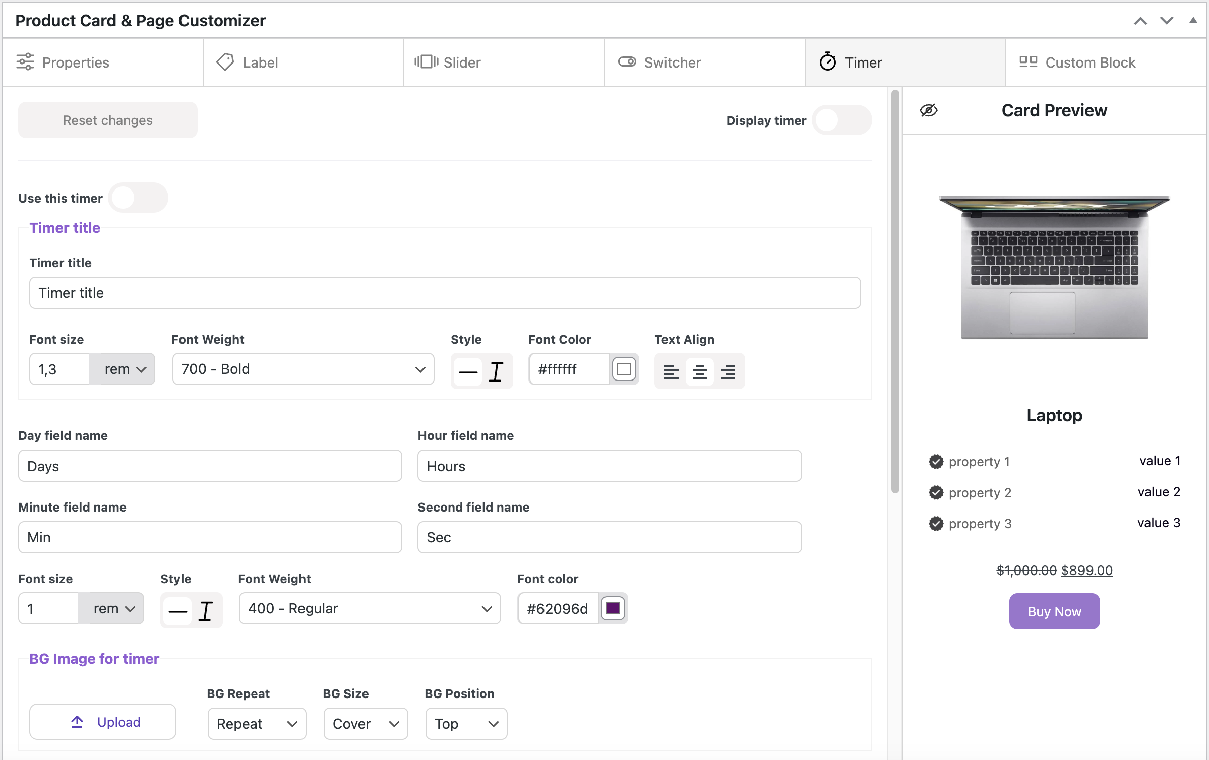
Turn on the ‘Display timer’ toggle, and the default timer will appear
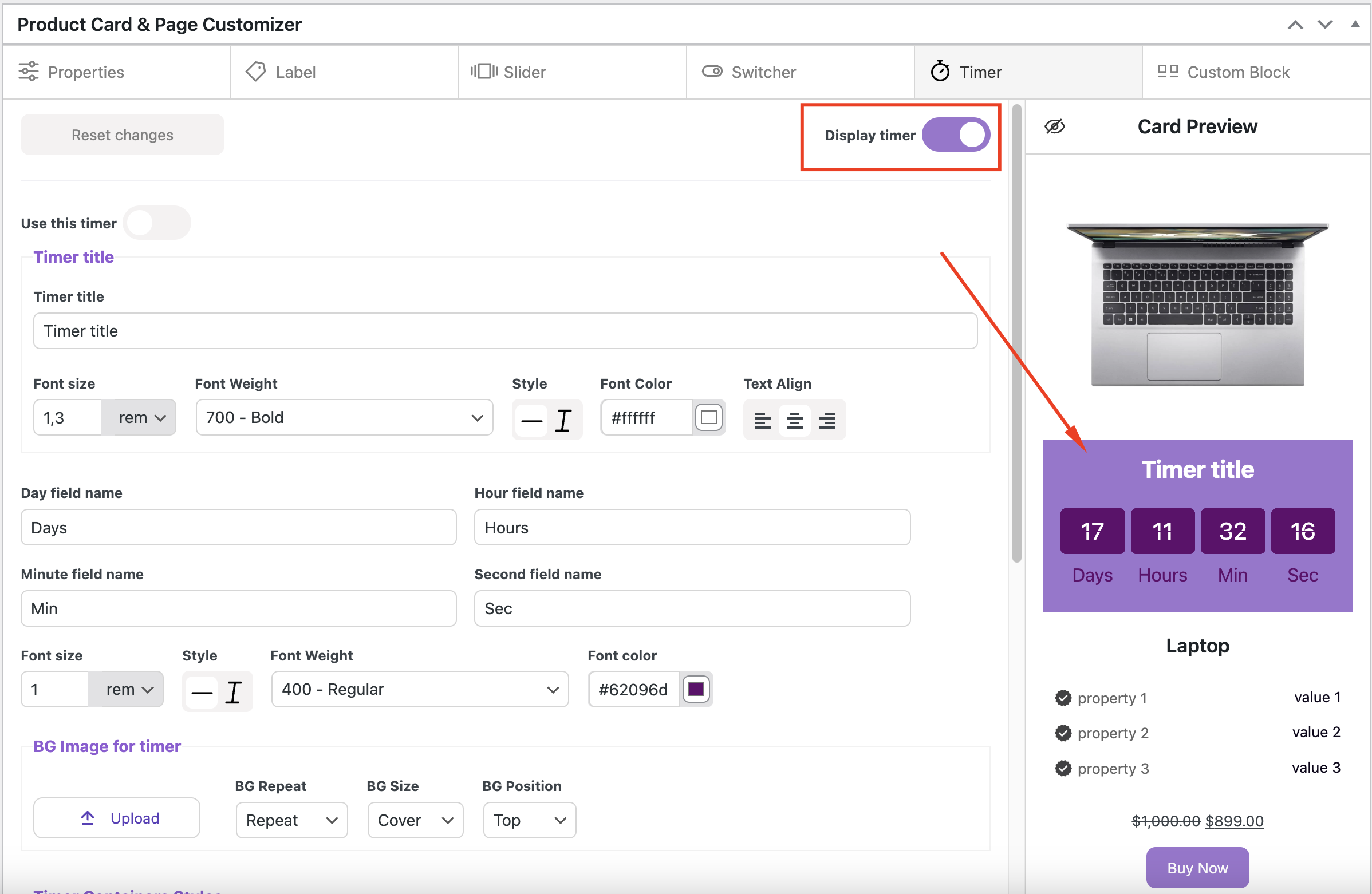
If you want to create your own timer, turn on ‘Use this timer’ toggle
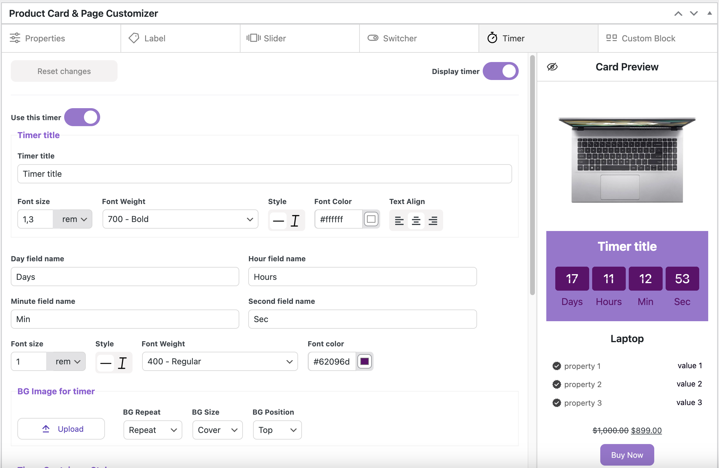
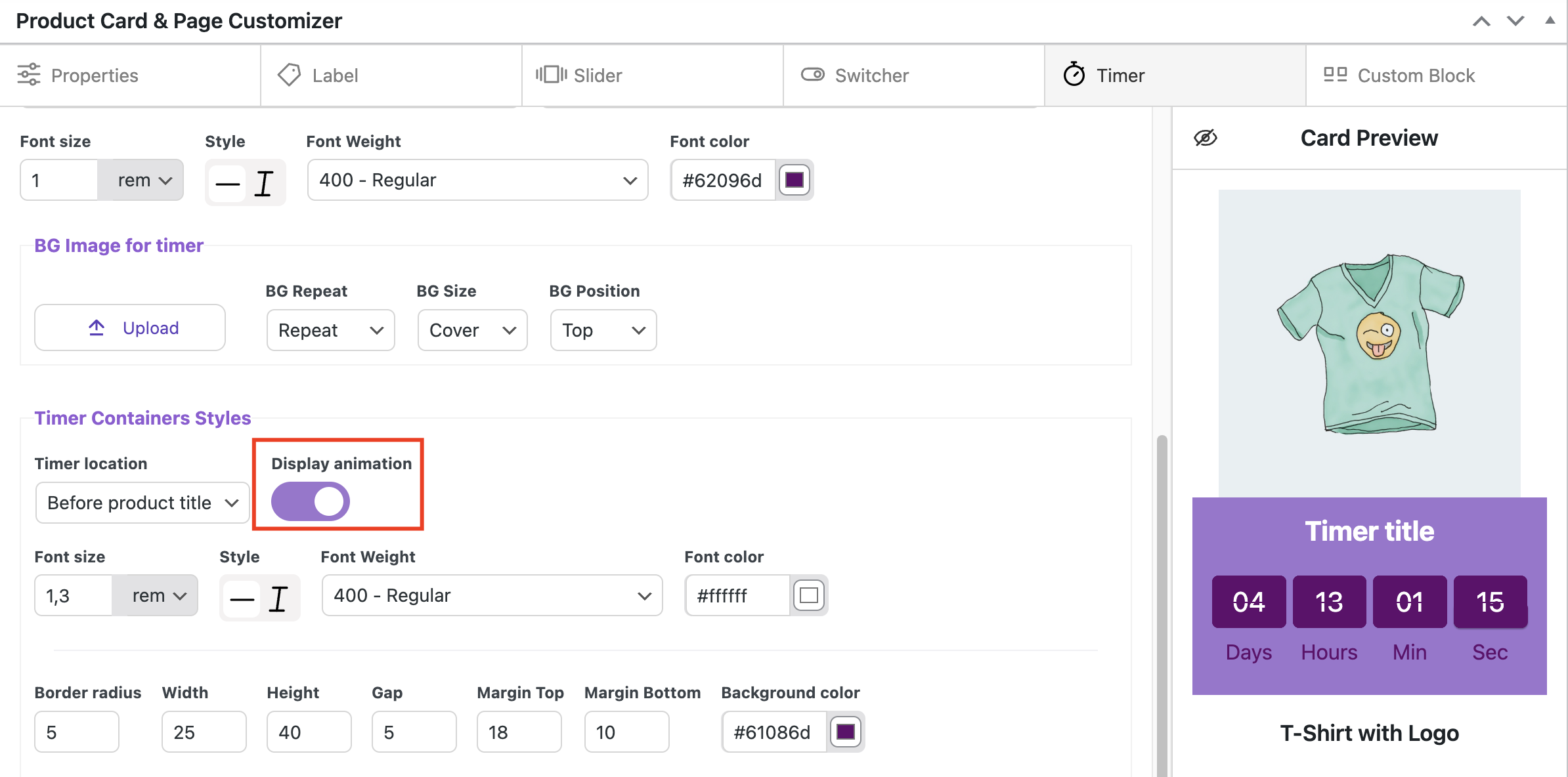
Timer title
Timer title – field for inserting the title for the timer
Font size – sets the font size for the timer title
Font Weight – sets the text weight for the timer title
Style – sets the text style for the timer title
Font Color – sets the text font color
Text Align – align the text on the left, right, or center
Day field name / Hour field name / Minute field name / Second field name – fields for inserting the names of day, hour, minute, and second. These can also be left empty
BG Image for timer
Upload button – allows to upload the image for timer background
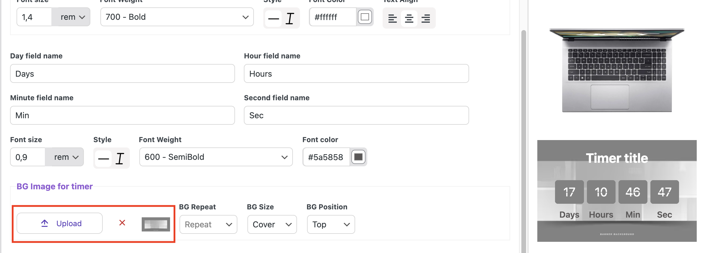
BG Repeat option controls whether the background image repeats. You can choose from the following options:
- Repeat – background image will repeat both horizontally and vertically
- No repeat – background image will not repeat
BG Size specifies how the background image is scaled. It can be set to:
- Cover – background image will cover the entire container, scaling up or down as needed to fill the space while maintaining its aspect ratio
- Contain – background image will scale to fit the container, ensuring the entire image is visible without cropping, while maintaining its aspect ratio
- Revert – resets the background size to its default or original setting, undoing any custom adjustments made previously
BG Position specifies the placement of the background image relative to the container’s edges. Common values for BG Position include:
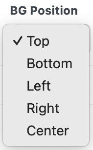
- Top – aligns the image to the top of the container
- Bottom – aligns the image to the bottom of the container
- Left – aligns the image to the left side of the container
- Right – aligns the image to the right side of the container
- Center – aligns the image to the center of the container
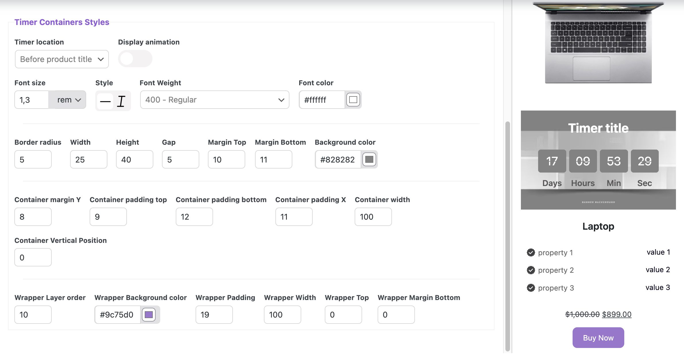
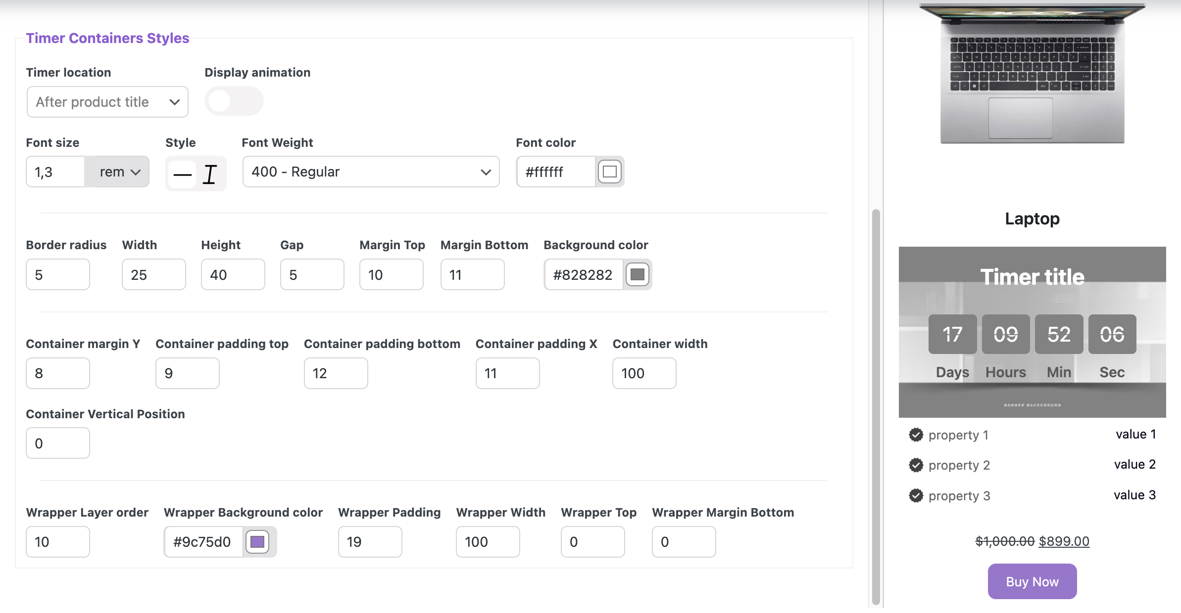
Timer Containers Styles
Timer location specifies the placement of the timer on the card. It can be set to:
Before product card
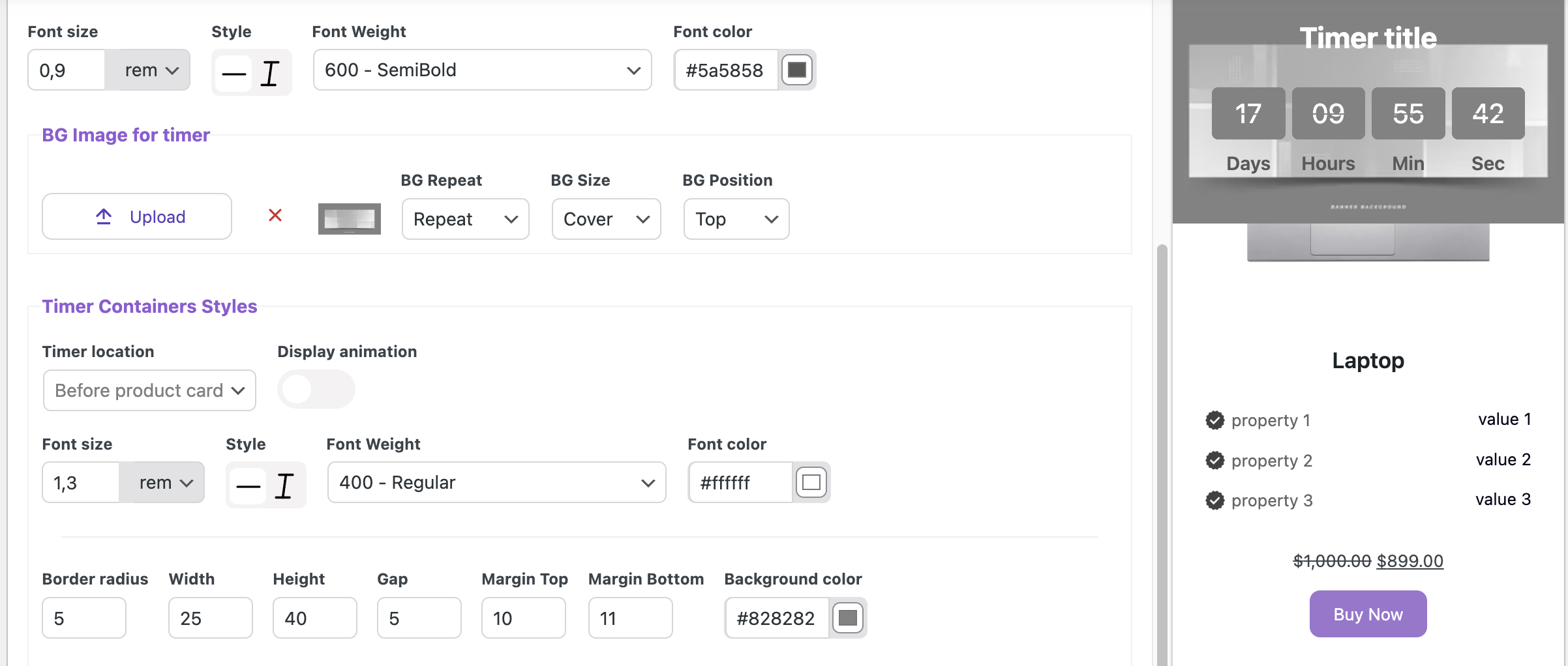
After product card
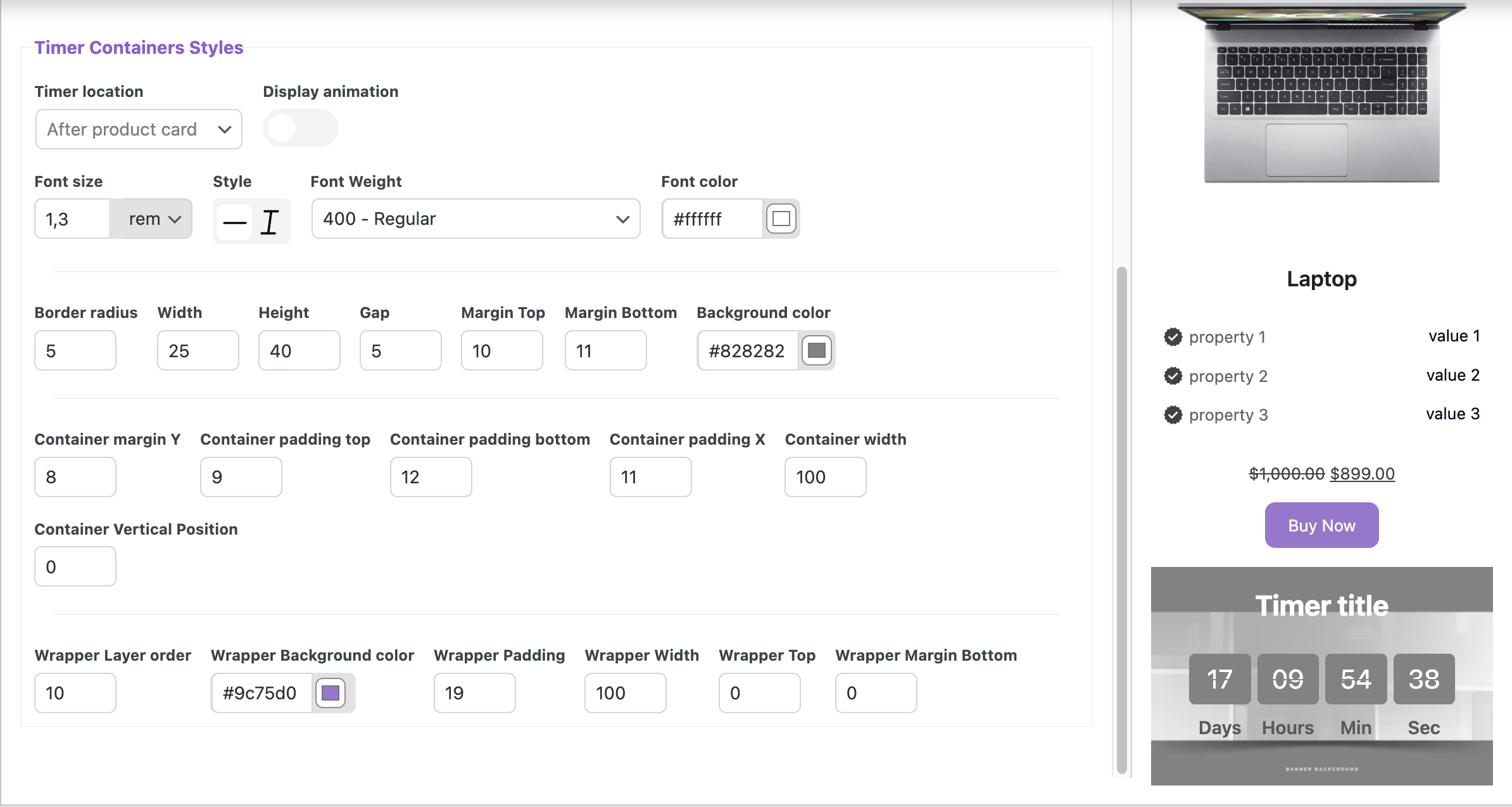
Before product title
After product title
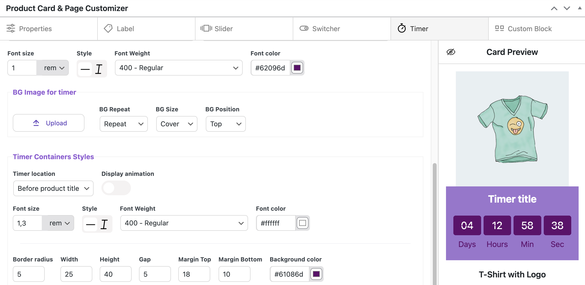
Turn on ‘Display animation‘ allows the timer to animate its countdown. It is displayed only in the square for seconds.
Font size – sets the size for the timer numbers
Style – sets the style for the timer numbers
Font Weight – sets the text weight for the timer numbers
Font Color – sets the number color
Border radius – sets the roundness of the number’s square corners
Width – sets the width of the number’s squares
Height – sets the height of the number’s squares
Gap – sets the space between the number’s squares
Margin Top – sets the outer space between the container top and the number’s squares
Margin Bottom – sets the outer space between the number’s squares and the container bottom
Background color – sets the number’s squares background
Container margin Y – sets outer space between elements in a vertical direction
Container padding top – sets inner space between the container’s top edge and its content
Container padding bottom – sets inner space between the container’s bottom edge and its content, pushing the content upwards
Container padding X – sets the horizontal inner space between the container’s left and right edges and its content
Container width – sets the width of container
Container Vertical Position – sets the placement of a container element along the vertical axis
Wrapper Layer order – sets the stacking order of elements, with elements having lower values placed below those with higher values
Wrapper Background color – sets the color of the wrapper background
Wrapper Padding – sets the inner space in the wrapper, creating space between the wrapper’s edges and its content
Wrapper Width – sets the width of wrapper
Wrapper Top – sets the distance from the top of the wrapper to the other elements
Wrapper Margin Bottom – sets the distance between the bottom of the wrapper and the element that follows it
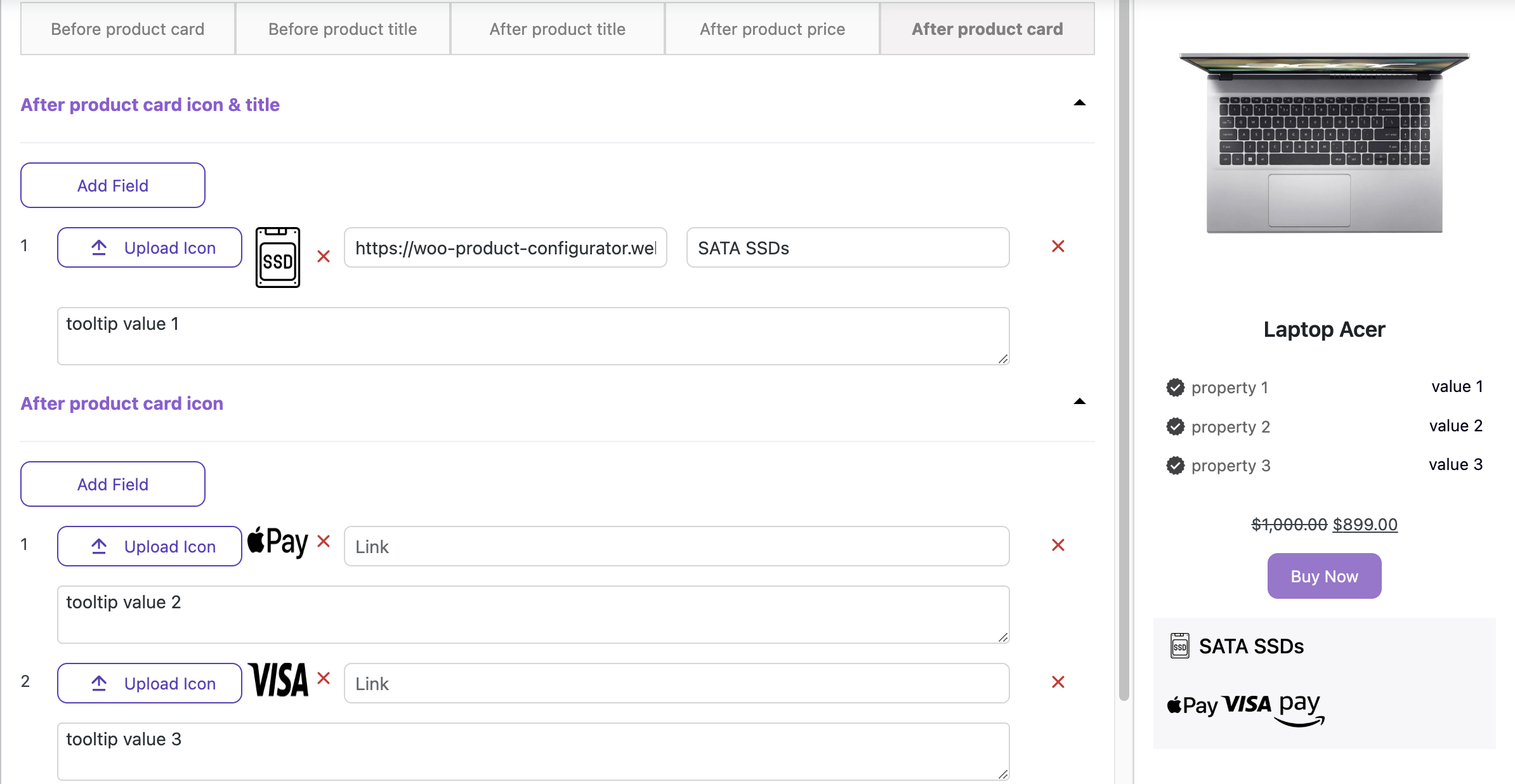
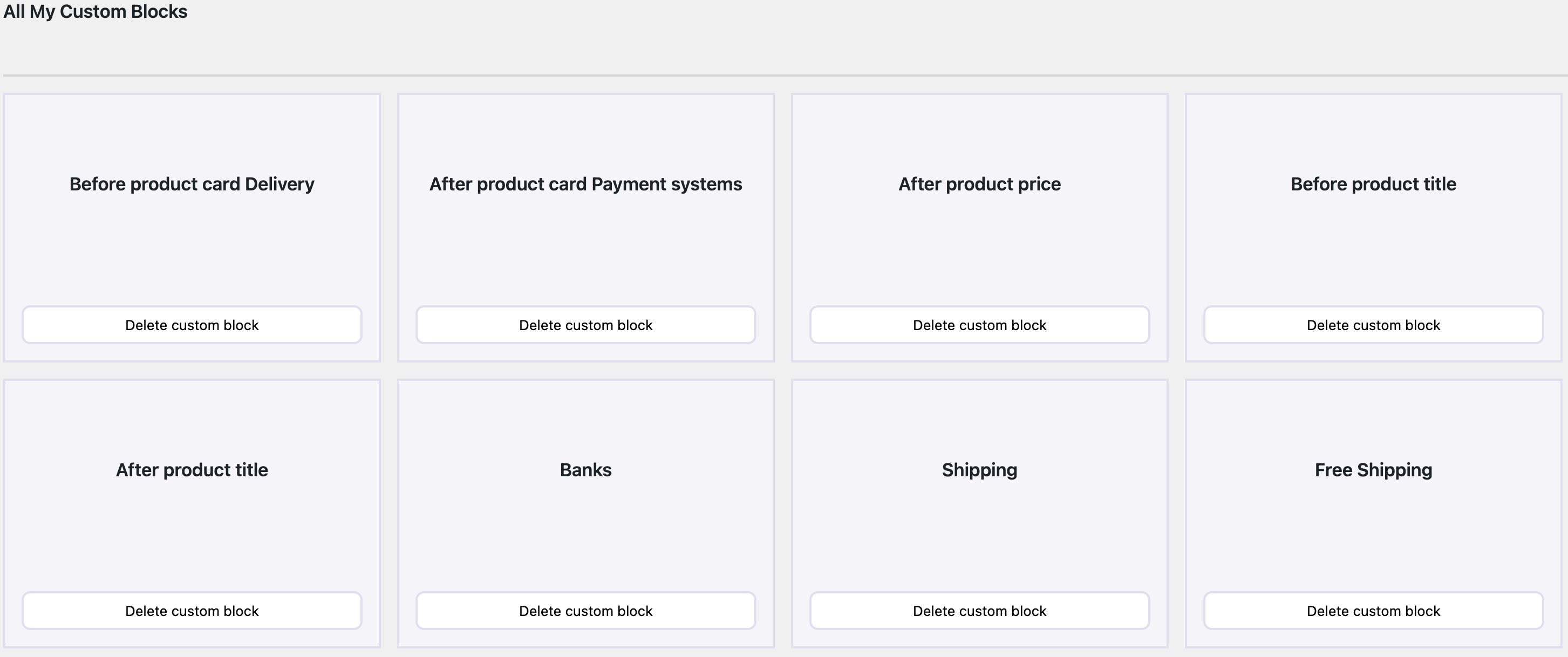
Creating and customizing/styling a unique custom blocks for a product #
The ‘Custom blocks’ tab allows you to place additional informational elements.
The Сustom block consists of five tabs, each responsible for different locations of the informational elements.
Before product card location
Before product title location
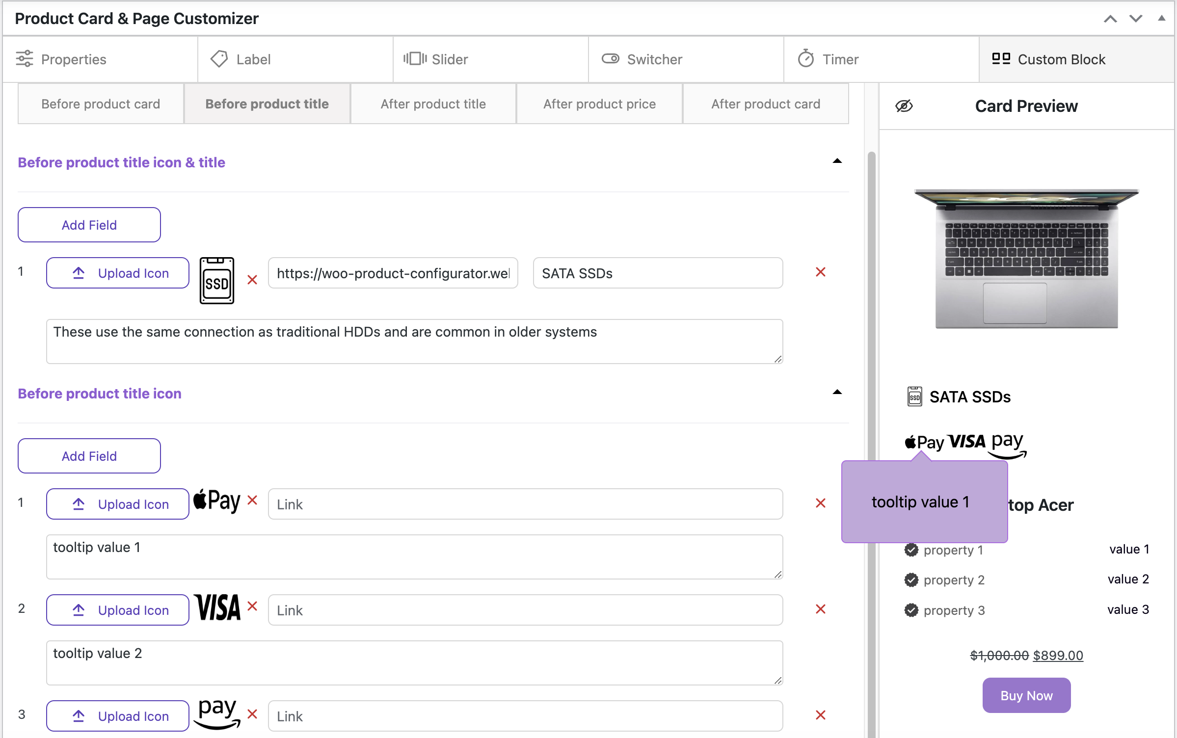
After product title location
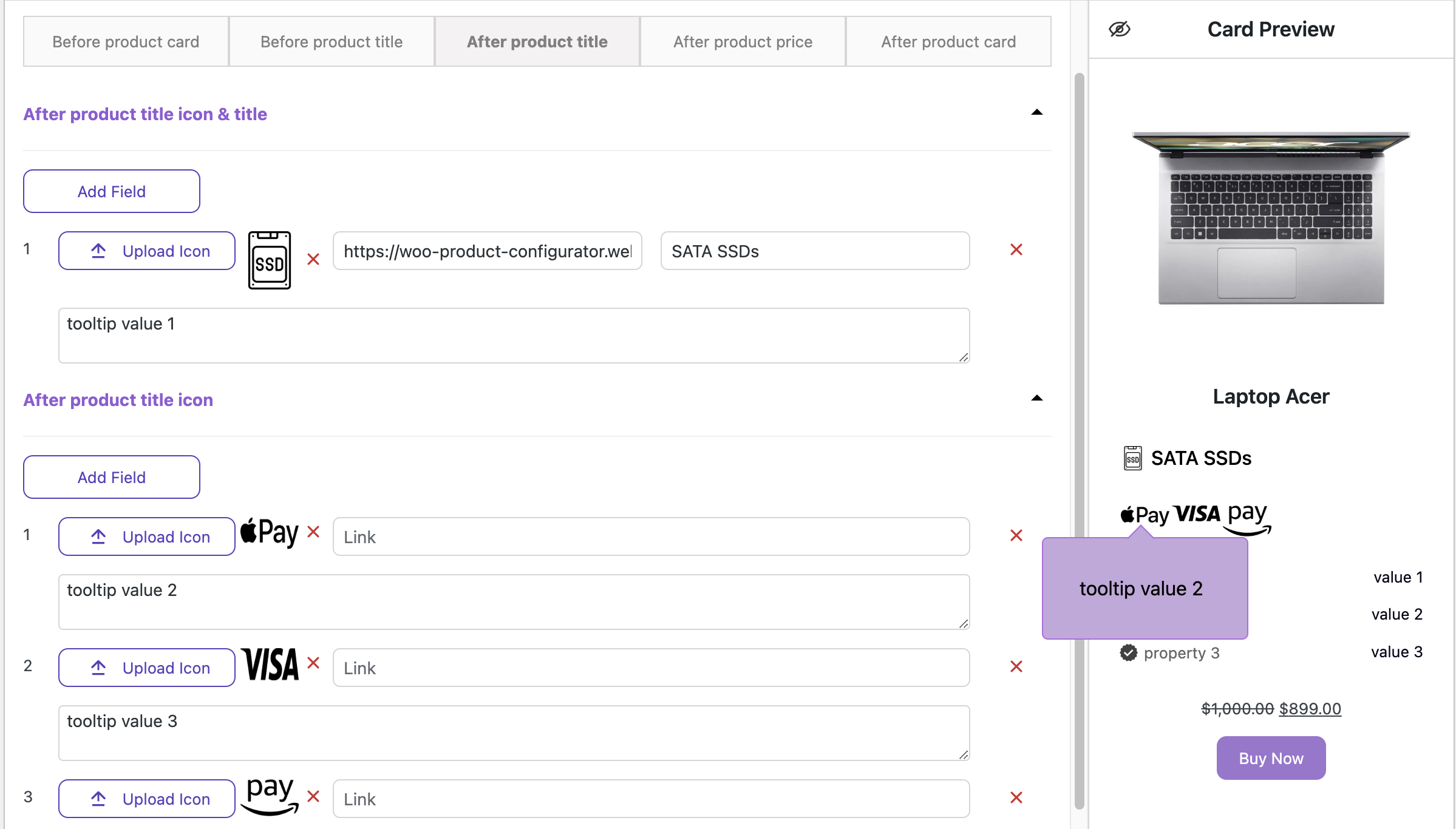
After product price
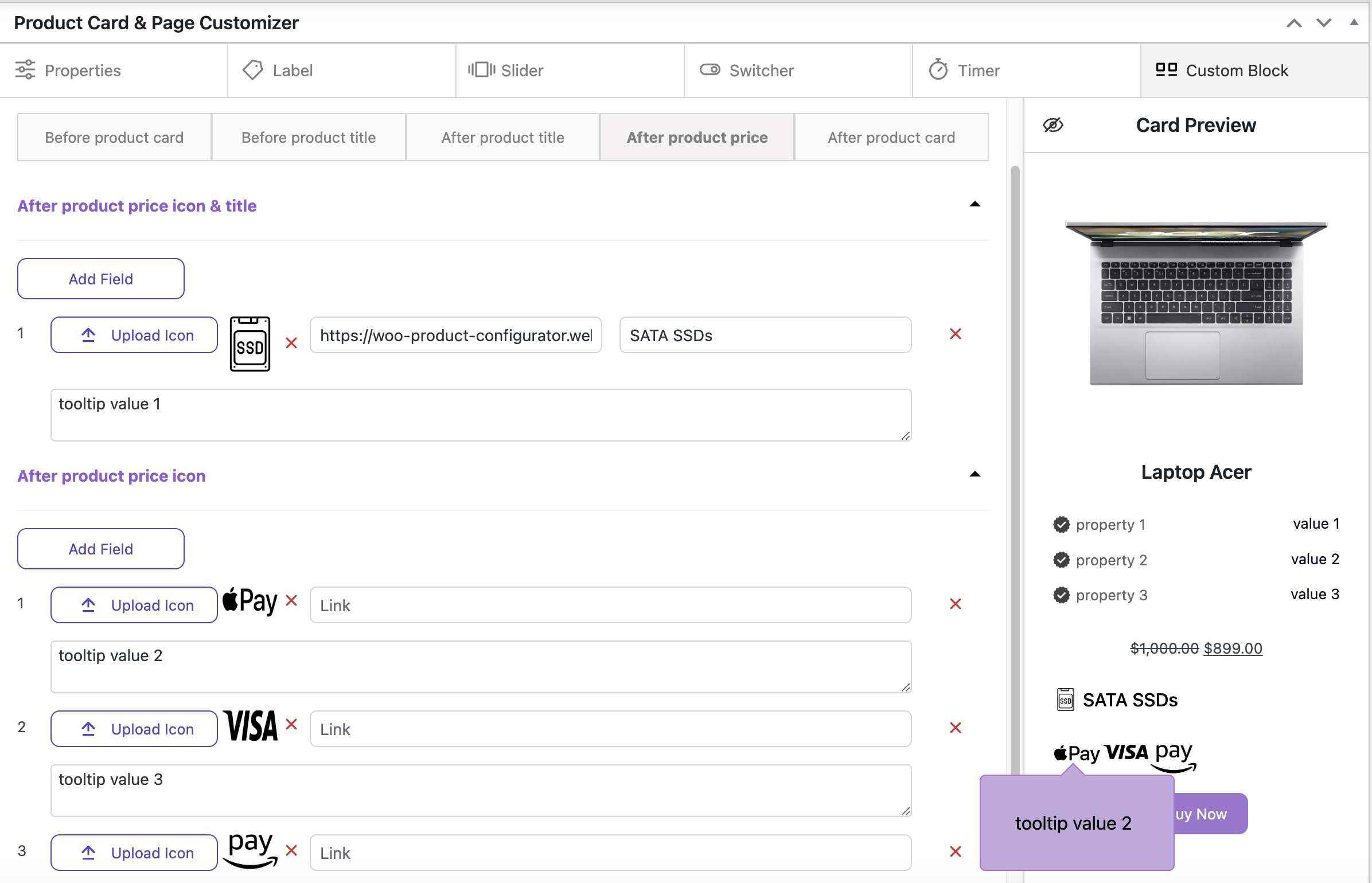
After product card
For stylisation custom block click ‘Repeaters styling’ button and turn on ‘Use this Custom Block’ toggle
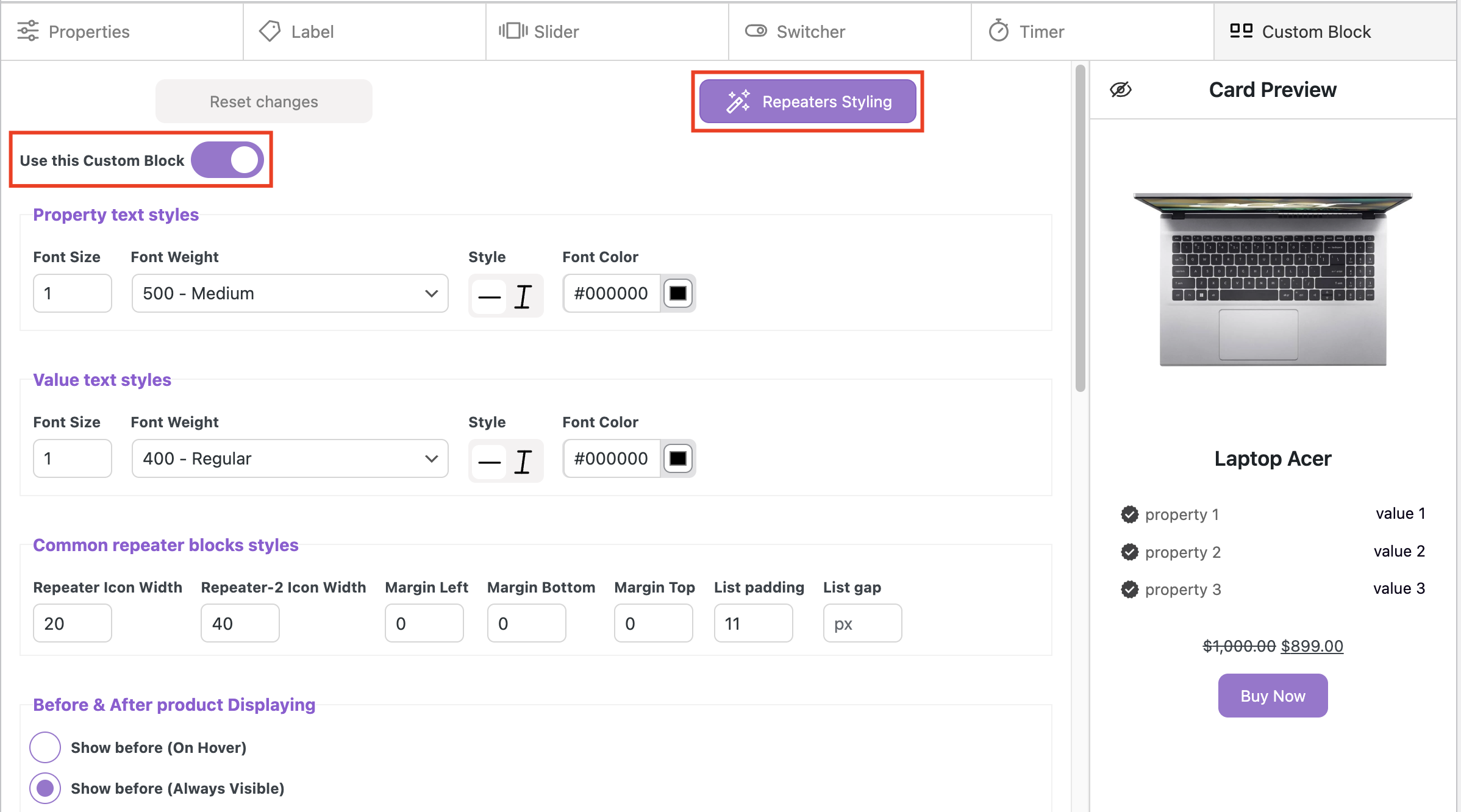
Property/Value text styles
Font Size – sets the text size
Font Weight – sets the text weight
Style – sets the text style (normal or italic)
Font Color – sets the text color
Common repeater blocks styles
Repeater Icon Width – sets the icon width in repeater
Repeater-2 Icon Width – sets the icon width in repeater-2
Margin Left – sets the outer space on the left side of an element, pushing it away from adjacent elements
Margin Bottom – sets the outer space below an element, pushing it away from elements under it
Margin Top – sets the outer space above an element, pushing it away from elements above it
List padding – sets the inner space between the list container’s edges and its content, affecting the spacing inside the list
List gap – sets the space between list items
Before & After product Displaying
Show before (On Hover) – the element is shown when the user hovers over a specific area or element
Show before (Always Visible) – the element is displayed at all times, regardless of user interaction
Show before (Above Product) – the element is positioned above a specific product or item
Show before (Higher Position) – similar to the above, but this refers to the placement of the element at a higher position relative to other content on the page
Show after (On Hover) – the element is shown when the user hovers over a specific area or element
Show after (Always Visible) – the element appears at all times and it is shown after product card
Show after (Absolute Positioning) – the element is positioned using CSS absolute positioning, meaning it is placed relative to its nearest positioned ancestor, not the normal document flow
Show after (Static Positioning) – the element will appear after other elements based on the natural flow of the page
Backgrounds
Before / After Item Repeater Background – sets the color of background for the Before / After Item Repeater
Before / After Item Repeater Background Opacity – sets the transparency level of the background color
Tooltip Styles for Repeater
Tooltip Background – sets the color of tooltip background
Tooltip Width – sets the width of tooltip background
Tooltip Padding – sets the inner space around the text in the tooltip
Tooltip Border Color – sets the border color for tooltip
Tooltip Border Width – sets the border width for tooltip
Tooltip Border Style – sets the border style of the tooltip
Tooltip Border Radius – sets the roundness of tooltip’s corners
Tooltip Shadow X / Tooltip Shadow Y – sets vertical and horizontal position of the shadow
Tooltip Shadow Dispersion – sets the density of the shadow
Tooltip Shadow Opacity – sets the level of transparency for the shadow
Tooltip Shadow Color – sets the color for the tooltip shadow
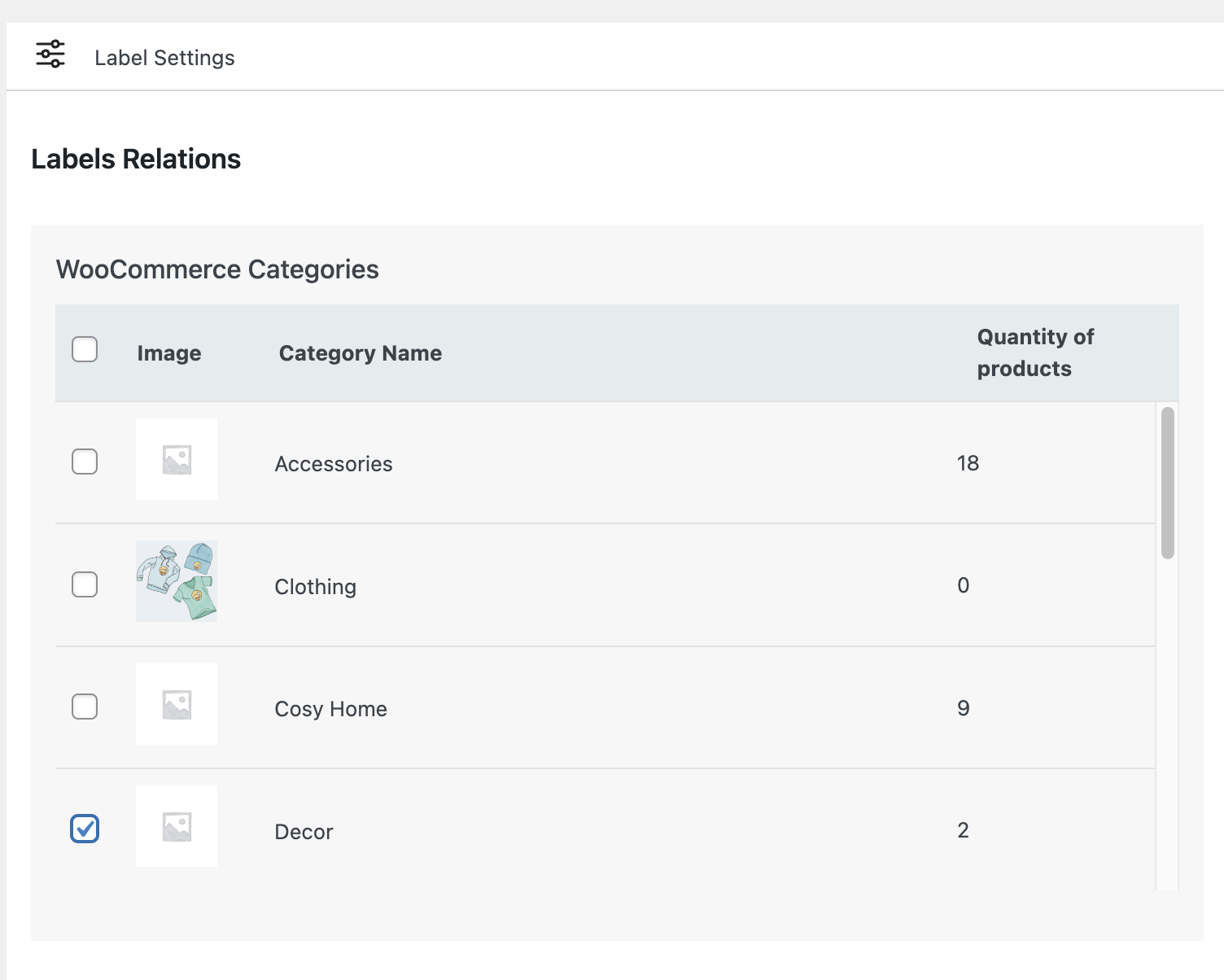
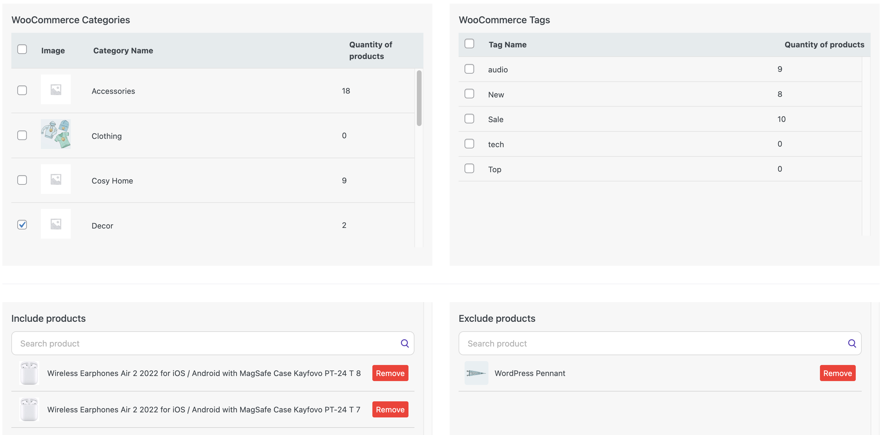
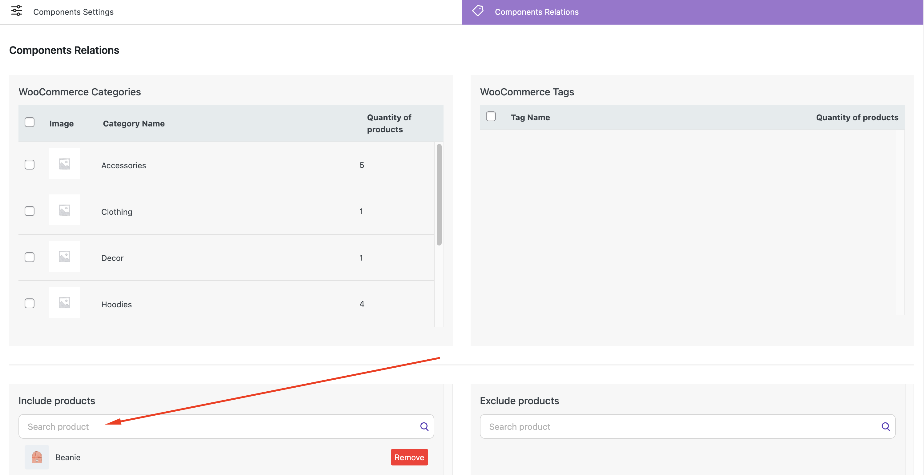
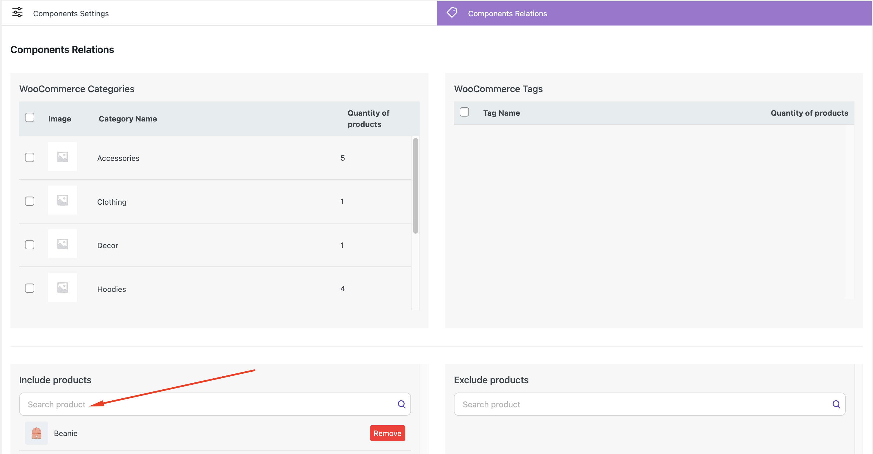
Bulk manager and library of elements #
The Bulk Manager is used to assign labels, timers, and custom blocks to multiple products at once.
You can use:
- Categories
- Tags
- Include or exclude specific products
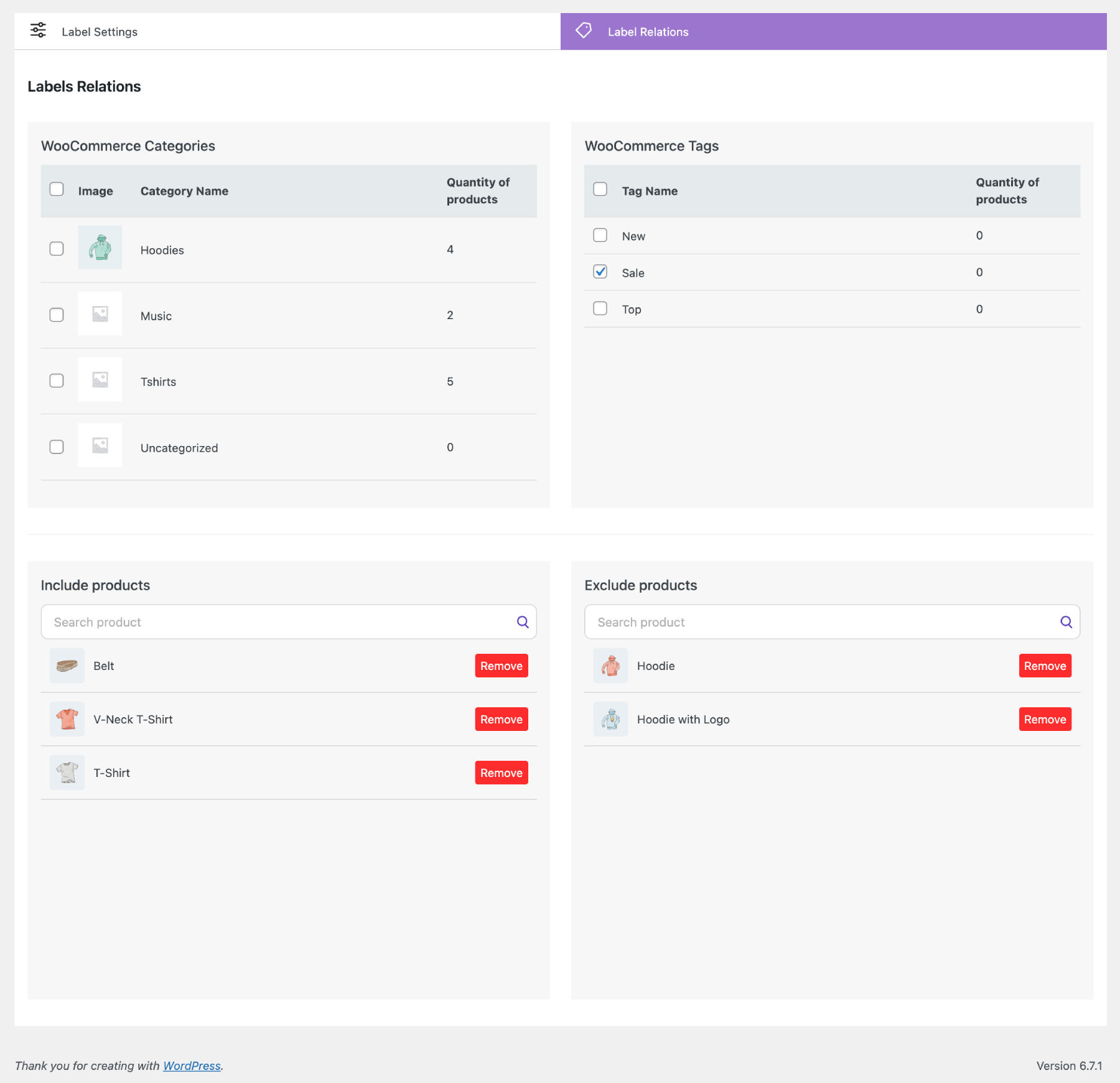
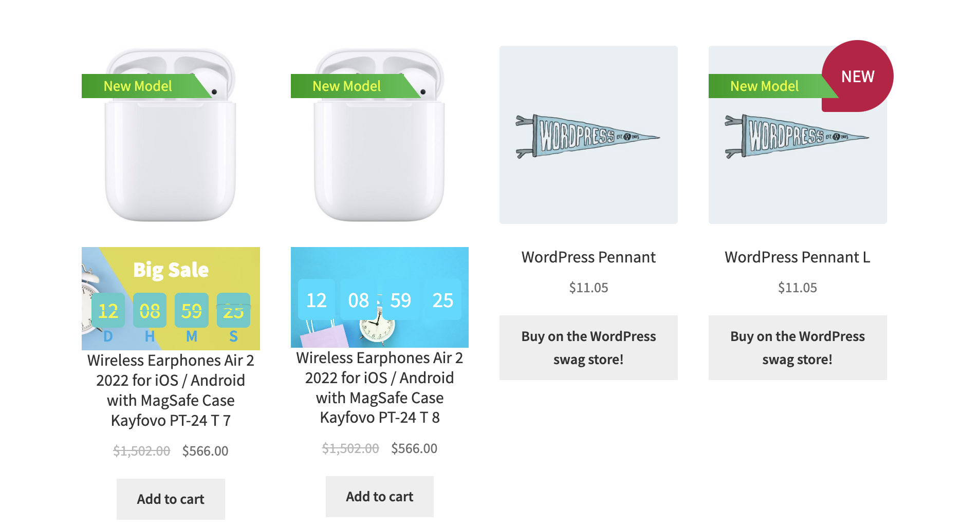
WooCommerce Categories – the element (label, timer, custom block) will be displayed on all products within this category.
WooCommerce Tags – the element (label, timer, custom block) will be displayed on all products with this tag.
Include products – adding the element (label, timer, custom block) to a specific product.
Exclude products – excludes the element from these products (the element will not be displayed on these products).
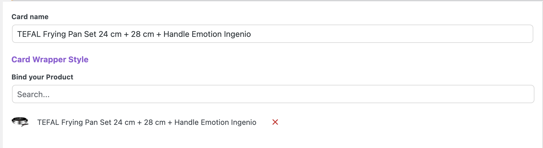
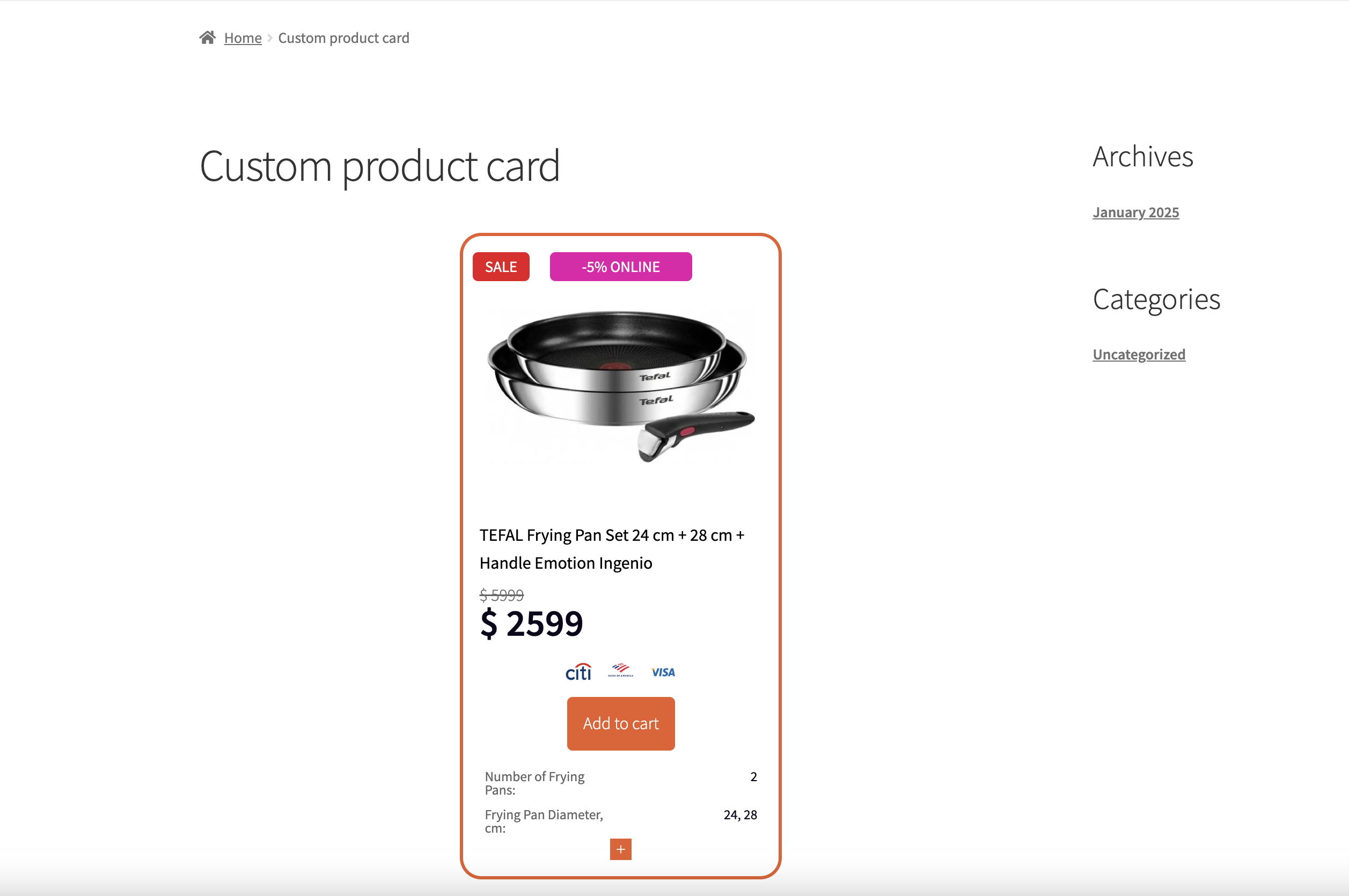
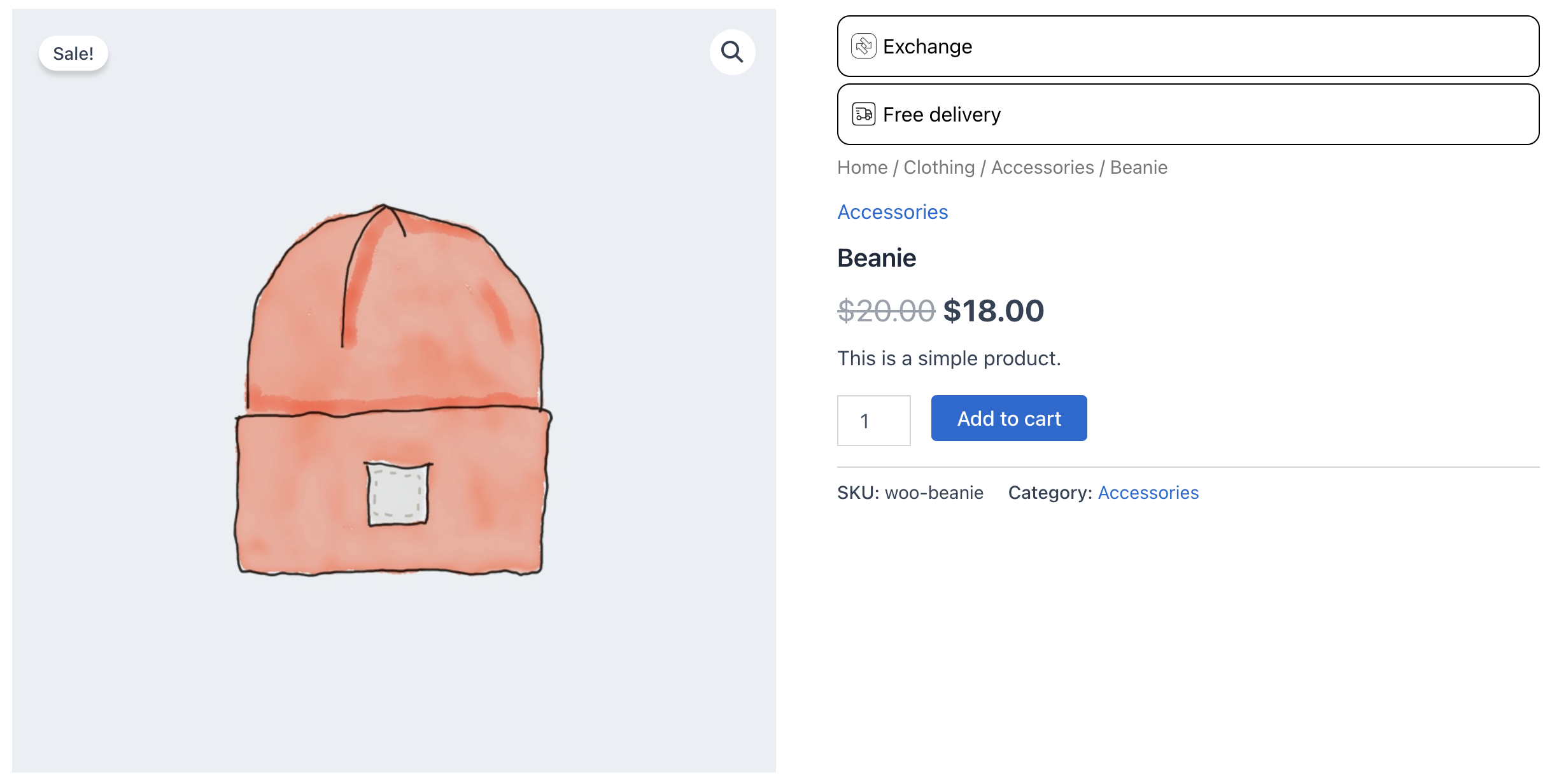
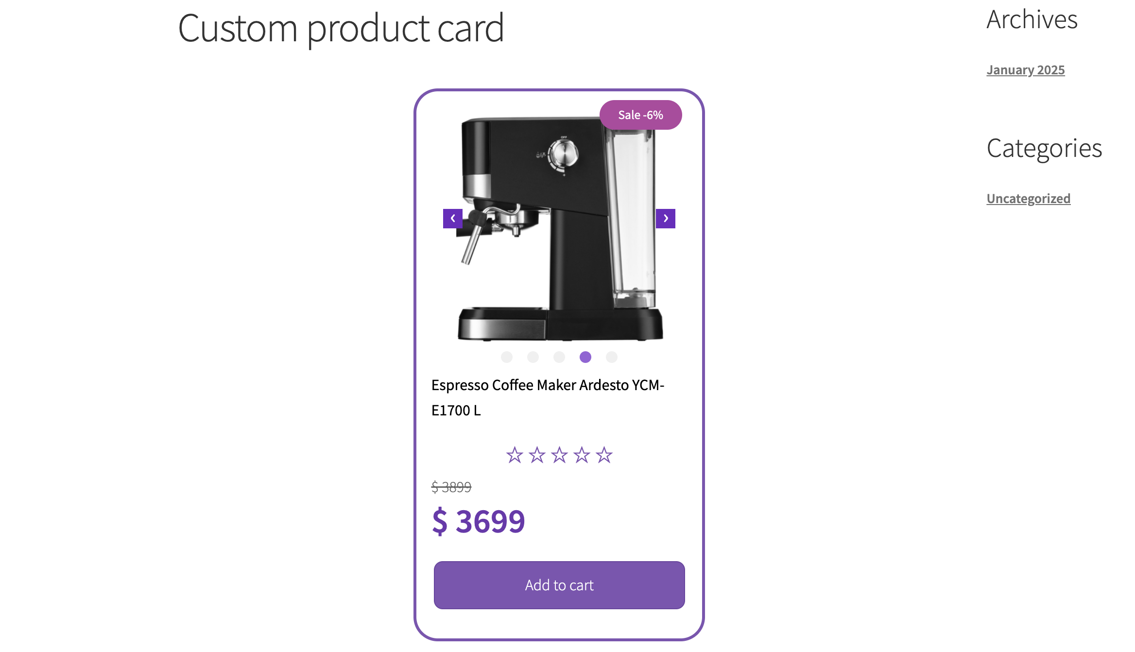
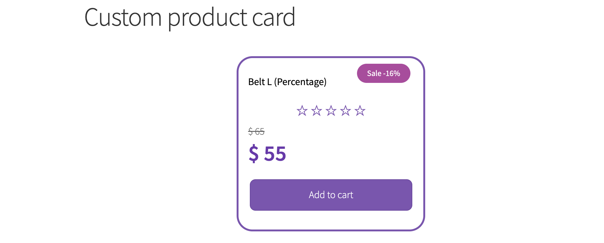
Creating a unique product card #
The plugin allows you to create unique product cards with custom design and functionality. These cards are independent of the theme installed on your site. You can place them anywhere on your site using a shortcode, wherever text can be written. The only requirement is that shortcode processing must be enabled in your theme (this feature works in most themes).
You can use popular website/page builders with the design and structure you need. Our unique/custom product cards will be compatible with these builders. Additionally, you can set the required unique design and settings for each card.
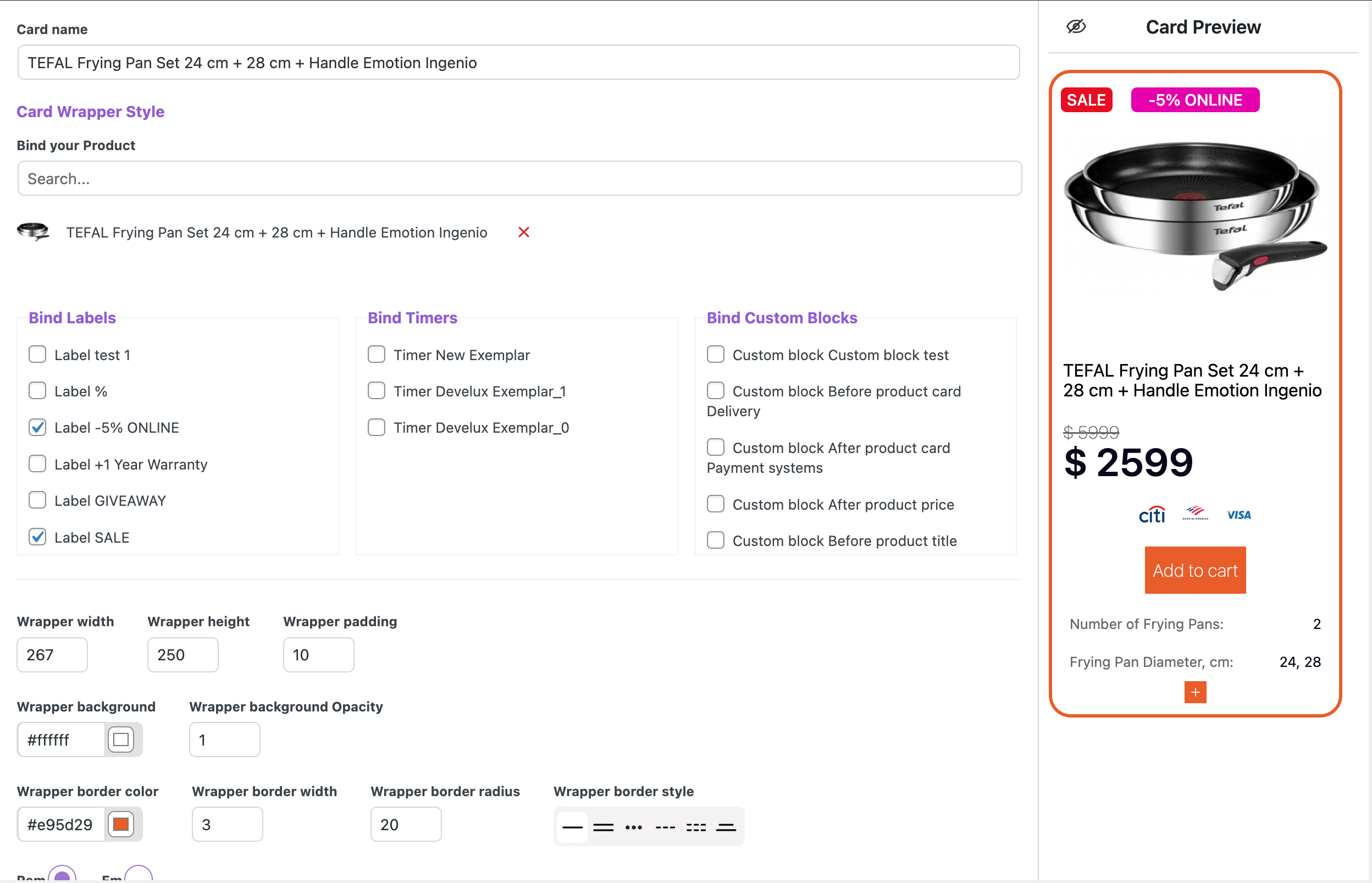
Before starting to create a custom product card, you need to attach the product
This is necessary so that the custom card can show you a preview of how the card will appear on the site, and how the required product card elements will be displayed, for example:
- Thumbnail (main product image)
- Image Slider
- Color switcher
- Rating
- Product name
- Product price
- etc
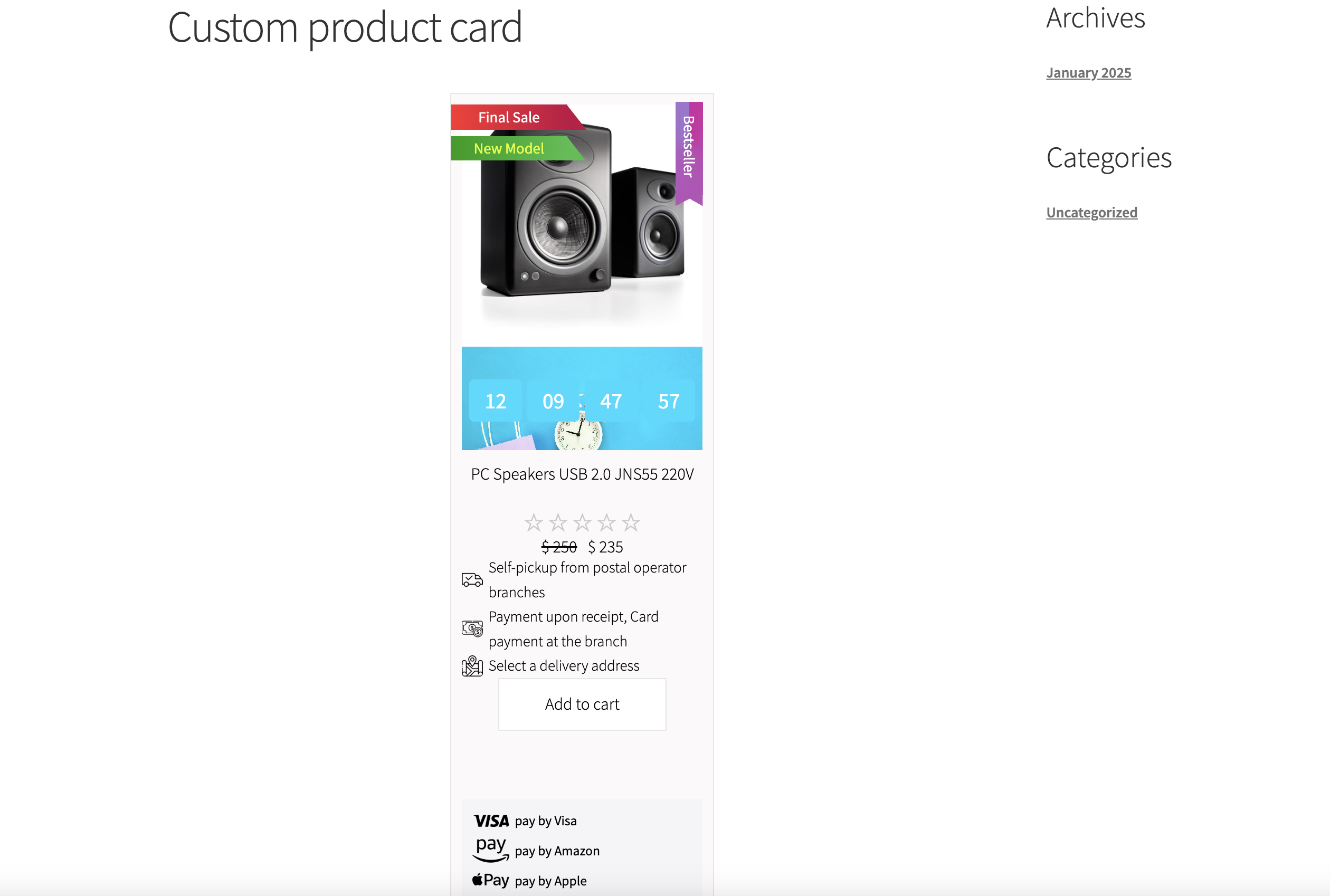
Custom cards have all the necessary elements for the product:
- Product image
- Slider for the product that will be displayed on the product card
- Product color variations
- Product price and buy button
- All of these elements can be styled and customized
- You can use an additional product description and style it for each specific card
- You can also add to the card:
- Labels
- Timers
- Additional content blocks
Adding additional elements
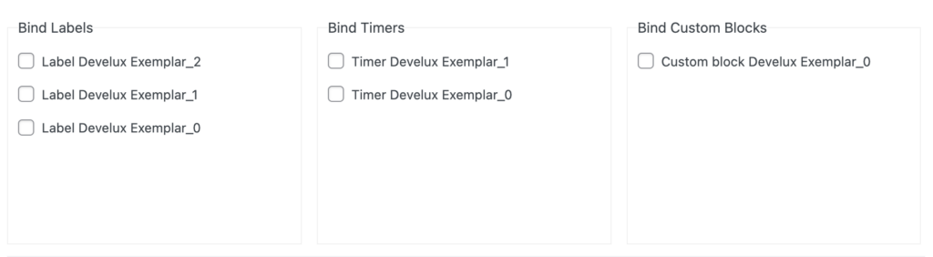
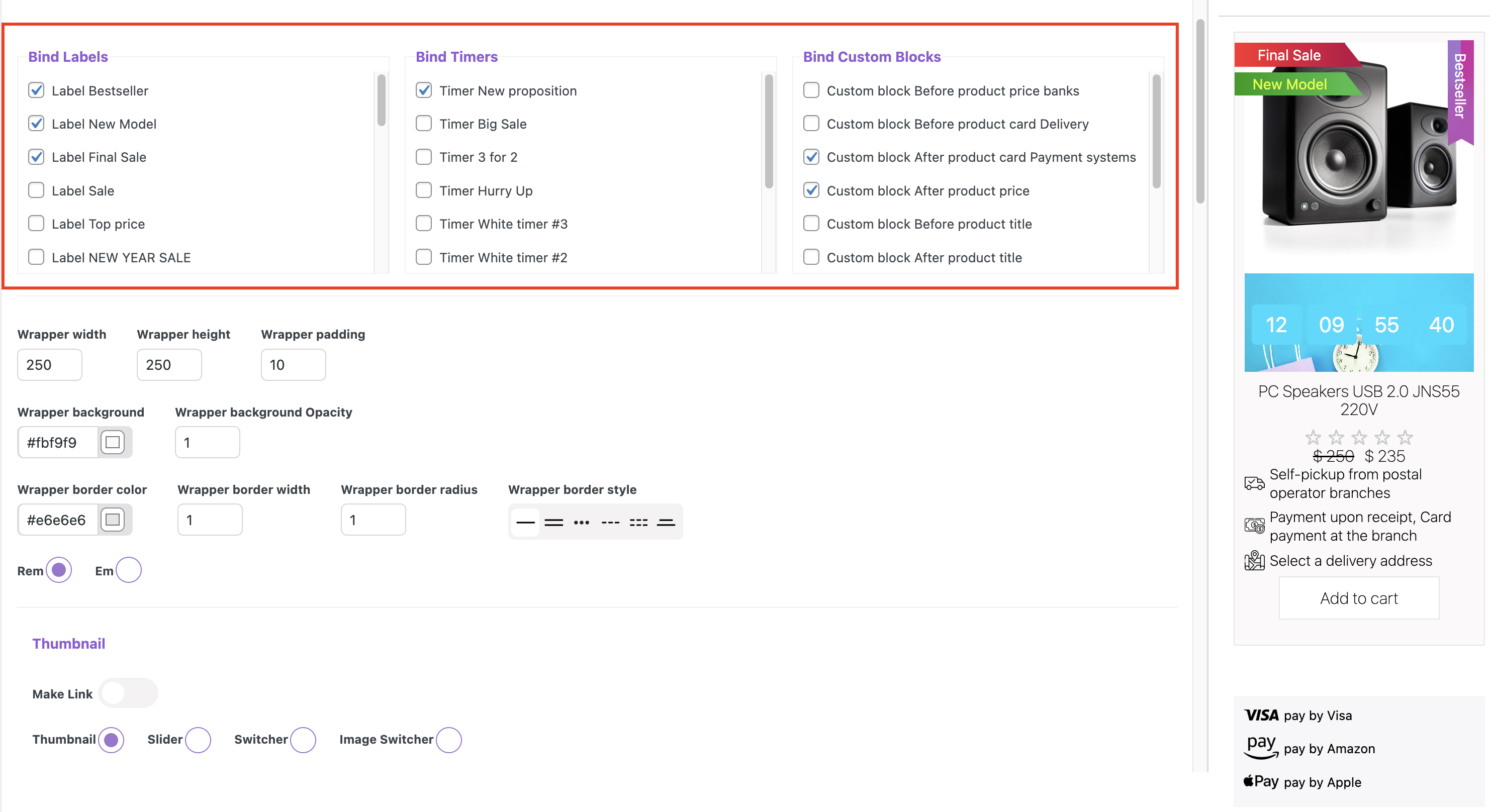
Bind Labels – add a label from the general label library.
Bind Timers – add a label from the general label library.
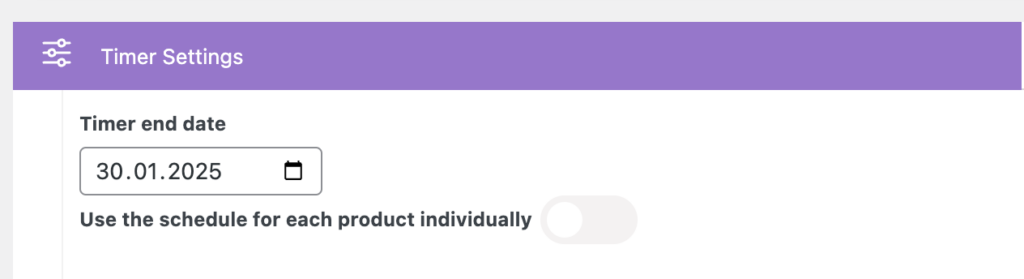
The countdown timer will be applied based on the settings of the selected timer. This can be the time for the discounted price, which is set on the product page in the General section, under the Schedule option.
Setting an end date for the timer in the timer library will apply a universal date for all products to which you assign this timer. This date will not be linked to the discount calendar you set in the General section of the product’s metabox.
Read more in the section on creating timers.
setting a date for the timer in the product metabox
setting a date for a timer in the timer library
Bind Custom Blocks – add an auxiliary informational element from the general library for custom elements.
All selected aditional elements in the bind section will be displayed in the custom card
Styling the Custom Product Card #
Wrapper width – sets the width of the product card
Wrapper height– sets the height of the product card
Wrapper padding – sets the inner spacing of the product card
Wrapper background – sets the background color of the product card
Wrapper background Opacity – sets the transparency level of the background color in the product card
Wrapper border color – sets the border color for the product card
Wrapper border width – sets the width of the border color in the product card
Wrapper border radius – sets the roundness of the product card’s corners
Wrapper border style – sets the wrapper border style of the product card
Rem / Em – sets the text size
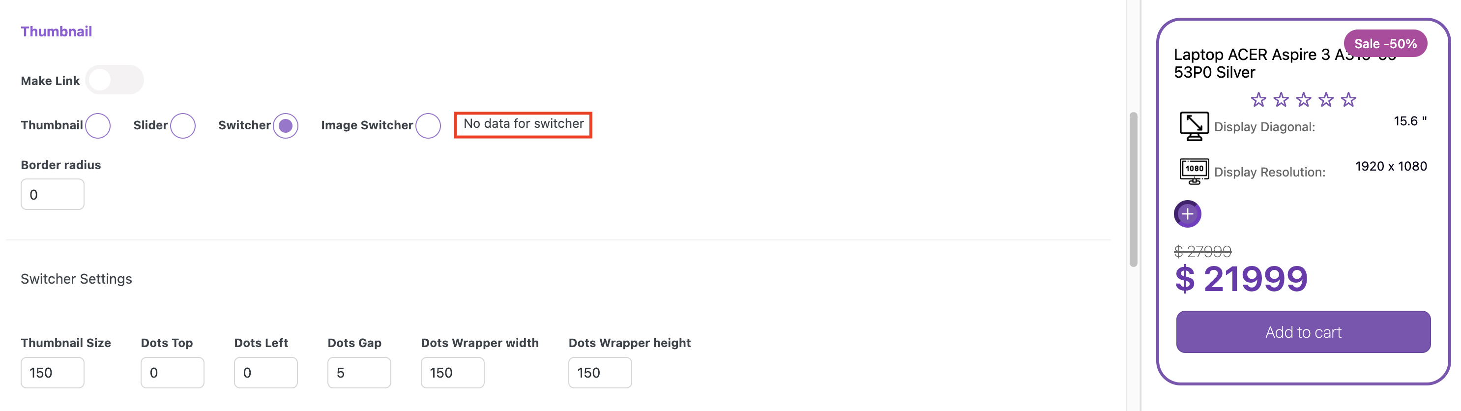
Thumbnail
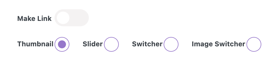
Switching off ‘Make link‘ toggle – prevents using the card page link in Thumbnail, Slider, Switcher, and Image Switcher
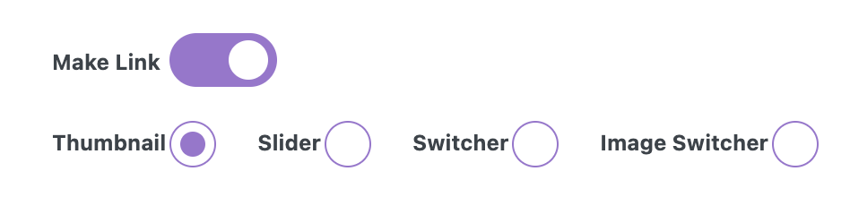
Switching on ‘Make link‘ toggle – allows using the card page link in Thumbnail, Slider, Switcher, and Image Switcher

Thumbnail / Slider / Switcher / Image Switcher – allows you to select the desired type of image display
If you select Slider, Switcher, or Image Switcher but haven’t set image settings in the meta boxes for them, a ‘No data for %switcher%’ alert will appear, and no image will be displayed in the Cart preview.
Thumbnail width – sets the size of the thumbnail
Border radius – sets the roundness of the thumbnail’s corners
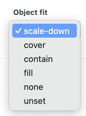
Object fit is used to specify how the image should be resized to fit its container
Scale-down – image is scaled down to the smallest version of none or contain
Cover – image keeps its aspect ratio and fills the given dimension. The image will be clipped to fit
Contain – image keeps its aspect ratio, but is resized to fit within the given dimension
Contain – image keeps its aspect ratio, but is resized to fit within the given dimension
Fill – image is resized to fill the given dimension
None – image is not resized
Unset – property will either inherit the value from its parent (if applicable) or reset to the default browser behavior (normal)
Slider Settings
Hide Slider Navigation – Allows you to hide the slide navigation
Navigation Icon Color – sets the color of icons in the slider navigation
Navigation Background – sets the background color in the slider navigation
Navigation Background Opacity – sets the transparency level of the navigation background
Navigation font size – sets the navigation size
Navigation position Y – sets the vertical position of the navigation, moving it to the top or bottom
Slider Viewport Width – sets the width of the slider viewport
Navigation width – sets the width of the navigation
Navigation height – sets the height of the navigation
Navigation border radius – sets the roundness of the border corners for the navigation
Navigation padding X / Navigation padding Y – sets the horizontal and vertical inner space for the navigation
Navigation arrow type – sets the type of the navigation
Hide Slider Dots – allows hiding the slider dots
Dots Background – sets the background for the dots
Dot Active Background – sets the background for the active dot
Dots position Y – sets the space between the thumbnail and dots
Switcher Settings
Thumbnail Size – sets the switcher thumbnail size
Dots Top – sets the top position for the dots
Dots Left – sets the left position for the dots
Dots Gap – sets the gap between the dots
Dots Wrapper width – sets the wrapper width for dots in ‘Before title’ and ‘After title’ dots locations
Dots Wrapper height – sets the wrapper height for dots in ‘Before title’ and ‘After title’ dots locations
Dot Size – sets the dots size
Dots Dislocation – sets the dots dislocation
Dots direction – sets the dots direction
Dots border color – sets the border color for dots
Active Dot border color – sets the border color for the active dot
Dots Border Radius – sets the corner roundness for the dots
Dots Border Width – sets the border width for the dots
Dots border style – sets the border style for the dots
Dots Shadow Color – sets the shadow color for the dots
Dots Shadow X / Dots Shadow Y – sets the position of the shadow for the dots
Dots Shadow Dispersion – sets the density of the shadow
Image Switcher Settings
Thumbnail Size – sets the thumbnail size for the switcher
Dots Top – sets the top position for the dots
Dots Left – sets the left position for the dots
Dots Gap – sets the gap between the dots
Dots Wrapper width – sets the wrapper width for dots in ‘Before title’ and ‘After title’ dots locations
Dots Wrapper height – sets the wrapper height for dots in ‘Before title’ and ‘After title’ dots locations
Dot Size – sets the dot size
Dots direction – sets the dots direction
Dots border color – sets the border color for dots
Active Dot border color – sets the border color for the active dot
Dots Border Radius – sets the corner roundness for the dots
Dots Border Width – sets the border width for the dots
Dots border style – sets the border style for the dots
Dots Shadow Color – sets the shadow color for the dots
Dots Shadow X / Dots Shadow Y – sets the position of the shadow for the dots
Dots Shadow Dispersion – sets the density of the shadow
Product Properties Settings
Dislocation ‘After Product Title’ – places properties after title
Dislocation ‘After Card’ – places properties after card
Padding X / Padding Y – sets the inner space around the properties
Property Font Size – sets the property text size
Property Font Weight – sets the property text weight
Property Font Color – sets the property font color
Style – sets the text style (normal or italic)
Value Font Size – sets the value text size
Value Font Weight – sets the value text weight
Value Font Color – sets the value font color
Icon Width – the size of the icon set for product properties lists
Decoration – specifies which decorative elements will be used for the lists (images, circles, or numbering)
Collapse Styles
Collapse after items – specifies whether a collapse is needed and after which element it should occur
Icon Size – sets the icon size
Font Color – sets the property font color
Background Color – sets the background color
Background Opacity – sets the transparency level of the background color
Collapse Size – sets the size for the button
Collapse Border Radius – sets the roundness of the collapse button corners
Collapse Border Width – sets the collapse border width
Border Color – sets the collapse border color
Border Style – sets the collapse border style
Title
Switching on / Switching off ‘Make link‘ toggle allows or disallows using the card page link in the title
Font Size – sets the text size
Font Weight – sets the text weight
Font Style – sets the text style (normal or italic)
Text Align – sets text on the left, right and center
Font Color – sets the value font color
Padding Top – sets the amount of space between the top edge of an element and its content
Padding Bottom – sets the amount of space between the bottom edge of an element and its content
Rating
Display / Hide – displays or hides the rating stars
Switching on / Switching off ‘Make link‘ toggle allows or disallows using the card page link in the rating
Rating star Size – sets the rating star’s size
Font Color – sets the color of the rating star’s
Regular Price
Font Size – sets the price size
Font Weight – sets the text weight
Font Style – sets the price style (normal or italic)
Color – sets the price font color
Text Align – sets the price on the left, right, and center
Price direction – sets the price direction
Price Gap – sets the space between Regular price and Sale
Price Padding Y – sets the top and bottom inner space around for the price
Sale Size – sets the sale size
Font Weight – sets the text weight
Font Style – sets the sale style (normal or italic)
Sale Color – sets the sale color
Button
Button Text – field for button text
Font Style – sets the text style (normal or italic) in the button
Font Weight – sets the text weight in the button
Font Size – sets the text font size
Font Color – sets the text font color
Font Hover Color – text color that appears when a user hovers over an element with their cursor
Width – sets the button width
Margin Top – sets the outer space between the price and the button
Margin Bottom – sets the outer space between the button and the card border
Padding Y / Padding X – inner spaces inside the button
Background – sets the button background color
Hover Background – background color that appears when a user hovers over the button with their cursor
Opacity – sets the transparency level of the background color in the button
Border color – sets the button border color
Border hover color – sets the hover border color
Border width – sets the button border width
Border radius – sets the roundness of the button’s corners
Border style – sets the button border style
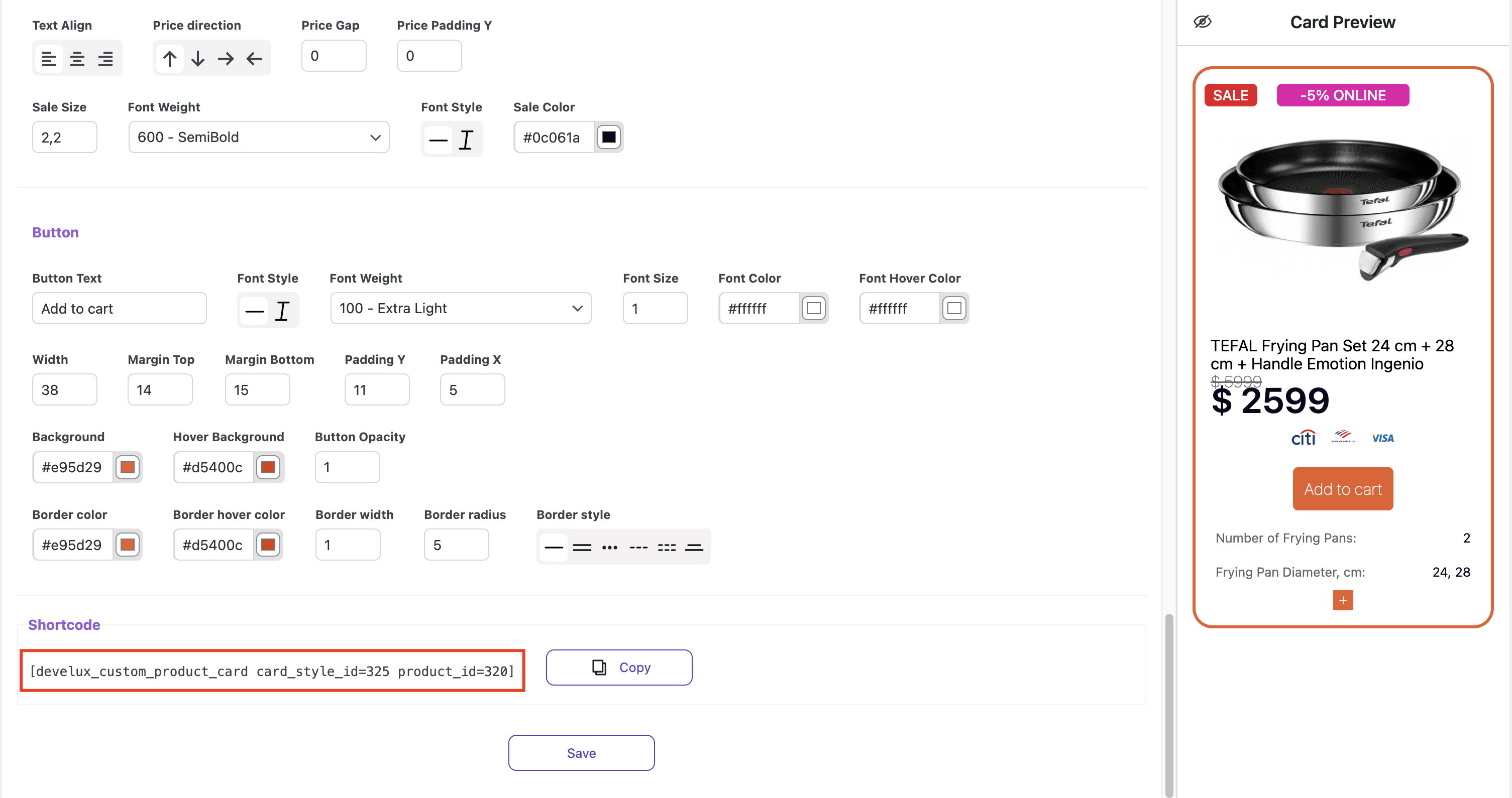
To display a custom card in the shop, save all settings and copy the shortcode
Create a new page
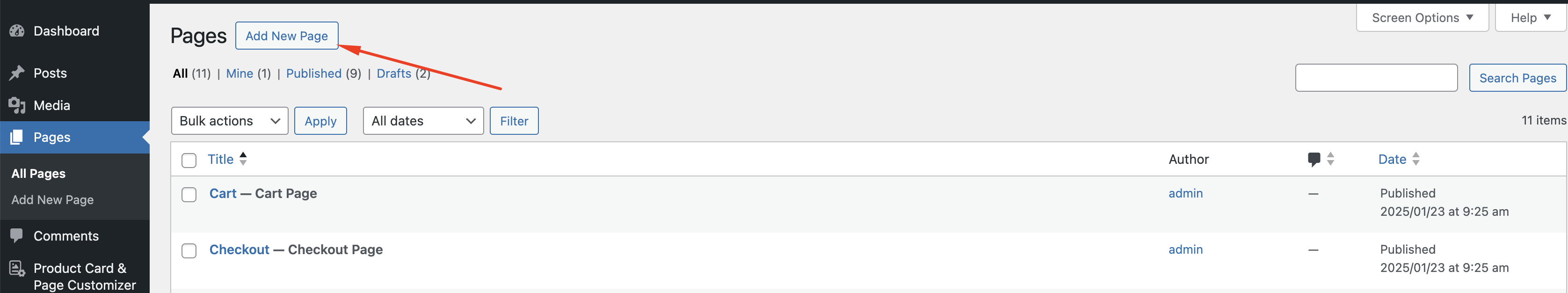
Insert the copied shortcode using the Gutenberg shortcode block or any other plugin like Elementor or Beaver Builder
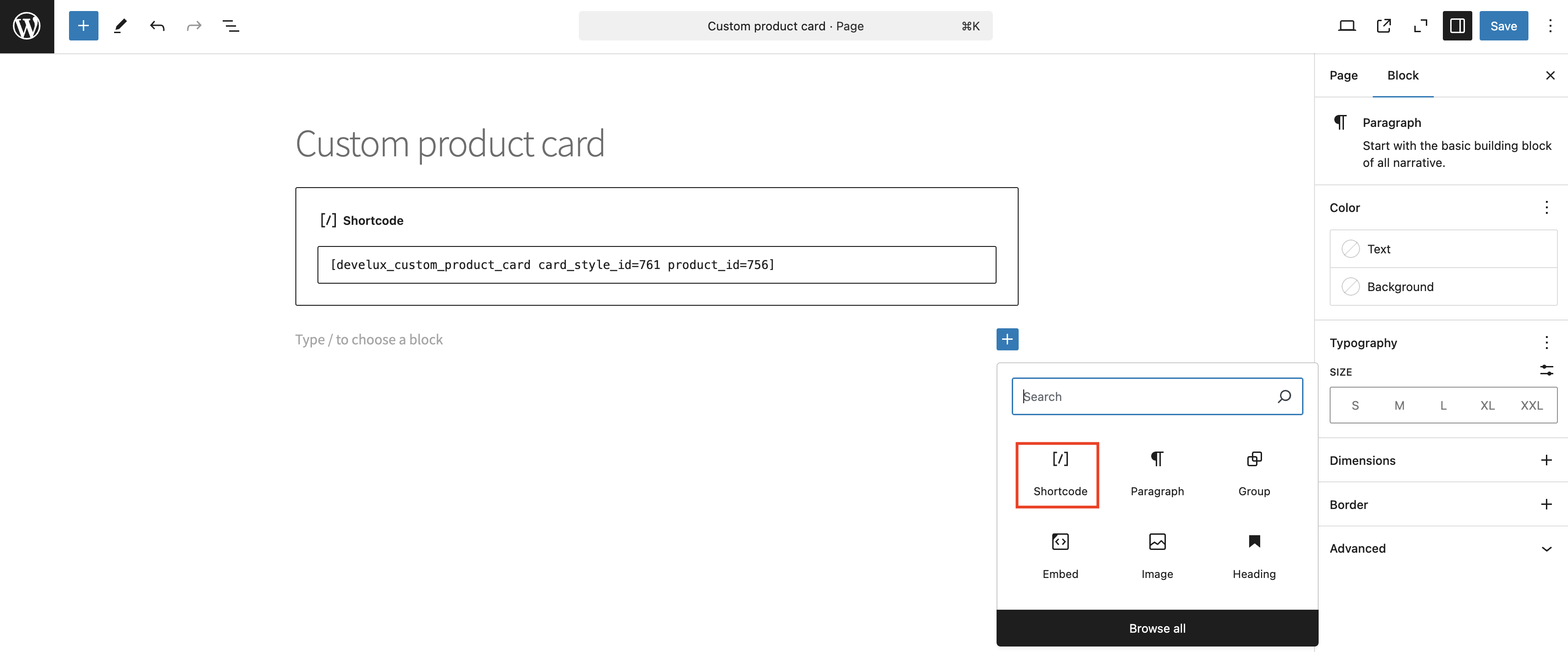
Click the ‘Save’ button, then the ‘View Page’ button
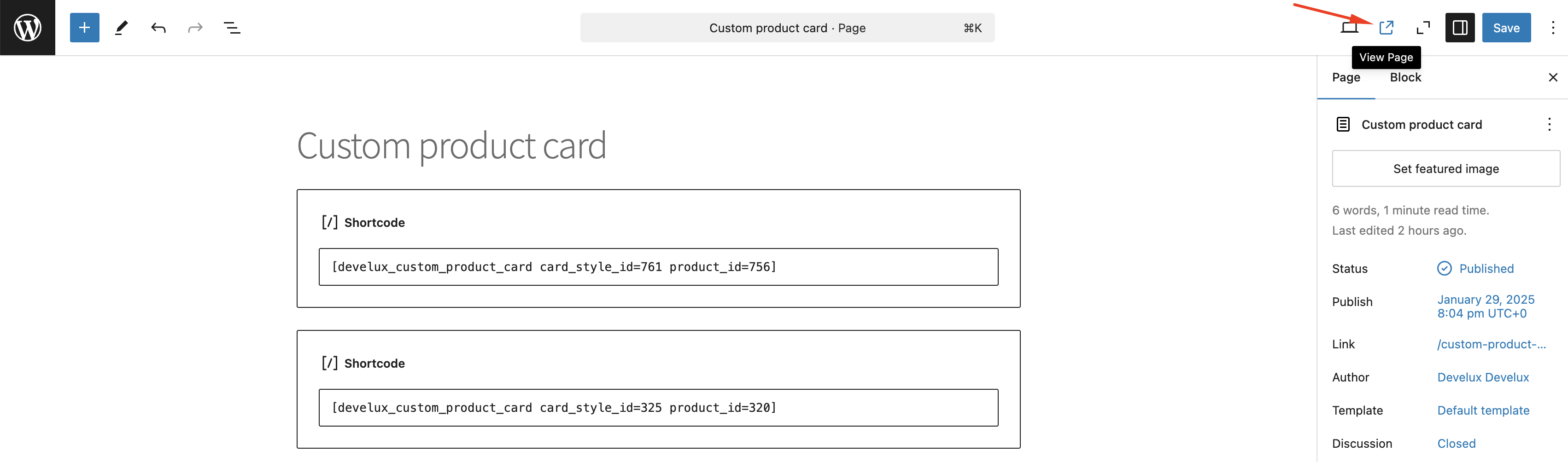
The inserted shortcode will display the custom card on the page
Library of labels #
Library of labels allows to create labels for the custom cards and assign them to multiple products at once.
You can read more details about creating labels here
Library of timers #
The library of timers allows to create timers for the custom cards and assign them to multiple products at once.
You can read more details about creating timers here
Library of custom blocks #
The library of custom blocks allows to create of an auxiliary informational element for the custom cards and assign them to multiple products at once.
You can read more details about custom blocks here
Single product page builder #
Single product page builder allows you to create different information blocks and add them to the single product page in the shop.
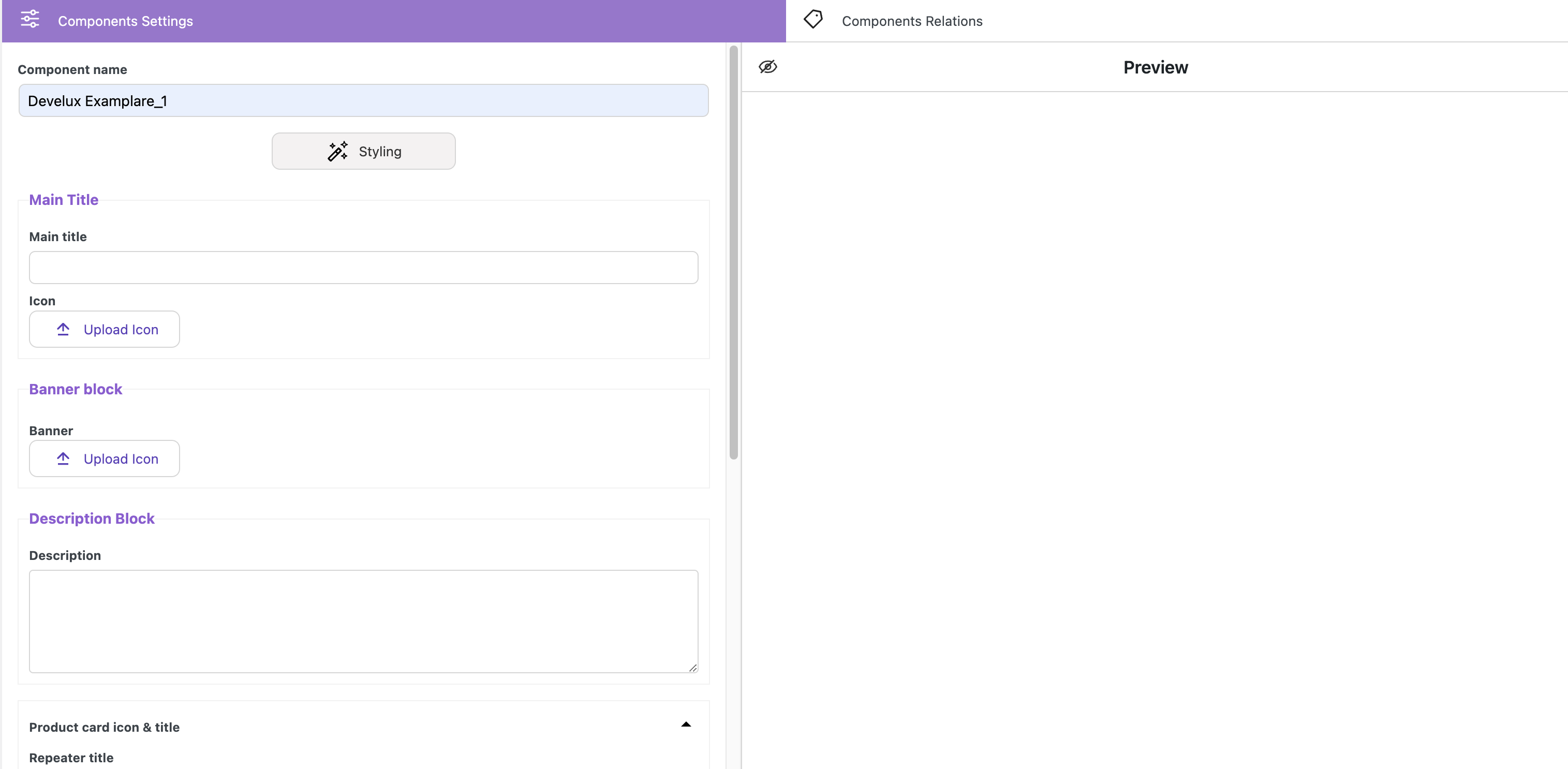
Component name – field for adding the component name
Main Title
Main title – field for adding content for the title
Icon – button for adding an image to the title
Banner block
Banner – button for adding the image for the banner
Description Block
Description – field for adding the content
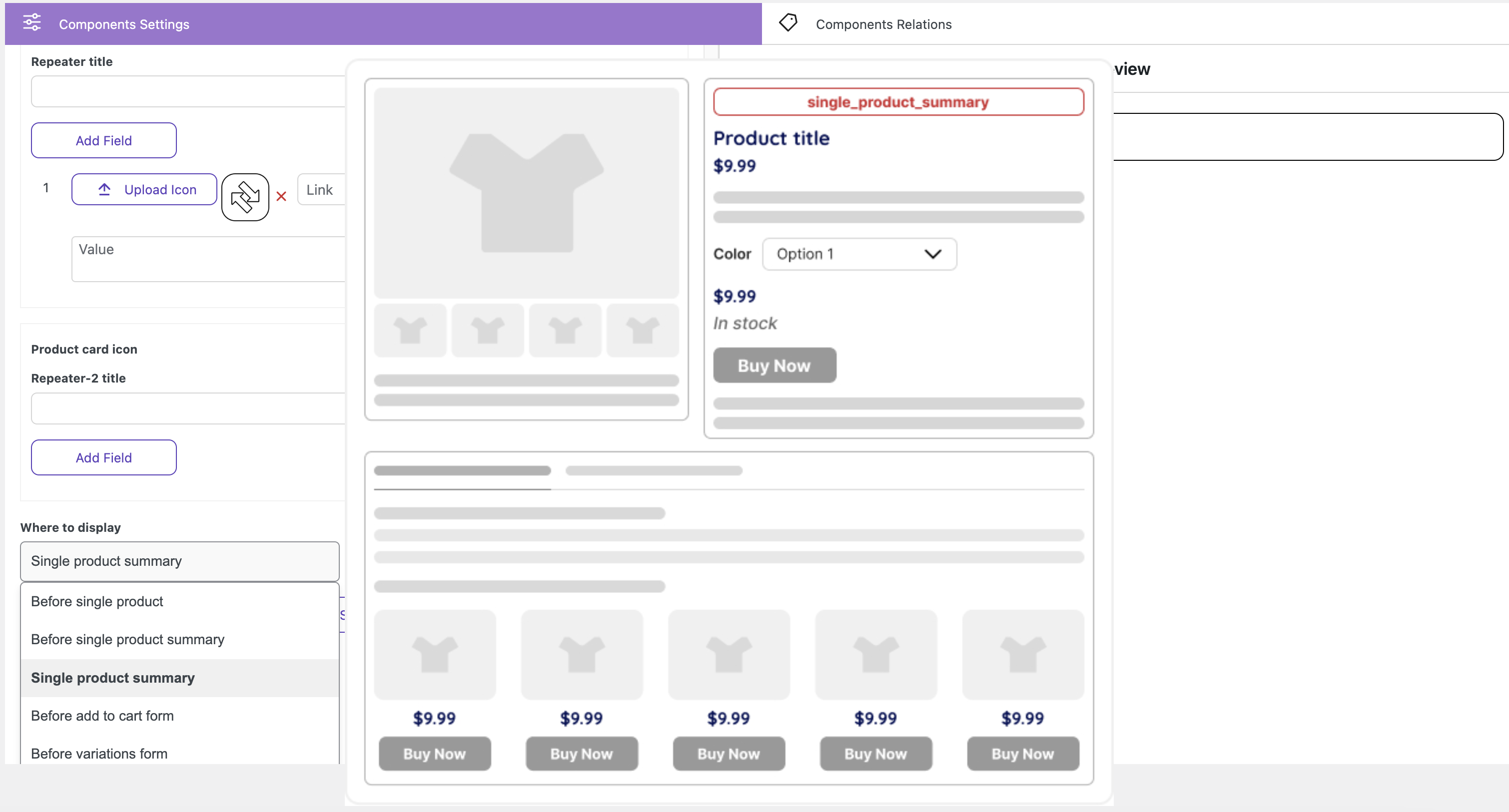
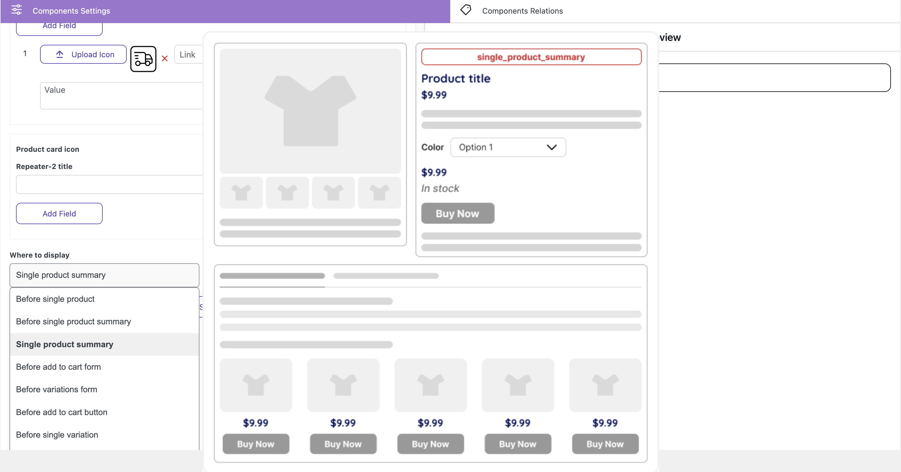
Product card icon & title allow you to place additional informational elements.
Repeater title – field for adding repeater title
Click on ‘Add field’ button forms:
‘Upload Icon’ button – allows to upload the image for property
Link field – allows to add of any link
Property field – allows to add content for property
Value field – allows to add of content for value
Product card icon
Repeater-2 title – field for adding repeater title
‘Upload Icon’ button – allows to upload the image for property
Link field – allows to add of any link
Value field – allows to add of content for value
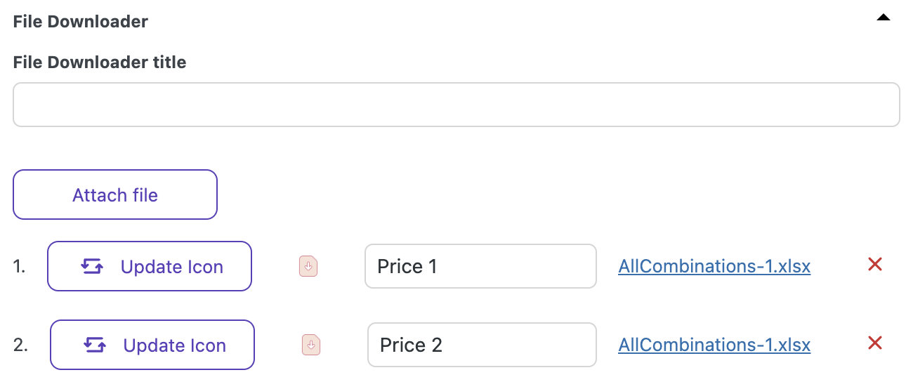
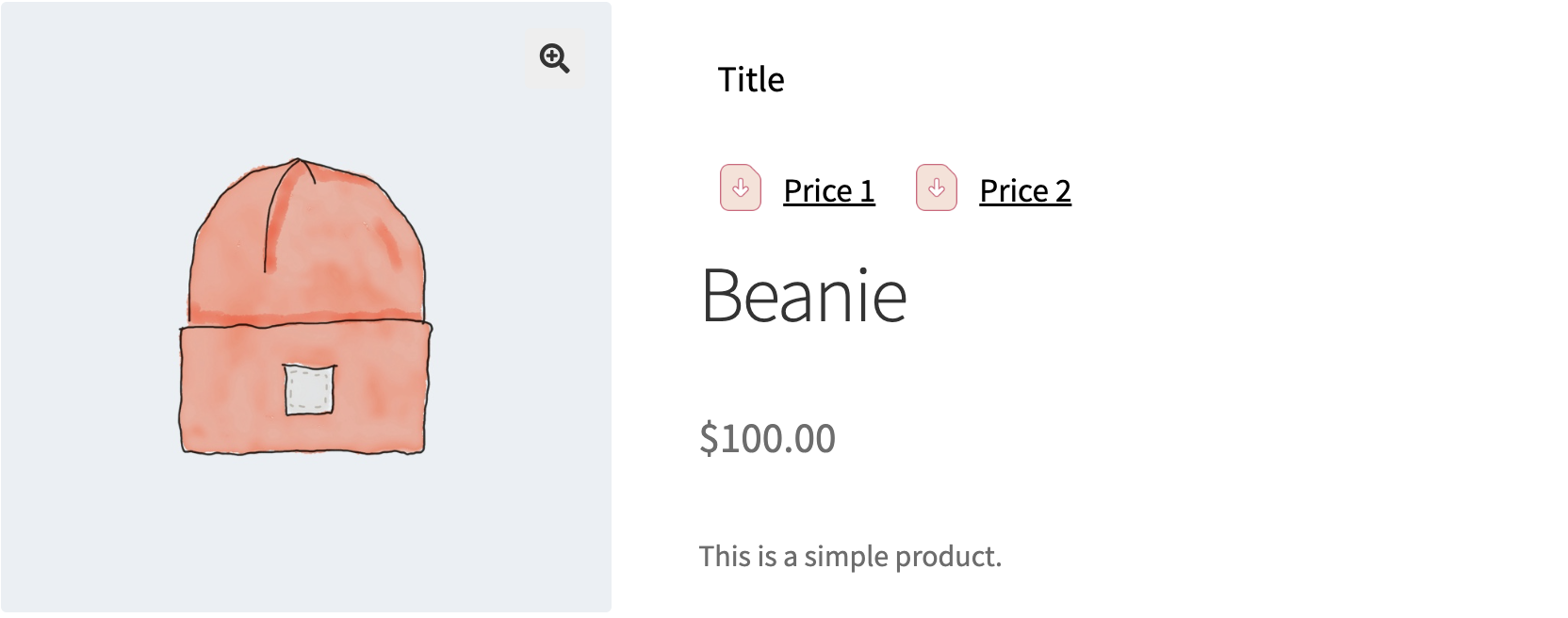
File Downloader allows you to upload necessary TXT, XLSX, PDF, and IMG files for users and enables them to download files directly from a website afterward.
File Downloader title allows to add the name for section with files
Attach file button allows to upload the desired file
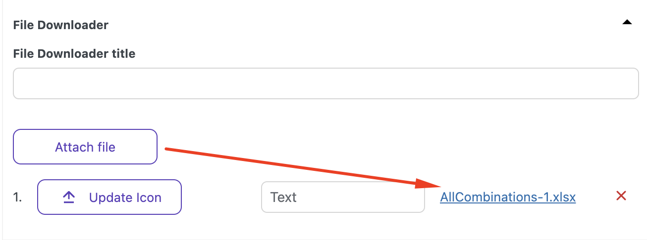
Update Icon button allows to upload an icon for the uploaded file
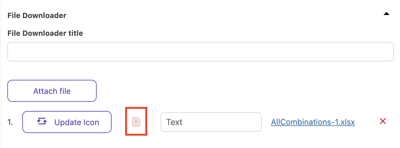
Text field allows adding the name of the uploaded file
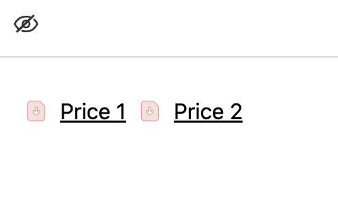
TIP!
If you need to place downloaded files in two columns
you can set
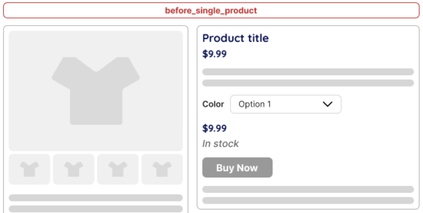
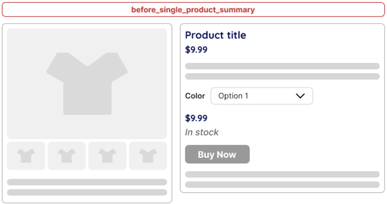
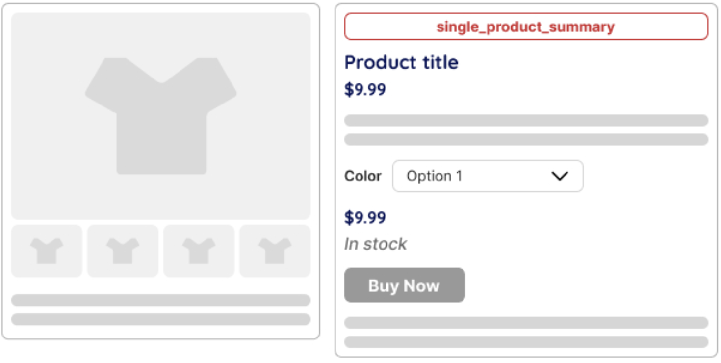
The ‘Where to Display‘ dropdown allows you to set the placement of information elements on the single product page.
Before single product
Position: Before the single product container starts. This hook fires before the main wrapping of the product details are opened. It can be used for notices or introductory content
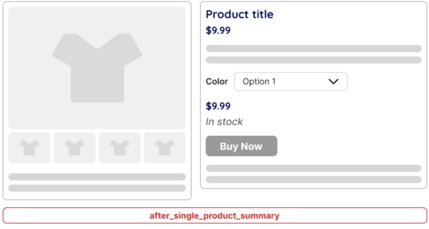
Before single product summary
Position: Before the product summary section (which includes the title, price, short description, etc). It can be useful for adding banners, promotional messages, or additional media before the main product information
Single product summary
Position: Inside the product summary section. This hook allows inserting content between WooCommerce’s default summary elements like the title, price, and add-to-cart button.
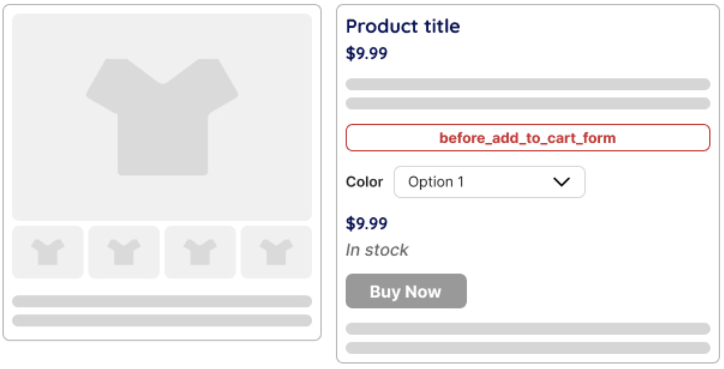
Before add to cart form
Position: Before wrapping the add-to-cart button. Allows inserting content before the add-to-cart form, such as custom notices or additional options.
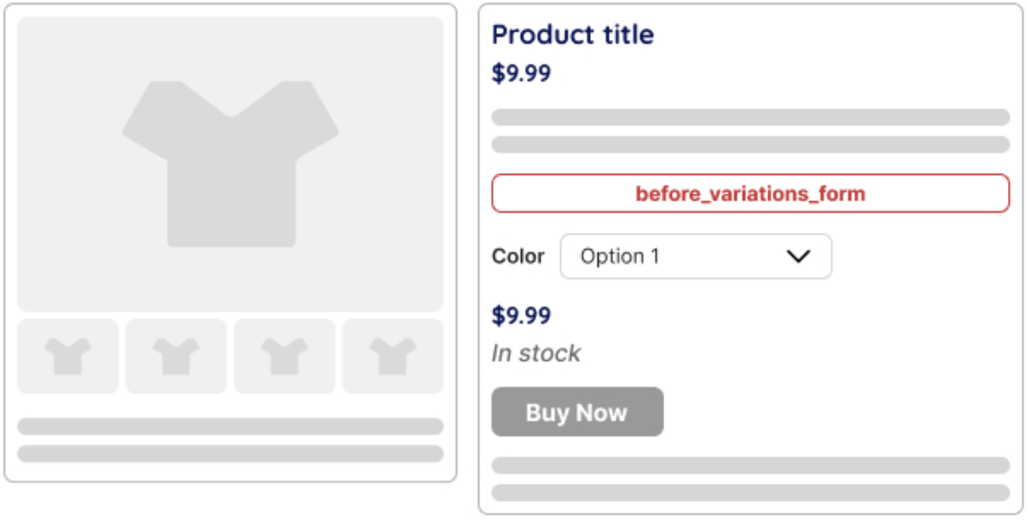
Before variations form
Position: Before the variation selection form. Used to insert content before the user selects a product variation. A variable product is required for this hook to fire.
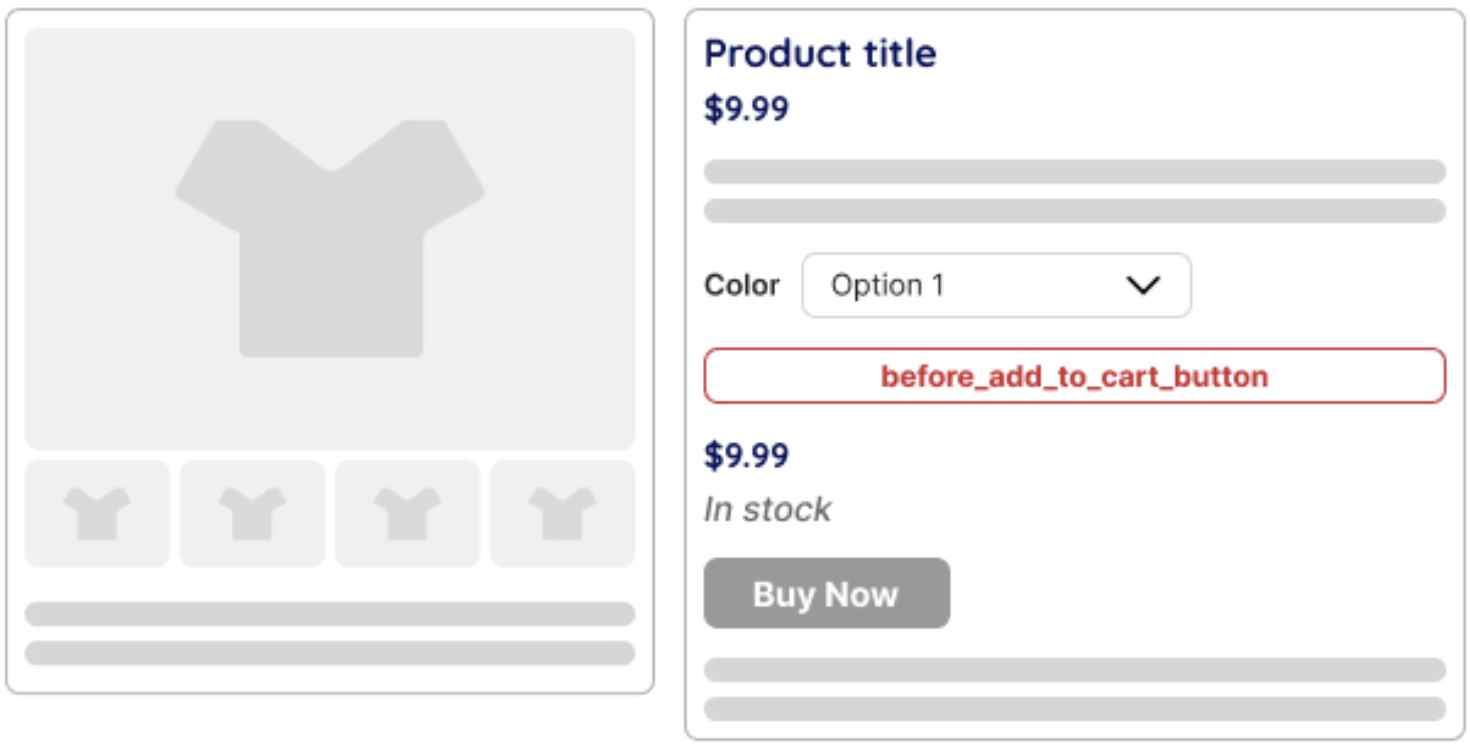
Before add to cart button
Position: Before the add-to-cart button. Allows inserting extra elements, such as quantity-based discounts or additional selections.
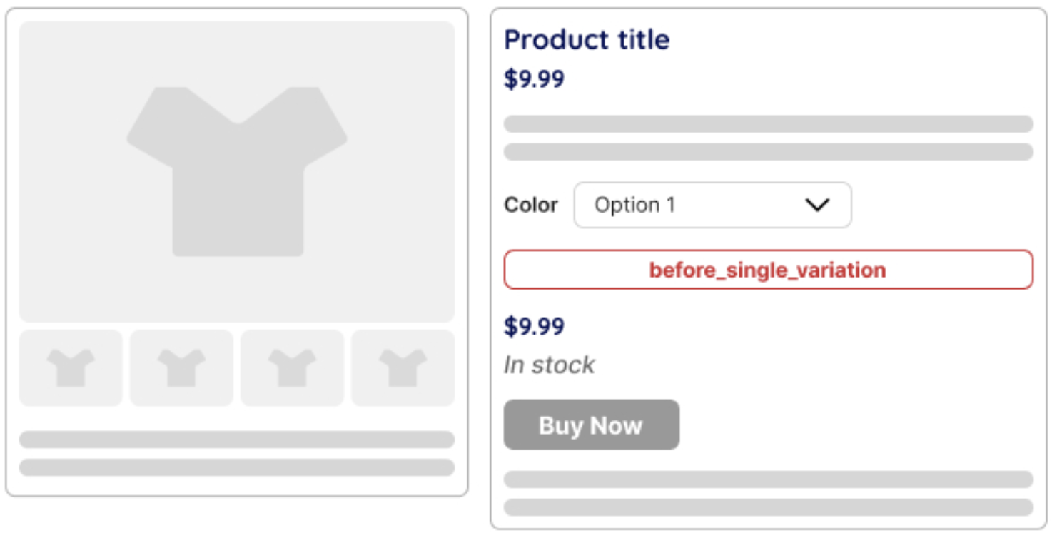
Before single variation
Position: Before the selected variation details are displayed. It can be used to insert variation-specific messages, such as customization options.
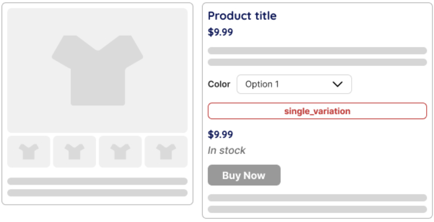
Single variation
Position: Inside the variation details section. Allows modifying the variation data display, like showing additional attributes or pricing details.
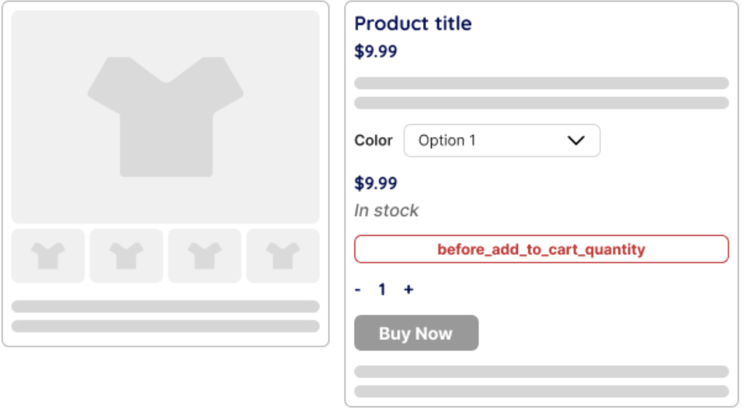
Before add to cart quantity
Position: Before the quantity selector in the “Add to Cart” section. It can be used to display additional information, notices, or custom elements related to product selection.
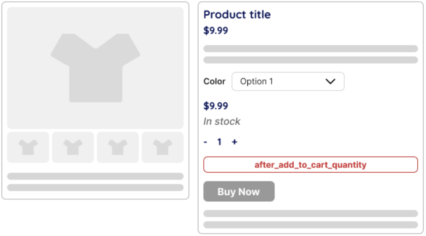
After add to cart quantity
Position: Right after the quantity selector in the “Add to Cart” section. It can be used to display custom messages, additional buttons, or other elements related to product selection.
After single variation
Position: After the selected variation details. Useful for inserting notices or additional variation-related information.

After add to cart button
Position: After the add-to-cart button. It can be used to add notices, custom buttons, or alternative purchase options.

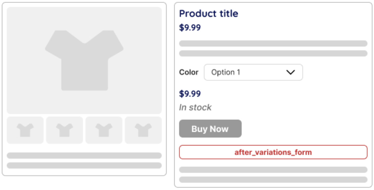
After variations form
Position: After the variation selection form. Useful for adding custom notices or explanations about variation options.
After add to cart form
Position: After the add-to-cart form. Useful for adding additional purchase-related content like special offers or upsells.
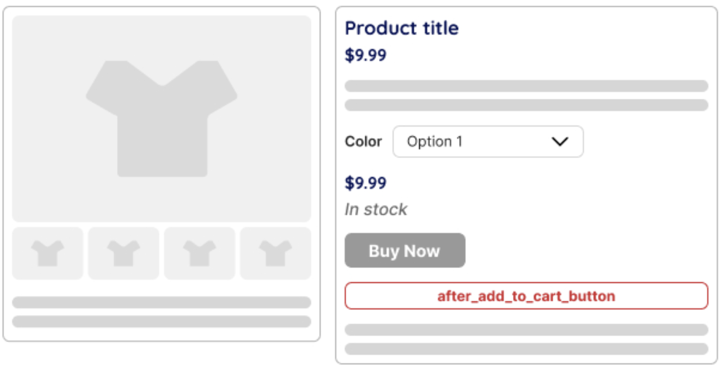
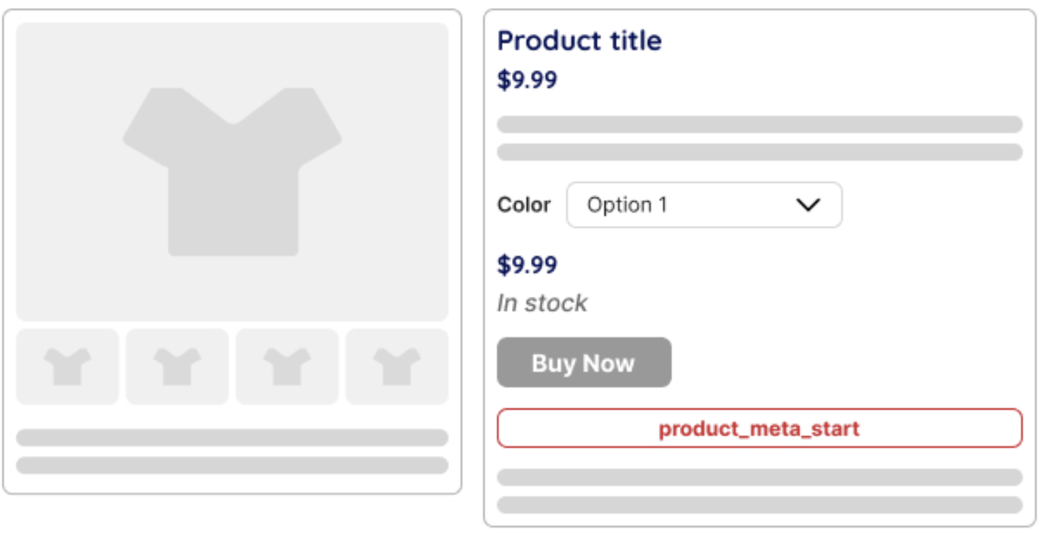
Product meta start
Position: Before the product meta section (SKU, categories, tags). Allows inserting custom metadata or additional product details before WooCommerce’s default metadata.
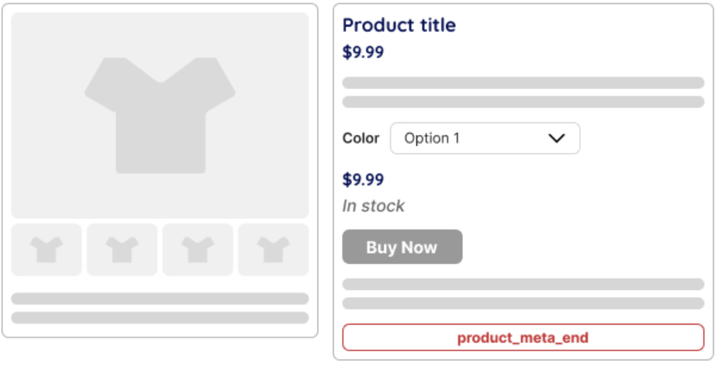
Product meta end
Position: After the product meta section. Suitable for adding extra product details, trust signals, or other meta-related elements.
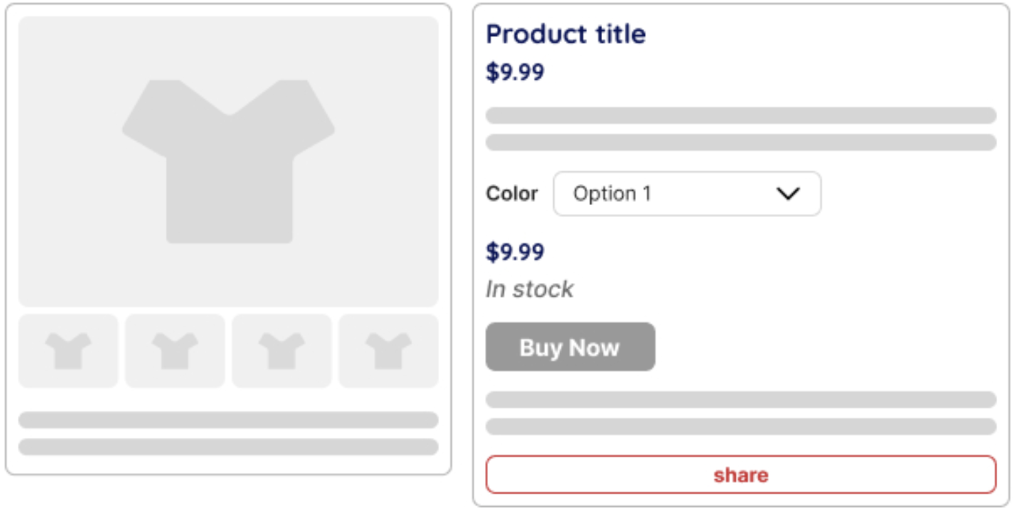
Share
Position: Inside the product summary, typically near social share buttons. Allows inserting custom social sharing buttons or additional social engagement features.
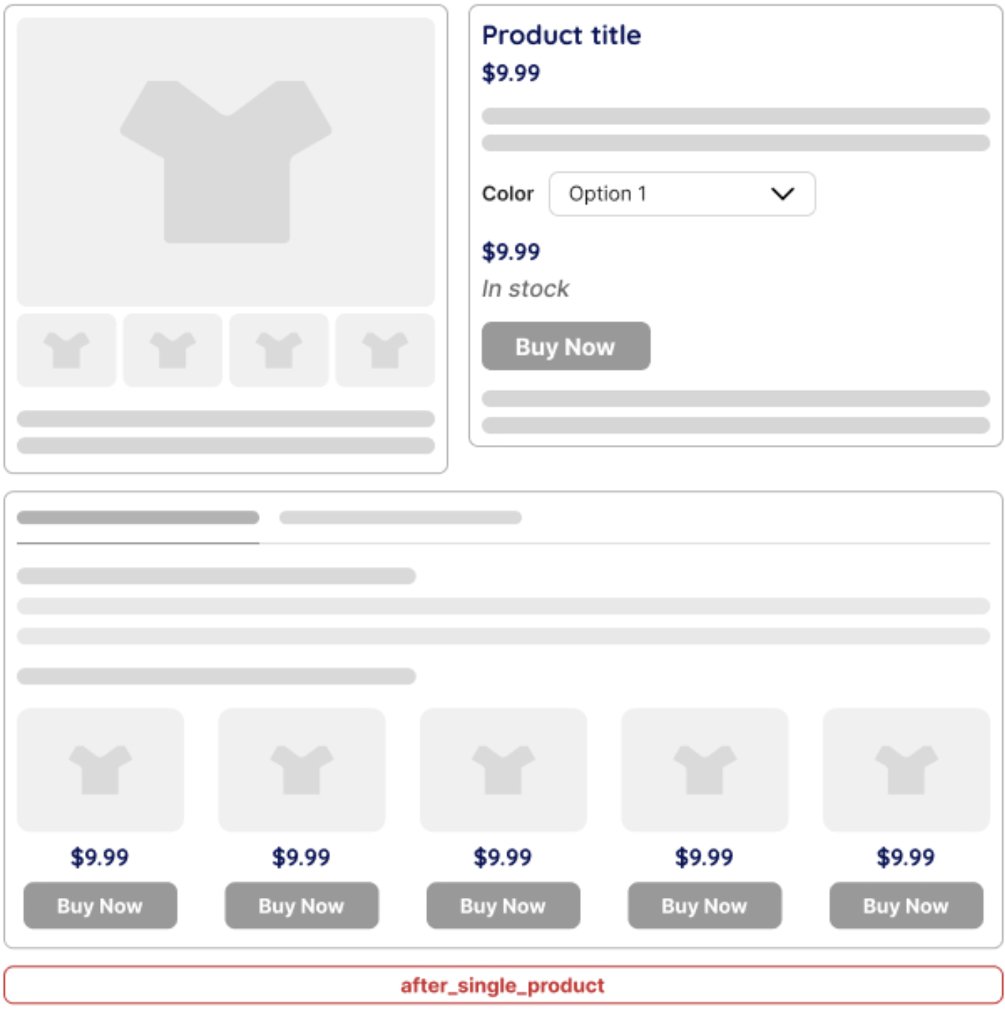
After single product summary
Position: After the entire product summary. Useful for adding upsells, additional product descriptions, or user-generated content like reviews.
After single product
This hook is triggered after the entire single product page content is rendered. It can be used to display additional information, related products, custom promotions, or other elements below the product details.
Important!
Variations Required hooks may not work properly for variations if the variation does not have a defined price. Ensure each variation has a set price for proper display:
- Before add to cart button
- After add to cart button
- Before add to cart quantity
- After add to cart quantity
Variable Product (Variation) hooks specifically affect variable products and require a selected variation to function properly:
- Before variations form
- After variations form
These hooks will not be triggered unless the product has variations
- Before single variation
- Single variation
- After single variation
These hooks will not fire if no variation is selected. Each variation must have a set price, or these hooks may not display expected content.
These WooCommerce hooks allow users to display a custom block at various locations on the product page. When dealing with variations, ensure that each variation has a set price to prevent unexpected behavior. If you have any questions about implementation, feel free to reach out!
Styling
Wrapper
Width – sets the width for the wrapper (px, %)
Min. Height – sets the height for the wrapper (px, %)
Padding Left – sets the internal spacing between the content and the element’s left border
Padding Right – sets the internal spacing between the content and the element’s right border
Padding Top – sets the internal spacing between the content and the element’s top border
Padding Bottom – sets the internal spacing between the content and the element’s bottom border
Margin Left – sets the external spacing between the element’s left border and the adjacent elements
Margin Right – sets the external spacing between the element’s right border and the adjacent elements
Margin Top – sets the external spacing between the element’s top border and the adjacent elements
Margin Bottom – sets the external spacing between the element’s bottom border and the adjacent elements
Border Color – sets the color for the border
Radius – sets the roundness of the wrapper’s corners
Border Width – sets the width for the wrapper
Style – sets the style for the wrapper
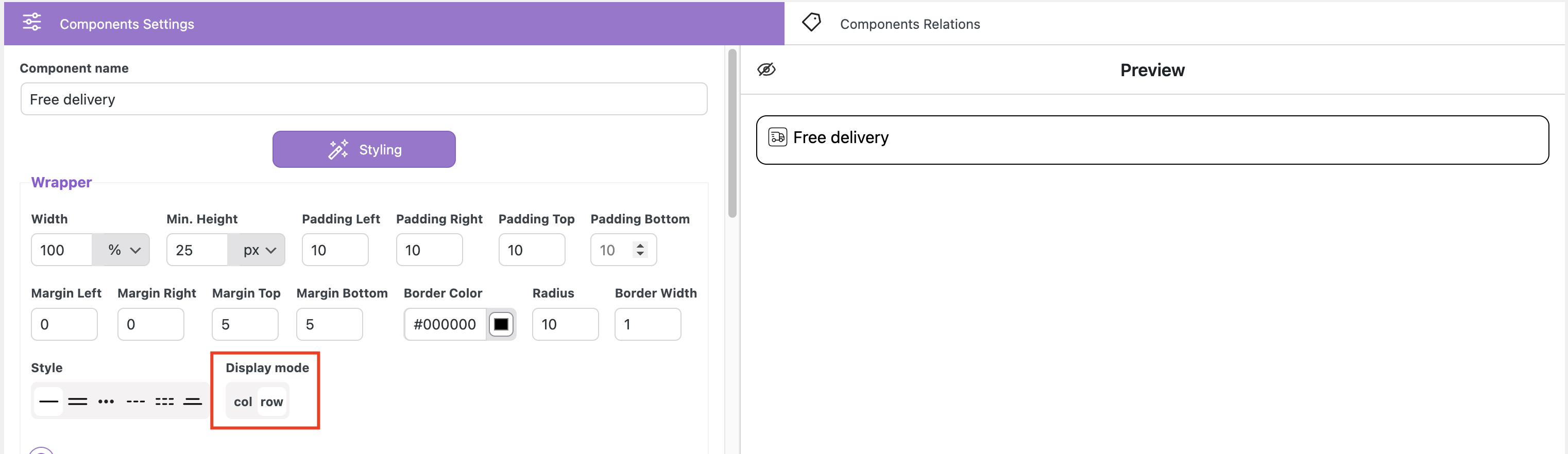
Display mode – allows placing two or more components in a column or a row
Row setting
Create two different elements and style them, setting ‘Display Mode’ as a row for both
image 1
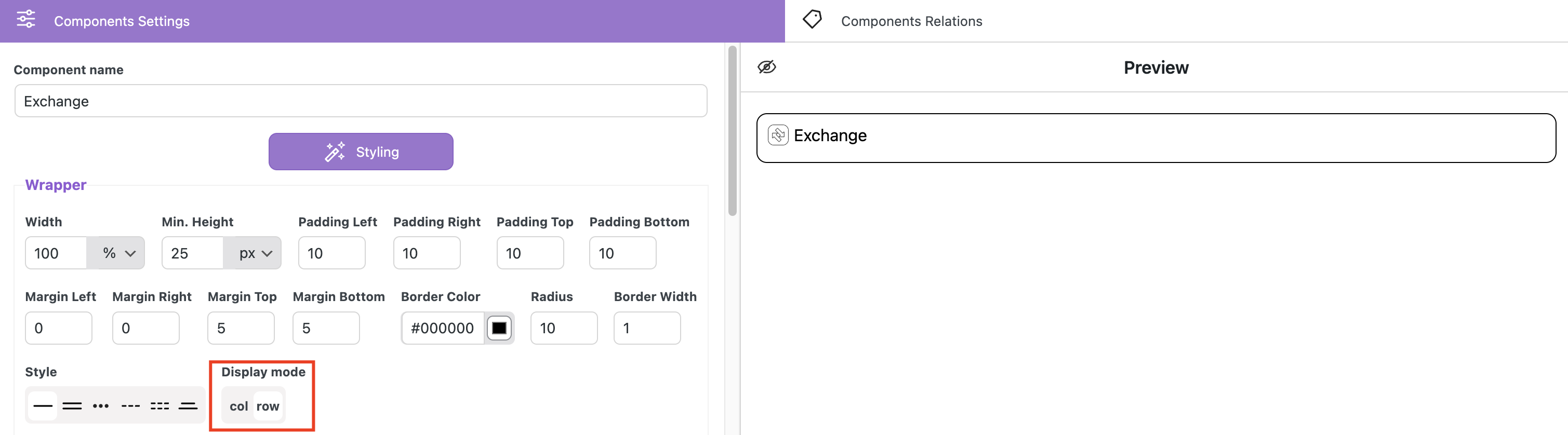
image 2
Set the same place for displaying
image 1
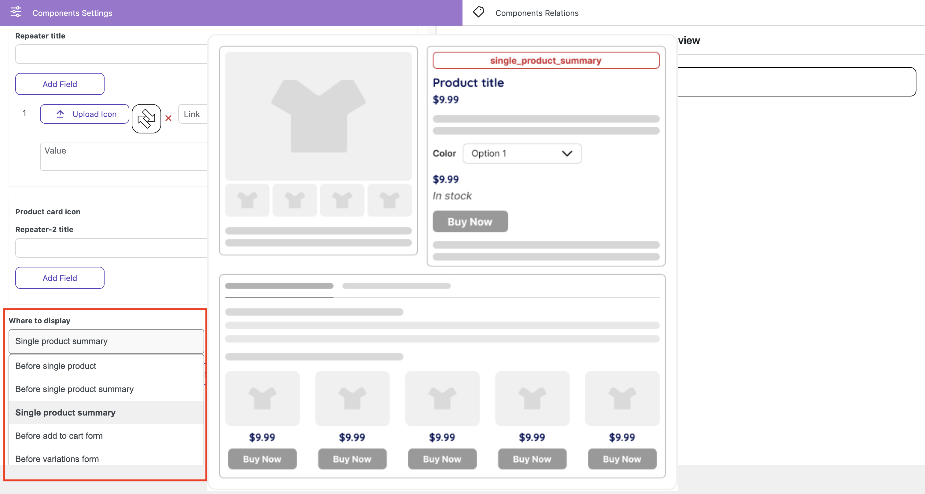
image 2
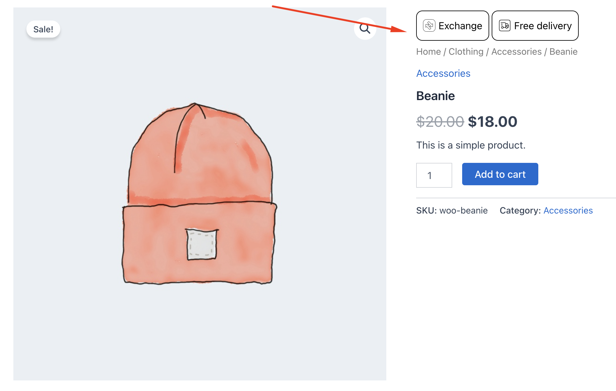
In the ‘Components Relations’ tab add required product for both components
Go to the single product card of the specified product
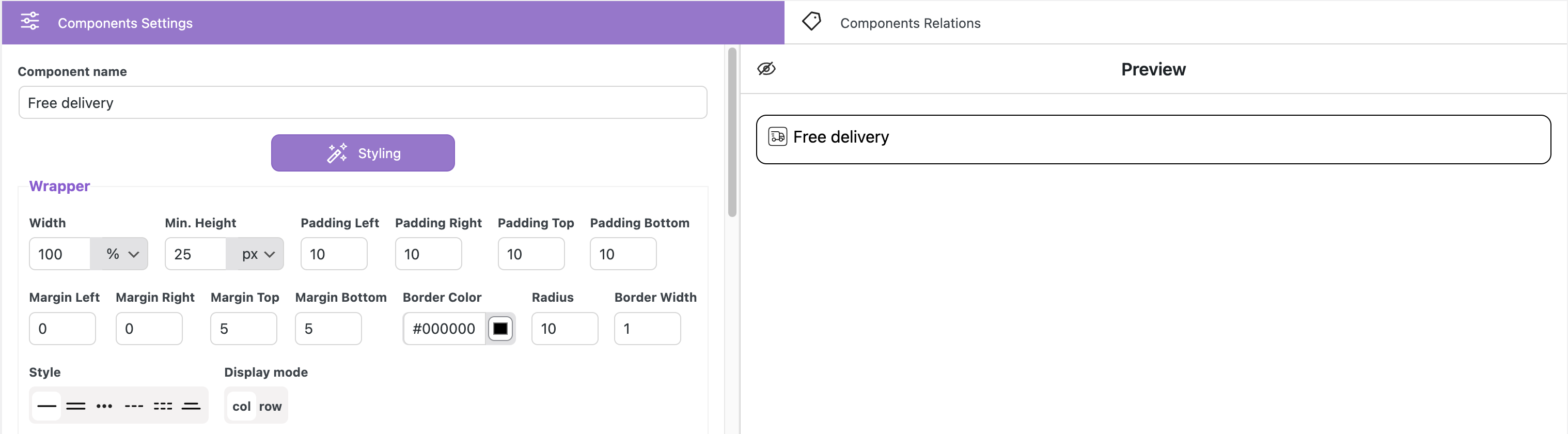
Column setting
Create two different elements and style them, setting ‘Display Mode’ as a column for both
image 1
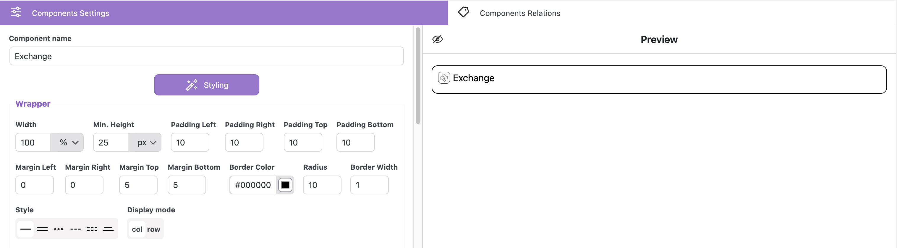
image 2
Set the same place for displaying
In the ‘Components Relations’ tab add the required product for both components
Go to the single product card of the specified product
Background mono Color – allows to select mono color for the background
Color – sets the color for the background
Background Opacity – sets the transparency level for the background
Background Gradient – allows to select of gradient color for the background
Start Color – sets the start color for the gradient
End Color – sets the end color for the gradient
Gradient Type – sets the type of the gradient
Gradient Opacity – sets the transparency level for the gradient background
Main title block
Text Align – align the text on the left, right, or center
Font Size – sets the font size
Vertical Align – sets the text’s vertical positioning relative to the image
start position
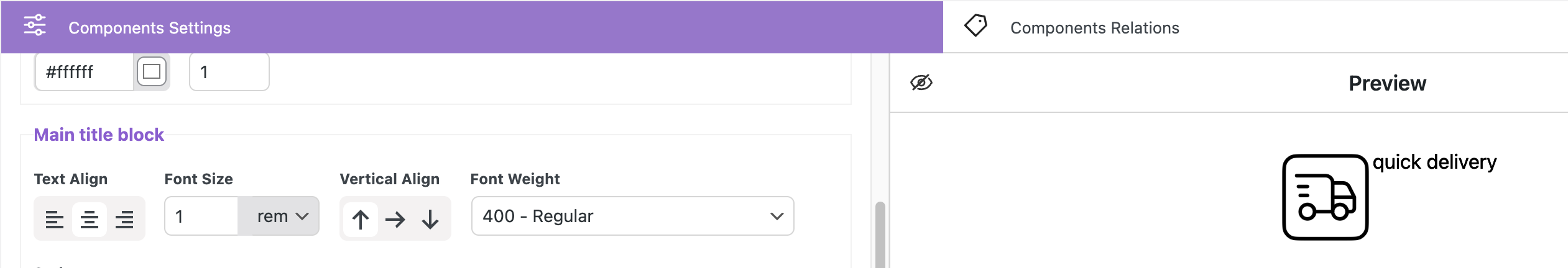
center position
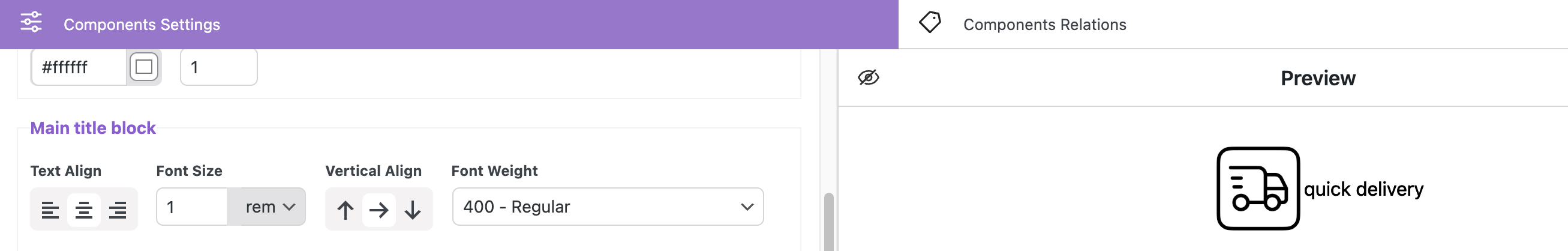
end position
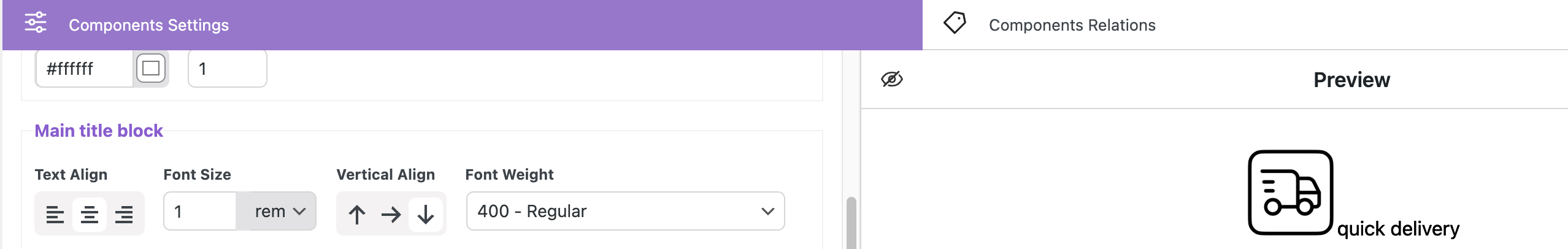
Font Weight – sets the text weight
Style – sets the style of text
Main title color
Mono Color radio button – allows to select one color for the title
Color – sets the title color
Shadow X / Y– sets the vertical and horizontal position of the shadow
Color – sets the color for the shadow
Gradient radio button – allows to select two colors for the title
Start color – sets the initial color
End color – sets the final color
Direction – sets the direction in which the gradient will be applied
Main title block Image
Display before text – places the icon before the text
Display after text – places the icon after the text
Image Width – sets the icon size
Image margin left – sets the external spacing on the left side of the image
Image margin right – sets the external spacing on the right side of the image
Description styles
Font Size – sets the text size
Font Weight – sets the text weight
Style – sets the font style
Font Color – sets the text color
Padding Left – sets the internal spacing between the content and the element’s left border
Padding Right – sets the internal spacing between the content and the element’s right border
Padding Top – sets the internal spacing between the content and the element’s top border
Padding Bottom – sets the internal spacing between the content and the element’s bottom border
Margin Left – sets the external spacing between the element’s left border and the adjacent elements
Margin Right – sets the external spacing between the element’s right border and the adjacent elements
Margin Top – sets the external spacing between the element’s top border and the adjacent elements
Margin Bottom – sets the external spacing between the element’s bottom border and the adjacent elements
Background – sets the background color for the container
Border Color – sets the border color for the container
Radius – sets the roundness of the container’s corners
Border Width – sets the width of the container border
Style – sets the style for the container border
Banner styles
Banner Width – sets the banner width
Banner Margin Y – sets the vertical position for banner
Banner Align – align the banner on the left, right and center
Repeater title styles
Font Size – sets the text size
Font Weight – sets the text weight
Style – sets the font style
Font Color – sets the text color
Common repeater blocks styles
Text Size Unit refers to the units of measurement that will be used for the text size.
- rem – Relative to font-size of the root element
- em – Relative to the font-size of the element (2em means 2 times the size of the current font)
Repeater Icon Width – sets the icon size for the repeater
Repeater-2 Icon Width – sets the icon size for the repeater-2
Margin Left – sets the external spacing between the element’s left border and the adjacent elements
Margin Bottom – sets the external spacing between the element’s bottom border and the adjacent elements
Margin Top – sets the external spacing between the element’s top border and the adjacent elements
List padding – sets the inner space between the list container’s edges and its content, affecting the spacing inside the list
List gap – sets the space between list items
Tooltip Styles for Repeater
Tooltip Background – sets the color of tooltip background
Tooltip Width – sets the width for tooltip
Tooltip Padding – sets the inner space around the text in the tooltip
Tooltip Border Color – sets the border color for tooltip
Tooltip Border Width – sets the border width for tooltip
Tooltip Border Style – sets the border style of the tooltip
Tooltip Border Radius – sets the roundness of tooltip’s corners
Tooltip Shadow X / Y – sets vertical and horizontal position of the shadow
Tooltip Shadow Dispersion – sets the density of the shadow
Tooltip Shadow Opacity – sets the level of transparency for the shadow
Tooltip Shadow Color – sets the color for the tooltip shadow
File Downloader styles
Display mode col / row – allows to display added files either in a column or a row
Title Font Size – sets the title size
Font Weight – sets the title’s font-weight
Style – sets the title’s style (normal or italic)
Title Font Color – sets the title’s font color
Margin Top – sets the outer space between the container top and the title
Margin Bottom – sets the distance between the title and the element that follows it
File Title Font Size – sets the file title size
File Title Font Weight – sets the file title’s font-weight
Style – sets the file title’s style (normal or italic)
File Title Font Color – sets the file title’s font color
Icon Width – sets the icon size
Vertical Align – sets the text’s vertical positioning relative to the image
Download Icon Gap – sets the distance between icon and text
Download Items Gap – sets the distance between items
Download Item Margin Top – sets the outer space between the container top and the downloaded item
Download Item Margin Bottom – sets the distance between the downloaded item and the element that follows it
Recommendations and solutions to potential problem
Each theme is partially unique and may have different settings, as well as different ways to implement the same elements. For such cases, our plugin provides various methods to implement the display of the required elements.
Examples of such cases include:
- Displaying Product Properties
- If your website uses narrow product cards and the text doesn’t fit, you can choose to display the text in Column mode. This option is available on the plugin’s page under the general appearance settings for product property descriptions, Global Properties Styles. If you’re customizing a specific product, you can do this in our Product Card Configurator metabox, under the Properties tab in the “Properties Styling” section, which is located on the product creation page.
Custom Properties Display Modes: Row vs. Column
Our plugin offers two modes for displaying custom properties: Row and Column.
By default, properties are shown in a row, making them align horizontally with other product details. However, if your theme displays six or more products per row, the available space for custom properties, values, and icons may become too narrow, causing layout issues.
In such cases, switching to Column mode will help by stacking properties vertically, ensuring better readability.
Another reason to use Column mode is when property names or values contain long text. If the text is too large to fit comfortably in a single row, displaying them in a column will improve clarity and presentation. Users can choose the mode that best fits their design and content needs.
Row example
Column example
Rem and Em unites
Em unit changes depending on the font size of its parent element.
Rem unit is fixed relative to the root element’s font size and doesn’t change based on the parent’s font size.
Important! Measurement units depend on the theme. For better text display, switch to rem.
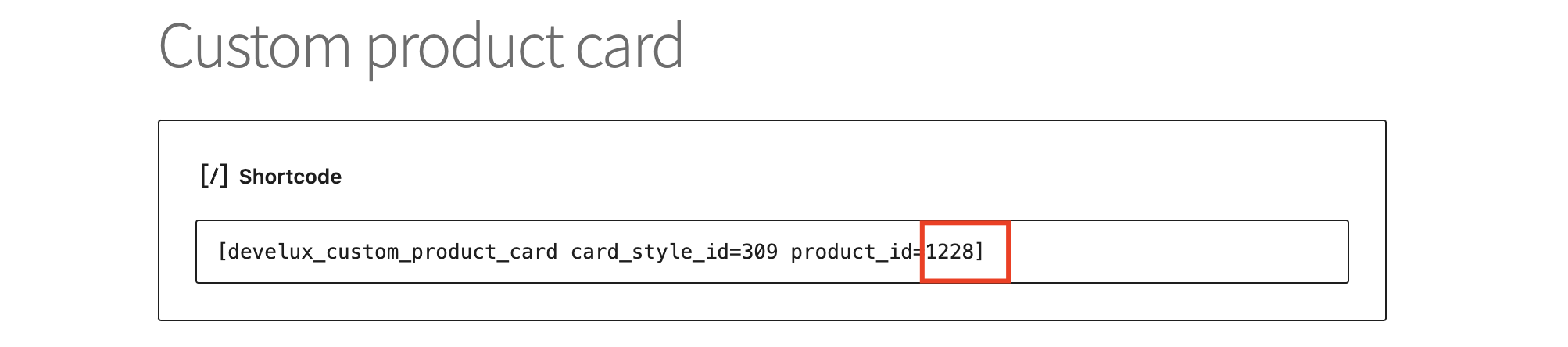
ID replacement in the shortcode
To display a custom card on the page, you need to enter the shortcode of this card into the shortcode field.
To replace the card on the product page, get the card ID from the Product tab
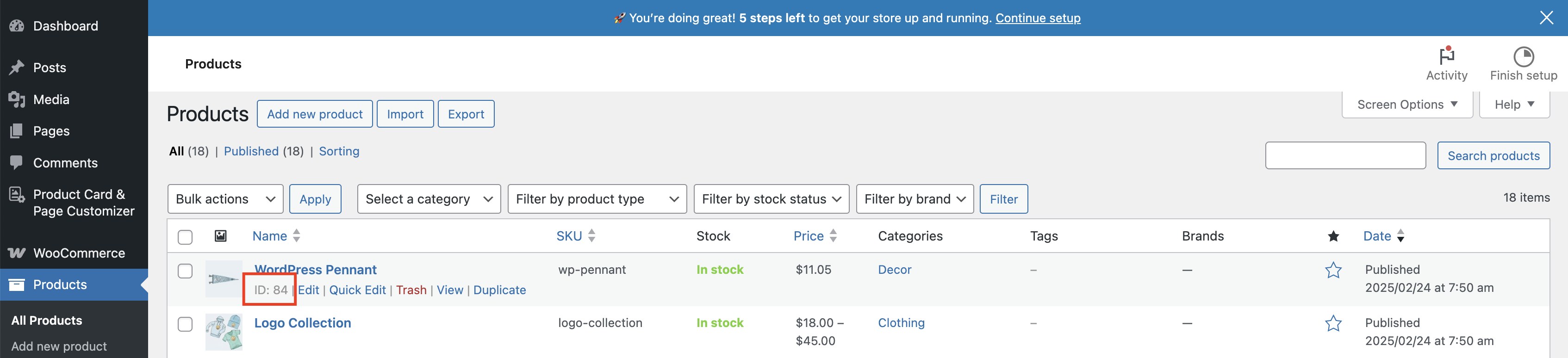
Enter this ID instead of existid ID in the shortcode
Important! If the shortcode belongs to a custom card with a slider, and a custom card shortcode with a switcher is inserted instead, the thumbnail will be absent on the custom product card
Timer location
In some themes, the “Before product title” position in the timer is only displayed when hovering over the image because the theme’s layout places the title area in a custom block with absolute positioning.
Animated timer
Some themes may affect the Display animation timer settings
In such cases, a regular timer should be used
Issue with not saving data in the fields
If you notice that some fields are not saving when updating a product, the issue may be related to a server setting called max_input_vars. This setting controls the maximum number of input fields (such as form fields and custom options) that can be processed at once. By default, many servers have this set to 1000, which may not be enough if you have a large number of custom fields.
To fix this, you need to increase max_input_vars to 3000 or 5000. You can do this by:
Editing the php.ini file (if you have access) and adding: max_input_vars = 5000
Adding a rule to .htaccess (for Apache servers): php_value max_input_vars 5000
Updating wp-config.php (for some hosting environments): @ini_set(‘max_input_vars’, ‘5000’);
If you’re unsure how to do this, contact your hosting provider and ask them to increase max_input_vars for you. After making the change, try saving your fields again, and they should now be saved properly.
Auxiliary functions of the plugin #
Disabling Default WooCommerce Labels
Most themes developed for WooCommerce display the default label. To disable these default labels, use this feature.

Important! ‘Disable WC Labels’ option may not work, it depends on the theme.
Enabling permission to use SVG files
By default, WordPress does not support SVG file format. Here, you can enable support for these files.


