
Enhance your WooCommerce product cards with custom labels like “Best Seller,” “On Sale,” and “Limited Edition” to grab customer attention and increase conversions. Easily customize label colors, fonts, and placement with a drag-and-drop editor—no coding needed!
General information about the plugin #
The Label Builder plugin by Develux provides additional functionality for your online store, enhancing the standard product card and product page capabilities.
In all online stores built on WooCommerce, product cards are displayed on the following pages:
- Catalog
- On the product page (Upsells)
- On the cart page (Cross-sells)
- May also be displayed on other pages if implemented in the site theme
If your WooCommerce theme has not modified the standard generation of product cards, the full functionality of the plugin will be available. Otherwise, only part of its features will be accessible.
With this plugin, you can perform the following actions:
- Create custom labels or use ready-made ones from our library. You can also use labels created in other graphic programs and saved in the following formats: jpg/jpeg, png, svg, placing them on the product card or page.
- Display additional informational elements in various places on the product card
- Work with the bulk manager, which allows you to assign labels to multiple products using WooCommerce categories and tags, as well as include or exclude specific products
- Create your own library of labels
- Use the general auxiliary features of the plugin
Plugin compatibility #
The plugin is designed to provide additional functionality for your online store built on WooCommerce. It is not compatible with other e-commerce platforms. Our plugin works correctly with WordPress themes developed for WooCommerce, following all requirements and recommendations of the WooCommerce/WordPress developer guidelines.
Important! Our plugin uses standard WooCommerce/WordPress hooks and filters. If your theme or other plugins modify the default behavior of these hooks/filters, the plugin may not function correctly!
Important! Our plugin uses the standard jQuery/jQuery UI library. If your theme or other plugins modify or disable these libraries, the plugin may not function correctly!
Installation and configuration #
The plugin is installed using the standard method provided in WordPress.
In the admin panel, you need to go to the Add New Plugin page.
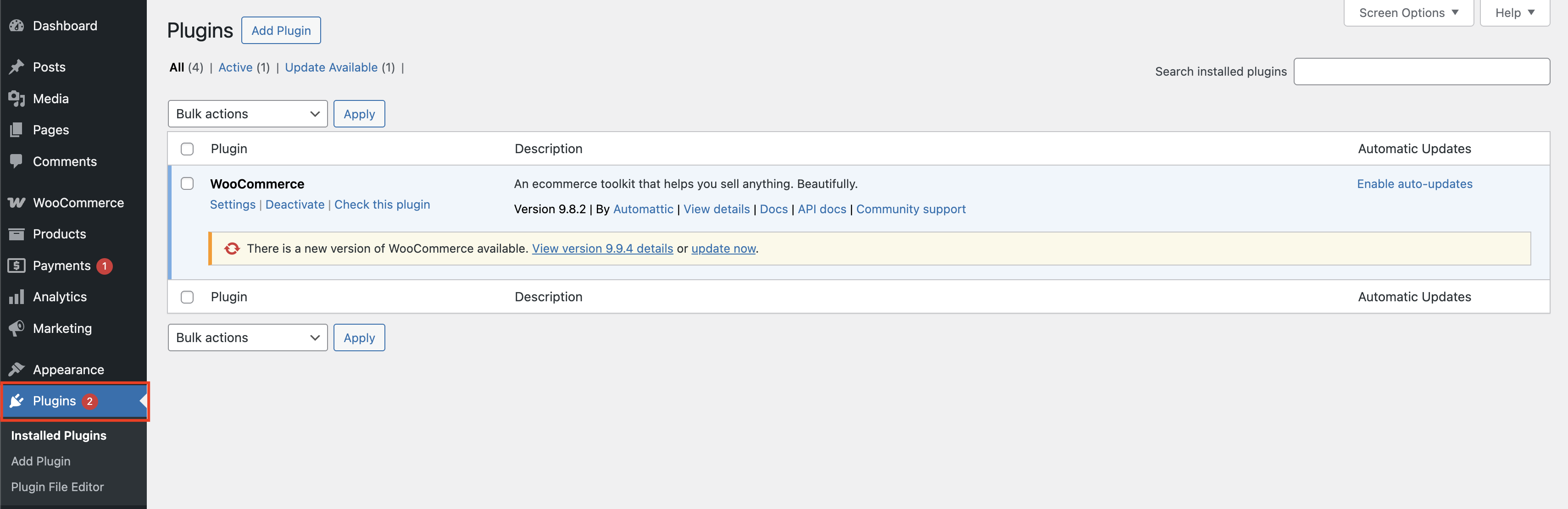
Plagin page
Using the Add Plugin button, upload the plugin’s zip archive.
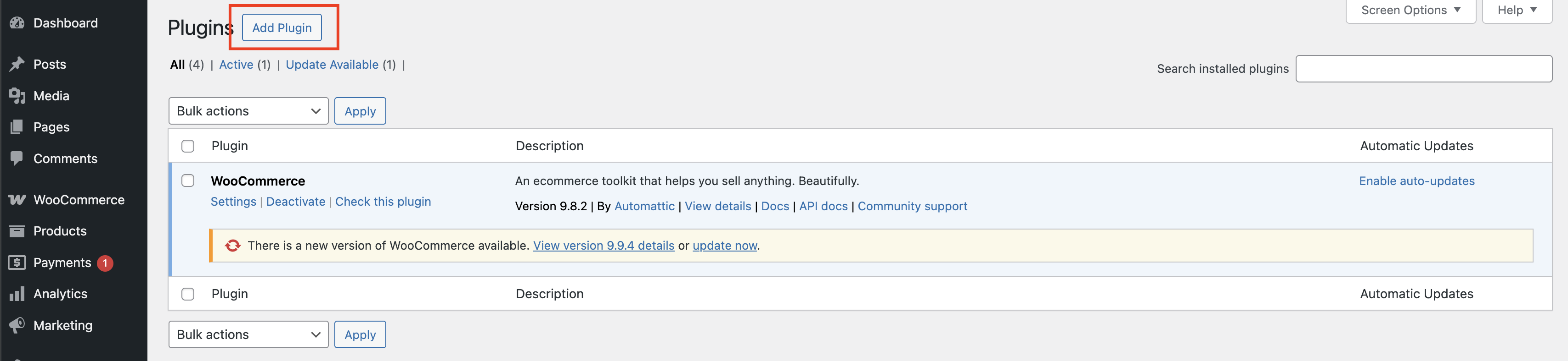
Click the highlighted Add Plugin button
After the plugin installation, it will be ready for use immediately. Additionally, after installation, you will receive ready-to-use elements in the label and timer library.

The Plugins page with the Label Builder plugin installed
Plugin global settings #
On this page, you can find general help functions.
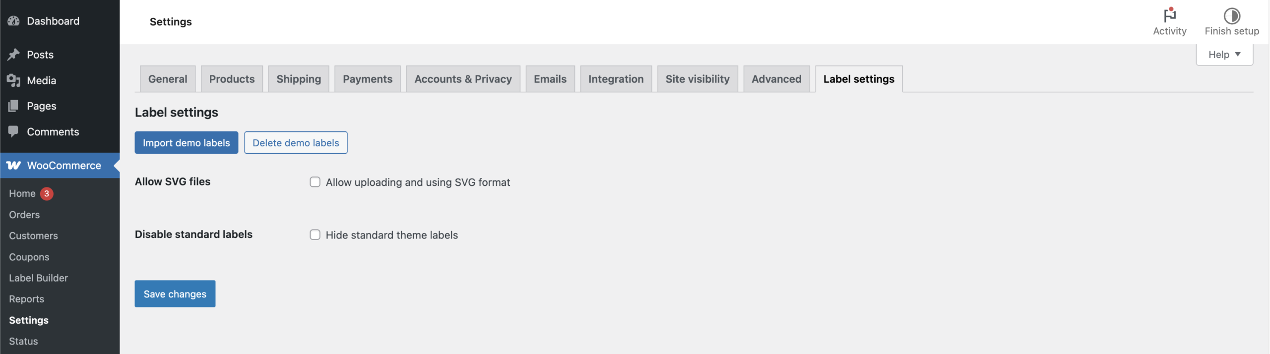
Label settings page
Import demo labels – uploading demo labels on the ‘Label builder’ page.
Delete demo labels – delete uploaded demo labels on the ‘Label builder’ page.
Allow SVG files – here you can enable support for working with svg files.
By default, support for this extension is disabled.
Disable standard labels – here you can disable the standard labels that are displayed in most WooCommerce themes.
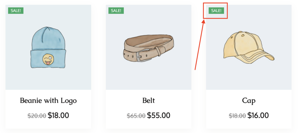
Example of standard WooCommerce labels
On the Label Builder page, there is an Import Demo Page button. It redirects you to the Label Settings page, where you can import demo labels.
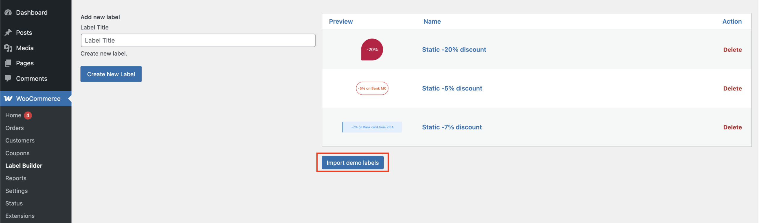
Import demo labels button on the Label Builder page
Creating and customizing/styling a unique label for a product #
With our tools, you can create two types of labels, custom and your own, in these formats (jpeg/jpg, png, SVG).
General settings page of Label Builder
It must be enabled using the ‘Display label’ switch for the label to appear on the product card
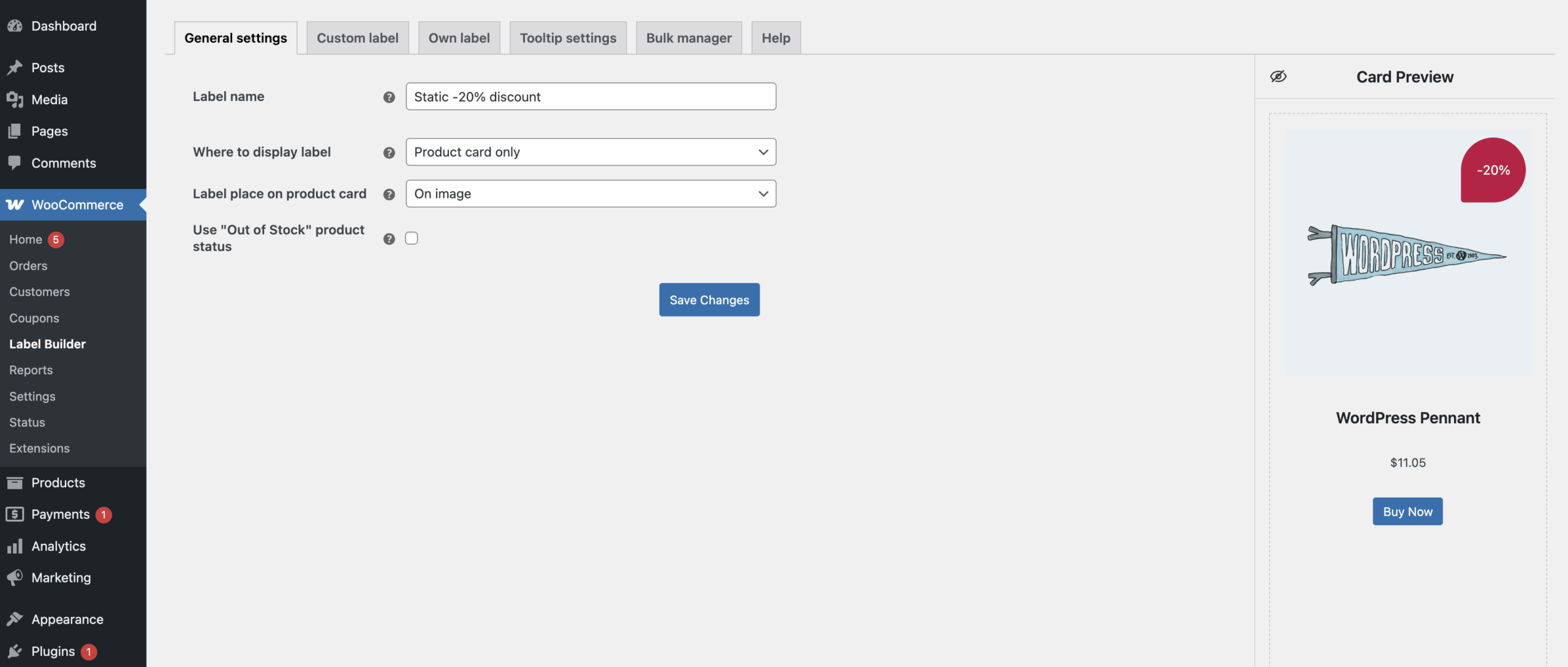
General settings tab #
Label name – field for entering the label name
Where to display label – the list of options allows selecting whether to show the label on the product card or the single product page.
- Product card only – the label will be placed exclusively on the product card
- Product page only – the label will be placed exclusively on the product page
- Product card and page – label will be placed on the card and product page
Label place on product card – sets the location for displaying the label on the product card/ product page (on image/ before title/ after title/ after price)
Use ‘Out of Stock’ product status – indicates that the product is currently unavailable in stock
The ‘Out of Stock’ product status option is displayed only if the product has the Stock Status set in the Products settings.
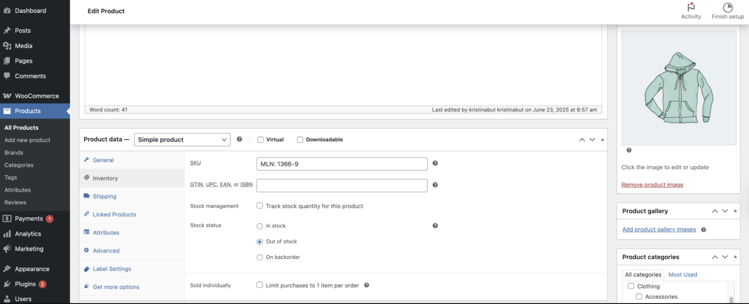
‘Out of stock’ settings on the Products page
For the option to work correctly, the following conditions must be met:
- the checkbox for Use ‘Out of Stock’ product status is activated
- The product is assigned in the Bulk Manager
Important! When the product status in Products is changed from ‘Out of Stock’ to any other status, the label stops being displayed on the product card in the store.
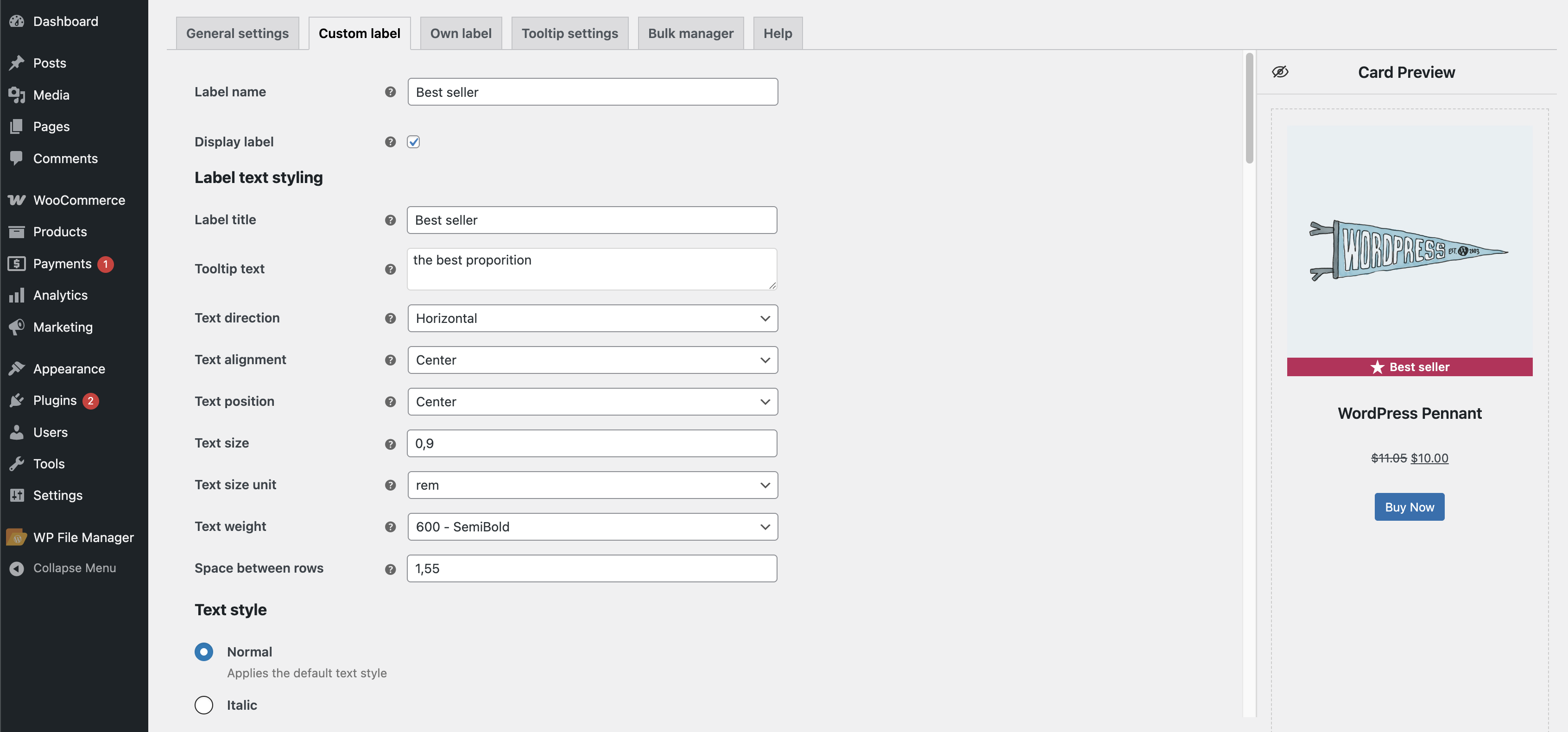
Custom label tab #
Label name – field for entering the label name
Display label – allows displaying the label on the card
Label text styling
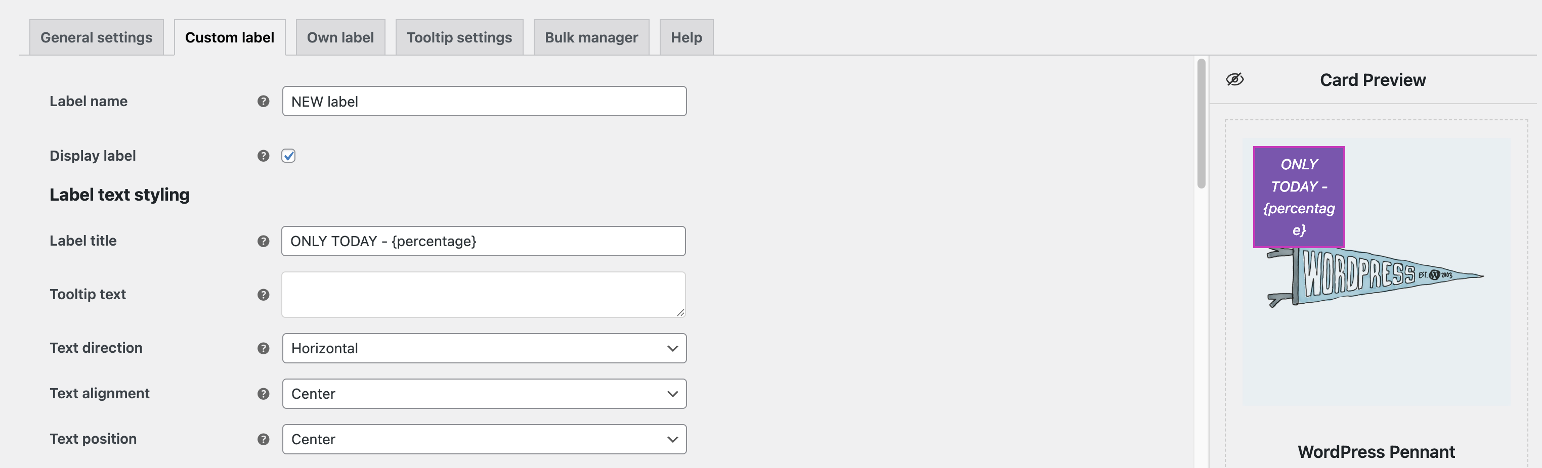
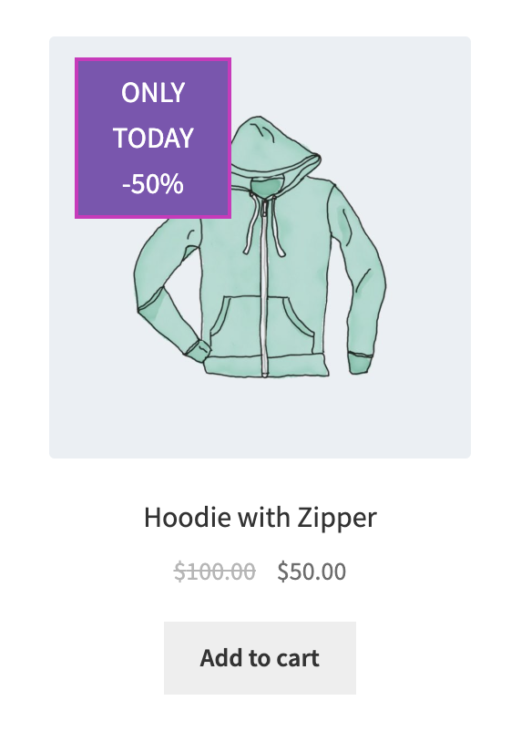
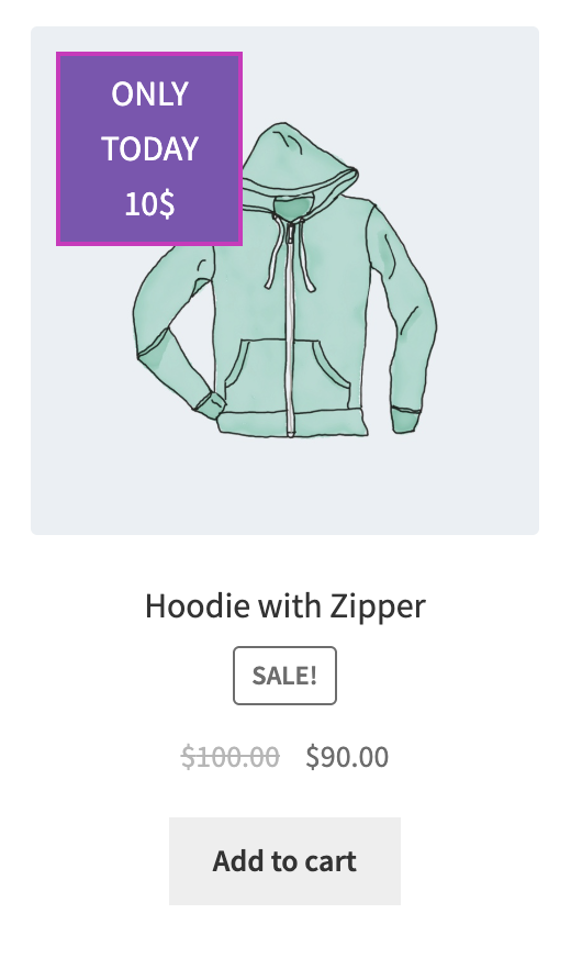
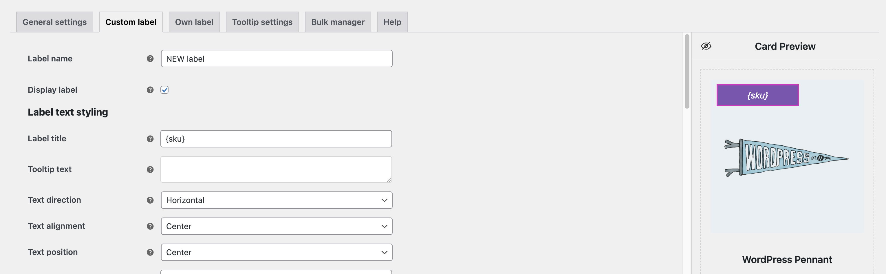
Label title – allows entering the label text or {percentage}, {discount_value}, {quantity}, {sku} placeholders.
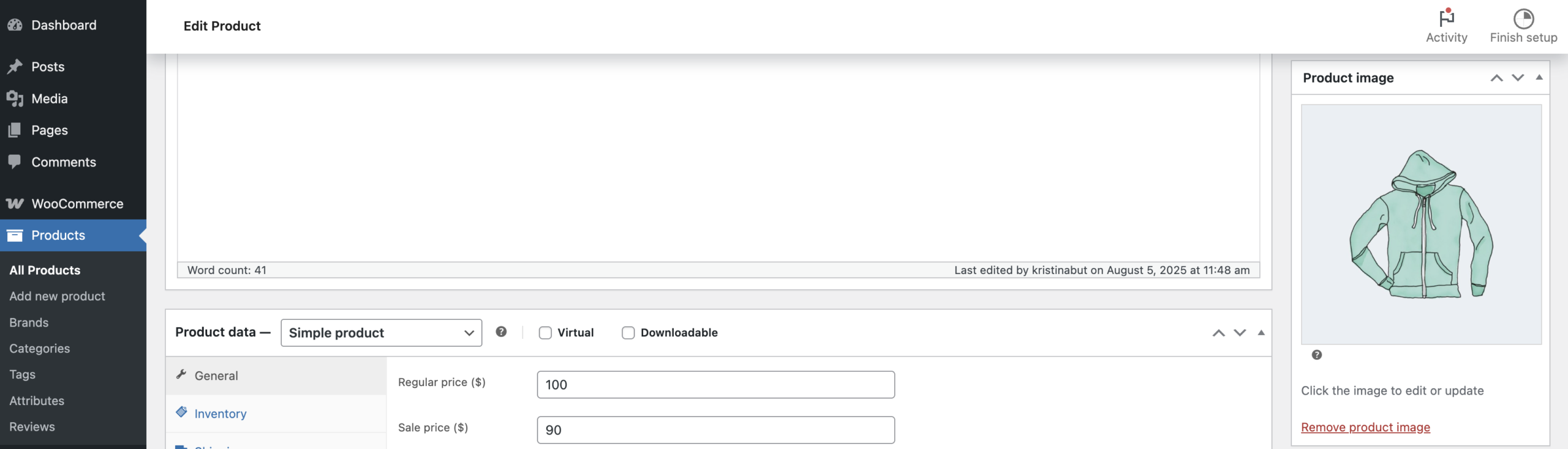
The {percentage} placeholder displays the discount amount in %.
For correct display, you need to set the Regular Price and Sale Price for the product.
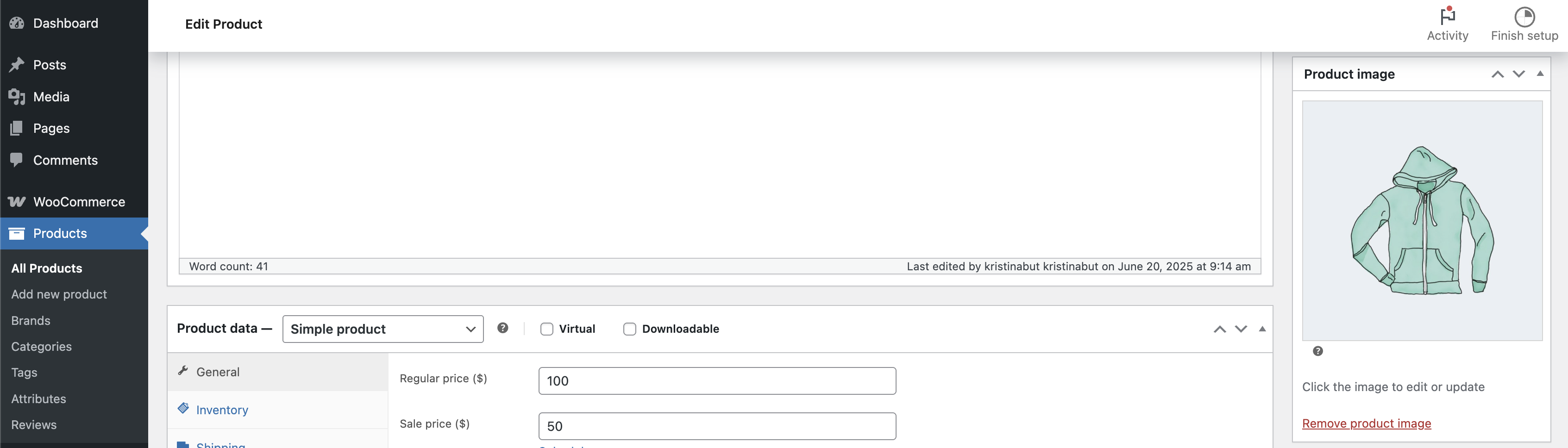
The {percentage} option settings on the Products, Label builder pages
The {discount_value} placeholder displays the discount amount in currency.
For correct display, you need to set the Regular Price and Sale Price for the product.
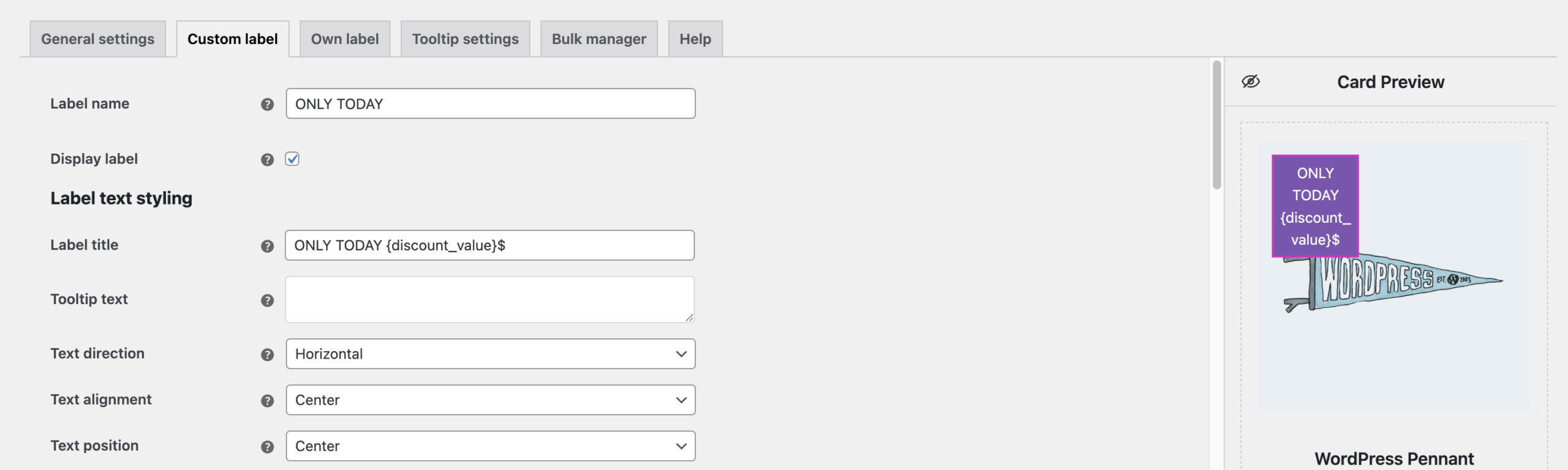
The {discount_value} option settings on the Products, Label builder pages
The {quantity} placeholder shows how many products are in stock.
For correct display, you need to set the stock quantity in the Products tab under stock management.
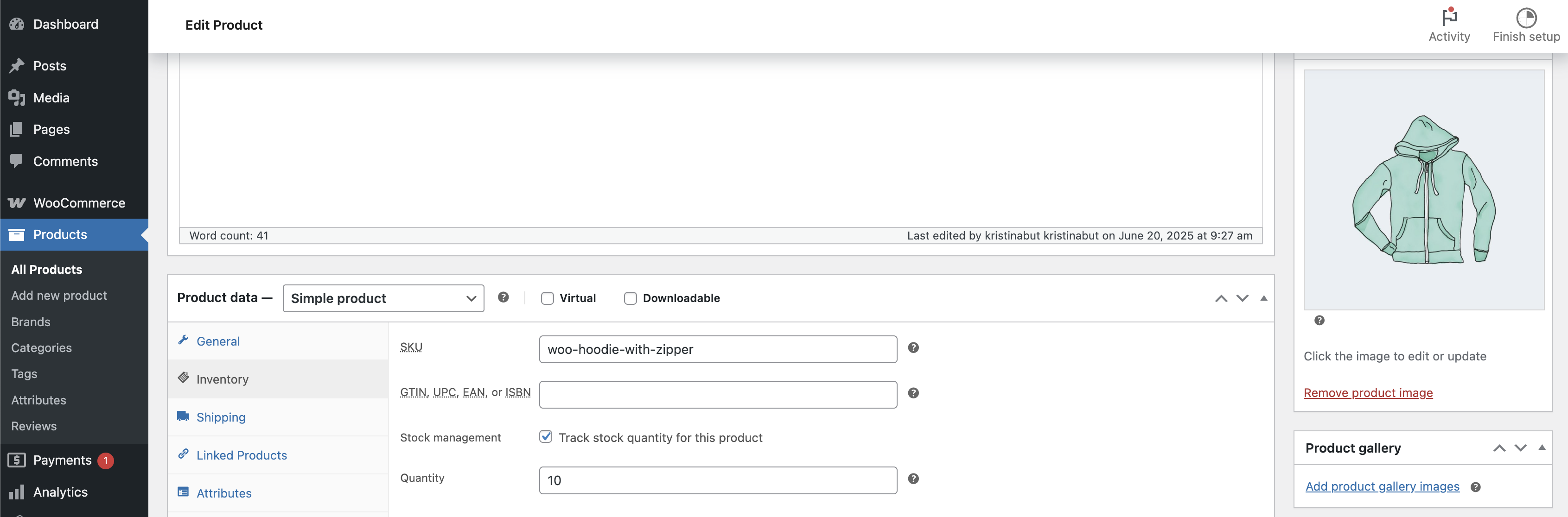
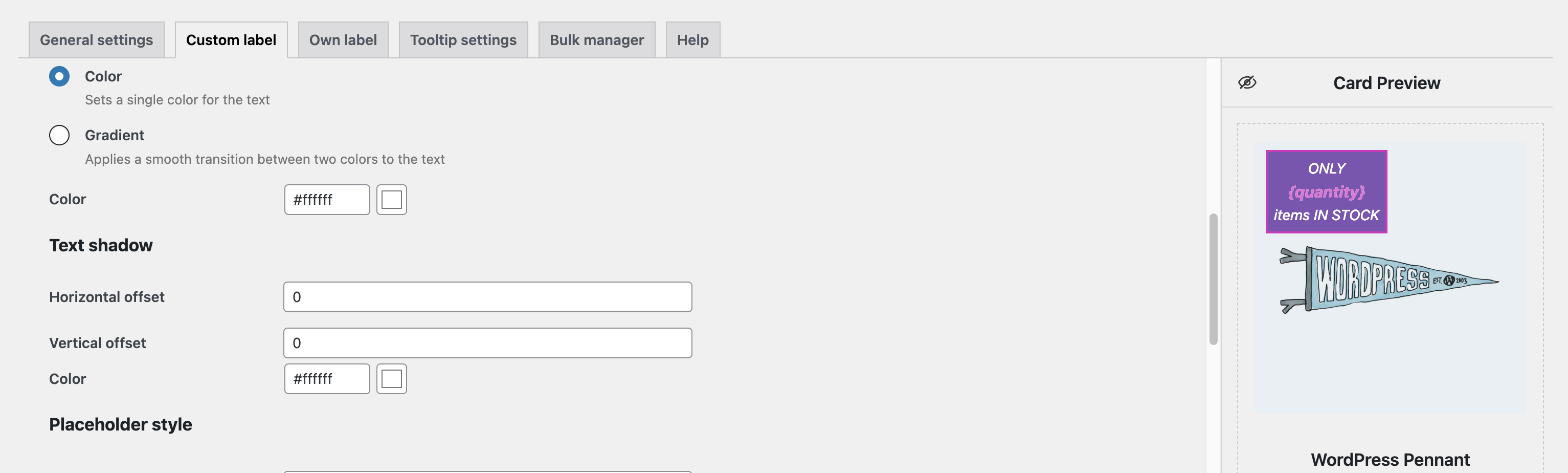
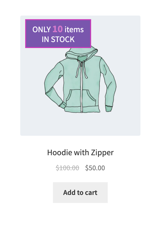
The {quantity} option settings on the Products, Label builder pages
The {sku} placeholder shows the product SKU name.
For correct display, you need to set SKU name in the Products tab.
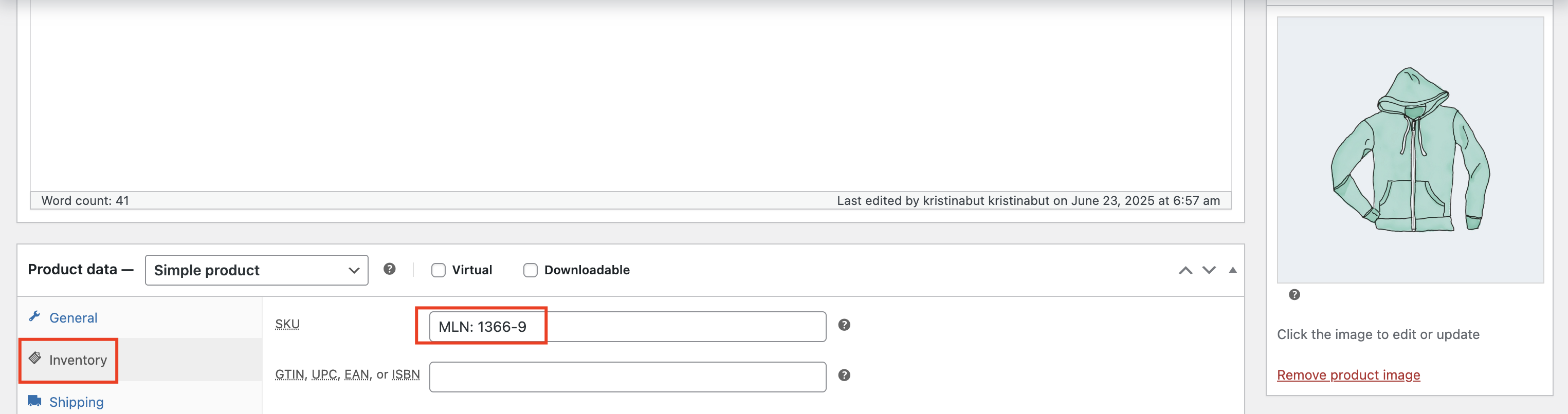
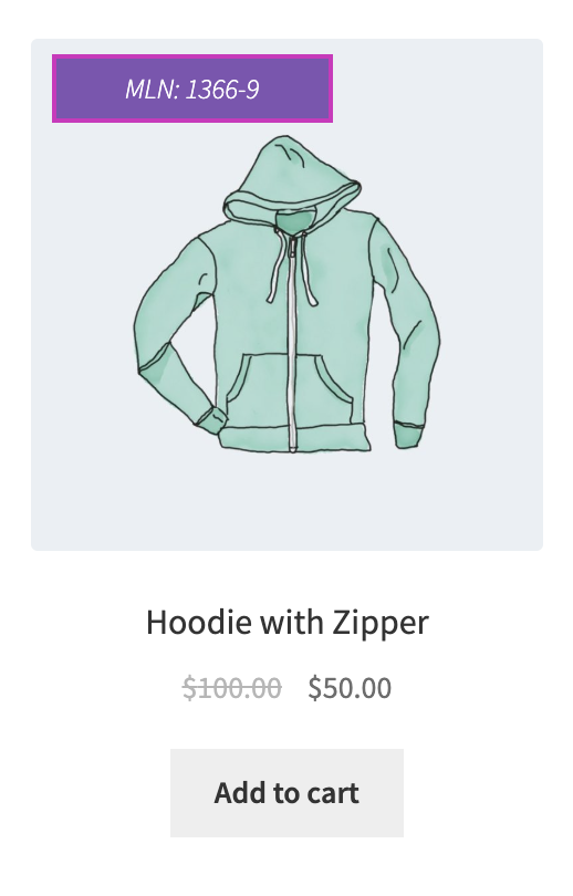
The {sku} option settings on the Products, Label builder pages
Tooltip text – field for entering the tooltip text
Text direction – Sets the direction for the text
Text alignment – sets the text alignment in the label
Text position – sets how the text is aligned vertically within the label
Text size – sets the font size for text
Text size unit – refers to the units of measurement that will be used for the text size
Text weight – sets the font bold
Space between rows – sets the spacing between lines of text
Text style
Normal – applies the default text style
Italic – makes the text slanted for emphasis or style
Text color
Color – sets a single color for the text
Gradient – applies a smooth transition between two colors to the text
Start color – sets the first color for the gradient
End color – sets the last color for the gradient
Direction – sets the direction of the gradient color in the text (top, bottom, left, right)
Placeholder style
Placeholder size – sets the size of the placeholder text
Placeholder weight – sets the font bold of the placeholder text
Placeholder color – sets the color of the placeholder text
Label movement
Position – sets the left, center, or right placement on the product card
Vertical offset – sets the label’s vertical alignment on the product card
Horizontal offset – sets the label’s horizontal alignment on the product card
Bottom outer space – sets the space below the label and the surrounding elements
Label layout settings
Color – sets a single background color for the label
Gradient – applies a smooth transition between two colors for the label background
Start color – sets the first color for the gradient
End color – sets the last color for the gradient
Gradient types – sets the style of the gradient applied to the label background
- Fades left to right – creates a smooth transition of colors starting from the left edge and blending toward the right edge
- Diagonal top-left to bottom-right – applies a gradient that runs diagonally, blending colors from the top-left corner to the bottom-right corner
- Diagonal top-right to bottom-left – applies a diagonal gradient that transitions colors from the top-right corner down to the bottom-left corner
- From center outward – starts the gradient in the center of the element and radiates the colors outward toward the edges, creating a burst effect
- Circular rotation of color – creates a circular gradient where colors rotate around a central point, forming a swirl-like or wheel effect
Gradient opacity – sets the level of transparency of the background
Label width – sets the width for the label
Label width unit – sets the measurement used to define the width of the label
Label height – sets the height for the label
Label height unit – sets the measurement used to define the height of the label
Horizontal inner space – sets space between the content and the left and right edges inside a label’s border
Vertical inner space – sets space between the content and the top and bottom edges inside an element’s border
Label opacity – sets the level of transparency for the label background
Layer order – sets the order of the element (used when multiple labels or elements appear on a product card)
General border styles
Border color – sets the color for the border
Rounding – sets the roundness of the label’s corners
Border width – sets the width of the border
Border style – sets the style for the border
Custom borders – sets the style individually for each side
Label shadow
Shadow color – sets the color for the shadow
Horizontal offset – sets the distance the shadow is moved left or right from its original position
Vertical offset – sets the distance the shadow is moved top or bottom from its original position
Dispersion – sets the density of the shadow
Opacity – sets the level of transparency for the shadow
Label icon styles
Label icon – allows uploading the image for the label
Icon size – sets the size of the image
Icon size unit – sets the units of measurement that will be used for the icon ( px, %)
Icon top offset – sets the distance the icon is moved top or bottom from its original position
Before text – allows placing an icon in front of the text
After text – allows placing an icon after the text
Geometrical shapes
Left side/ Right side/ Bottom side/ Top side – set the geometrical shape on the left/ right/ bottom/ top sides
Shape type – allows selecting the shape’s form
Background – set the background color for the geometrical shape
Opacity – set the level of transparency of the background geometrical shape
Height – set the width of the geometrical shape
Custom label settings page
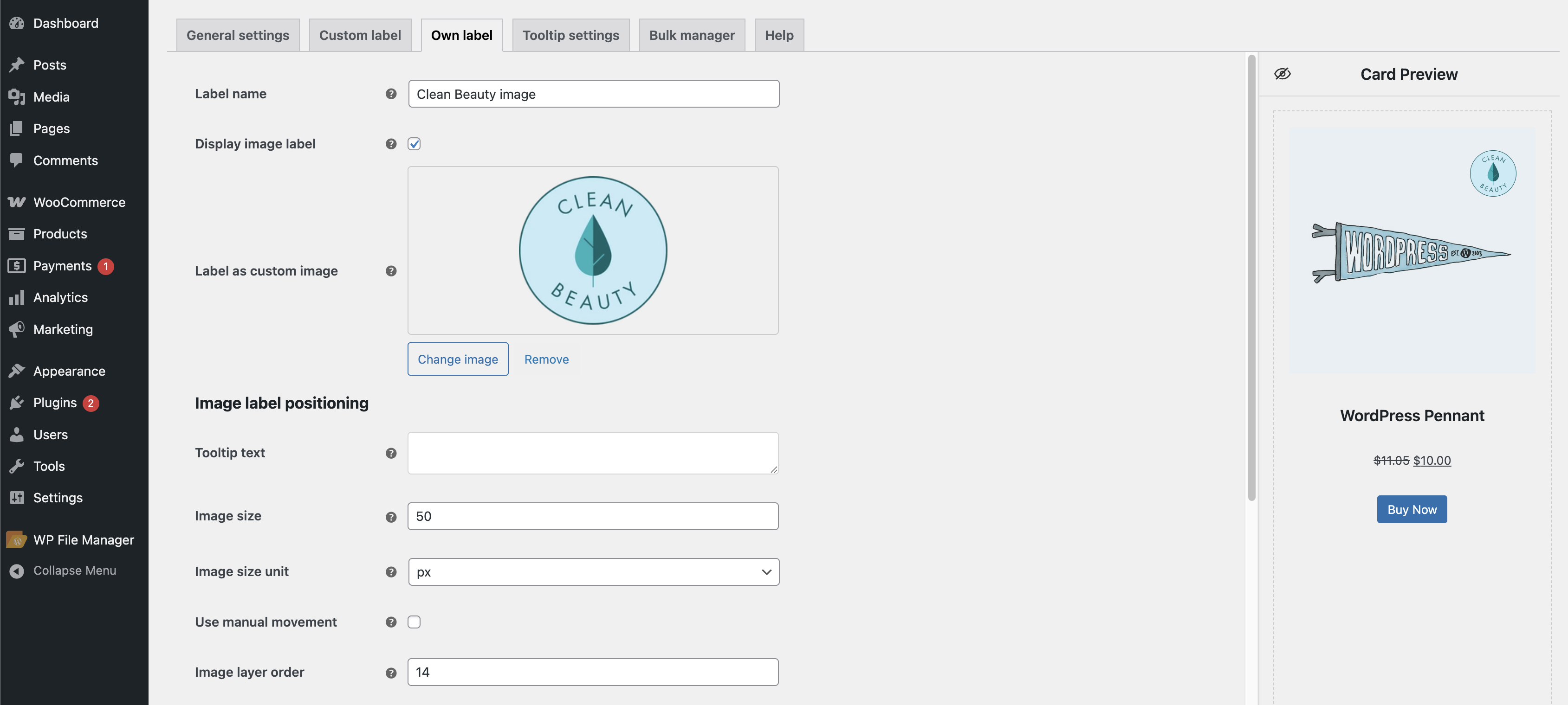
Own label tab #
Label name – field for entering the label name
Display image label – allows displaying an image on the card
Label as custom image – allows uploading own image
Image label positioning
Tooltip text – field for entering the tooltip text
Image size – sets the image size
Image size unit – refers to the units of measurement that will be used for the image size
Position – sets the left, center, or right placement on the product card
Vertical offset – sets the label’s vertical alignment on the product card
Horizontal offset – sets the label’s horizontal alignment on the product card
Bottom outer space – sets the space below the label and the surrounding elements
Image layer order – sets the order of the element (used when multiple labels or elements appear on a product card)
Shadow settings
Shadow color – sets the color for the shadow
Horizontal offset – sets the distance the shadow is moved left or right from its original position
Vertical offset – sets the distance the shadow is moved top or bottom from its original position
Dispersion – sets the density of the shadow
Opacity – sets the level of transparency for the shadow
Own label settings page
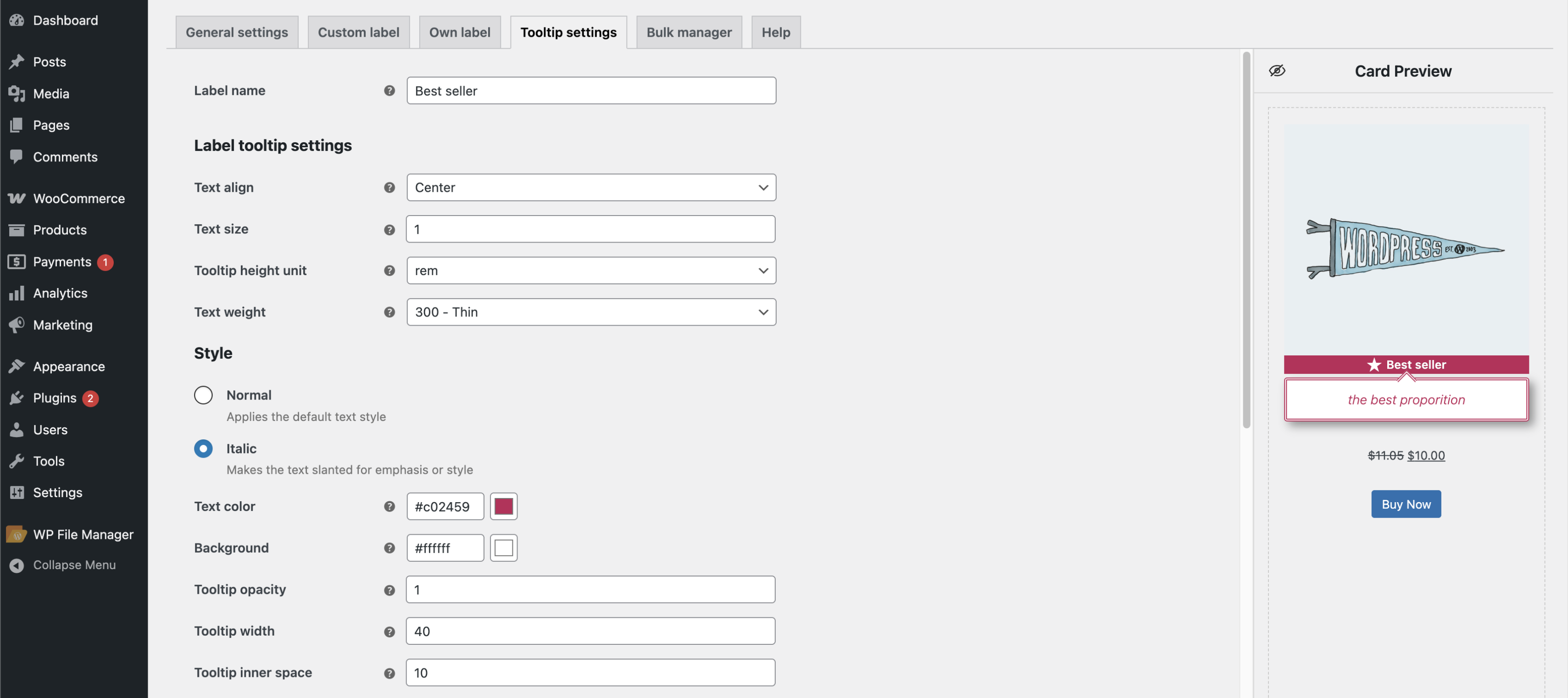
Tooltip settings #
Label name – field for entering the label name
Label tooltip settings
Text align – sets the text alignment in the tooltip
Text size – sets the font size for text
Tooltip height unit – sets the measurement used to define the height of the tooltip
Text weight – sets the font bold
Style
Normal – applies the default text style
Italic – makes the text slanted for emphasis or style
Text color – sets the font color
Background – sets the color of the background
Tooltip opacity – sets the transparency level of the tooltip background
Tooltip width – sets the width of the tooltip
Tooltip inner space – sets space between the content and the left and right edges inside a label’s border
Border color – sets the color for the border
Border size – sets the width of the border
Border style – sets the style for the border
Border rounding – sets the roundness of the tooltip’s corners
Shadow settings
Shadow color – sets the color for the shadow
Horizontal offset – sets the distance the shadow is moved left or right from its original position
Vertical offset – sets the distance the shadow is moved top or bottom from its original position
Dispersion – sets the density of the shadow
Opacity – sets the level of transparency for the shadow
Tooltip settings page
Bulk manager #
The Bulk manager is used to assign labels to multiple products at once.
You can use:
- Categories
- Tags
- Include or exclude specific products
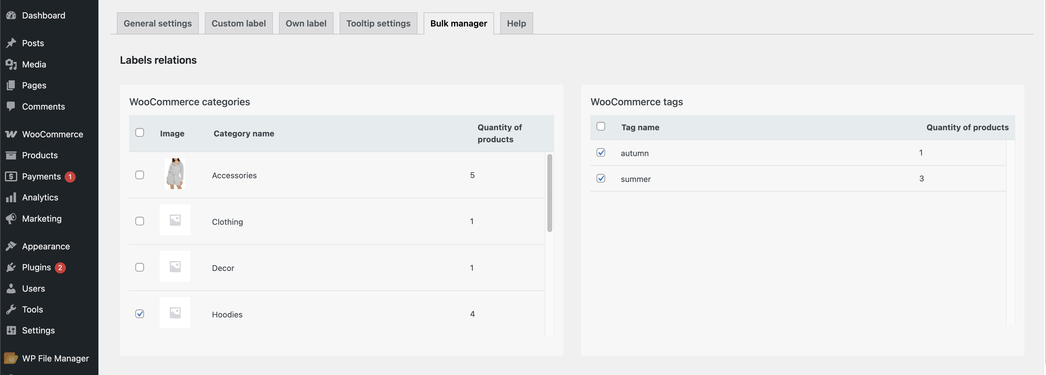
Bulk manager page
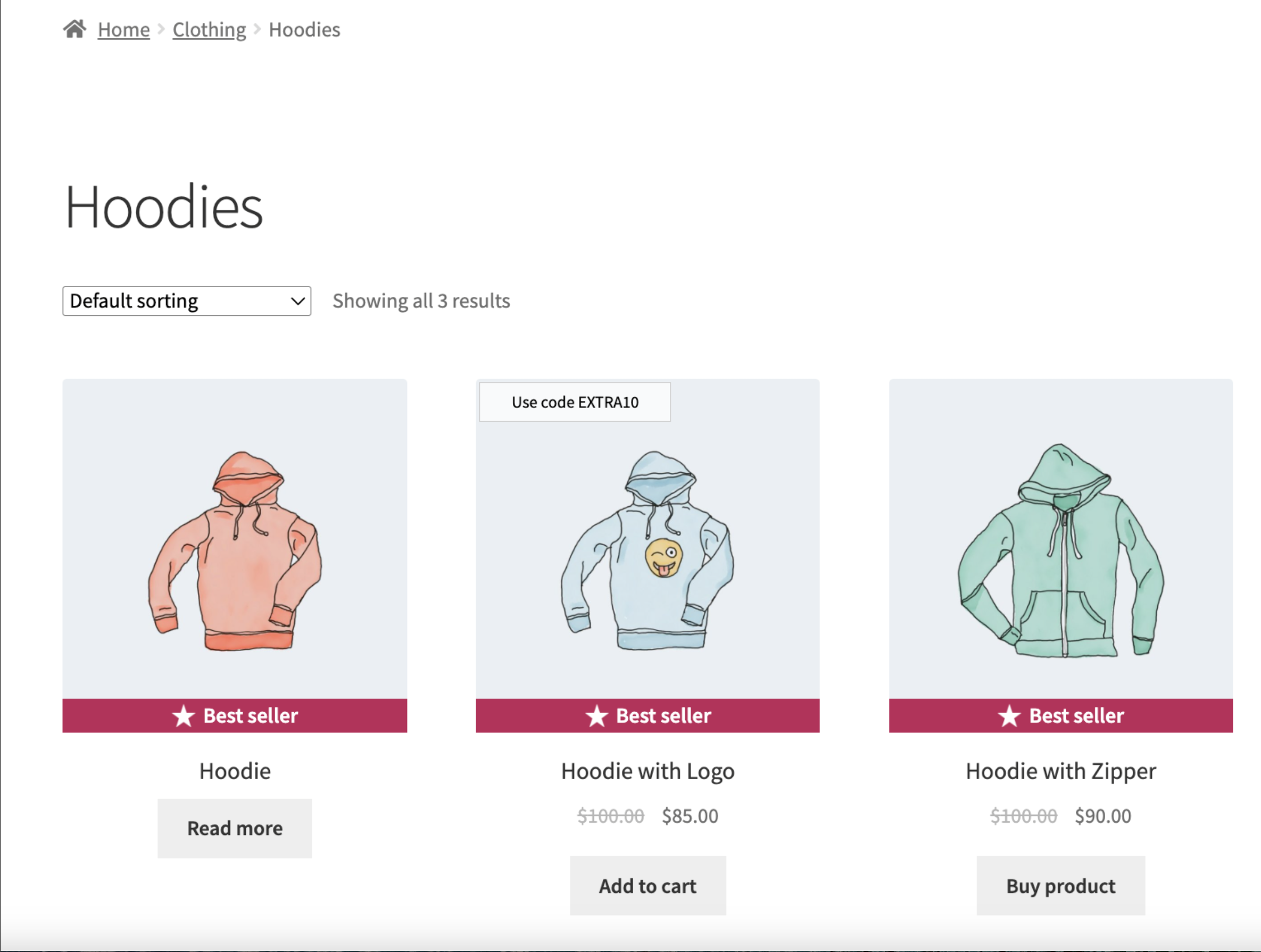
WooCommerce Categories – a label will be displayed on all products within this category.
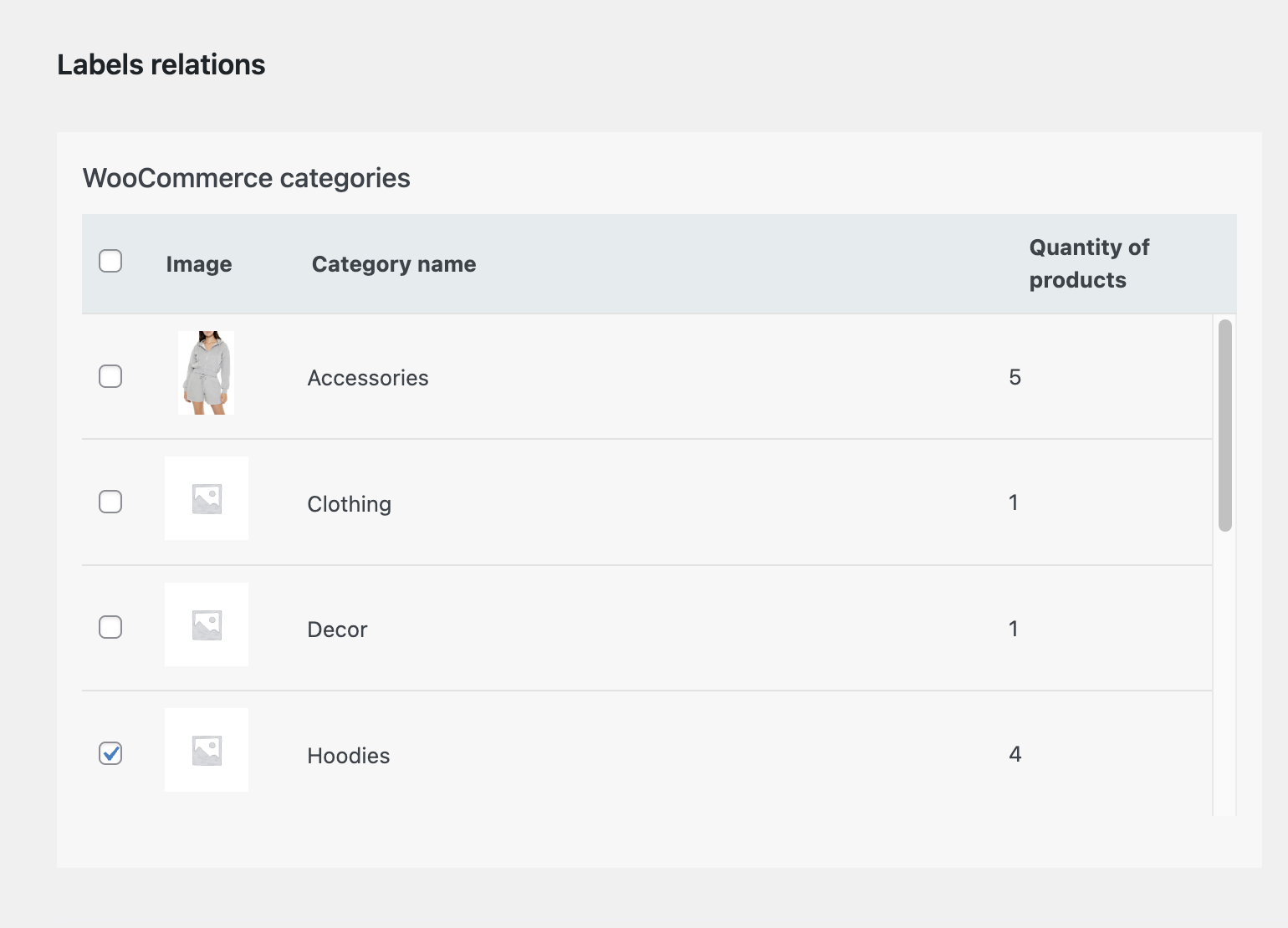
Label assignment via categories in the Bulk manager tab
WooCommerce Tags – a label will be displayed on all products with this tag.
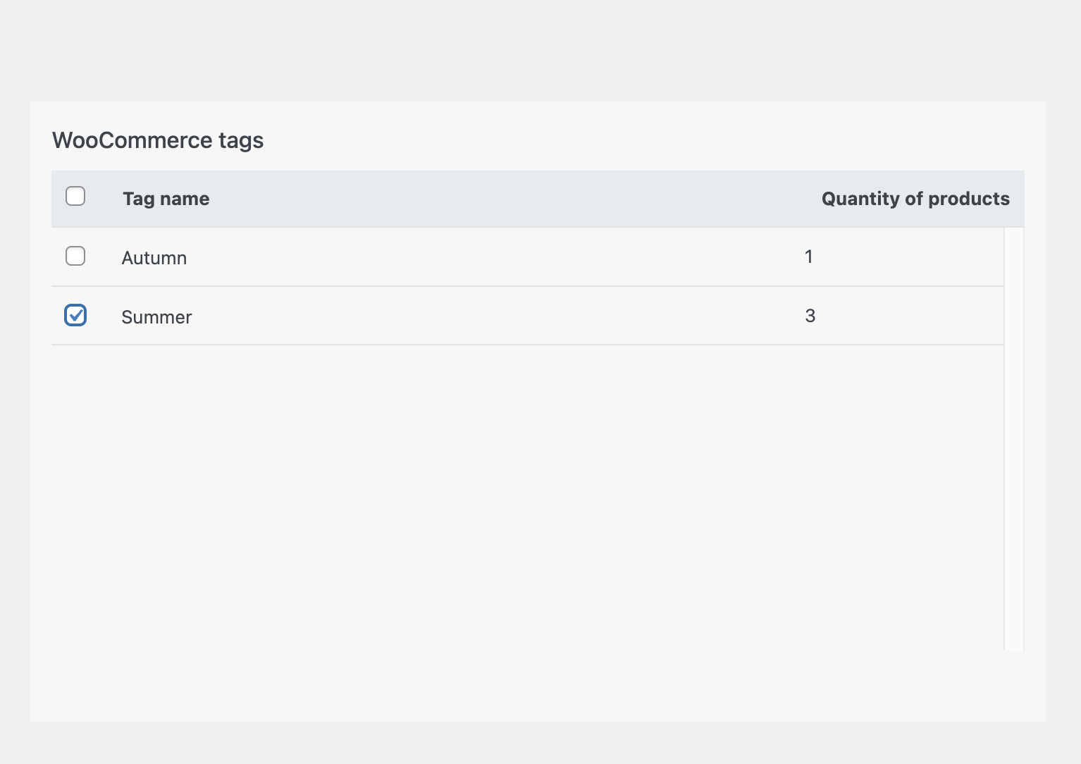
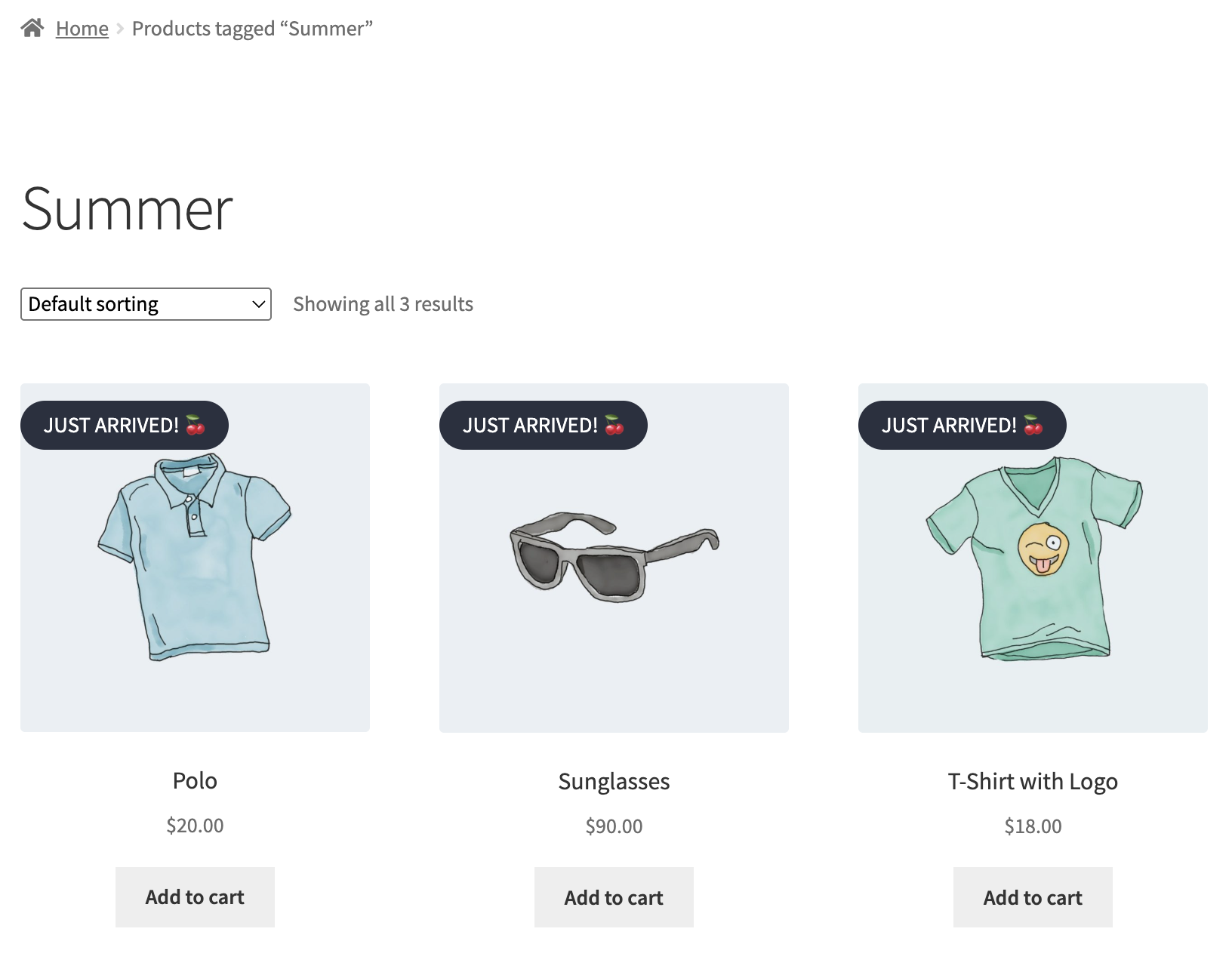
Label assignment via tags in the Bulk manager tab
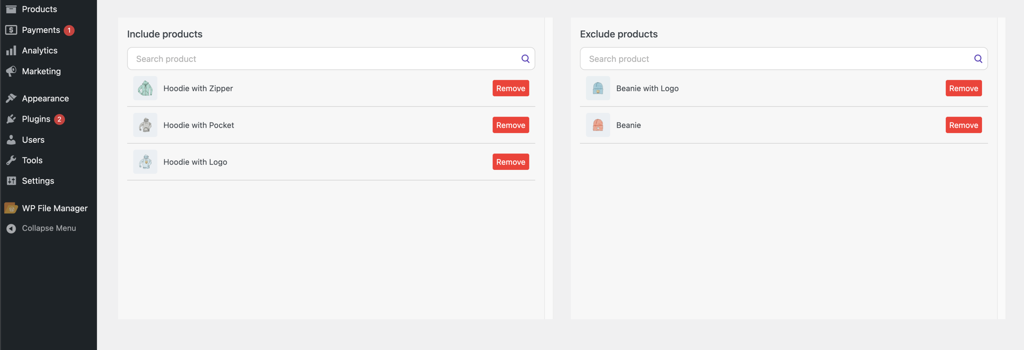
Include products – adding the element (label, timer, custom block) to a specific product.
Exclude products – excludes the element from these products (the element will not be displayed on these products).
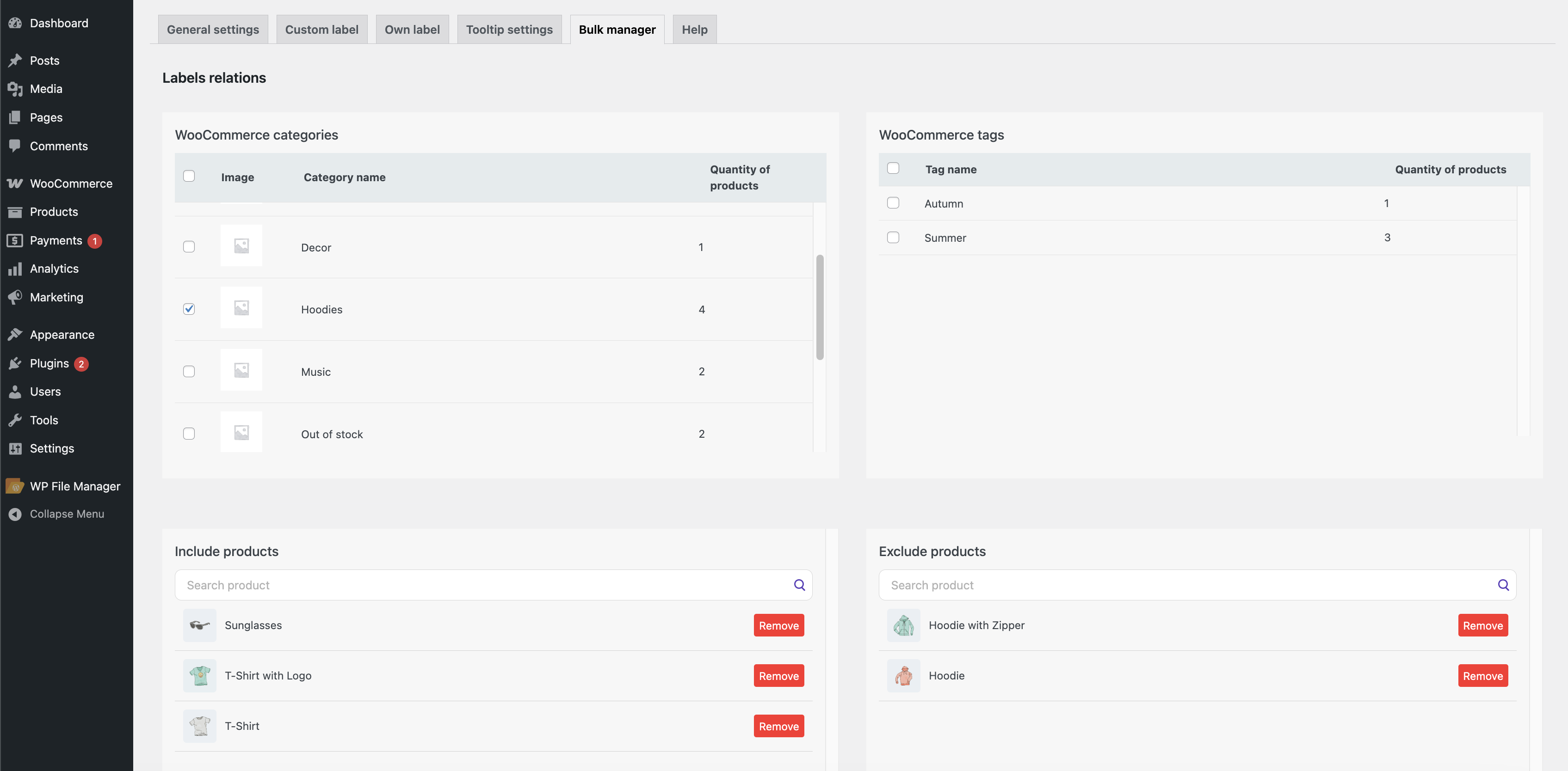
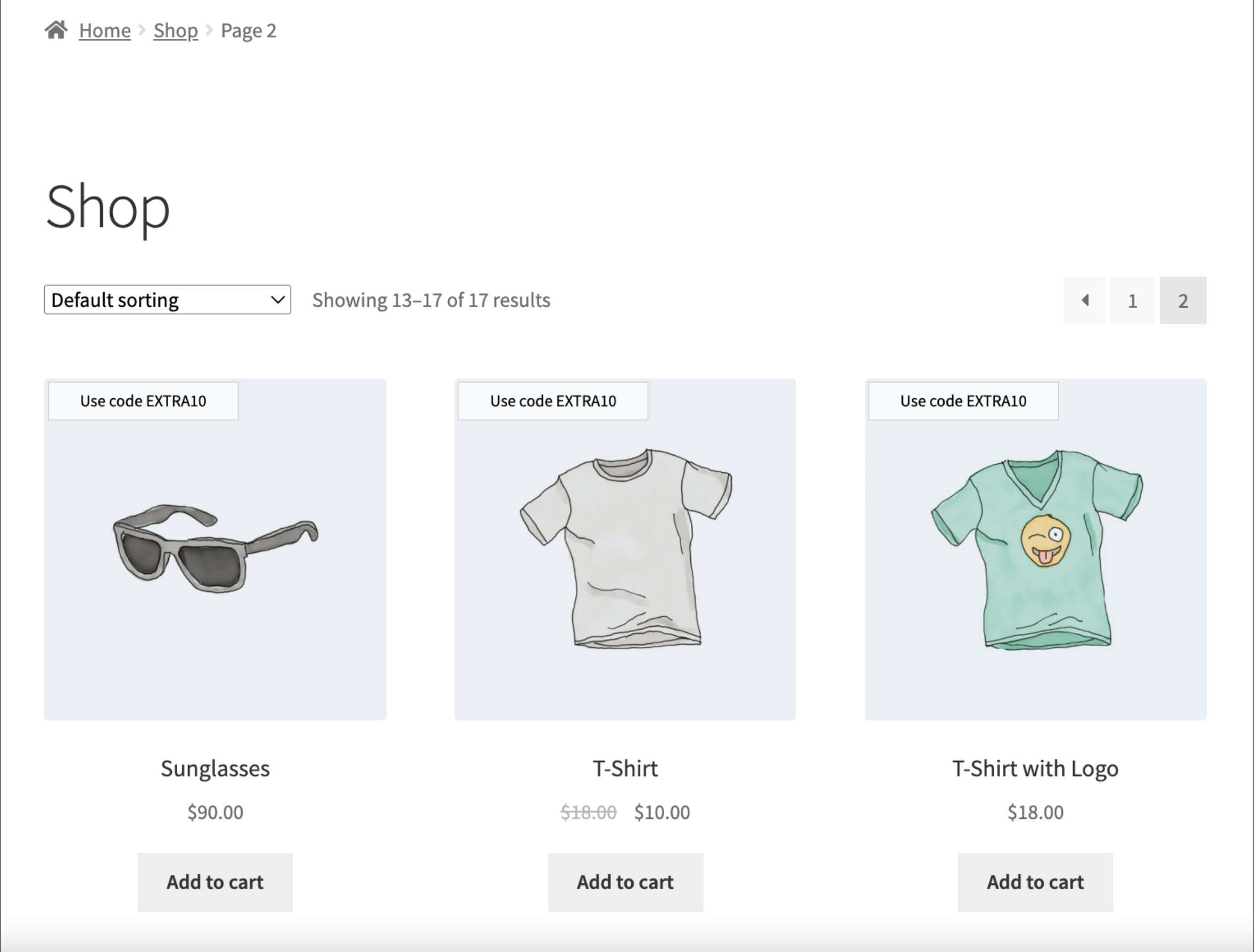
Adding/removing products for a label through Include/Exclude Products
If you have any questions related to the plugin, you can contact support in the Help tab.
Help Center tab
Label template assignment for a product in Products #
You can also assign a label to a product through Products.
To do this, you need to:
- Create a label in the Label Builder
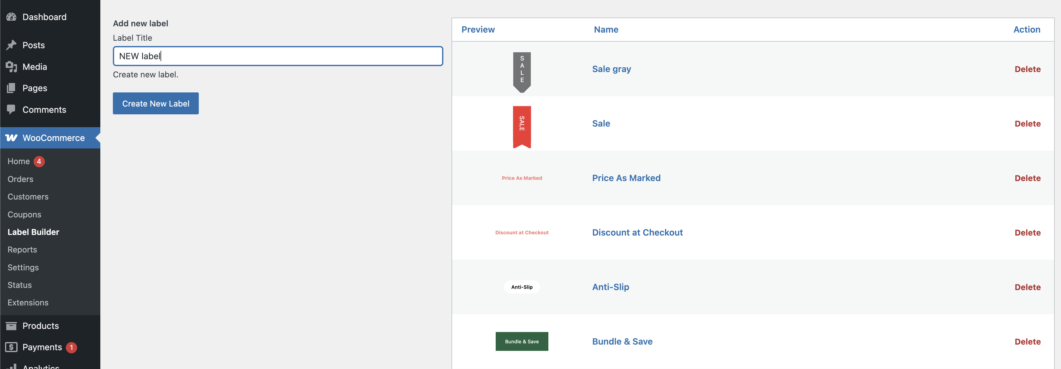
All custom label page
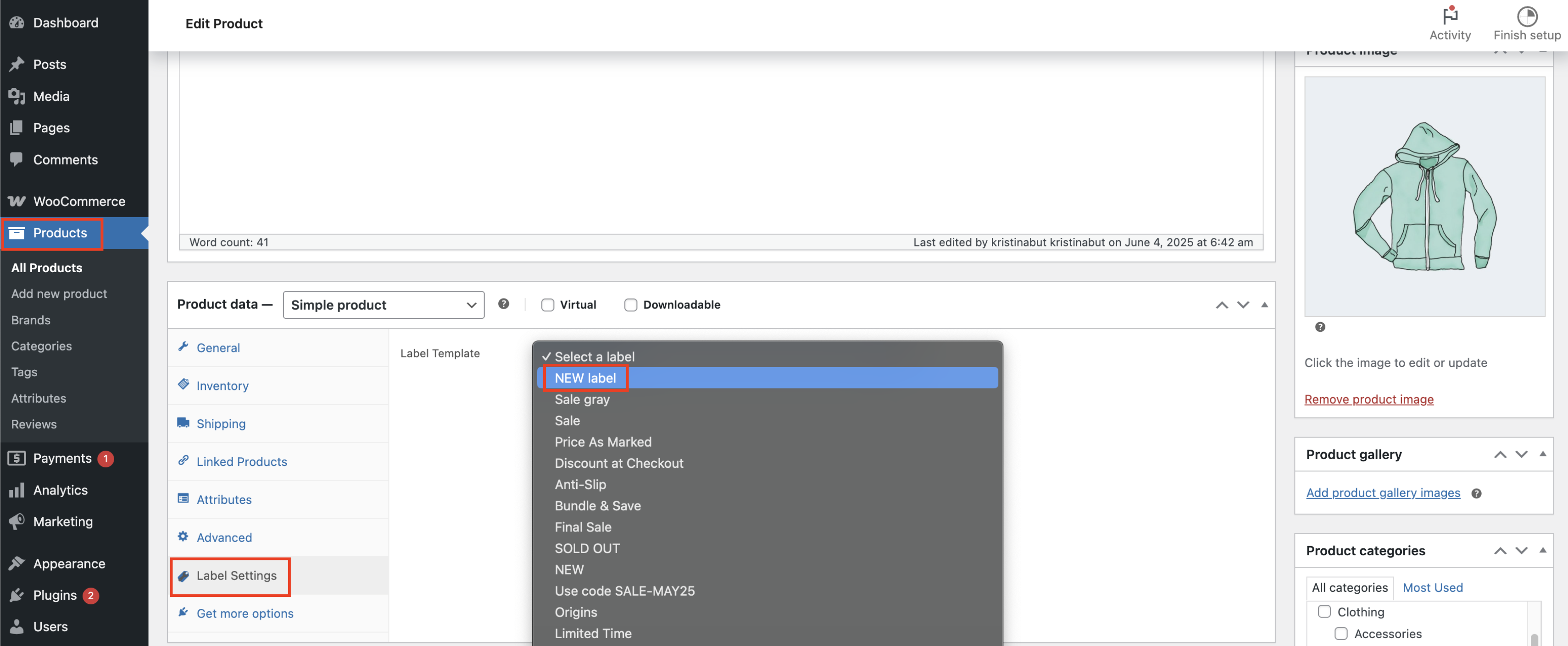
2. Open the desired product in Products
3. Go to the Label Settings tab, select the required template in Label Template, and save the changes
Product page
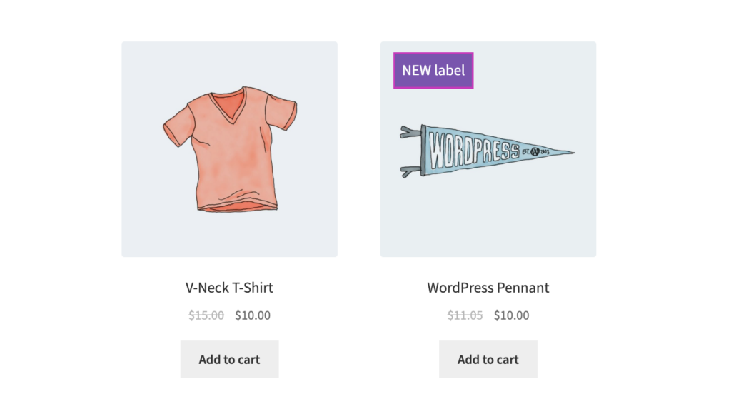
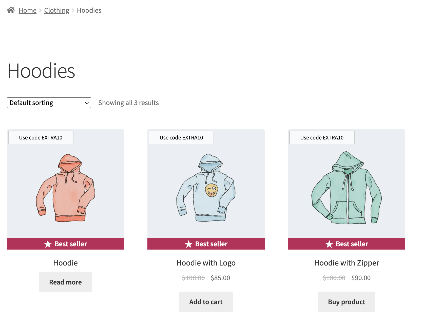
Template label displayed on the product card
It is also possible to combine multiple labels on a product card:
1. custom label
2. own label
3. label template from the Products
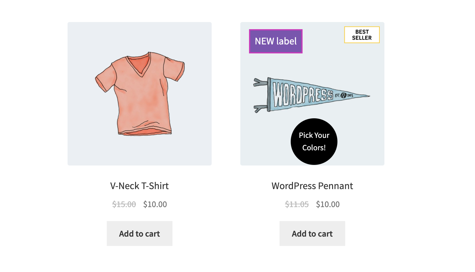
Example of multiple labels on a product card
Auxiliary functions of the plugin #
Label settings
Most themes developed for WooCommerce display the default label. To disable these default labels, use this feature.
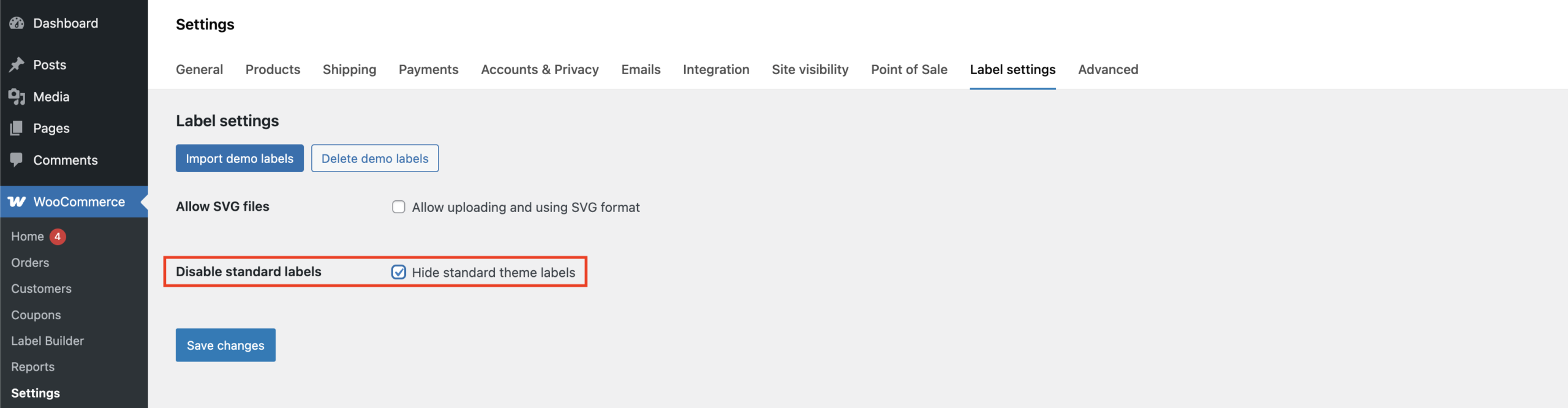
Disable standard label settings on the Label settings page
Important! ‘Disable standard labels’ option may not work; it depends on the theme.
Enabling permission to use SVG files
By default, WordPress does not support SVG file format. Here, you can enable support for these files.
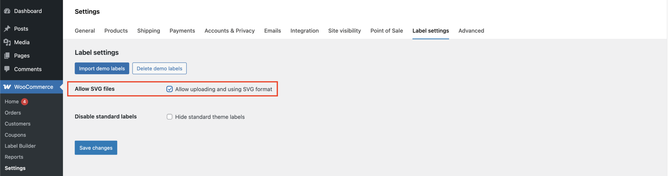
Allow SVG settings on the Label settings page
Use the Import Demo Labels option to upload ready-made label templates.
- Click ‘Import demo labels’
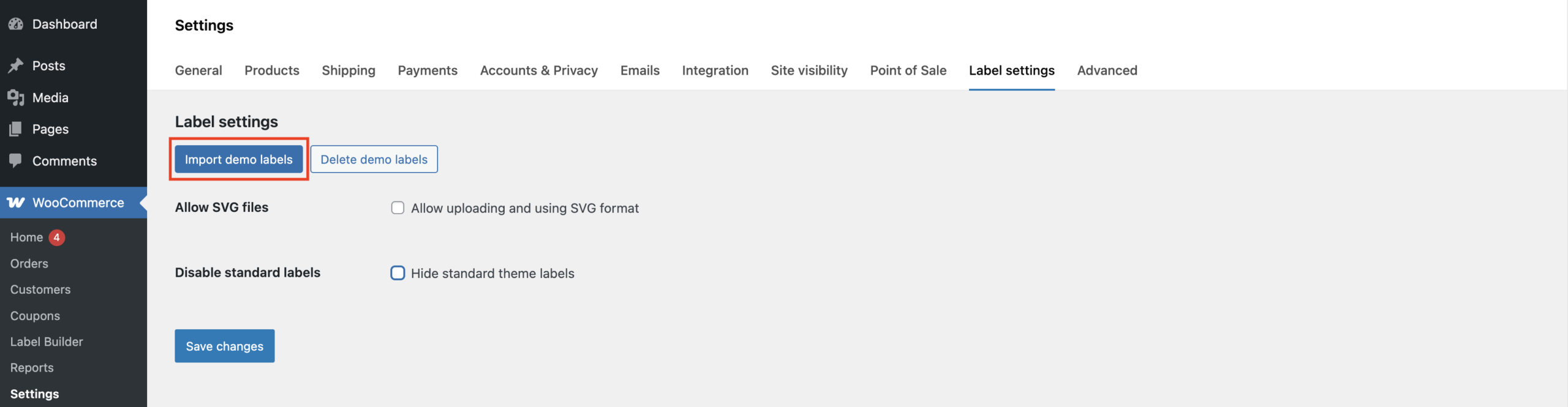
Import demo labels option on the Label settings page
2.After the ‘Demo label uploaded’ notification appears, the demo labels will be available on the Label Builder page.
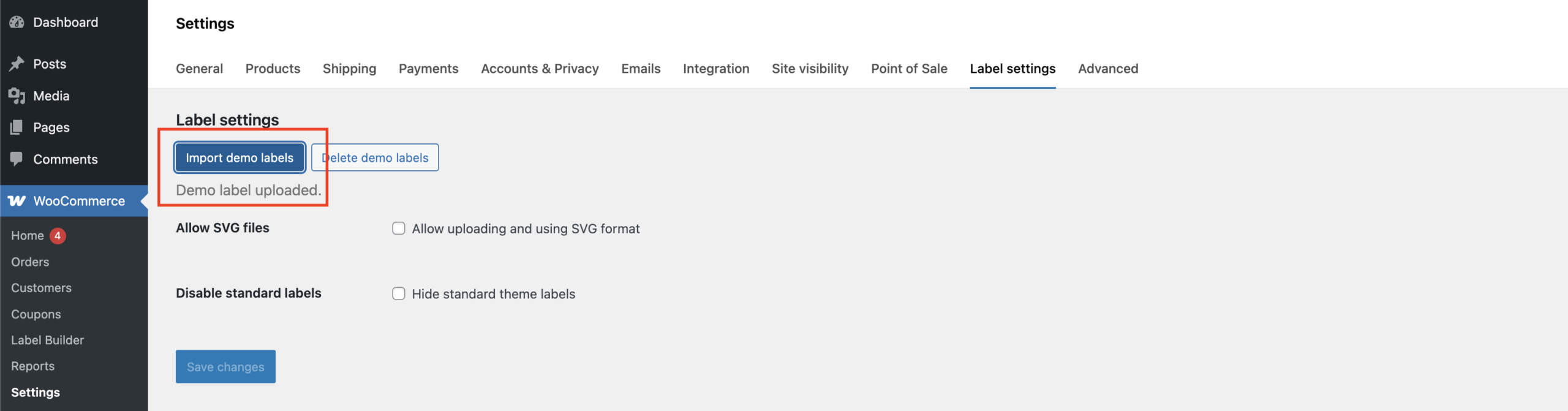
Alert about demo data import is displayed on the Label Settings page
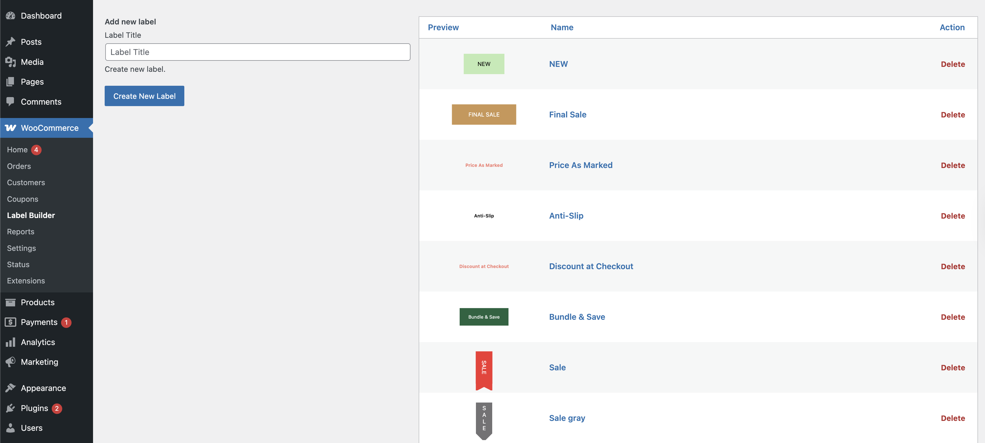
Uploaded demo labels on the Label Builder page
Important! If you click the ‘Import Demo Labels’ button again, duplicate label templates will be uploaded to the Label Builder page.
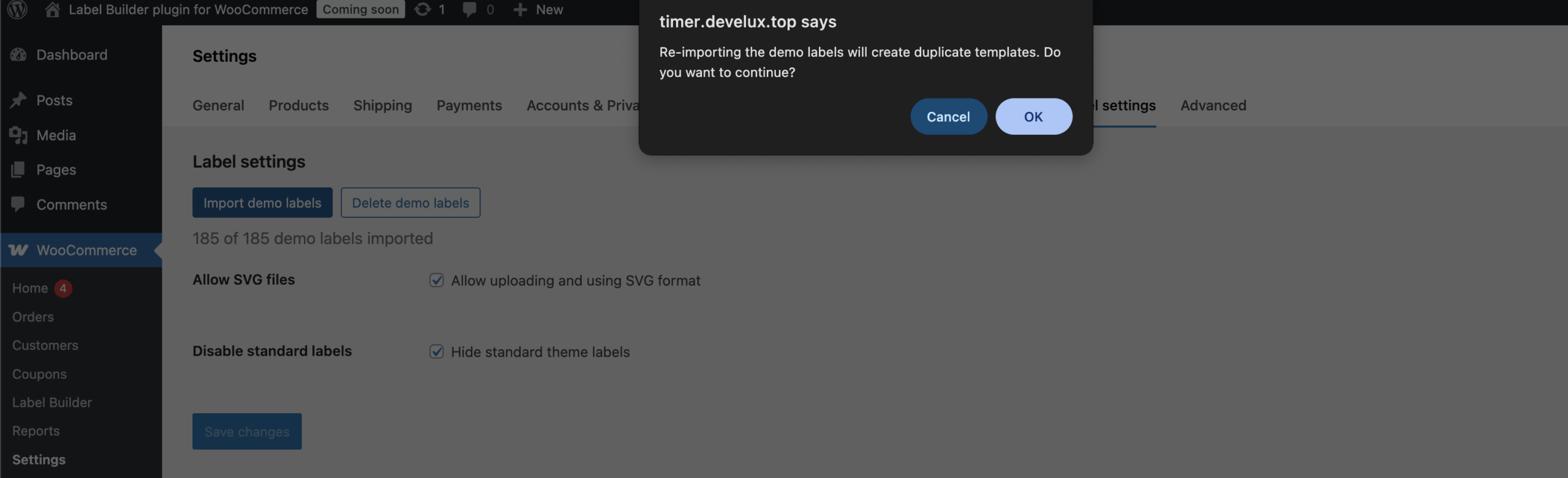
Duplicate label templates alert on the Label Settings page
Delete demo labels option allows deleting the uploaded demo labels
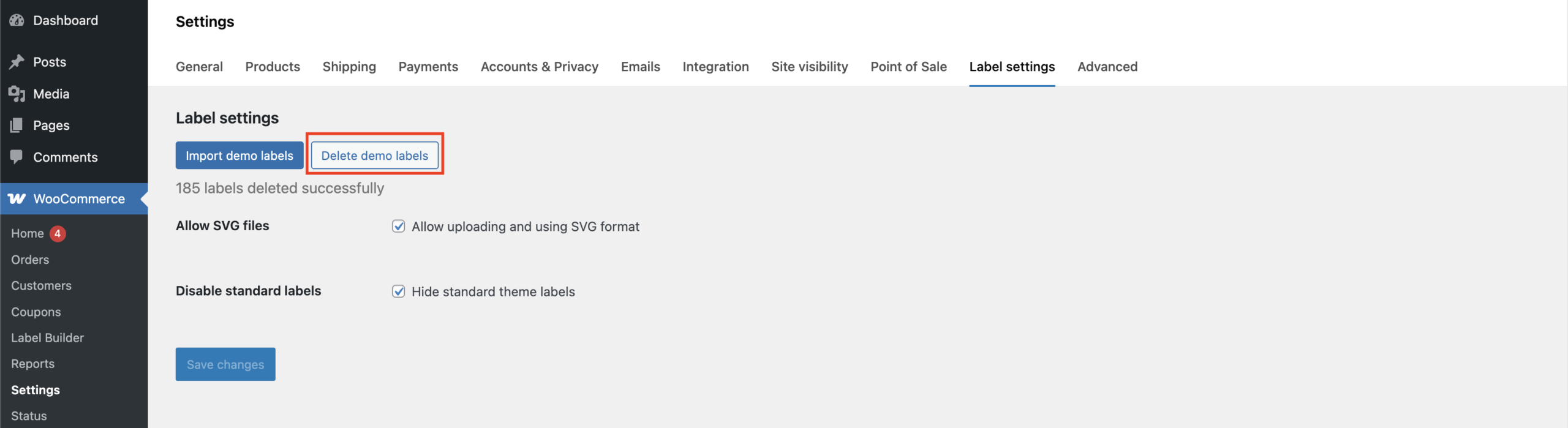
Delete demo labels on the Label Settings page
Recommendations and solutions to potential problems #
Each theme is partially unique and may have different settings, along with various ways to implement the same elements.
Rem and Em unite
Em unit changes depending on the font size of its parent element.
Rem unit is fixed relative to the root element’s font size and doesn’t change based on the parent’s font size.
Important! Measurement units depend on the theme.
Displaying geometric shapes on labels
The settings of some themes affect how geometric shapes are displayed on labels. If the selected geometric element does not appear on the product card or product page, simply switch to a different theme.


